
You know how sometimes you don’t like a song the first time you hear it, but after every radio station plays it twice an hour for three weeks, you end up humming along because it simply wears you down?

Well, unfortunately, that’s not going to happen with Ultraviolet and me.

No amount of exposure is going to make me like this color for interior design. Nope. No way, no how.
Pantone says that Ultraviolet is “a dramatically provocative and thoughtful purple shade” that “communicates originality, ingenuity, and visionary thinking that points us towards the future.” Hmph.
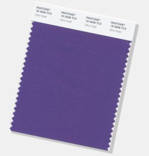
I have had a love/hate relationship with purple, and I humbly admitted several years ago that I have come to accept most shades of this much beloved color. Especially lavender.
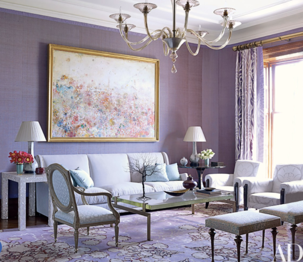
But Ultraviolet…it’s a bit gauche. There’s no nuance. No subtlety. It’s in your face, and not in an awesome 8th grade girl power kind of way. No, it’s in your face in a mean uncle kind of way…you know, the boisterous one who’s rude at Thanksgiving.
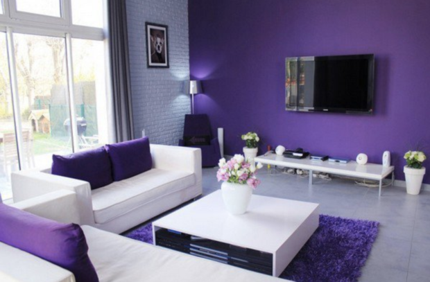
To decorate successfully with Ultraviolet in its purest form will be to relegate it to the tiniest accents – or alongside other colors in busy patterns. Nothing large. A chair in Ultraviolet? Eeew. A rug in Ultraviolet? Worse. Multi-colored wallpaper in which Ultraviolet is the tiniest feather on a bird’s wing and part of a shadow cast by a peony? Maybe.
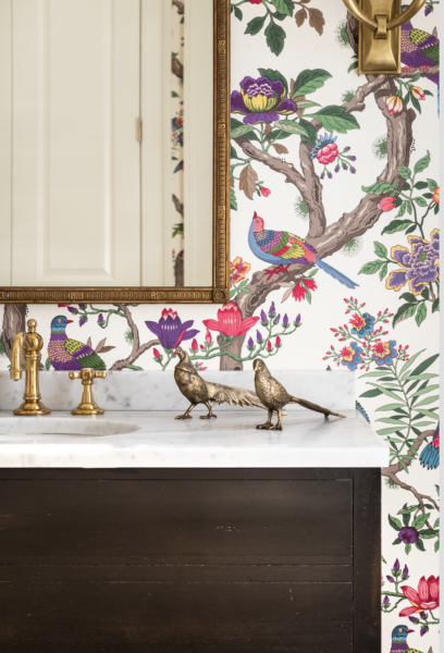
Or a dramatic geometric design. Yes.
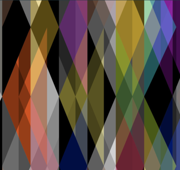
Otherwise, Gentle Readers, to get through the Year of Ultraviolet, we’re going to have to interpret the color loosely. We’ll water it down a bit to make it more lavender.
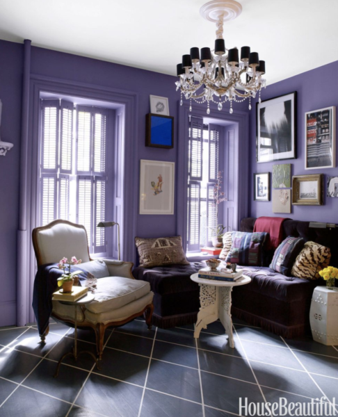
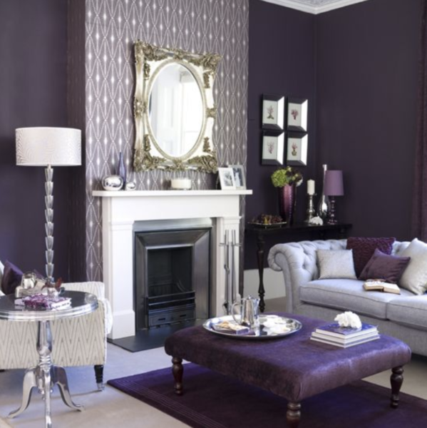
We’ll lighten it and add more blue so it becomes almost cornflower. We’ll add gray and make it almost aubergine.
Last year’s Greenery was such a pleasant surprise. Fresh and optimistic. The year before that, 2015, was two colors, Rose Quartz and Serenity, which really weren’t all that bad.
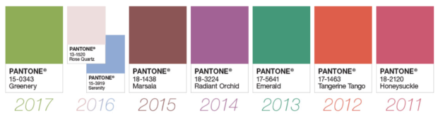
The year before that, 2015, was two colors, Rose Quartz and Serenity, which weren’t all that bad. But then, Marsala – disaster. Radiant Orchid – even worse than Ultraviolet. Emerald – thank you. Tangerine Tango – took me a while, but I came around to its amazingness. Honeysuckle – so happy!
But Ultraviolet. It is not awesome.
Annie Elliott | bossy color is a design firm based in Washington, DC. Don’t miss us in the December 2017 issue of Washingtonian Magazine!
