• Skip to main content
  • Skip to header left navigation
  • Skip to header right navigation
  • Skip to site footer
  • about
    • services
    • team
  • portfolio
  • press
Annie Elliott Design, Washington DC

Annie Elliott Design

Greater Washington DC

  • book
  • blog
  • contact

Pantone’s Color of the Year 2013, Emerald Green, in action!

Annie Elliott | January 29, 2013

Who knew I’d end up embracing Pantone’s Color of the Year so wholeheartedly?

Pantone's color of the year 2013: Emerald Green, as seen in a bedroom

Emerald Green,  I apologize! I’m sorry I doubted you! I was counting on a liberal interpretation of the color — grassy green, yellowy green, limey green — to get me through 2013. Turns out I don’t need to!

I mean, look at that bedroom up there! Love the green on green with the lamps and the wall color. Please don’t carry the green into the adjacent bathroom, though…funny things can happen when you paint a bathroom green. Ask me how I know that.

And how awesome is this stair runner with black and white? We did a green stair runner last year — we’re SO ahead of the trends ;) — and it was smashing.

Emerald Stair Runner

We’ve been deep into tile-land lately…these green tiles are fantastic, aren’t they? Look carefully: they’re just hexagonals, but the pattern and installation make them so edgy. Love them with the tub. (Note to self: layer the same color via different elements in a room.)
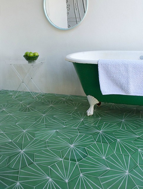
Pantone's color of the year 2013: Emerald Green tile and bathtub

Here are a few ideas for incorporating Emerald Green into your home this year:
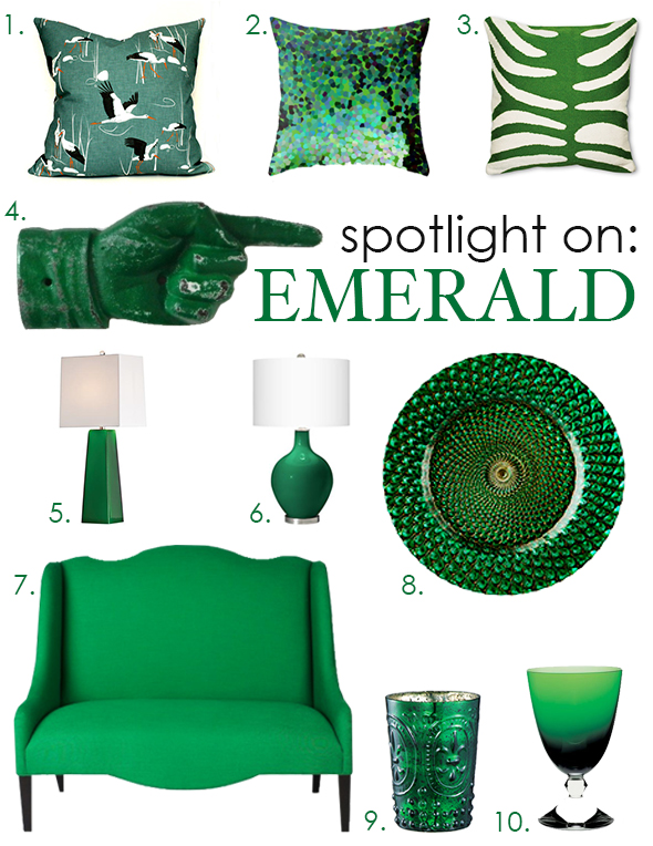
 

Pantone's color of the year 2013: Emerald Green small changes

Convinced? If you’re still on the fence, stay tuned. Post coming soon of my very own, brand spanking new dining room rug. Guess what color it is?

1. Etsy Decorative Pillow Cover; 2. Emerald Isle Pillow Cover; 3. Jonathan Adler Zebra Pillow (I’ve been wanting one of his needlepoint zebra rugs forever. Maybe I’ll do a pillow instead); 4. Etsy Vintage Style Sign; 5. Case Glass Table Lamp; 6. Ovo Table Lamp; 7. South of Market Loveseat; 8. Glass Charger Plate; 9. Glass Votive Holder; 10. Baccarat Water Glass. The splurge item, obviously!

Quoted in publications from The New York Times to The Washington Post to Real Simple magazine, Annie Elliott is considered an expert in color, residential space planning, and telling people what to do in the nicest way possible. Her interior design firm, bossy color, has been serving residents in the greater Washington, D.C. area since 2004.


Category: Color + paint colorTag: 17-5641, Emerald green, emerald green glass, emerald green lamp, emerald green pillows, emerald green plate, emerald green settee, emerald green votive, Pantone color of the year 2013

Sidebar

Subscribe


Bossy Color Blog

Categories

  • Art + accessories »
  • Bedroom »
  • Color + paint color »
  • Dining room »
  • Furniture + upholstery »
  • Kids »
  • Kitchen + bath »
  • Lighting »
  • Living Room + Family Room »
  • Renovation »
  • Rugs »
  • Wallpaper »
  • Window treatments »

View Portfolio

view Bossy Color's portfolio

Instagram

annieelliottdesign

View Instagram post by annieelliottdesign

Oct 3

Open post by annieelliottdesign with ID 18482506054114649
You likely know where I stand on pillows: they NEVER should be an afterthought. Check out my latest blog post for recommendations on size, shape, style, and placement. Link in bio. 📸 @stacyzaringoldberg📸 @kipdawkinsphoto📸 @angieseckinger

annieelliottdesign

View Instagram post by annieelliottdesign

Oct 2

Open post by annieelliottdesign with ID 18103510994172389
This client’s gorgeous collection of gold icons in the bookcases puts this room in a league of its own. Whenever you have a collection — of ANYTHING: frog figurines, English engravings of flowers or dogs, snow globes — maximize its impact by bringing the objects together and placing them in a prominent place. These icons are breathtaking, and the sheer number invites you to go closer and study them. With reverence.#eastlake #vintagerug #antiquerug

annieelliottdesign

View Instagram post by annieelliottdesign

Sep 28

Open post by annieelliottdesign with ID 18630011602021777
Happy Fall! Ironic, isn’t it, that fall weather is cool, but the colors we associate with the season are warm? The earthy orange grasscloth in this foyer is undeniably “fall” to me. Add deep, warm versions of green and blue, et voilà: a cozy, inviting, autumnal space.

annieelliottdesign

View Instagram post by annieelliottdesign

Sep 23

Open post by annieelliottdesign with ID 17881497900529047
For this week’s Wallpaper Wednesday we go into the Woods… Woods is a great example of Cole & Son’s innovation in serigraphy, a traditional method of screen printing. The pattern is available on fabric and wallpaper in a variety of soothing yet elegant colorways. Due (I’m sure) to the booming success of the original, there are now some whimsical variations on Woods: Cole & Son added metallic stars to some colorways and pears to others. As you may imagine, however, this traditionalist prefers the original 🙂For some reason, Woods is especially popular for nurseries. Maybe those babies really wanted out of their cribs. 👶🏼In 2005, Woods deservedly won the ELLE Decoration International Design Award for Wallcovering of the Year. And it’s still going strong.

annieelliottdesign

View Instagram post by annieelliottdesign

Sep 22

Open post by annieelliottdesign with ID 17934708156387896
“Isn’t ‘modern farmhouse’ over yet?” I loved speaking with @authordinacheney @washingtonpost about the worst interior design trends! Turns out I’m not the only designer with strong opinions 😊@vincentewolfdesigns @kimletgordon @maxsinsteden #interiordesign #washingtonpost #designopinions #annieelliottdesign

annieelliottdesign

View Instagram post by annieelliottdesign

Sep 18

Open post by annieelliottdesign with ID 17989063023104856
Best part of being an interior designer is using your own home as a playground for creative ideas! We changed the paint in our living room again and here’s how it looks now! #interiordesign

annieelliottdesign

View Instagram post by annieelliottdesign

Sep 17

Open post by annieelliottdesign with ID 18125330714481993
When you become an empty nester, when is it ok to reclaim your adult child’s space? Check out my latest blog post for my recommendations on how to approach empty nesting!📸 @stacyzaringoldberg📸 @kipdawkinsphoto📸 Michael Wilkinson📸 @angieseckinger

annieelliottdesign

View Instagram post by annieelliottdesign

Sep 10

Open post by annieelliottdesign with ID 17906571285498443
Pink, green, and a splash of dark orange come together to create this sunny, summery bedroom 🪷

annieelliottdesign

View Instagram post by annieelliottdesign

Sep 9

Open post by annieelliottdesign with ID 18104009318233584
It’s Wallpaper Wednesday! This week, feast your eyes on @timorous_beasties Fruit Looters. TB claims that William Morris’s Strawberry Thief pattern inspired Fruit Looters, but only the name indicates the connection: Strawberry Thief, Fruit Looters…get it? Whereas Morris’s iconic pattern is medium-scale, rhythmic, 2-D, cartoon-like, and muted, Fruit Looters is the opposite in every way but subject matter. The scale is huge, with the foliage “stripes” providing a geometric order, and it oozes TB’s trademark edginess. The crisp pattern is finely drawn; pull it apart, and each element — a flower, a bird — could be in an English botanical print. Fruit Looters comes in vivid, saturated colorways, some with a metallic sheen, and dramatic black is present in all.Recently, a client (who originally introduced me to Timorous Beasties!) and I used Fruit Looters wallpaper in her stairwell, in the Alabaster colorway. The drama. Oh, the drama!
Follow

Looking for something?

Don’t miss a single post


Where classic and modern hang out and drink gin.

  • Instagram
  • TikTok
  • Pinterest
  • Facebook
American Society of Interior Designers Firm Partner

© 2026 · Annie Elliott Design · privacy policy