• Skip to main content
  • Skip to header left navigation
  • Skip to header right navigation
  • Skip to site footer
  • about
    • services
    • team
  • portfolio
  • press
Annie Elliott Design, Washington DC

Annie Elliott Design

Greater Washington DC

  • book
  • blog
  • contact

Pantone’s color of the year 2012: 17-1463 Tangerine Tango

Annie Elliott | December 13, 2011

Kristie at The Decorologist broke the news to me first. Pantone’s color of the year for 2012 is a dark reddish orange called Tangerine Tango.
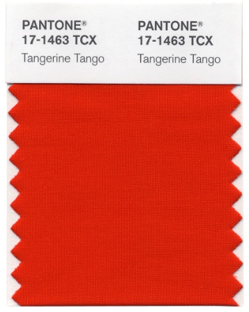
Pantone's color of the year 2012

Sigh. Was it too much to hope for a nice, grassy green?

Leatrice Eisman describes Tangerine Tango thus:

Reminiscent of the radiant shadings of a sunset, Tangerine Tango marries the vivaciousness and adrenaline rush of red with the friendliness and warmth of yellow, to form a high-visibility, magnetic hue  that emanates heat and energy.

Now THERE’s a concise little description. Sheesh.

Why am I so cranky about this? You know I’m a fan of bold colors. And there’s nothing WRONG with Tangerine Tango per se. I like red, I like depth…everything Ms. Eisman says about the color is true.

But here’s the thing: I’m still recovering from orange.

Wasn’t it just yesterday that orange was EVERYWHERE?
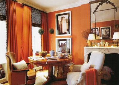
Orange room with fireplace and round table
Jeffrey Bilhuber in Habitually Chic

Especially with olive and kiwi greens?

Olive green room with orange chairs and Albers painting
Elaine Griffin in Elle Decor
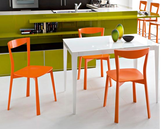
Orange chairs, white table, green shelves
From kitchendesignimages.blogspot.com

Granted, it was a much lighter orange – tangerine without the tango, if you will – but I feel as though stores from West Elm to CB2 were just reveling in it, especially for accessories.

Habitually Chic has a wonderful post about the positives of orange. But here’s the thing: it was written 11 months ago. See what I mean?

To be honest, I’m still grooving on Pantone’s color of the year for 2011: Honeysuckle pink.
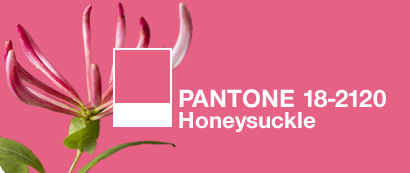
Pantone's color of the year 2011: Honeysuckle Pink

In fact, I’d finally traded out those goofy half-orange chairs (and they ARE close to Tangerine Tango)…

Chairs upholstered in orange herringbone and Schumacher Pearl River chairs

…for new pink chairs, and I’d just reupholstered my little Mitchell Gold Mona sofette in a pretty pink and cream Ikat from Schumacher.
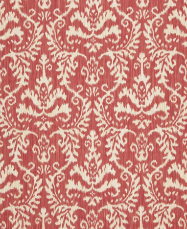
Pink and cream Ikat fabric
Schumacher's Tiraz Ikat

Is that it? Am I feeling left behind? (I still have those darn two-tone chairs, but you couldn’t pay me enough to put them back in the living room.)

Or maybe I’m angry with Pantone for creating these awesome Christmas tree ornaments but not selling them in the U.S. this year.
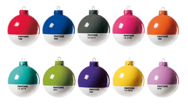
Colorful Pantone Christmas tree ornaments

Look. I’m sure I’ll get with the program eventually. But for now, Tangerine Tango doesn’t feel fresh as much as recycled. In a lame way, not a cool eco way. A strong, grassy or blue-green would have been much fresher.

As for Benjamin Moore’s color of the year for 2012, HC-143 Wythe Blue…that’s a subject for another time. (One word, though: tired.)
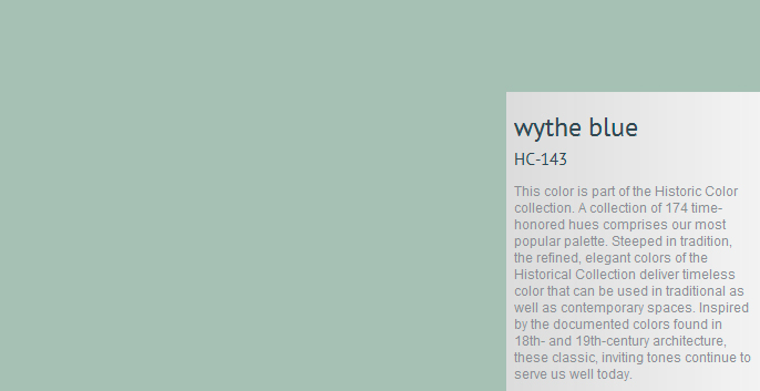
Benjamin Moore's HC-143 Wythe Blue
From Tobi Fairley's blog

Annie Elliott – aka bossy color – is an interior decorator and design blogger in Washington, D.C. She has been quoted by The Washington Post, the Associated Press, and most recently, she had a full-page interview in USA Today’s glossy magazine, American Life Home. Look for it. And when you find it, please send it to her, because she only has it on a PDF.

Category: Color + paint colorTag: color of the year, Pantone, Pantone's color of the year 2012, Tangerine Tango, Wythe Blue

Sidebar

Subscribe


Bossy Color Blog

Categories

  • Art + accessories »
  • Bedroom »
  • Color + paint color »
  • Dining room »
  • Furniture + upholstery »
  • Kids »
  • Kitchen + bath »
  • Lighting »
  • Living Room + Family Room »
  • Renovation »
  • Rugs »
  • Wallpaper »
  • Window treatments »

View Portfolio

view Bossy Color's portfolio

Instagram

annieelliottdesign

View Instagram post by annieelliottdesign

Jul 8

Open post by annieelliottdesign with ID 18120991804793828
Star-studded wallpaper on the ceiling childish? Not necessarily! Here are the differences between babyish and grown-up star themed wallpaper. #wallpaper #interiordesign

annieelliottdesign

View Instagram post by annieelliottdesign

Jul 4

Open post by annieelliottdesign with ID 18098048903219045
Happy Independence Day! I happen to love a room decorated in red, white, and blue. It’s not always gimmicky; wouldn’t you agree that the dining room below is bold and sophisticated? 🤪 My advice: vary the shades (clash those blues if you have to!), throw some large-scale patterns into the mix, and add texture. A grasscloth ceiling, for example 😉 Have a great 4th, everyone!#interiordesign #homedecor #pattermixing

annieelliottdesign

View Instagram post by annieelliottdesign

Jul 3

Open post by annieelliottdesign with ID 17934768423090149
I was honored to co-chair — with the inimitable @ianthainteriors — the design competition, America at 250: The New Look of American Design, a project conceived by the nonprofit MADE: In America.Design students from Howard University partnered with Washington Design Center showrooms to create storyboards and vignettes reflecting their vision of “American style.” The Design Center is showcasing the students’ work through July 10; admission is free and open to the public. Details may be found at the link in the @washingtondesigncenter’s bio.I encourage you to visit! It’s so important to support the next generation of designers, and I was delighted to participate in this event. Iantha and I are grateful to James De Lorbe, Chairman of MADE: In America; and we extend our warmest thanks to jurors @melissacolganinteriors, @mariella.cruzado,  @gaildavisdesigns, @val_hawkins_architect, @hadleykeller, @byronrisdon, and @jazmynedesignstudio.

annieelliottdesign

View Instagram post by annieelliottdesign

Jul 1

Open post by annieelliottdesign with ID 18345901804173891
Happy Wallpaper Wednesday! This week’s guest star: Schumacher’s Birds & Butterflies. It’s so whimsical, yet so grown up! Creatures on wallpaper can be a tough sell to adults, but Birds & Butterflies’ black and white background is quite sophisticated. (That’s why the Multi on White is my favorite colorway. I wouldn’t bother with the others.)The pattern is derived from a hand-printed 1960s wallpaper in the Schumacher archive. It’s certainly earned its place in the Exuberant Prints collection, don’t you think?#wallpaperinspo #interiordesign #roomdesign

annieelliottdesign

View Instagram post by annieelliottdesign

Jun 26

Open post by annieelliottdesign with ID 18423163795132747
Before and after part 2: a NYC pied-a-terre part deux! In this video we move to the primary bedroom, guest bedroom/office/workout area (remember: it’s NY! Gotta maximize your space!) and the tiniest powder room in the world. Such a fabulous, fun project!Mentioned:@Schumacher_midatlantic@leejofa@visualcomfort@fornasetti#interiordesign #wallpaper #nycdesign

annieelliottdesign

View Instagram post by annieelliottdesign

Jun 26

Open post by annieelliottdesign with ID 18095719559219273
Another installment of my Before and After video series! This project is in NYC. SO fun!!! We start with a VERY challenging living space/kitchen and then…well, then there’s Part 2!Mentioned:@Schumacher_midatlantic@leejofa@visualcomfort@fornasetti

annieelliottdesign

View Instagram post by annieelliottdesign

Jun 23

Open post by annieelliottdesign with ID 18095254961251333
Having sworn I never would wield a paintbrush again, I recently found myself helping my daughter paint her first apartment. Thus a tutorial about paint sheens for her, thus a recap for you!My latest blog post explains the differences between paint sheens and tells you what goes where ;)Link in bio to read. #interiordesigner #paintinspo #apartmenrdecor

annieelliottdesign

View Instagram post by annieelliottdesign

Jun 22

Open post by annieelliottdesign with ID 18011049497869192
There’s no other word for it: Sheila Bridges’ pattern Harlem Toile De Jouy has become an American icon. Iconic and ironic: the pattern conflates her experiences as a Black woman living in Harlem with pastoral motifs from 1700s French toile. Delightful and lighthearted at first glance, the pattern gives you plenty to think about. Bridges created Harlem Toile as a wallpaper but later expanded the collection to include fabric, bedding, plates, glassware, umbrellas, and clothing. I strongly recommend getting a piece of this pattern any way you can. @harlemtoilegirl#interiordesign #harlemtoile #patterninspo

annieelliottdesign

View Instagram post by annieelliottdesign

Jun 17

Open post by annieelliottdesign with ID 18106157639319026
“Much of the wallpaper [in the Victorian era]—fabric, too—was made with arsenic,’ explains Elliott. ‘There are worse ways to go, I suppose.’”I loved speaking with @allisonpduncan @vogueliving about the art of using two wallpapers in one room. Happy Wallpaper Wednesday!#interiordesign #wallpaper #vogueliving #designopinions #annieelliottdesignSlide 1 📸  by Stacy Zarin Goldberg, Design by Annie ElliottSlide 2 📸 by Leslee Mitchell, Design by Kim ScodroSlide 3 📸 by Donna Dotan, Design by Ariel OkinSlide 4 📸 by Gordon Gregory, Design by Jenny Holladay
Follow

Looking for something?

Don’t miss a single post


Where classic and modern hang out and drink gin.

  • Instagram
  • TikTok
  • Pinterest
  • Facebook
American Society of Interior Designers Firm Partner

© 2026 · Annie Elliott Design · privacy policy