• Skip to main content
  • Skip to header left navigation
  • Skip to header right navigation
  • Skip to site footer
  • about
    • services
    • team
  • portfolio
  • press
Annie Elliott Design, Washington DC

Annie Elliott Design

Greater Washington DC

  • book
  • blog
  • contact

Pantone’s color of the year 2011: Honeysuckle pink!

Annie Elliott | December 9, 2010

Woo-hoo! Let’s hear it for pink! Honeysuckle: that kind of orange-ish, kind of reddish, bright, happy, optimistic PINK!

Pantone Honeysuckle pink

Today Pantone announces that Honeysuckle, aka 18-2120 TCX, is its color of the year for 2011. They proclaim:

Pantone turquoiseWhile the 2010 color of the year, PANTONE 15-5519 Turquoise, served as an escape for many, Honeysuckle emboldens us to face everyday troubles with verve and vigor.

I read the news in the Wall Street Journal’s excellent Personal Journal section, where the pinks in the collage looked stronger than Pantone’s swatch.
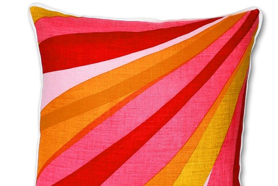
Jonathan Adler pink and yellow pillow
Jonathan Adler, picture from the Wall St. Journal

No matter. I don’t even care what the totally exact shade of pink Pantone has crowned queen. I care more that it’s pink AT ALL, and not a wussy pastel pink. And not a too-dark, obnoxious hot pink. And not a too blue cool pink…

…well look at that. Seems like I do care after all.
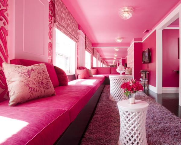
Pink lounge
Kristen Brant, through Elle Decor

I was never that high on turquoise, although some of you pointed out that my new office color, Benjamin Moore’s 2052-70 Ice Blue, is, in fact, a super light shade of turquoise.
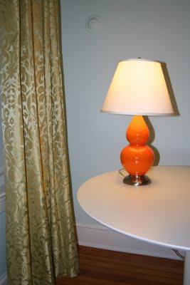
Orange lamp with green drapes

(How great would it look to switch out that lamp for a Honeysuckle pink one?)
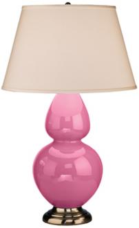
Pink lamp
Robert Abbey's double gourd lamp

But I drew the line when a few of you argued that my newly reupholstered sofa could be called a dark turquoise. I mean, even with broad artistic interpretation, the sofa doesn’t come close to Pantone’s swatch.
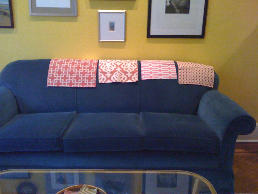
Pink fabric swatches on blue sofa

But see? There was a moment when I toyed with upholstering our smaller sofa pink and white and “those darn chairs” white with pink and white pillows.

But I hesitated. And the moment passed.

Chicken. I could have been so cutting-edge!
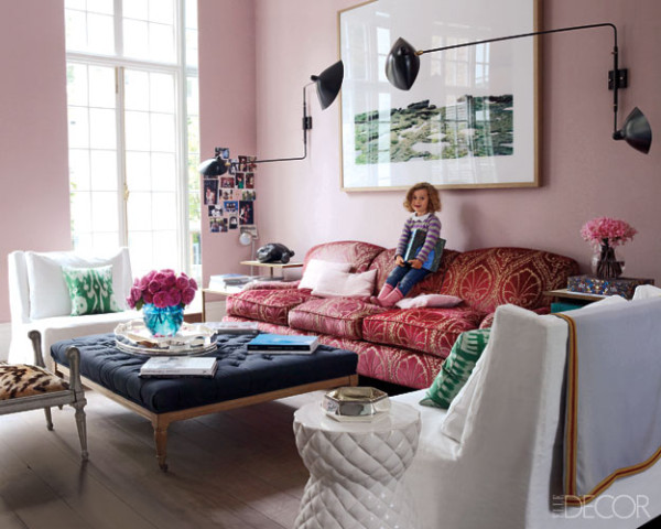
Pink living room
Elle Decor

As we apply Pantone’s Honeysuckle to the decorating arena, the challenge will be to get the not so forward-thinking men in our lives (not all men, just those who are more, shall we say, conservative in their tastes) to buy in.

I think we can do it.
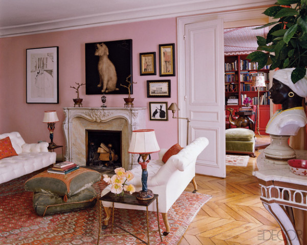
Pink LR and library
Lisa Fine through Elle Decor

Annie Elliott – aka bossy color – is an interior decorator and design blogger in Washington, D.C. She has been quoted in publications from The Washington Post to Real Simple and is considered an expert on color, residential space planning, and telling people what to do in the nicest way possible.

Category: Color + paint color, Living Room + Family RoomTag: color of the year, honeysuckle pink, Pantone, pink

Sidebar

Subscribe


Bossy Color Blog

Categories

  • Art + accessories »
  • Bedroom »
  • Color + paint color »
  • Dining room »
  • Furniture + upholstery »
  • Kids »
  • Kitchen + bath »
  • Lighting »
  • Living Room + Family Room »
  • Renovation »
  • Rugs »
  • Wallpaper »
  • Window treatments »

View Portfolio

view Bossy Color's portfolio

Instagram

annieelliottdesign

View Instagram post by annieelliottdesign

Jul 8

Open post by annieelliottdesign with ID 18120991804793828
Star-studded wallpaper on the ceiling childish? Not necessarily! Here are the differences between babyish and grown-up star themed wallpaper. #wallpaper #interiordesign

annieelliottdesign

View Instagram post by annieelliottdesign

Jul 4

Open post by annieelliottdesign with ID 18098048903219045
Happy Independence Day! I happen to love a room decorated in red, white, and blue. It’s not always gimmicky; wouldn’t you agree that the dining room below is bold and sophisticated? 🤪 My advice: vary the shades (clash those blues if you have to!), throw some large-scale patterns into the mix, and add texture. A grasscloth ceiling, for example 😉 Have a great 4th, everyone!#interiordesign #homedecor #pattermixing

annieelliottdesign

View Instagram post by annieelliottdesign

Jul 3

Open post by annieelliottdesign with ID 17934768423090149
I was honored to co-chair — with the inimitable @ianthainteriors — the design competition, America at 250: The New Look of American Design, a project conceived by the nonprofit MADE: In America.Design students from Howard University partnered with Washington Design Center showrooms to create storyboards and vignettes reflecting their vision of “American style.” The Design Center is showcasing the students’ work through July 10; admission is free and open to the public. Details may be found at the link in the @washingtondesigncenter’s bio.I encourage you to visit! It’s so important to support the next generation of designers, and I was delighted to participate in this event. Iantha and I are grateful to James De Lorbe, Chairman of MADE: In America; and we extend our warmest thanks to jurors @melissacolganinteriors, @mariella.cruzado,  @gaildavisdesigns, @val_hawkins_architect, @hadleykeller, @byronrisdon, and @jazmynedesignstudio.

annieelliottdesign

View Instagram post by annieelliottdesign

Jul 1

Open post by annieelliottdesign with ID 18345901804173891
Happy Wallpaper Wednesday! This week’s guest star: Schumacher’s Birds & Butterflies. It’s so whimsical, yet so grown up! Creatures on wallpaper can be a tough sell to adults, but Birds & Butterflies’ black and white background is quite sophisticated. (That’s why the Multi on White is my favorite colorway. I wouldn’t bother with the others.)The pattern is derived from a hand-printed 1960s wallpaper in the Schumacher archive. It’s certainly earned its place in the Exuberant Prints collection, don’t you think?#wallpaperinspo #interiordesign #roomdesign

annieelliottdesign

View Instagram post by annieelliottdesign

Jun 26

Open post by annieelliottdesign with ID 18423163795132747
Before and after part 2: a NYC pied-a-terre part deux! In this video we move to the primary bedroom, guest bedroom/office/workout area (remember: it’s NY! Gotta maximize your space!) and the tiniest powder room in the world. Such a fabulous, fun project!Mentioned:@Schumacher_midatlantic@leejofa@visualcomfort@fornasetti#interiordesign #wallpaper #nycdesign

annieelliottdesign

View Instagram post by annieelliottdesign

Jun 26

Open post by annieelliottdesign with ID 18095719559219273
Another installment of my Before and After video series! This project is in NYC. SO fun!!! We start with a VERY challenging living space/kitchen and then…well, then there’s Part 2!Mentioned:@Schumacher_midatlantic@leejofa@visualcomfort@fornasetti

annieelliottdesign

View Instagram post by annieelliottdesign

Jun 23

Open post by annieelliottdesign with ID 18095254961251333
Having sworn I never would wield a paintbrush again, I recently found myself helping my daughter paint her first apartment. Thus a tutorial about paint sheens for her, thus a recap for you!My latest blog post explains the differences between paint sheens and tells you what goes where ;)Link in bio to read. #interiordesigner #paintinspo #apartmenrdecor

annieelliottdesign

View Instagram post by annieelliottdesign

Jun 22

Open post by annieelliottdesign with ID 18011049497869192
There’s no other word for it: Sheila Bridges’ pattern Harlem Toile De Jouy has become an American icon. Iconic and ironic: the pattern conflates her experiences as a Black woman living in Harlem with pastoral motifs from 1700s French toile. Delightful and lighthearted at first glance, the pattern gives you plenty to think about. Bridges created Harlem Toile as a wallpaper but later expanded the collection to include fabric, bedding, plates, glassware, umbrellas, and clothing. I strongly recommend getting a piece of this pattern any way you can. @harlemtoilegirl#interiordesign #harlemtoile #patterninspo

annieelliottdesign

View Instagram post by annieelliottdesign

Jun 17

Open post by annieelliottdesign with ID 18106157639319026
“Much of the wallpaper [in the Victorian era]—fabric, too—was made with arsenic,’ explains Elliott. ‘There are worse ways to go, I suppose.’”I loved speaking with @allisonpduncan @vogueliving about the art of using two wallpapers in one room. Happy Wallpaper Wednesday!#interiordesign #wallpaper #vogueliving #designopinions #annieelliottdesignSlide 1 📸  by Stacy Zarin Goldberg, Design by Annie ElliottSlide 2 📸 by Leslee Mitchell, Design by Kim ScodroSlide 3 📸 by Donna Dotan, Design by Ariel OkinSlide 4 📸 by Gordon Gregory, Design by Jenny Holladay
Follow

Looking for something?

Don’t miss a single post


Where classic and modern hang out and drink gin.

  • Instagram
  • TikTok
  • Pinterest
  • Facebook
American Society of Interior Designers Firm Partner

© 2026 · Annie Elliott Design · privacy policy