• Skip to main content
  • Skip to header left navigation
  • Skip to header right navigation
  • Skip to site footer
  • about
    • services
    • team
  • portfolio
  • press
Annie Elliott Design, Washington DC

Annie Elliott Design

Greater Washington DC

  • book
  • blog
  • contact

lavender

Bathroom with gray and cinnamon-colored wallpaper

2025 Interior Design Trends Seen at High Point Market

Annie Elliott | October 28, 2024

It’s that time of year, Gentle Readers! The fall edition of High Point Furniture Market, a 5-day extravaganza during during which 75,000 interior designers from around the world visit 2,000 exhibitors in a small town in North Carolina. It’s nuts. High Point makes it easy to spot interior design trends for the coming year. Here’s …

Read more »2025 Interior Design Trends Seen at High Point Market
» Trends

Final interior design trend seen at High Point!

Annie Elliott | October 27, 2022

Wrapping up this series, Gentle Readers! Our first five trends were: light wood, natural materials, curved furniture, bouclé upholstery, and 1980s revival (heaven help us). Here’s the final interior design trend we just can’t ignore, much as we’d like to. Trend #6: Pastels, especially mauve There’s still a lot of white and gray out there …

Read more »Final interior design trend seen at High Point!
» Color + paint color, Trends

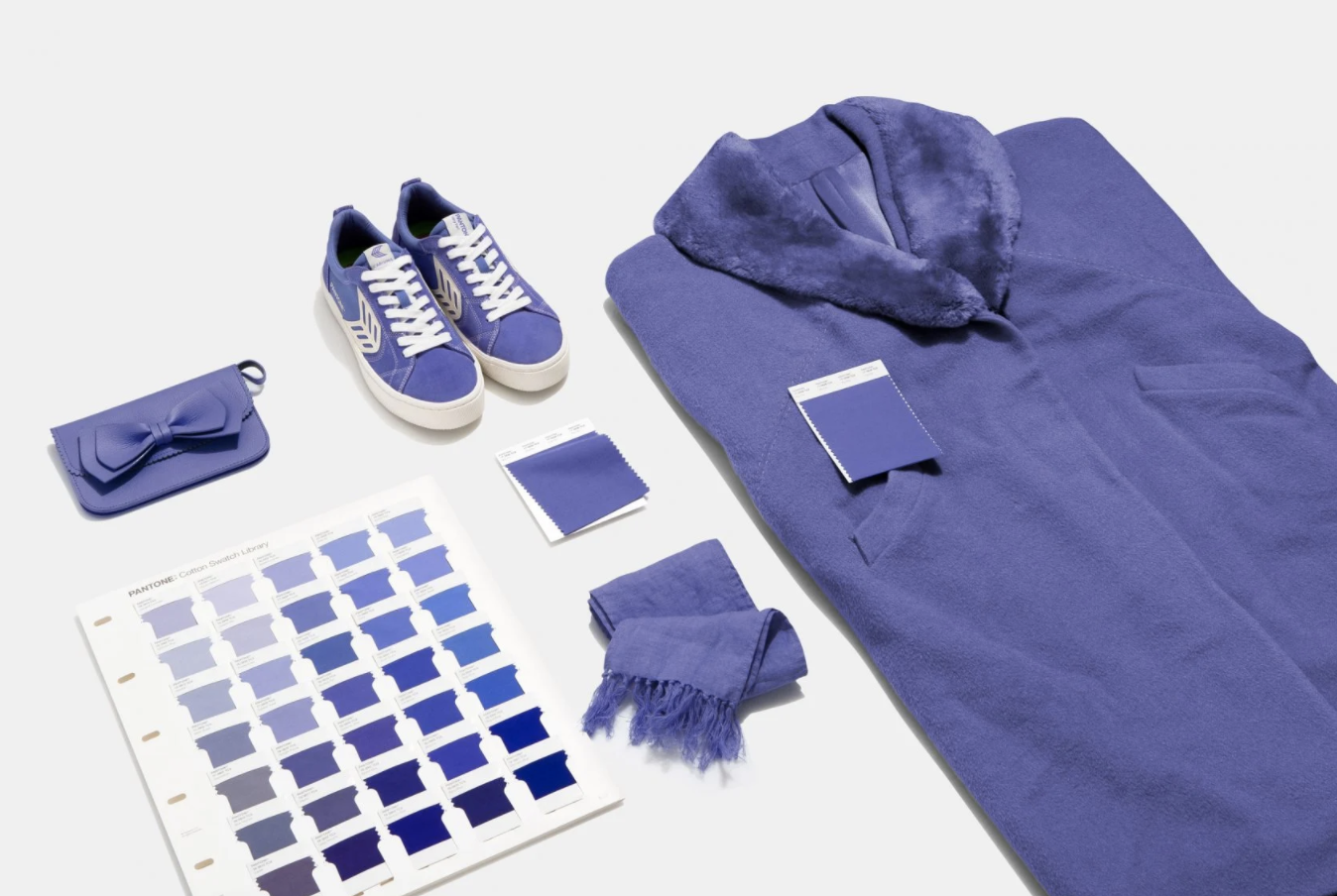
Pantone’s Color of the Year 2022: Very Peri. Not the worst, but definitely not the best

Annie Elliott | December 13, 2021

It could have been worse, Gentle Readers. Pantone’s Color of the Year for 2022 is Very Peri, a clear, perky purple with a blue edge. Bold but cold. The people at the Pantone Color Institute say, “Very Peri, a dynamic periwinkle blue hue with a vivifying violet red undertone, blends the faithfulness and constancy of …

Read more »Pantone’s Color of the Year 2022: Very Peri. Not the worst, but definitely not the best
» Color + paint color
Multi-colored floral wallpaper with brass birds

How to Cope with Ultraviolet, Pantone’s Color of the Year for 2018

Annie Elliott | December 9, 2017

You know how sometimes you don’t like a song the first time you hear it, but after every radio station plays it twice an hour for three weeks, you end up humming along because it simply wears you down? Well, unfortunately, that’s not going to happen with Ultraviolet and me. No amount of exposure is …

Read more »How to Cope with Ultraviolet, Pantone’s Color of the Year for 2018
» Color + paint color

Purple? Pink? Mauve? Fuchsia? Pantone’s 2014 Color of the Year: Radiant Orchid

Annie Elliott | December 6, 2013

The news is out: Pantone’s color of the year for 2014 is 18-3224, Radiant Orchid. UGH. Now, you may be thinking, “Hold it right there, missy! Mere weeks ago you were telling us about your new-found acceptance of purple. Are you backpedaling? Are you now against it after being for it, or whatever?” NO, Gentle …

Read more »Purple? Pink? Mauve? Fuchsia? Pantone’s 2014 Color of the Year: Radiant Orchid
» Color + paint color

My love/hate relationship with purple

Annie Elliott | October 20, 2013

I’ve always hated purple. It didn’t matter what shade it was. Lilac, lavender, aubergine, eggplant, plum, grape…I just didn’t like it. If you said, “purple living room,” this is what I pictured:   With images like that in my head, I don’t even know that my aversion was to purple itself. It may have been what I associated …

Read more »My love/hate relationship with purple
» Color + paint color

Colors that match vs. complement vs. just plain work. (Bonus: an unexpectedly fabulous color combo!)

Annie Elliott | May 24, 2011

We all know that when you're decorating a room from scratch, my advice is to start with the rug.

One of my most loyal, blog-reading, bossy-bossing clients is moving into a darling bungalow, and she took this advice to heart. (Advice, gentle suggestion, command...tomato, tomahto, tomuto.)

Remember how I said recently that blue dining rooms are all the rage? In part because they pull the blues from Oriental rugs so beautifully - blues MATCH well? That was the case here. This client's bungalow dining room was a "before" in the blue dining room post....

Read more »Colors that match vs. complement vs. just plain work. (Bonus: an unexpectedly fabulous color combo!)
» Color + paint color, Dining room
  • Page 1
  • Page 2
  • Next

Where classic and modern hang out and drink gin.

  • Instagram
  • TikTok
  • Pinterest
  • Facebook
American Society of Interior Designers Firm Partner

© 2026 · Annie Elliott Design · privacy policy