• Skip to main content
  • Skip to header left navigation
  • Skip to header right navigation
  • Skip to site footer
  • about
    • services
    • team
  • portfolio
  • press
Annie Elliott Design, Washington DC

Annie Elliott Design

Greater Washington DC

  • book
  • blog
  • contact

How to Cope with Ultraviolet, Pantone’s Color of the Year for 2018

Annie Elliott | December 9, 2017

You know how sometimes you don’t like a song the first time you hear it, but after every radio station plays it twice an hour for three weeks, you end up humming along because it simply wears you down?

Blue screen shot of Shape of You by Ed Sheeran
Sigh.

Well, unfortunately, that’s not going to happen with Ultraviolet and me.

Pantone's Color of the Year 2018, Ultraviolet 18-3838
Pantone’s Color of the Year 2018: Ultraviolet 18-3838

No amount of exposure is going to make me like this color for interior design. Nope. No way, no how.

Pantone says that Ultraviolet is “a dramatically provocative and thoughtful purple shade” that “communicates originality, ingenuity, and visionary thinking that points us towards the future.” Hmph.
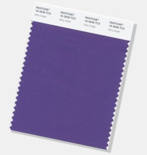
Swatch of Ultraviolet, Pantone's Color of the Year 2018
Ultraviolet, unadulaterated

I have had a love/hate relationship with purple, and I humbly admitted several years ago that I have come to accept most shades of this much beloved color. Especially lavender.
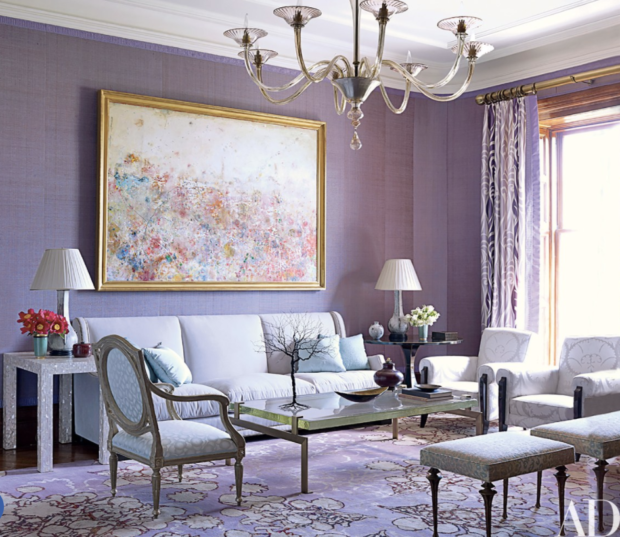
Purple living room with lavender grasscloth on the walls and purple rug
A lavender living room by my design hero, Jamie Drake, in Architectural Digest

But Ultraviolet…it’s a bit gauche. There’s no nuance. No subtlety. It’s in your face, and not in an awesome 8th grade girl power kind of way. No, it’s in your face in a mean uncle kind of way…you know, the boisterous one who’s rude at Thanksgiving.
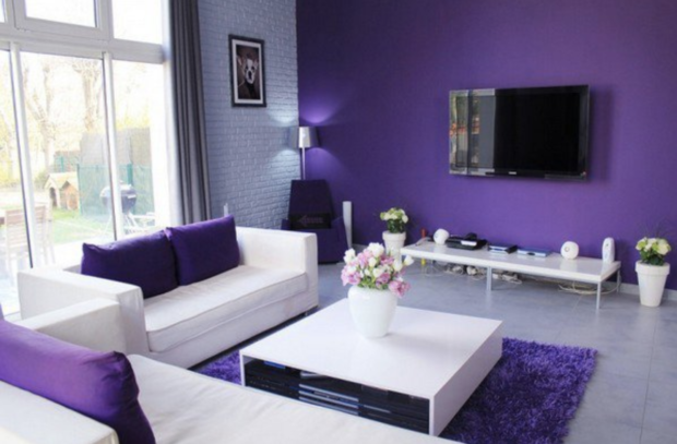
Contemporary purple and white living room with accent wall
Contemporary purple and white living room via Home Design Lover

To decorate successfully with Ultraviolet in its purest form will be to relegate it to the tiniest accents – or alongside other colors in busy patterns. Nothing large. A chair in Ultraviolet? Eeew. A rug in Ultraviolet? Worse. Multi-colored wallpaper in which Ultraviolet is the tiniest feather on a bird’s wing and part of a shadow cast by a peony? Maybe.
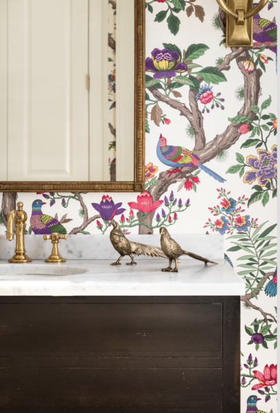
Multi-colored floral wallpaper with brass birds
Cole & Son’s Fontainebleau wallpaper, in a gigantic bossy color-designed powder room

Or a dramatic geometric design. Yes.

Diamond geometric multicolored wallpaper with purple
Cole & Son’s Circus wallpaper. I did a foyer in this once. How cutting edge were those clients?!

Otherwise, Gentle Readers, to get through the Year of Ultraviolet, we’re going to have to interpret the color loosely. We’ll water it down a bit to make it more lavender.
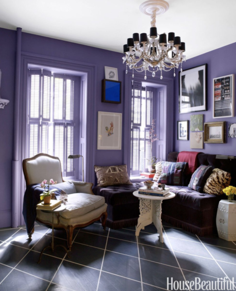
Small living room with purple walls and purple velvet banquette
I love this tiny purple apartment in NY. Designer: David Kaihoi

We’ll lighten it and add more blue so it becomes almost cornflower. We’ll add gray and make it almost aubergine.
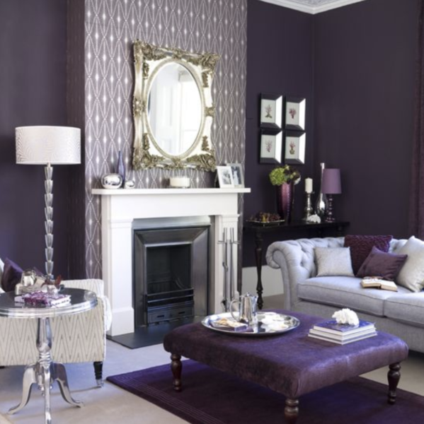
Dark purple living room

Last year’s Greenery was such a pleasant surprise. Fresh and optimistic. The year before that, 2015, was two colors, Rose Quartz and Serenity, which really weren’t all that bad.
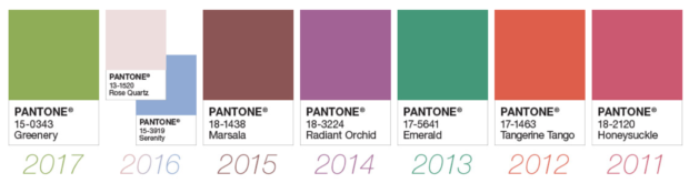
Row of color squares - Pantone's recent Colors of the Year
Pantone’s recent Colors of the Year

The year before that, 2015, was two colors, Rose Quartz and Serenity, which weren’t all that bad. But then, Marsala – disaster. Radiant Orchid – even worse than Ultraviolet. Emerald – thank you. Tangerine Tango – took me a while, but I came around to its amazingness. Honeysuckle – so happy!

But Ultraviolet. It is not awesome.

Annie Elliott | bossy color is a design firm based in Washington, DC. Don’t miss us in the December 2017 issue of Washingtonian Magazine!

Category: Color + paint colorTag: Circus, Cole & Son, David Kaihoi, Emerald, Fontainebleau, Greenery, honeysuckle pink, Jamie Drake, lavender, Marsala, Pantone, purple, Tangerine Tango, Ultraviolet

Sidebar

Subscribe


Bossy Color Blog

Categories

  • Art + accessories »
  • Bedroom »
  • Color + paint color »
  • Dining room »
  • Furniture + upholstery »
  • Kids »
  • Kitchen + bath »
  • Lighting »
  • Living Room + Family Room »
  • Renovation »
  • Rugs »
  • Wallpaper »
  • Window treatments »

View Portfolio

view Bossy Color's portfolio

Instagram

annieelliottdesign

View Instagram post by annieelliottdesign

May 22

Open post by annieelliottdesign with ID 18125488516719287
I follow two rules when mixing patterns in the same space: vary the scale, and vary the subject.I was excited to share this and other insights on pattern splicing with @ericafinamore from @apartmenttherapy! #interiordesign #patternsplicing #patternmixing #designopinions #annieelliottdesign

annieelliottdesign

View Instagram post by annieelliottdesign

May 20

Open post by annieelliottdesign with ID 18082241465136951
It’s Wallpaper Wednesday! This week we’re featuring Deconstructed Stripe by Schumacher (in collaboration with Miles Redd).This pattern pays tribute to the legendary decorator Albert Hadley. Redd was inspired by Hadley’s contemporary, streamlined designs that played with scale and proportion. Deconstructed Stripe is impactful on its own but also looks INCREDIBLE next to other patterns.@schumacher1889 #designinspo #wallpaper #interiordesigner

annieelliottdesign

View Instagram post by annieelliottdesign

May 19

Open post by annieelliottdesign with ID 17926257288321853
HuffPost asked for my thoughts about the new White House ballroom. As you can imagine, I have many. I was so delighted to be included in this conversation! Thank you, @huffpost and @carsar91!#interiordesign #whitehouse #designopinions #annieelliottdesign

annieelliottdesign

View Instagram post by annieelliottdesign

May 13

Open post by annieelliottdesign with ID 18340156693174785
I was thrilled to attend Imar Lyman’s exhibition opening at the Kreeger recently! I’ve loved his work for years and am lucky enough to own one of his silkscreens (ours is of Frederick Douglass). He’s moved from portraiture to abstraction, but he still does some work in collage, which I confess is my favorite ;) The exhibition is up through July 11. Play hooky one afternoon and go.(The last painting is by Frank Stella, by the way — an influence on the artist, as you can see!)@imarhutchins @kreegermuseum

annieelliottdesign

View Instagram post by annieelliottdesign

May 11

Open post by annieelliottdesign with ID 18089647349356601
I’ve decided that spring cleaning is not enough this year. Spring MAKEOVERS are in store!Read my latest blog post to see before-and-after photos of some past and current projects. It’s heavy on pictures, light on commentary…the blog version of a beach read to give you a jump on summer 🏖️.

annieelliottdesign

View Instagram post by annieelliottdesign

May 8

Open post by annieelliottdesign with ID 18121007992638464
It was an honor to be a sponsor of the 87th annual Flower Mart at the National Cathedral! My  daughters have been trekking up to the Cathedral for this event since they were little - wonderful memories. This year, my favorite flower display was the Hong Kong Economic and Trade office; those peonies smelled UNBELIEVABLE! 🌺 🌼 🌷 🌻! Switzerland was a close second ;)

annieelliottdesign

View Instagram post by annieelliottdesign

May 6

Open post by annieelliottdesign with ID 17979927968845150
For today’s Wallpaper Wednesday, we discuss Hicks Grand by David Hicks.The British interior designer created the smaller-scale Hicks Hexagon in the 1960s and later scaled up the pattern to create Hicks Grand. The contemporary, geometric, honeycomb repeat adds intrigue and depth to any room. I have only used the smaller Hicks Hexagon (stairway picture), but I LOVE the scale of Hicks Grand. Fun fact: The Hicks Hexagon pattern was used on the rugs in the Overlook Hotel’ hallways in The Shining 😱#wallpaperinspo #interiorinspiration #hicksandgrand

annieelliottdesign

View Instagram post by annieelliottdesign

Apr 30

Open post by annieelliottdesign with ID 18088806227011860
Florals? For spring? Groundbreaking.But nothing says spring like flowers! 🌷 🌻 🌸 (And birds!)

annieelliottdesign

View Instagram post by annieelliottdesign

Apr 28

Open post by annieelliottdesign with ID 17870996082665526
Your house should reflect *you*. My recent visits to Eudora Welty’s house and the Mississippi Museum of Art reminded me of that. If the wallpaper you put up makes you happy, it’s a success! If you need help figuring out how to translate your personality and lifestyle into your home’s function and appearance, I’m here 😉.Read my new blog post for more!
Follow

Looking for something?

Don’t miss a single post


Where classic and modern hang out and drink gin.

  • Instagram
  • TikTok
  • Pinterest
  • Facebook
American Society of Interior Designers Firm Partner

© 2026 · Annie Elliott Design · privacy policy