• Skip to main content
  • Skip to header left navigation
  • Skip to header right navigation
  • Skip to site footer
  • about
    • services
    • team
  • portfolio
  • press
Annie Elliott Design, Washington DC

Annie Elliott Design

Greater Washington DC

  • book
  • blog
  • contact

What does “luxury” look like? And thank you, Wall Street Journal

Annie Elliott | July 8, 2019

I hope you saw us in The Wall Street Journal on Saturday! Thank you, WSJ Off Duty and Kathryn O’Shea Evans, for featuring one of our recent projects in the House Tours column.

Contemporary condo with white walls and colorful furniture
The home of Jason Reynolds. Interior design by Annie Elliott | bossy color, photo by Angie Seckinger

The article, “How Color Made a Routine Condo Special,” went online last week, but it wasn’t until I saw the article in print that one of my client’s comments really grabbed me. Ms. Evans writes:

When Jason Reynolds bought his condo in Washington, D.C.’s Kingman Park area, it was “glass and steel, black and white,” he said. It seems, he added, “that everybody believes: ‘This is what luxury looks like.’”

This is what luxury looks like. Indeed. This is how Jason’s condo looked when he called us:

White and gray contemporary condo
Before

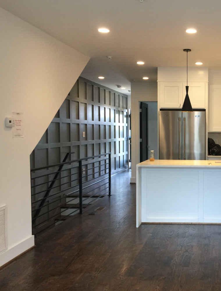
It’s hard to see, but the door to the left of the fridge is black. As was every single door in the place. So: luxurious? Or soul-sucking? Or just plain uncreative?

Let me step back for a second. Jason Reynolds is an amazing author and collector who places supreme importance on his surroundings. If an object is in his house, it’s meaningful to him. He gives equal weight to scribbles from friends, work by emerging and established artists, and family memorabilia. (If you don’t know Jason’s name yet, your kid probably does; I think he’s spoken at every school in the Northern Hemisphere.)

Wooden bookcase with accessories
Jason Reynolds’ entry, also by Annie Elliott | bossy color, photo by Angie Seckinger

In other words, Jason is a discerning person. He wants to live in a comfortable, spirit-lifting home that is at once beautiful and sophisticated. And he does not want to live in a home devoid of color. 

Architects and developers default to black and white, and designers and decorators default to beige and cream (or, in recent years, gray). Tragically, these limited, neutral palettes have come to define luxury and elegance.

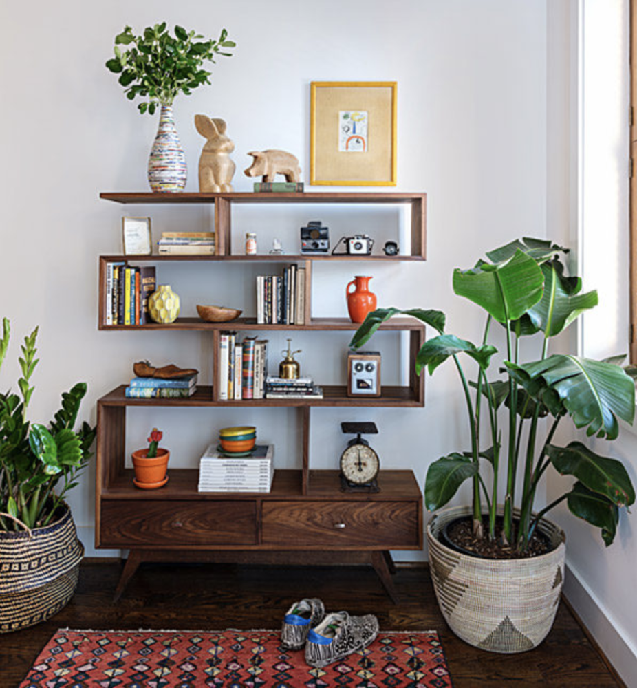
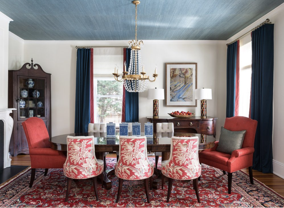
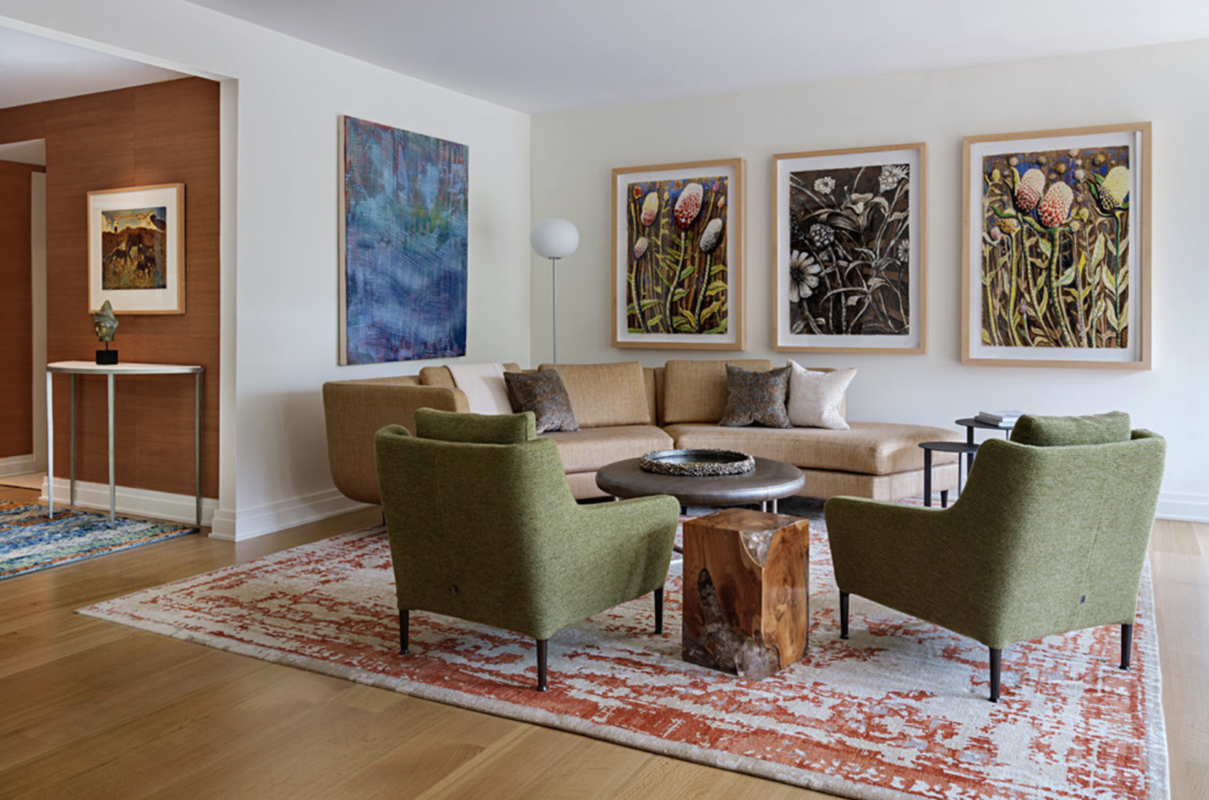
But color and elegance can coexist very happily, as evidenced in the work of Katie Ridder, Jamie Drake, and Alessandra Branca. And my own:

Victorian house with a dining room with blue ceiling
Blue grasscloth on the ceiling of a Victorian home. Annie Elliott | bossy color, photo by Angie Seckinger
Modern living room with green chairs and large artwork
The art and furniture provide most of the color in this modern home. Annie Elliott | bossy color, photo by Angie Seckinger
Navy blue living room with orange sofa and chairs
A bright orange sofa is the focal point of this dark blue living room. Annie Elliott | bossy color, photo by Angie Seckinger

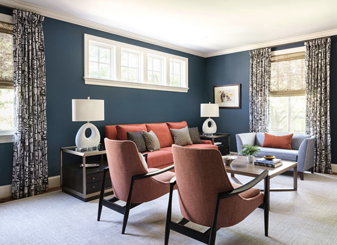
So, what does luxury look like? It’s up to you. Whether you want to be enveloped in aubergine or just glimpse bits of sky blue in unexpected places, there’s a place for color in your luxurious, elegant home. I promise.

Annie Elliott | bossy color is based in Washington, DC. Annie’s design work has appeared in numerous local and national publications, most recently The New York Times, Home & Design, Washingtonian, and The Washington Post.

Category: Color + paint colorTag: color in decorating, decorating with color, elegance, Jason Reynolds, Kathryn O'Shea Evans, luxury, neutral palette, paint color, press, Wall Street Journal

Sidebar

Subscribe


Bossy Color Blog

Categories

  • Art + accessories »
  • Bedroom »
  • Color + paint color »
  • Dining room »
  • Furniture + upholstery »
  • Kids »
  • Kitchen + bath »
  • Lighting »
  • Living Room + Family Room »
  • Renovation »
  • Rugs »
  • Wallpaper »
  • Window treatments »

View Portfolio

view Bossy Color's portfolio

Instagram

annieelliottdesign

View Instagram post by annieelliottdesign

Apr 13

Open post by annieelliottdesign with ID 18085288493580590
Let’s talk about what fabric doesn’t work ❌ for the sectional upholstery in this beach house TV Room. Even though these fabrics are beautiful on their own… they don’t work here. The dark stripes were not lighthearted enough and the smaller scale blue and white pattern was too predictable. Watch to listen to me plead my case for lavender and green! 🏖️#interiordetails #colorfulinteriors #beachhousedesign

annieelliottdesign

View Instagram post by annieelliottdesign

Apr 13

Open post by annieelliottdesign with ID 18321246121271986
Here’s the challenge: Imagine you are designing a lighthearted, summer beach house. In the TV Room, there are bookcases, a neutral rug, and a large sectional.What upholstery would you put on the sectional?Comment your pick before you see part 2 👇#designchallenge #interiorsandhome #interiorinspiration

annieelliottdesign

View Instagram post by annieelliottdesign

Apr 8

Open post by annieelliottdesign with ID 18338258239300458
When you come home after a long day, do you want your foyer to rev you up or calm you down? Decide which approach you need and run with it. Add large-scale wallpaper and layered rugs for excitement, or paint the walls off-white and be selective with your artwork and mirrors for calm. #foyer #homedesign #foyerinspiration

annieelliottdesign

View Instagram post by annieelliottdesign

Apr 3

Open post by annieelliottdesign with ID 17848603689678580
Q: What is one thing you can do to elevate a room❓💬 The first thing you see when you walk into a room needs to look great. In your office, get a nice, big vintage desk. In a living room, paint all the walls a dark color. Avoid satin brass hardware, pills on sofa fabric, and fake wood!#interiordesign #dcdesigner #decorinspo

annieelliottdesign

View Instagram post by annieelliottdesign

Apr 1

Open post by annieelliottdesign with ID 17918392215338642
This will come as no surprise, but I think about window treatments a LOT. Especially during the transition from winter to spring, with the change in temperature and light…I’m reminded what a critical design element window treatments are. And then I get to thinking about window treatments through the ages. Who invented drapes? Did the Romans *really* invent Roman shades?I decided to do some digging. Check out my blog to see what I discovered!📸 @stacyzaringoldberg📸 @jennverrierphoto#windowtreatments #drapes #interiordesign

annieelliottdesign

View Instagram post by annieelliottdesign

Mar 25

Open post by annieelliottdesign with ID 18088729466185965
It’s Wallpaper Wednesday! Today we feature Brunschwig & Fils’ Les Touches. @brunschwigfils introduced Les Touches in 1965, and the pattern soon became a Brunschwig classic. (Interestingly, “touches” translates to “keys” or “strokes…” I guess that’s close to “dabs,” which is what I’d assumed.) According to handwritten records, Les Touches is inspired by post-WWII black and white photographs, but the connection between this inspiration and the pattern remains a mystery. Referred to most often as a stylized animal print, Les Touches is a staple of the Le Jardin Chinois collection.Today, Les Touches comes in 18 colorways, but the blue colorway remains iconic. I’ve used Les Touches for window treatments and upholstery, but I can’t wait to try it as wallpaper!

annieelliottdesign

View Instagram post by annieelliottdesign

Mar 23

Open post by annieelliottdesign with ID 18102457048819740
Here’s what ✨ I ✨ would do… Instead of matching everything, you balance it. Pull one color. Shift the scale. Let each piece do something different. Here’s what ✨ I ✨ would do… Instead of matching everything, you balance it. Pull one color. Shift the scale. Let each piece do something different. Bonus: Change the rug! Suddenly you’d make a completely different window choice.Did you guess it?!Watch part 1 for the challenge context and part 2 for what doesn’t work.#interiorsandhome #fabricdesign #romanshades

annieelliottdesign

View Instagram post by annieelliottdesign

Mar 23

Open post by annieelliottdesign with ID 17860517745617635
Let’s talk about what fabric doesn’t work ❌ for the Roman shades in this teenage girl’s bedroom with 2 big windows and a statement ceiling. Even though these fabrics are beautiful on their own… they don’t work here. Biggest mistake: repeating the same motif (moths, butterflies, etc.) across the room. It starts to feel themed instead of designed.Watch part 1 for the full context, and watch part 3 to find out what I would choose.#interiordesign #wallpaper #interiorsandhome

annieelliottdesign

View Instagram post by annieelliottdesign

Mar 23

Open post by annieelliottdesign with ID 18038018090572669
Here’s the challenge: a teenage girl’s bedroom. Not huge. Two big windows. Statement ceiling. White walls.Which fabric would you choose for the Roman shades?There’s a right answer… a safe answer… and a couple very wrong ones. Comment your pick before you see part 2 👇#interiordesigner #wallpaper #romanshades
Follow

Looking for something?

Don’t miss a single post


Where classic and modern hang out and drink gin.

  • Instagram
  • TikTok
  • Pinterest
  • Facebook

© 2026 · Annie Elliott Design · privacy policy