• Skip to main content
  • Skip to header left navigation
  • Skip to header right navigation
  • Skip to site footer
  • about
    • services
    • team
  • portfolio
  • press
Annie Elliott Design, Washington DC

Annie Elliott Design

Greater Washington DC

  • book
  • blog
  • contact

Pantone’s Color of the Year 2019: Living Coral

Annie Elliott | December 6, 2018

THANK YOU, Pantone! If ever we needed a lift, it’s now. Kudos to you for selecting an optimistic, playful, happy — almost giddy! — color for 2019: Living Coral.

Pantone Color of the Year 2019 Living Coral
Pantone Color of the Year 2019: Living Coral. It’s alive!

What a relief. I’m serious: I lose sleep over this stuff. As much as I’d like to deny it, Pantone’s Color of the Year seeps into every design aspect of our lives: homes, clothing, graphics and printed material… You get a bad color (like Pantone’s Color of the Year 2015, Marsala) and you could be in for a bummer of a year.

But not this time! I don’t know who spiked the punch at Pantone’s HQ, but I extend my deepest thanks. Living Coral is a GREAT color for 2019. These are stressful, uncertain times, my fellow Americans, no matter which side of the aisle you prefer.

Navy blue room with white cabinet and pink drapes
Coral in a limited dose, via drapes. Kate Schintzius

Here’s what Pantone says about the happy hue:

“Vibrant, yet mellow PANTONE 16-1546 Living Coral embraces us with warmth and nourishment to provide comfort and buoyancy in our continually shifting environment.”

Sure! I’ll disregard the wordiness and unnecessary comma and focus on the keywords: WARMTH, COMFORT, BUOYANCY. That last one’s a good one, actually. I like “buoyancy.”

Room hallway foyer with pink walls and pink chairs
Who designed this cheerful foyer? Benjamin Moore’s 2003-50 Coral Pink. More pink than coral, I’d say, but still.

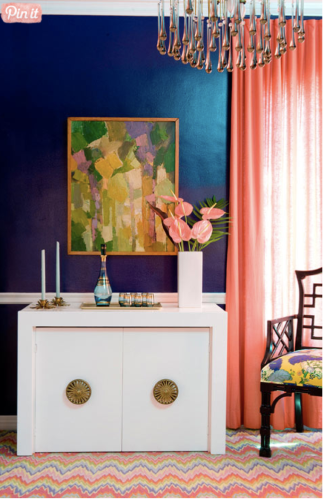
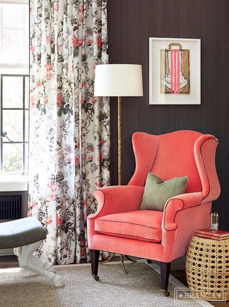
You don’t have to put Living Coral all over the walls — that’s pretty bold. You could limit it to a single piece of furniture…

Bright pink coral wing chair in front of floral drapes
Alessandra Branca

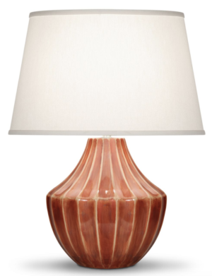
…or to a few accessories. I love this lamp from Kravet…

The Julian ceramic table lamp with brick pink base
The Julian table lamp from Kravet. So pretty! And what a coincidence that they just sent me this picture! ;)

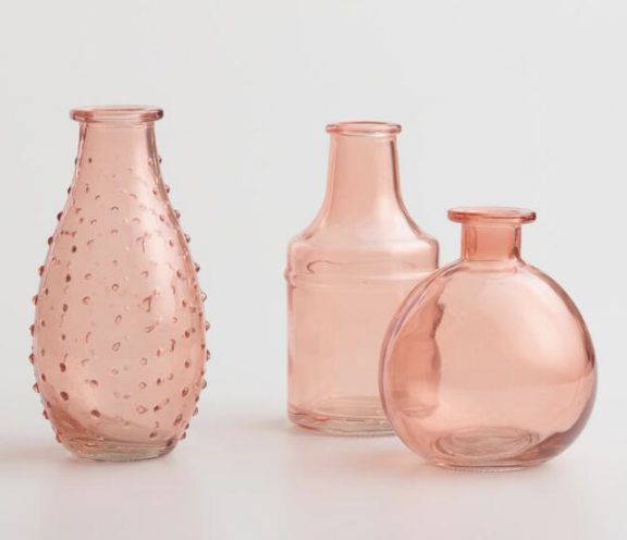
…and these sweet little vases from World Market. They could just sit on a windowsill or a table (keep them together, please):

3 pink glass jars vases
Coral Glass Bud Vases from World Market

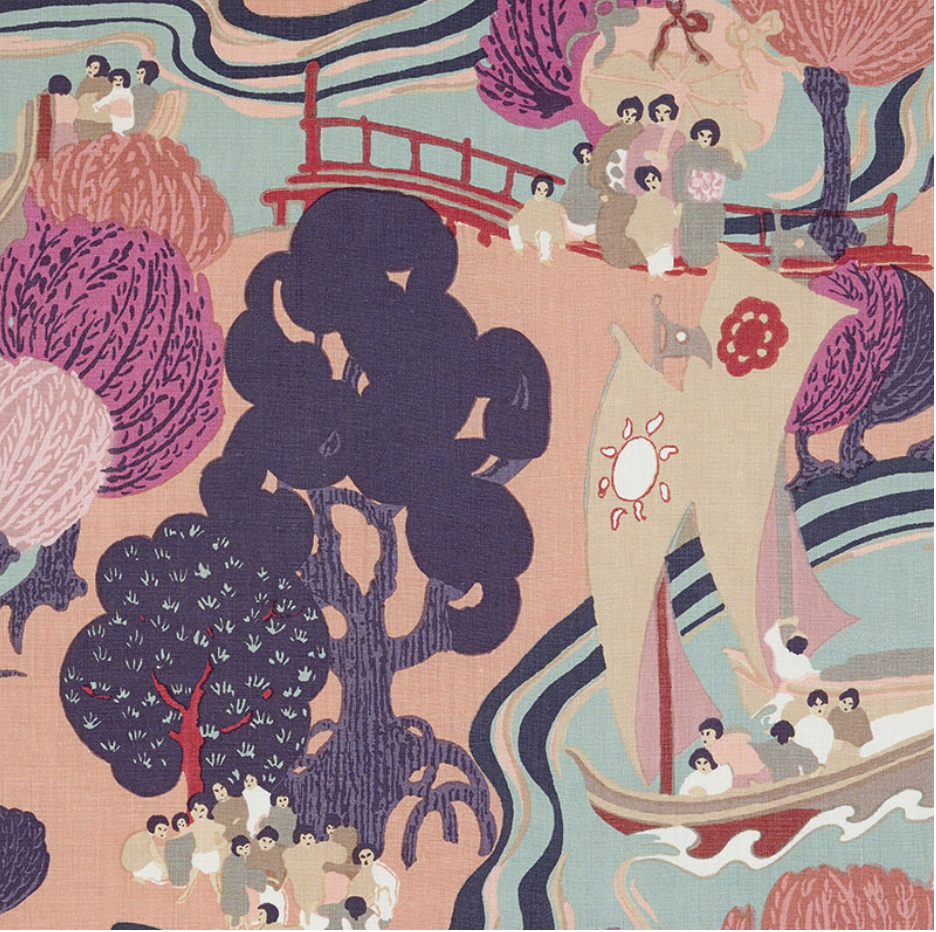
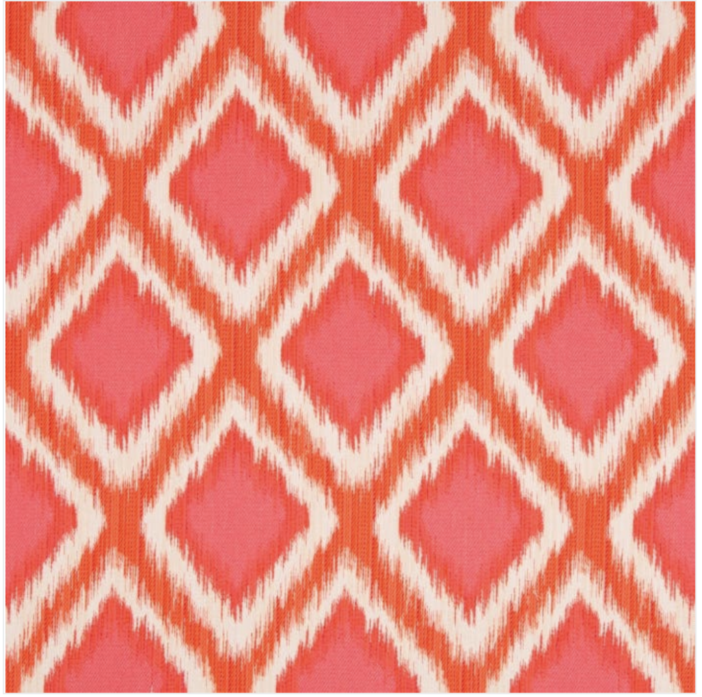
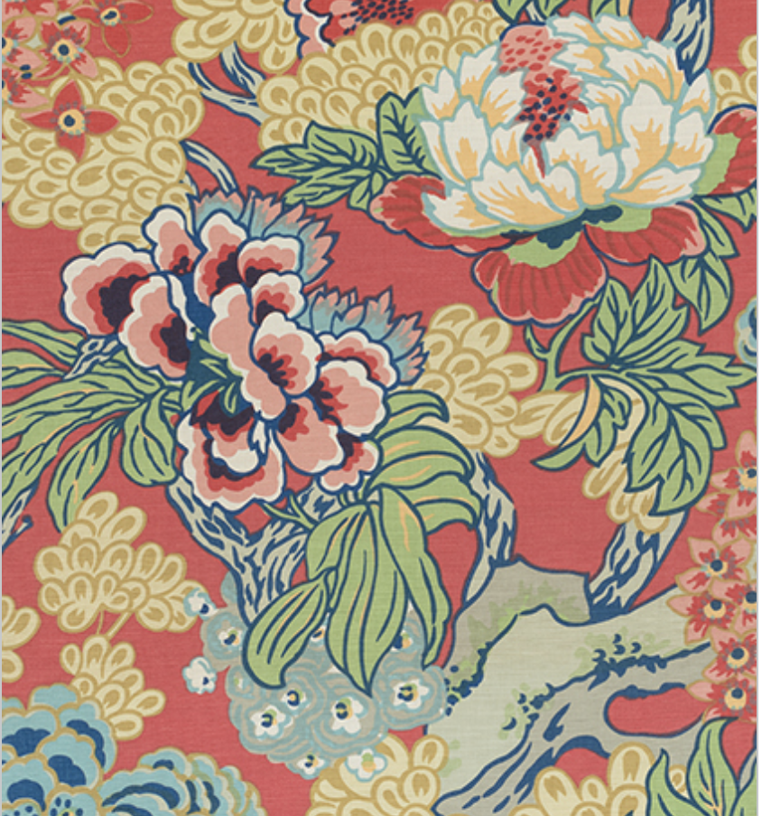
You also could make pillows in any of these fabulous fabrics:

Fabric Schumacher's Pearl River
Schumacher, Pearl River
Orange and pink diamond pattern fabric
Brunschwig & Fils, Kapari Woven
Pink and coral multi-colored floral pattern
Thibaut, Honshu. This pattern also comes in wallllpaaapeerrrrrr….! I’m just saying.

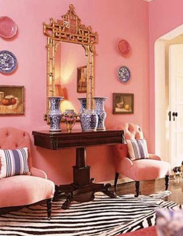
I always remind people that Pantone’s Color of the Year is to be interpreted liberally, not literally. There’s been a huge rise in blush this past year. Was it a harbinger of things to come?

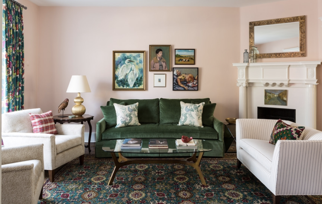
Blush seemed to be the answer when I was searching for a color to replace the egg-yolk yellow in my own living room. It was perfect for that north-facing, not-huge space.

Pink living room with dark green sofa and Oriental rug
Benjamin Moore’s 050 Pink Moire

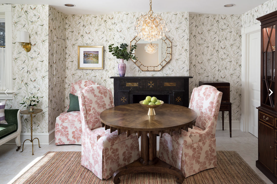
In a sunny breakfast room we did earlier this year, a coral-y pink made appearances. (Before-and-after pictures are here.)

Bright dining room with wallpaper
A bright breakfast room we designed this year

Pantone says it chose Living Coral in part to remind people of:

“the desired, familiar, and energizing aspects of color found in nature.”

Well, green also is going to be a popular color in 2019, and you don’t get much more nature-y than that. I’m so excited. A year of zingy coral and rich green. Bring it on.

Living room with dark pink walls
Coral as only Miles Redd can do it. His NY townhouse

Annie Elliott | bossy color is a design firm based in Washington, DC. Annie’s design work has appeared in numerous local and national publications, most recently The Washington Post, Home & Design, Washingtonian magazine, and The New York Times.

Category: Color + paint colorTag: Alessandra Branca, Benjamin Moore, blush, Brunschwig et Fils, coral, green, Kravet, Living Coral, Miles Redd, Pantone, Pantone's Color of the Year, pink, Schumacher, Thibaut, World Market

Sidebar

Subscribe


Bossy Color Blog

Categories

  • Art + accessories »
  • Bedroom »
  • Color + paint color »
  • Dining room »
  • Furniture + upholstery »
  • Kids »
  • Kitchen + bath »
  • Lighting »
  • Living Room + Family Room »
  • Renovation »
  • Rugs »
  • Wallpaper »
  • Window treatments »

View Portfolio

view Bossy Color's portfolio

Instagram

annieelliottdesign

View Instagram post by annieelliottdesign

Jun 26

Open post by annieelliottdesign with ID 18423163795132747
Before and after part 2: a NYC pied-a-terre part deux! In this video we move to the primary bedroom, guest bedroom/office/workout area (remember: it’s NY! Gotta maximize your space!) and the tiniest powder room in the world. Such a fabulous, fun project!Mentioned:@Schumacher_midatlantic@leejofa@visualcomfort@fornasetti#interiordesign #wallpaper #nycdesign

annieelliottdesign

View Instagram post by annieelliottdesign

Jun 26

Open post by annieelliottdesign with ID 18095719559219273
Another installment of my Before and After video series! This project is in NYC. SO fun!!! We start with a VERY challenging living space/kitchen and then…well, then there’s Part 2!Mentioned:@Schumacher_midatlantic@leejofa@visualcomfort@fornasetti

annieelliottdesign

View Instagram post by annieelliottdesign

Jun 23

Open post by annieelliottdesign with ID 18095254961251333
Having sworn I never would wield a paintbrush again, I recently found myself helping my daughter paint her first apartment. Thus a tutorial about paint sheens for her, thus a recap for you!My latest blog post explains the differences between paint sheens and tells you what goes where ;)Link in bio to read. #interiordesigner #paintinspo #apartmenrdecor

annieelliottdesign

View Instagram post by annieelliottdesign

Jun 22

Open post by annieelliottdesign with ID 18011049497869192
There’s no other word for it: Sheila Bridges’ pattern Harlem Toile De Jouy has become an American icon. Iconic and ironic: the pattern conflates her experiences as a Black woman living in Harlem with pastoral motifs from 1700s French toile. Delightful and lighthearted at first glance, the pattern gives you plenty to think about. Bridges created Harlem Toile as a wallpaper but later expanded the collection to include fabric, bedding, plates, glassware, umbrellas, and clothing. I strongly recommend getting a piece of this pattern any way you can. @harlemtoilegirl#interiordesign #harlemtoile #patterninspo

annieelliottdesign

View Instagram post by annieelliottdesign

Jun 17

Open post by annieelliottdesign with ID 18106157639319026
“Much of the wallpaper [in the Victorian era]—fabric, too—was made with arsenic,’ explains Elliott. ‘There are worse ways to go, I suppose.’”I loved speaking with @allisonpduncan @vogueliving about the art of using two wallpapers in one room. Happy Wallpaper Wednesday!#interiordesign #wallpaper #vogueliving #designopinions #annieelliottdesignSlide 1 📸  by Stacy Zarin Goldberg, Design by Annie ElliottSlide 2 📸 by Leslee Mitchell, Design by Kim ScodroSlide 3 📸 by Donna Dotan, Design by Ariel OkinSlide 4 📸 by Gordon Gregory, Design by Jenny Holladay

annieelliottdesign

View Instagram post by annieelliottdesign

Jun 13

Open post by annieelliottdesign with ID 17913412296404982
Pink, light yellow, and gold-y tan combine to create a soft, unexpected color palette. The quiet colors are sophisticated together, and the palette will age beautifully as this tween moves through high school and college. (Her parents won’t even have to redecorate if it becomes a guest bedroom someday! But one step at a time…)#homedesign #paintinspo #bedroomdesign

annieelliottdesign

View Instagram post by annieelliottdesign

Jun 10

Open post by annieelliottdesign with ID 17929516656341682
Deep down, I believe that a house isn’t a home without wallpaper 😊 My latest blog post identifies five unexpected places you can use wallpaper — and some are small! Wallpapering the space behind your island stools could be your gateway to my favorite home furnishing. If you have other creative spots for wallpaper, I’d love to hear about them!#wallpaperinspo #interiordesign #wallpaper

annieelliottdesign

View Instagram post by annieelliottdesign

Jun 9

Open post by annieelliottdesign with ID 18112589929761575
Welcome to my new before-and-after series! 🥰 I take you through my thinking as I design a space — my “process,” as it were. Pretty pictures are involved too, of course. I hope you enjoy it!This was a super fun project: a historic townhouse with the challenge of a loooong shoebox-shaped front room. You know the kind. Here’s how we made this color-and-pattern-loving client’s challenging space amazing. Like this series? Please let me know! #interiordesigner #windowtreatments #wallpaper

annieelliottdesign

View Instagram post by annieelliottdesign

Jun 5

Open post by annieelliottdesign with ID 18087273683080656
Don’t let your porch be a throwaway space! Make it a room. Get a high quality indoor/outdoor rug. Make sure your furniture is COMFY. Find a cordless lamp (they’re everywhere now!). Hang art! You can even add a vintage console table or cabinet if you’re ok with it weathering over time 🕰️. #interiordesign #porchdesign
Follow

Looking for something?

Don’t miss a single post


Where classic and modern hang out and drink gin.

  • Instagram
  • TikTok
  • Pinterest
  • Facebook
American Society of Interior Designers Firm Partner

© 2026 · Annie Elliott Design · privacy policy