• Skip to main content
  • Skip to header left navigation
  • Skip to header right navigation
  • Skip to site footer
  • about
    • services
    • team
  • portfolio
  • press
Annie Elliott Design, Washington DC

Annie Elliott Design

Greater Washington DC

  • book
  • blog
  • contact

Blush walls in Annie’s living room!

Annie Elliott | March 5, 2017

Hello, Gentle Readers! Under the heading, “change is good” (subheading, “a slippery slope”), the walls in my living room are now blush (Benjamin Moore’s 050 Pink Moiré)!

Yellow room with white fireplace
In progress. Gotta love careful prep

I desperately wanted to use Farrow & Ball paint. The product is amazing, and I’ve been eager to get back to it…the depth of color is just so gorgeous. Unfortunately, though, the color I thought was going to be perfect, Farrow & Ball’s Pink Ground, looked like old Calamine lotion in the northern light. Sad.

So it was back to Benjamin Moore, tried and true.

Oriental rug
Blush paint samples with the rug that started it all

The catalyst was simply that I was ready for a change, but from a technical standpoint, it all started with the rug. (Which is where you SHOULD start, as you know.)

Our old rug was, well, old. Old and stained. It was light aqua, if you recall: we needed a light rug to let the room breathe with those super-saturated yellow walls. But a light rug isn’t going to last long in a house with muddy kids and muddier dogs. It’s ok, though. It wasn’t expensive, and it was always too small. It had a good run.

I love Oriental-slash-Persian rugs. So I casually started keeping my eyes open for a non-navy, non-red-medallion Oriental rug. When this one popped up on eBay, I pounced. The colors are great, and it’s appropriately worn and vintage (from the 40s or 50s). NOTHING will show on this sucker: not muddy feet, dog fur, or red wine.

I thought it would look great with any number of wall colors. Light yellow, teal, avocado green (ok, that idea only lasted about 2 hours, but still)…but remembering that I wanted a soft color this time around, blush ended up the winner.

Light pink walls in a living room
After the paint, before the furniture was back in place

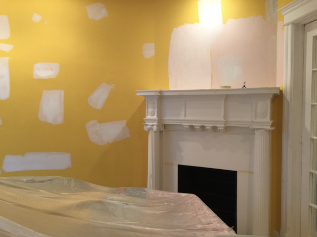
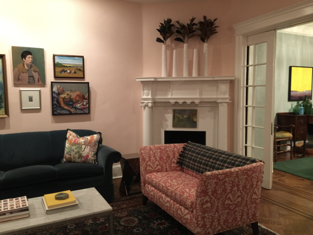
See how washed out the walls look above? That’s why this room is so tricky! Pink Moiré is darker that what I thought I’d use, but lighter colors just go white in the morning light (the brightest time of day in the living room).

Pink walls with blue sofa and teal oriental rug
Walls done!

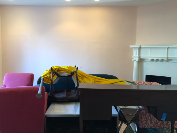
And they look a little yellow in the above picture, which was taken at night. Here are more —

Pink living room with floral drapes and Oriental carpet
Walls finished, all the current furnishings in place
Pink living room with pink and white settee and fireplace
Pink living room, looking into the still light blue dining room…light blue for about 12 more hours!

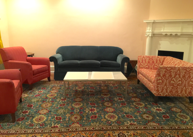
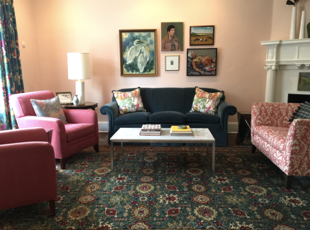
And finally, here’s the room in natural light. This is how it looks right now —

Pink living room with gallery wall
Ta da!

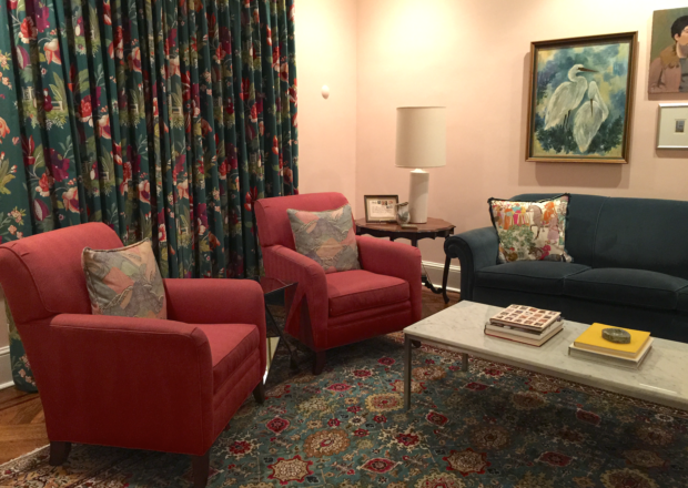
Now imagine the blush walls and teal rug with a dark green sofa, cream and camel chairs, and a reupholstered settee in cream and navy linen. And a new lamp. Just a few changes ;) That’s the slippery slope to which I alluded earlier.

Tomorrow, we paint the dining room.

Yellow ;)

Bossy color / Annie Elliott interiors is a full-service design firm based in Washington, D.C.

Category: Color + paint color, Living Room + Family RoomTag: before and after, blue sofa, blush, Living room, Oriental rug, paint, Persian rug, pink, pink walls, redecorating, repainting, yellow, yellow paint, yellow walls

Sidebar

Subscribe


Bossy Color Blog

Categories

  • Art + accessories »
  • Bedroom »
  • Color + paint color »
  • Dining room »
  • Furniture + upholstery »
  • Kids »
  • Kitchen + bath »
  • Lighting »
  • Living Room + Family Room »
  • Renovation »
  • Rugs »
  • Wallpaper »
  • Window treatments »

View Portfolio

view Bossy Color's portfolio

Instagram

annieelliottdesign

View Instagram post by annieelliottdesign

Apr 13

Open post by annieelliottdesign with ID 18085288493580590
Let’s talk about what fabric doesn’t work ❌ for the sectional upholstery in this beach house TV Room. Even though these fabrics are beautiful on their own… they don’t work here. The dark stripes were not lighthearted enough and the smaller scale blue and white pattern was too predictable. Watch to listen to me plead my case for lavender and green! 🏖️#interiordetails #colorfulinteriors #beachhousedesign

annieelliottdesign

View Instagram post by annieelliottdesign

Apr 13

Open post by annieelliottdesign with ID 18321246121271986
Here’s the challenge: Imagine you are designing a lighthearted, summer beach house. In the TV Room, there are bookcases, a neutral rug, and a large sectional.What upholstery would you put on the sectional?Comment your pick before you see part 2 👇#designchallenge #interiorsandhome #interiorinspiration

annieelliottdesign

View Instagram post by annieelliottdesign

Apr 8

Open post by annieelliottdesign with ID 18338258239300458
When you come home after a long day, do you want your foyer to rev you up or calm you down? Decide which approach you need and run with it. Add large-scale wallpaper and layered rugs for excitement, or paint the walls off-white and be selective with your artwork and mirrors for calm. #foyer #homedesign #foyerinspiration

annieelliottdesign

View Instagram post by annieelliottdesign

Apr 3

Open post by annieelliottdesign with ID 17848603689678580
Q: What is one thing you can do to elevate a room❓💬 The first thing you see when you walk into a room needs to look great. In your office, get a nice, big vintage desk. In a living room, paint all the walls a dark color. Avoid satin brass hardware, pills on sofa fabric, and fake wood!#interiordesign #dcdesigner #decorinspo

annieelliottdesign

View Instagram post by annieelliottdesign

Apr 1

Open post by annieelliottdesign with ID 17918392215338642
This will come as no surprise, but I think about window treatments a LOT. Especially during the transition from winter to spring, with the change in temperature and light…I’m reminded what a critical design element window treatments are. And then I get to thinking about window treatments through the ages. Who invented drapes? Did the Romans *really* invent Roman shades?I decided to do some digging. Check out my blog to see what I discovered!📸 @stacyzaringoldberg📸 @jennverrierphoto#windowtreatments #drapes #interiordesign

annieelliottdesign

View Instagram post by annieelliottdesign

Mar 25

Open post by annieelliottdesign with ID 18088729466185965
It’s Wallpaper Wednesday! Today we feature Brunschwig & Fils’ Les Touches. @brunschwigfils introduced Les Touches in 1965, and the pattern soon became a Brunschwig classic. (Interestingly, “touches” translates to “keys” or “strokes…” I guess that’s close to “dabs,” which is what I’d assumed.) According to handwritten records, Les Touches is inspired by post-WWII black and white photographs, but the connection between this inspiration and the pattern remains a mystery. Referred to most often as a stylized animal print, Les Touches is a staple of the Le Jardin Chinois collection.Today, Les Touches comes in 18 colorways, but the blue colorway remains iconic. I’ve used Les Touches for window treatments and upholstery, but I can’t wait to try it as wallpaper!

annieelliottdesign

View Instagram post by annieelliottdesign

Mar 23

Open post by annieelliottdesign with ID 18102457048819740
Here’s what ✨ I ✨ would do… Instead of matching everything, you balance it. Pull one color. Shift the scale. Let each piece do something different. Here’s what ✨ I ✨ would do… Instead of matching everything, you balance it. Pull one color. Shift the scale. Let each piece do something different. Bonus: Change the rug! Suddenly you’d make a completely different window choice.Did you guess it?!Watch part 1 for the challenge context and part 2 for what doesn’t work.#interiorsandhome #fabricdesign #romanshades

annieelliottdesign

View Instagram post by annieelliottdesign

Mar 23

Open post by annieelliottdesign with ID 17860517745617635
Let’s talk about what fabric doesn’t work ❌ for the Roman shades in this teenage girl’s bedroom with 2 big windows and a statement ceiling. Even though these fabrics are beautiful on their own… they don’t work here. Biggest mistake: repeating the same motif (moths, butterflies, etc.) across the room. It starts to feel themed instead of designed.Watch part 1 for the full context, and watch part 3 to find out what I would choose.#interiordesign #wallpaper #interiorsandhome

annieelliottdesign

View Instagram post by annieelliottdesign

Mar 23

Open post by annieelliottdesign with ID 18038018090572669
Here’s the challenge: a teenage girl’s bedroom. Not huge. Two big windows. Statement ceiling. White walls.Which fabric would you choose for the Roman shades?There’s a right answer… a safe answer… and a couple very wrong ones. Comment your pick before you see part 2 👇#interiordesigner #wallpaper #romanshades
Follow

Looking for something?

Don’t miss a single post


Where classic and modern hang out and drink gin.

  • Instagram
  • TikTok
  • Pinterest
  • Facebook

© 2026 · Annie Elliott Design · privacy policy