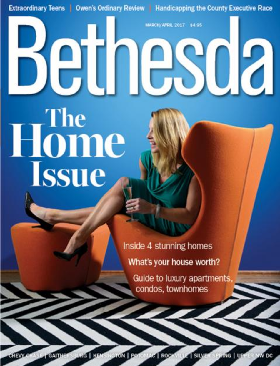
• Skip to main content
  • Skip to header left navigation
  • Skip to header right navigation
  • Skip to site footer
  • about
    • services
    • team
  • portfolio
  • press
Annie Elliott Design, Washington DC

Annie Elliott Design

Greater Washington DC

  • book
  • blog
  • contact
Painted red painting of birds, leaves, trees for kitchen backsplash

My kitchen renovation, part 13: backsplash

Annie Elliott | January 6, 2017

Hello, Gentle Readers! Backsplash update: the custom Chinoiserie panel situation has been, shall we say, challenging. I won’t sleep until it’s safely on my wall. It’s literally on a slow boat from China as I type, and it’s expected to arrive in another, oh, 4 weeks or so. Pray for calm seas. Today’s post is not about …

Read more »My kitchen renovation, part 13: backsplash
» Kitchen + bath
Green bedroom with gallery wall and vintage black and white bedding

Hooray for Greenery! Pantone’s Color of the Year 2017

Annie Elliott | December 11, 2016

THANK YOU, PANTONE!!! Thank you, thank you, for giving us Greenery this year! Talk about a much-needed lift! 15-0343 Greenery. What a fresh, optimistic color! Cause for celebration! A grassy green with enough lime to give it some energy and playfulness. Greenery is a straightforward, honest green that wants the best for all of us. It turns …

Read more »Hooray for Greenery! Pantone’s Color of the Year 2017
» Color + paint color
Renovation of galley kitchen with unstained wood floor

My kitchen renovation, part 12: Floors and wall color

Annie Elliott | December 5, 2016

Gentle Readers, this is going to be an action-packed blog entry so I can bring you an UP TO THE MINUTE report! As I mentioned last time, counters have to go in before the kitchen is usable. So the plumbing and gas were connected right after that. BUT we didn’t want to start walking on the floor …

Read more »My kitchen renovation, part 12: Floors and wall color
» Color + paint color, Renovation
Marble countertop being moved in to kitchen renovation

My Kitchen Renovation, Part 11: Countertops

Annie Elliott | November 28, 2016

Hello, Gentle Readers! I got a bit behind schedule, so there’s a lot to tell you! The countertops are in!!! And I have to say, they’re GORGEOUS. Let me back up for a moment: I realize that I didn’t give you any insight into how I decided to use a natural stone for our counters instead of …

Read more »My Kitchen Renovation, Part 11: Countertops
» Kitchen + bath, Renovation
Better Homes & Gardens cover December 2016 red wreath

Thanks, Better Homes and Gardens!

Annie Elliott | November 18, 2016

I was delighted to be invited to be Better Homes and Gardens‘ “color expert” for the month of December! The color: Winterberry Red. Excellent for this time of year! If you can’t get to a newsstand, the article is available on bossy color’s press page. I hope you enjoy it! Bossy color | Annie Elliott interiors is …

Read more »Thanks, Better Homes and Gardens!
» Color + paint color

My kitchen renovation, Part 10: Cabinets and a Chinoiserie update

Annie Elliott | November 15, 2016

CABINETS!!!! NOW it’s feeling like a kitchen! I’m sorry, but I LOVE the blue cabinets in the butler’s pantry. When they went in, I did have a pang…should I have done the whole kitchen blue? But it might have been too much. Anyway… See that doorway to the left? That will be covered by a matching …

Read more »My kitchen renovation, Part 10: Cabinets and a Chinoiserie update
» Kitchen + bath, Renovation
Drywall doorway in DC kitchen renovation

My kitchen renovation, part 9: it’s looking like a room again

Annie Elliott | November 7, 2016

You know how with renovations it feels like nothing is moving and everything is ugly and dusty, and then all of a sudden stuff happens? It happened! Overnight — literally overnight; I don’t know how the contractors did it so fast — we had a new floor, and it took 1-2 days for the drywall …

Read more »My kitchen renovation, part 9: it’s looking like a room again
» Kitchen + bath, Renovation
  • Previous
  • Page 1
  • Interim pages omitted …
  • Page 26
  • Page 27
  • Page 28
  • Page 29
  • Page 30
  • Interim pages omitted …
  • Page 101
  • Next

Sidebar

Subscribe


Bossy Color Blog

Categories

  • Art + accessories »
  • Bedroom »
  • Color + paint color »
  • Dining room »
  • Furniture + upholstery »
  • Kids »
  • Kitchen + bath »
  • Lighting »
  • Living Room + Family Room »
  • Renovation »
  • Rugs »
  • Wallpaper »
  • Window treatments »

View Portfolio

view Bossy Color's portfolio

Instagram

annieelliottdesign

View Instagram post by annieelliottdesign

Apr 13

Open post by annieelliottdesign with ID 18085288493580590
Let’s talk about what fabric doesn’t work ❌ for the sectional upholstery in this beach house TV Room. Even though these fabrics are beautiful on their own… they don’t work here. The dark stripes were not lighthearted enough and the smaller scale blue and white pattern was too predictable. Watch to listen to me plead my case for lavender and green! 🏖️#interiordetails #colorfulinteriors #beachhousedesign

annieelliottdesign

View Instagram post by annieelliottdesign

Apr 13

Open post by annieelliottdesign with ID 18321246121271986
Here’s the challenge: Imagine you are designing a lighthearted, summer beach house. In the TV Room, there are bookcases, a neutral rug, and a large sectional.What upholstery would you put on the sectional?Comment your pick before you see part 2 👇#designchallenge #interiorsandhome #interiorinspiration

annieelliottdesign

View Instagram post by annieelliottdesign

Apr 8

Open post by annieelliottdesign with ID 18338258239300458
When you come home after a long day, do you want your foyer to rev you up or calm you down? Decide which approach you need and run with it. Add large-scale wallpaper and layered rugs for excitement, or paint the walls off-white and be selective with your artwork and mirrors for calm. #foyer #homedesign #foyerinspiration

annieelliottdesign

View Instagram post by annieelliottdesign

Apr 3

Open post by annieelliottdesign with ID 17848603689678580
Q: What is one thing you can do to elevate a room❓💬 The first thing you see when you walk into a room needs to look great. In your office, get a nice, big vintage desk. In a living room, paint all the walls a dark color. Avoid satin brass hardware, pills on sofa fabric, and fake wood!#interiordesign #dcdesigner #decorinspo

annieelliottdesign

View Instagram post by annieelliottdesign

Apr 1

Open post by annieelliottdesign with ID 17918392215338642
This will come as no surprise, but I think about window treatments a LOT. Especially during the transition from winter to spring, with the change in temperature and light…I’m reminded what a critical design element window treatments are. And then I get to thinking about window treatments through the ages. Who invented drapes? Did the Romans *really* invent Roman shades?I decided to do some digging. Check out my blog to see what I discovered!📸 @stacyzaringoldberg📸 @jennverrierphoto#windowtreatments #drapes #interiordesign

annieelliottdesign

View Instagram post by annieelliottdesign

Mar 25

Open post by annieelliottdesign with ID 18088729466185965
It’s Wallpaper Wednesday! Today we feature Brunschwig & Fils’ Les Touches. @brunschwigfils introduced Les Touches in 1965, and the pattern soon became a Brunschwig classic. (Interestingly, “touches” translates to “keys” or “strokes…” I guess that’s close to “dabs,” which is what I’d assumed.) According to handwritten records, Les Touches is inspired by post-WWII black and white photographs, but the connection between this inspiration and the pattern remains a mystery. Referred to most often as a stylized animal print, Les Touches is a staple of the Le Jardin Chinois collection.Today, Les Touches comes in 18 colorways, but the blue colorway remains iconic. I’ve used Les Touches for window treatments and upholstery, but I can’t wait to try it as wallpaper!

annieelliottdesign

View Instagram post by annieelliottdesign

Mar 23

Open post by annieelliottdesign with ID 18102457048819740
Here’s what ✨ I ✨ would do… Instead of matching everything, you balance it. Pull one color. Shift the scale. Let each piece do something different. Here’s what ✨ I ✨ would do… Instead of matching everything, you balance it. Pull one color. Shift the scale. Let each piece do something different. Bonus: Change the rug! Suddenly you’d make a completely different window choice.Did you guess it?!Watch part 1 for the challenge context and part 2 for what doesn’t work.#interiorsandhome #fabricdesign #romanshades

annieelliottdesign

View Instagram post by annieelliottdesign

Mar 23

Open post by annieelliottdesign with ID 17860517745617635
Let’s talk about what fabric doesn’t work ❌ for the Roman shades in this teenage girl’s bedroom with 2 big windows and a statement ceiling. Even though these fabrics are beautiful on their own… they don’t work here. Biggest mistake: repeating the same motif (moths, butterflies, etc.) across the room. It starts to feel themed instead of designed.Watch part 1 for the full context, and watch part 3 to find out what I would choose.#interiordesign #wallpaper #interiorsandhome

annieelliottdesign

View Instagram post by annieelliottdesign

Mar 23

Open post by annieelliottdesign with ID 18038018090572669
Here’s the challenge: a teenage girl’s bedroom. Not huge. Two big windows. Statement ceiling. White walls.Which fabric would you choose for the Roman shades?There’s a right answer… a safe answer… and a couple very wrong ones. Comment your pick before you see part 2 👇#interiordesigner #wallpaper #romanshades
Follow

Looking for something?

Don’t miss a single post


Where classic and modern hang out and drink gin.

  • Instagram
  • TikTok
  • Pinterest
  • Facebook

© 2026 · Annie Elliott Design · privacy policy