• Skip to main content
  • Skip to header left navigation
  • Skip to header right navigation
  • Skip to site footer
  • about
    • services
    • team
  • portfolio
  • press
Annie Elliott Design, Washington DC

Annie Elliott Design

Greater Washington DC

  • book
  • blog
  • contact

Goodbye, yellow living room. A love letter of sorts

Annie Elliott | February 20, 2017

Dear Living Room,

I love you.

But I haven’t always.

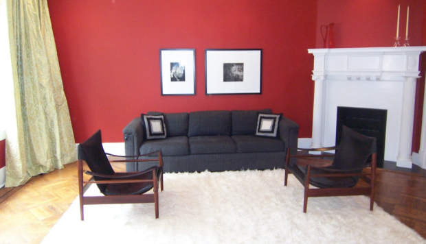
You’re not easy, you know. When we bought this house at the end of 2004, I didn’t know what to do with you. You’re north-facing. You’re almost square. You have a corner fireplace – and you know how tricky those can be.

1980s picture of boys smoking
Glens Falls, New York, circa 1980. My brother James (aka Jimmy Riot, look him up on YouTube ;) ) is second from right

You have a single, gigantic window, Living Room. And you have two double-width doorways. You have no obvious furniture arrangement, no obvious wall color.

Red living room with black mid-century chairs
My living room, third paint color

I struggled mightily as I tried to figure out what paint color would work best for you. I tried 5 colors in 3 years, isn’t that right? I’ve written about that epic journey before.

White living room with black furniture
My living room, fourth or fifth color in 2007. I’m convinced I’ve lost a color somewhere…

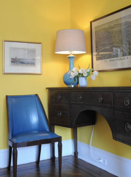
But from the moment in 2011 when I put Benjamin Moore’s 343 Sunrays on your hundred-year-old walls, I knew we’d found the answer. It shouldn’t have taken so long, to be honest. Yellow is my favorite color. Yellow warms up a north-facing room. STRONG yellow maintains its integrity when the weak, gray-tinged light finally makes an appearance.

Yellow living room with blue sofa
Me in my much-adored bright yellow living room, 2011 or so

In so many houses, the living room is underused.

Not so with you, Living Room! Our daughters flop down here when they get home from school, phones in hand for their permissible screen time before homework. I work here sometimes, feet on the coffee table, laptop in, well, my lap. John reads the paper in here. You’re where we have drinks with friends before dinner. Christmas happens here.

Your cheerful yellow walls made us want to spend time with you, Living Room. Yellow cracked the code. Yellow was the answer.

Yellow room
Detail of the yellow living room, with English engraving, English chair and sideboard, and true-blue American map of Glens Falls, NY

So if I love your brilliant yellow walls so much, why oh why am I changing them?

It’s as simple as this: I needed a change.

I will defend saturated wall colors until the end of time. But for me, right now, I want something softer. Something less aggressive. I wanted to see if you could be happy, inviting, and warm with a lighter, more subtle color on your walls.

Blue sofa with art wall
The yellow living room with a good gallery wall — finally! — and a new rug. See, the new rug with the saturated yellow walls…too intense

And guess what, my dear Living Room? You can! Look good in a softer, strategically selected color. Such as blush. A pinky, peachy blush. Possibly darker than the blush so popular right now, because I did learn my lesson: super light colors wash out in your northern light.

Oriental rug
Blush (oh all right: pink) paint samples with the new rug and ideas for new upholstery

You’ll look pretty great in blush, Living Room. Don’t you think? Grannie’s sideboard and round table will look even prettier. I have a new (to me) vintage painting with shades of mustard…that will look terrific against your walls (I’ve always loved dark yellow and light pink together.) And then maybe new furniture, so the blush walls will be the only pink in the room. No more pink furniture – too feminine.

So farewell, yellow, and welcome, blush.

You’ll see, Living Room. I’ll do you proud.

Love,
Annie

Annie Elliott’s work has appeared in publications from Washingtonian Magazine to The Wall Street Journal. Bossy color is a full-service design firm based in Washington, D.C.

Category: Color + paint color, Living Room + Family RoomTag: blue sofa, blush, Danish Modern chairs, Glens Falls, living room makeover, makeover, midcentury chairs, Oriental rug, painting, perfect living room color, pink, re-painting, red walls, Swedish safari chairs, white walls, yellow

Sidebar

Subscribe


Bossy Color Blog

Categories

  • Art + accessories »
  • Bedroom »
  • Color + paint color »
  • Dining room »
  • Furniture + upholstery »
  • Kids »
  • Kitchen + bath »
  • Lighting »
  • Living Room + Family Room »
  • Renovation »
  • Rugs »
  • Wallpaper »
  • Window treatments »

View Portfolio

view Bossy Color's portfolio

Instagram

annieelliottdesign

View Instagram post by annieelliottdesign

Apr 13

Open post by annieelliottdesign with ID 18085288493580590
Let’s talk about what fabric doesn’t work ❌ for the sectional upholstery in this beach house TV Room. Even though these fabrics are beautiful on their own… they don’t work here. The dark stripes were not lighthearted enough and the smaller scale blue and white pattern was too predictable. Watch to listen to me plead my case for lavender and green! 🏖️#interiordetails #colorfulinteriors #beachhousedesign

annieelliottdesign

View Instagram post by annieelliottdesign

Apr 13

Open post by annieelliottdesign with ID 18321246121271986
Here’s the challenge: Imagine you are designing a lighthearted, summer beach house. In the TV Room, there are bookcases, a neutral rug, and a large sectional.What upholstery would you put on the sectional?Comment your pick before you see part 2 👇#designchallenge #interiorsandhome #interiorinspiration

annieelliottdesign

View Instagram post by annieelliottdesign

Apr 8

Open post by annieelliottdesign with ID 18338258239300458
When you come home after a long day, do you want your foyer to rev you up or calm you down? Decide which approach you need and run with it. Add large-scale wallpaper and layered rugs for excitement, or paint the walls off-white and be selective with your artwork and mirrors for calm. #foyer #homedesign #foyerinspiration

annieelliottdesign

View Instagram post by annieelliottdesign

Apr 3

Open post by annieelliottdesign with ID 17848603689678580
Q: What is one thing you can do to elevate a room❓💬 The first thing you see when you walk into a room needs to look great. In your office, get a nice, big vintage desk. In a living room, paint all the walls a dark color. Avoid satin brass hardware, pills on sofa fabric, and fake wood!#interiordesign #dcdesigner #decorinspo

annieelliottdesign

View Instagram post by annieelliottdesign

Apr 1

Open post by annieelliottdesign with ID 17918392215338642
This will come as no surprise, but I think about window treatments a LOT. Especially during the transition from winter to spring, with the change in temperature and light…I’m reminded what a critical design element window treatments are. And then I get to thinking about window treatments through the ages. Who invented drapes? Did the Romans *really* invent Roman shades?I decided to do some digging. Check out my blog to see what I discovered!📸 @stacyzaringoldberg📸 @jennverrierphoto#windowtreatments #drapes #interiordesign

annieelliottdesign

View Instagram post by annieelliottdesign

Mar 25

Open post by annieelliottdesign with ID 18088729466185965
It’s Wallpaper Wednesday! Today we feature Brunschwig & Fils’ Les Touches. @brunschwigfils introduced Les Touches in 1965, and the pattern soon became a Brunschwig classic. (Interestingly, “touches” translates to “keys” or “strokes…” I guess that’s close to “dabs,” which is what I’d assumed.) According to handwritten records, Les Touches is inspired by post-WWII black and white photographs, but the connection between this inspiration and the pattern remains a mystery. Referred to most often as a stylized animal print, Les Touches is a staple of the Le Jardin Chinois collection.Today, Les Touches comes in 18 colorways, but the blue colorway remains iconic. I’ve used Les Touches for window treatments and upholstery, but I can’t wait to try it as wallpaper!

annieelliottdesign

View Instagram post by annieelliottdesign

Mar 23

Open post by annieelliottdesign with ID 18102457048819740
Here’s what ✨ I ✨ would do… Instead of matching everything, you balance it. Pull one color. Shift the scale. Let each piece do something different. Here’s what ✨ I ✨ would do… Instead of matching everything, you balance it. Pull one color. Shift the scale. Let each piece do something different. Bonus: Change the rug! Suddenly you’d make a completely different window choice.Did you guess it?!Watch part 1 for the challenge context and part 2 for what doesn’t work.#interiorsandhome #fabricdesign #romanshades

annieelliottdesign

View Instagram post by annieelliottdesign

Mar 23

Open post by annieelliottdesign with ID 17860517745617635
Let’s talk about what fabric doesn’t work ❌ for the Roman shades in this teenage girl’s bedroom with 2 big windows and a statement ceiling. Even though these fabrics are beautiful on their own… they don’t work here. Biggest mistake: repeating the same motif (moths, butterflies, etc.) across the room. It starts to feel themed instead of designed.Watch part 1 for the full context, and watch part 3 to find out what I would choose.#interiordesign #wallpaper #interiorsandhome

annieelliottdesign

View Instagram post by annieelliottdesign

Mar 23

Open post by annieelliottdesign with ID 18038018090572669
Here’s the challenge: a teenage girl’s bedroom. Not huge. Two big windows. Statement ceiling. White walls.Which fabric would you choose for the Roman shades?There’s a right answer… a safe answer… and a couple very wrong ones. Comment your pick before you see part 2 👇#interiordesigner #wallpaper #romanshades
Follow

Looking for something?

Don’t miss a single post


Where classic and modern hang out and drink gin.

  • Instagram
  • TikTok
  • Pinterest
  • Facebook

© 2026 · Annie Elliott Design · privacy policy