
…is white. That’s correct Gentle Readers: Pantone’s daring selection for 2026’s color of the year is WHITE. Aka Cloud Dancer, 11-4201. Here it is:

I’m just kidding. Here it is:
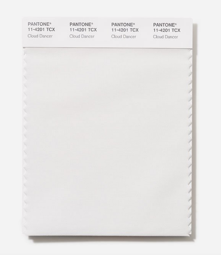
According to Pantone, Cloud Dancer is “a billowy white imbued with a feeling of serenity.”
Imbued with? It’s so serene I’m dead.

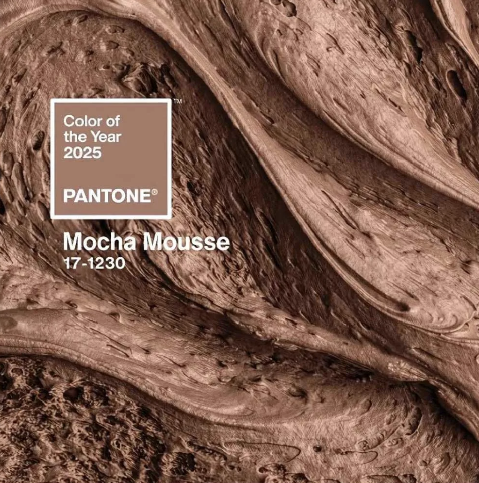
The selection of WHITE — let’s call it what it is — is perhaps the biggest cop-out in Pantone’s history. 2025’s Color of the Year was the soothing Mocha Mousse, which, surprisingly, I did not hate. (Compared with Cloud Dancer, it was downright eye searing.)
I’ve been tolerant of some other years’ colors, also. I found a way to cope with 2022’s Very Peri, for example. And in 2021, I didn’t completely hate Pantone’s *two* colors, a yellow and a gray — even though my daughter Ruthie thought that using a neutral was cheating.
You know what’s interesting? Pantone doesn’t try to pretend that Cloud Dancer is any color but pure white. They don’t mention any undertones. They don’t say it’s a cool white or a warm white, a bluish, grayish, or yellowish white.
They’re sticking to non-visual descriptors such as, “lofty white,” “ethereal white,” “discrete white hue,” “airy white.”
They are ALL IN on white.

Here’s why Cloud Dancer doesn’t work as a Color of the Year. You can’t have a default thing be the special thing. Does that make sense? It’s too much pressure! White was never meant to be the star of the show!
Regarding its use in interiors specifically, Pantone explains:
With its expansive presence…Cloud Dancer invites a space where function and feeling intertwine to build atmospheres of serenity and spaciousness, providing a refuge of visual cleanliness that inspires well-being and lightness, whether introduced in furniture or furnishings throughout the home.
Let’s not talk about how poorly written that is.
Is Pantone predicting — or advocating for? — white on white interiors? You know what I think of when I think of white on white on white?
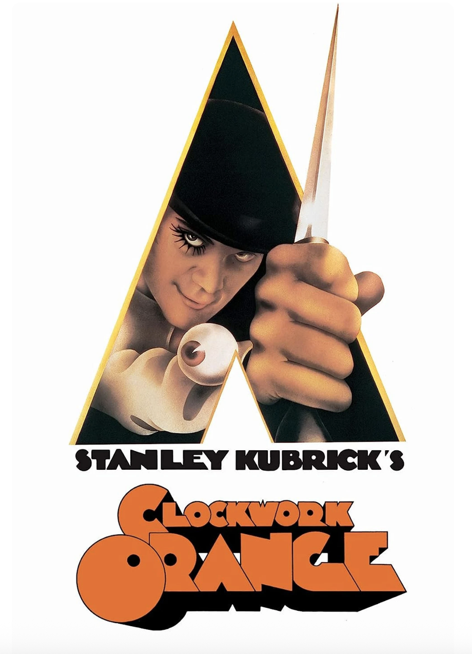
Or

You’re not trying something new if you paint a room white. You’re not taking a risk. It’s the OTHER stuff you do in a white room that makes the space interesting.
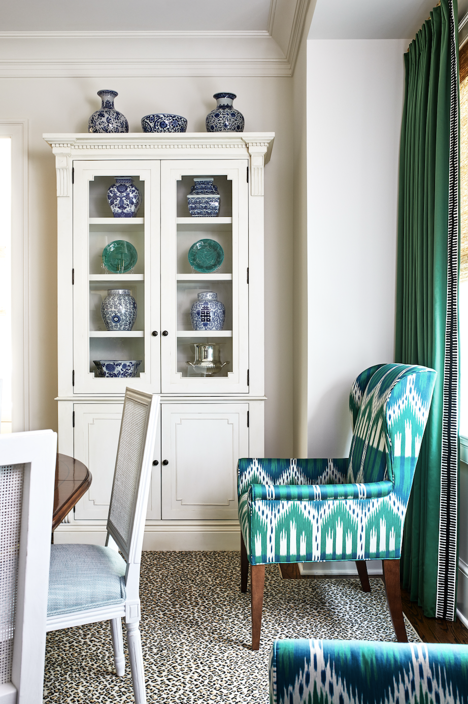
You can create a room that embodies all of the buzzwords above — serenity, refuge, cleanliness, lightness, the ubiquitous “well-being” — by pairing white with anything else. The green above, say, or, light blue.
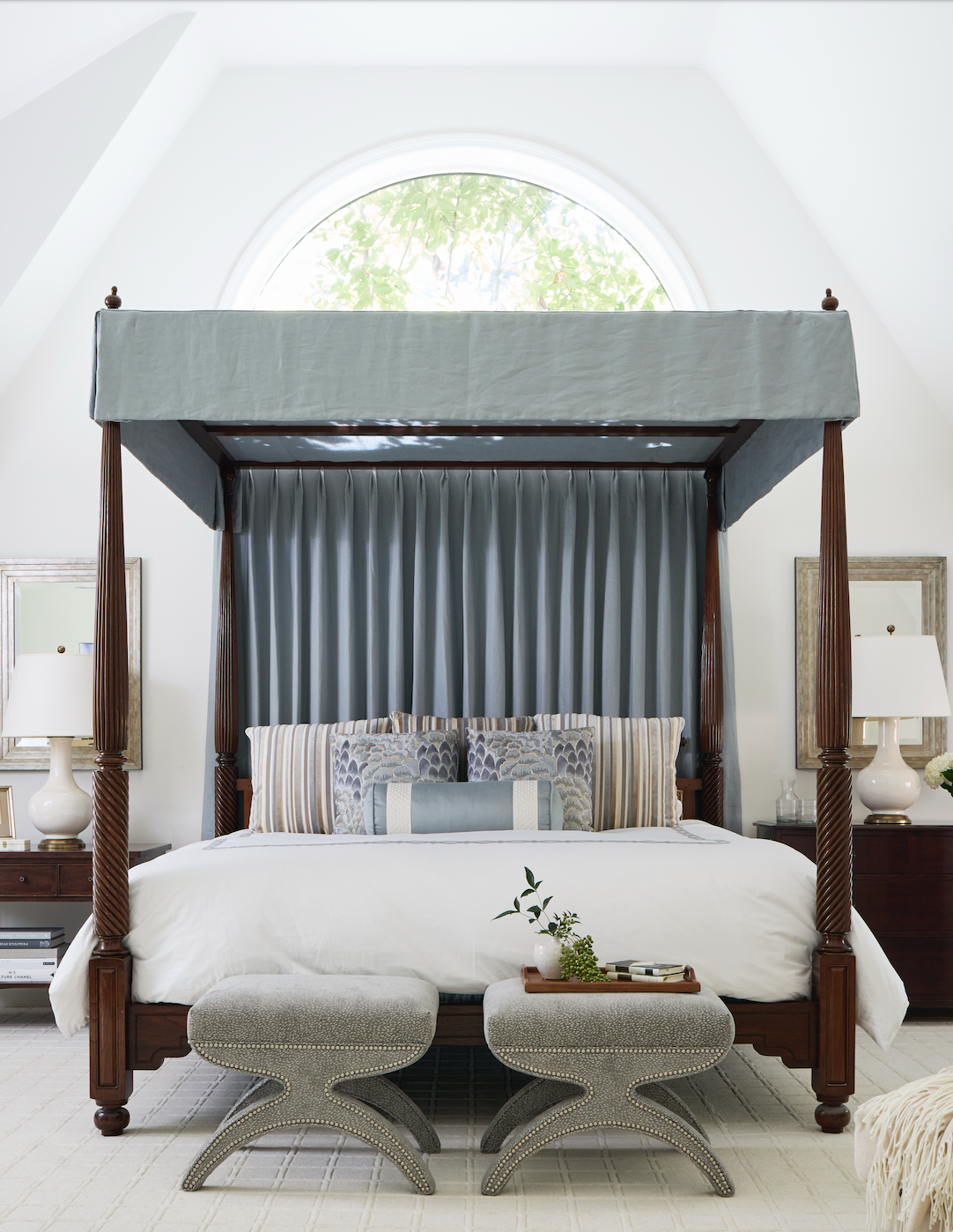
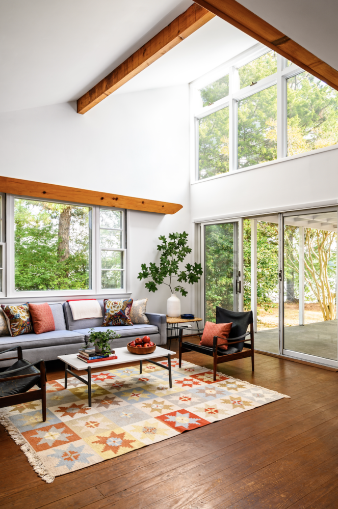
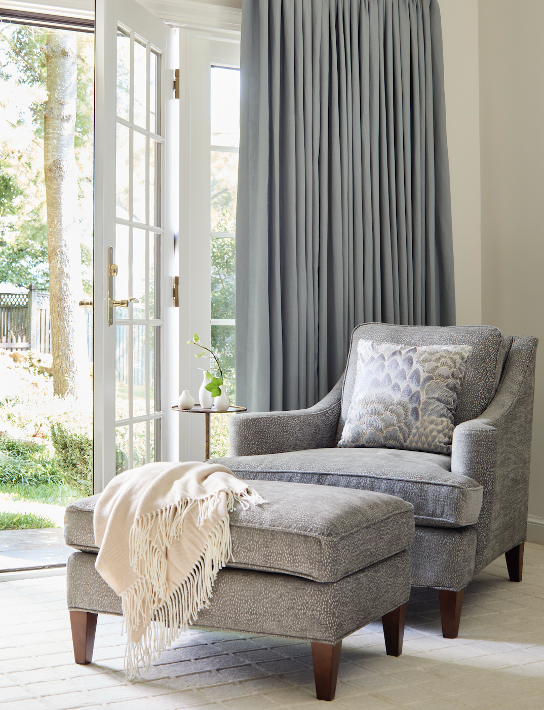
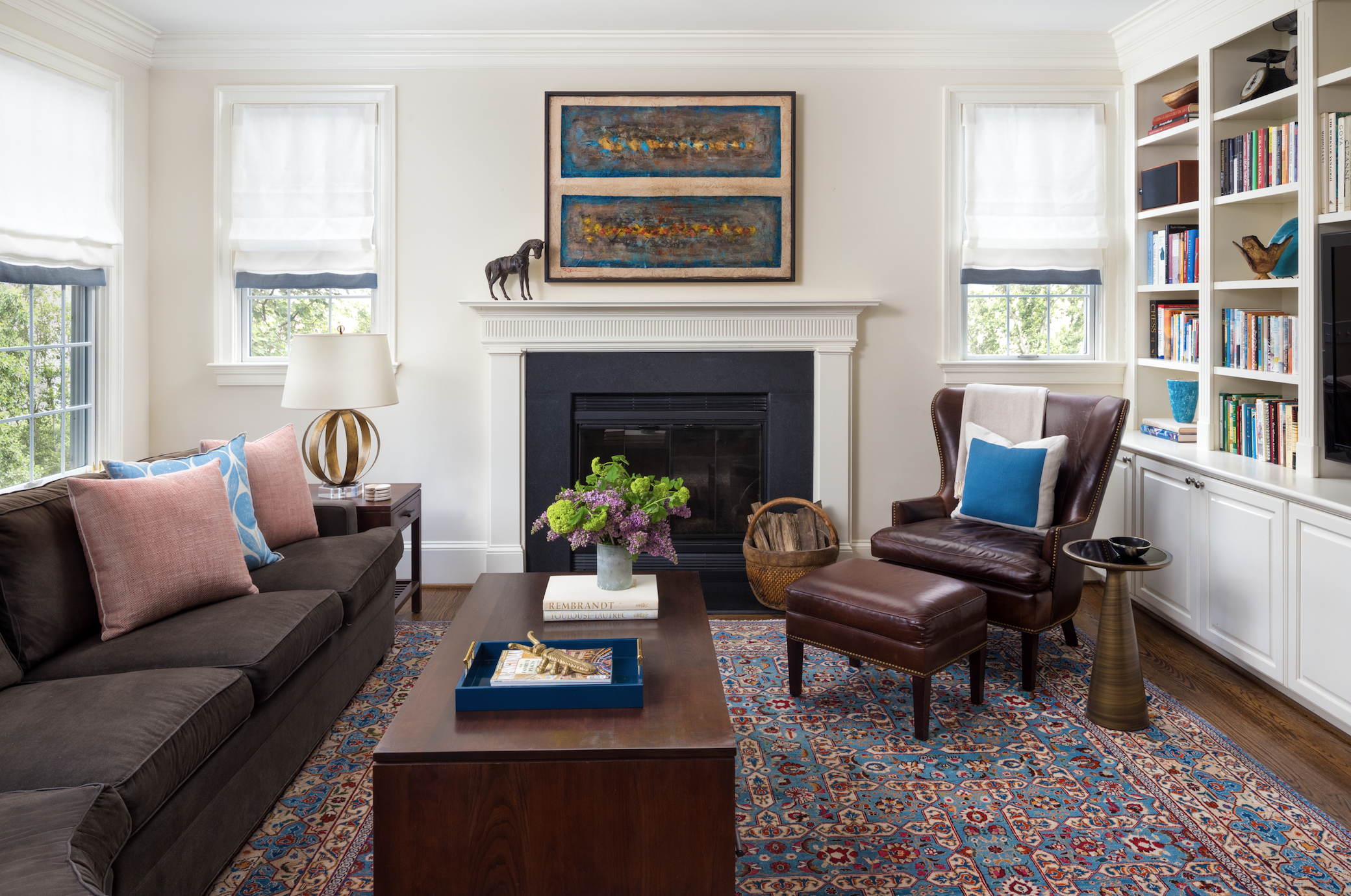
Right? White needs a friend or it’s too sterile. Or frightening.
A quick note about Cloud Dancer-branded items, because it’s hilarious that they exist. Be on the lookout for notebooks:
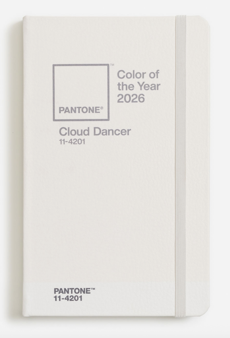
(I’m going to write in Cloud Dancer ink):

Cortado mugs:
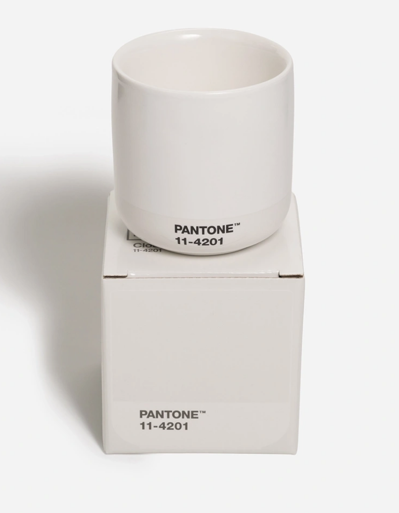
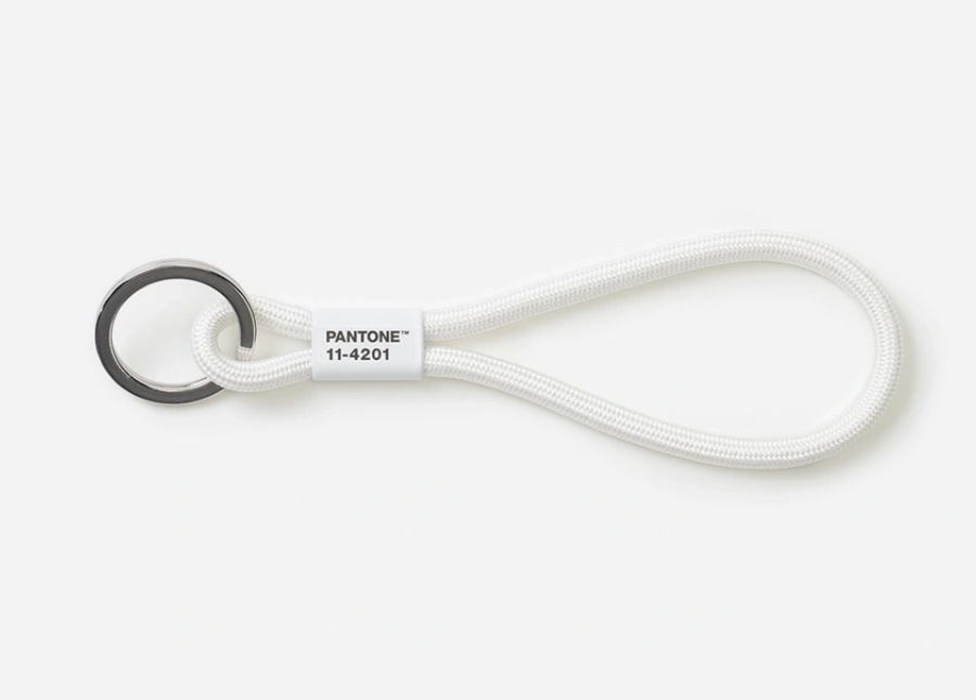
And keychains.
Here’s an upside! Think of all of the Cloud Dancer items you already own! Bedsheets! Ceilings! Pieces of paper! Tile! Redi-whip!
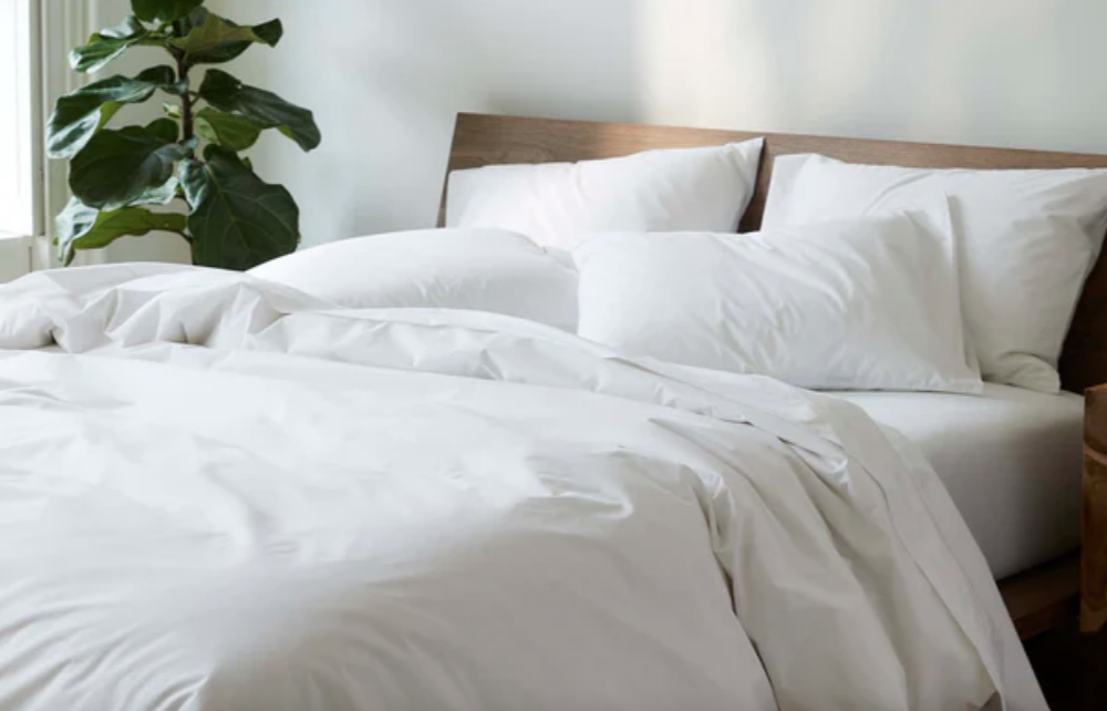
You’re cutting edge and you didn’t even know it ;)
You know what, Gentle Readers? In the time it took me to write this post, I went from angry to sad. You failed me, Pantone. Cloud Dancer doesn’t give me hope or serenity; it makes me feel adrift and resigned.
What color is the flag of surrender?
Cloud Dancer.
My book, My Neighbor Saw Me Naked, and Other Reasons You Need Drapes: The Essential Decorating Handbook, is the ideal gift! It’s a great bottle-of-wine alternative for parties; a lovely gift for fellow decorating enthusiasts; and, of course, a thoughtful present for anyone who is moving, has recently moved, is thinking about moving, or should move.
Annie Elliott Design is booking projects for spring 2026. Please be in touch to discuss.
