• Skip to main content
  • Skip to header left navigation
  • Skip to header right navigation
  • Skip to site footer
  • about
    • services
    • team
  • portfolio
  • press
Annie Elliott Design, Washington DC

Annie Elliott Design

Greater Washington DC

  • book
  • blog
  • contact

Pantone’s Color of the Year 2022: Very Peri. Not the worst, but definitely not the best

Annie Elliott | December 13, 2021

It could have been worse, Gentle Readers.

Pantone's color of the year 2022, Veri Peri, a purplish periwinkle blue
Pantone 17-3938 TCX Very Peri

Pantone’s Color of the Year for 2022 is Very Peri, a clear, perky purple with a blue edge. Bold but cold.

The people at the Pantone Color Institute say, “Very Peri, a dynamic periwinkle blue hue with a vivifying violet red undertone, blends the faithfulness and constancy of blue with the energy and excitement of red.” As a person who has written many art history papers, I appreciate this level of creative interpretation.

Other statements from the Institute mention, newness, technology, and reimagining the future. I’m not going to argue with any of that.

But as a color for interiors…it’s not my fave. First, it evokes 1980s Laura Ashley for me. I owned a LOT of clothing in this color, and a high school friend’s bedroom was wallpapered in a periwinkle Laura Ashley print. (I was insanely jealous, needless to say.)

Purple and pink floral bedroom
Not exactly like this, but you catch my drift

And second, it’s cold. It’s not welcoming, and that’s the number one word my clients use when describing their ideal home.

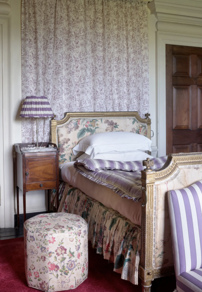
As with all of Pantone’s Colors of the Year, Very Peri will be watered down for the masses. It will find its way onto walls in the form of light lavender (which looks amazing with red Oriental carpets, by the way)

Lavender living room by Jamie Drake
One of my favorite rooms by interior design icon Jamie Drake

and into rugs and textiles in the form of a deeper majestic purple. Big-box stores will sell accent pillows in exactly this color, but not many.

Pantone Very Peri pillow 2022
This doesn’t look as electric as the swatch, which makes it more palatable

As I said earlier, though, Pantone’s selection could have been worse.

It could have been SAGE GREEN. Which is what both Benjamin Moore AND Sherwin Williams selected. They must have been trapped in a fever dream of Pottery Barn in the mid-aughts, with sweaty flashes of cranberry accents to complete the hallucination.

Sage green kitchen - Benjamin Moore's Color of the Year 2022
Benjamin Moore’s October Mist. Uninspired
Dark sage green home office in Sherwin-Williams color of the year 2022
Sherwin Williams’ Evergreen Fog. Even less inspired

No, Pantone at least selected a color with some life.

What we have to remember that in selecting its Color of the Year, Pantone isn’t thinking only of interiors. They’re more focused on fashion and product design.

Various products in Very Peri, a lavender blue
Multiple products in Very Peri
Model on runway in lavender feather had and purple cape
Valentino haute couture
Purple Pantone Very Peri Cariuma sneakers
I do love Cariuma sneakers

So there you have it, Gentle Readers. A new year, a new color coronation by Pantone. Do with it what you will ;)

Annie Elliott Design is based in Washington, DC, with offices in St. Michaels, Maryland and Middlebury, Vermont. Annie recently reported on 2022 design trends from High Point Market on NBC4.

Category: Color + paint colorTag: color of the year, Color of the Year 2022, lavender, Pantone, Very Peri

Sidebar

Subscribe


Bossy Color Blog

Categories

  • Art + accessories »
  • Bedroom »
  • Color + paint color »
  • Dining room »
  • Furniture + upholstery »
  • Kids »
  • Kitchen + bath »
  • Lighting »
  • Living Room + Family Room »
  • Renovation »
  • Rugs »
  • Wallpaper »
  • Window treatments »

View Portfolio

view Bossy Color's portfolio

Instagram

annieelliottdesign

View Instagram post by annieelliottdesign

Jun 17

Open post by annieelliottdesign with ID 18106157639319026
“Much of the wallpaper [in the Victorian era]—fabric, too—was made with arsenic,’ explains Elliott. ‘There are worse ways to go, I suppose.’”I loved speaking with @allisonpduncan @vogueliving about the art of using two wallpapers in one room. Happy Wallpaper Wednesday!#interiordesign #wallpaper #vogueliving #designopinions #annieelliottdesignSlide 1 📸  by Stacy Zarin Goldberg, Design by Annie ElliottSlide 2 📸 by Leslee Mitchell, Design by Kim ScodroSlide 3 📸 by Donna Dotan, Design by Ariel OkinSlide 4 📸 by Gordon Gregory, Design by Jenny Holladay

annieelliottdesign

View Instagram post by annieelliottdesign

Jun 13

Open post by annieelliottdesign with ID 17913412296404982
Pink, light yellow, and gold-y tan combine to create a soft, unexpected color palette. The quiet colors are sophisticated together, and the palette will age beautifully as this tween moves through high school and college. (Her parents won’t even have to redecorate if it becomes a guest bedroom someday! But one step at a time…)#homedesign #paintinspo #bedroomdesign

annieelliottdesign

View Instagram post by annieelliottdesign

Jun 10

Open post by annieelliottdesign with ID 17929516656341682
Deep down, I believe that a house isn’t a home without wallpaper 😊 My latest blog post identifies five unexpected places you can use wallpaper — and some are small! Wallpapering the space behind your island stools could be your gateway to my favorite home furnishing. If you have other creative spots for wallpaper, I’d love to hear about them!#wallpaperinspo #interiordesign #wallpaper

annieelliottdesign

View Instagram post by annieelliottdesign

Jun 9

Open post by annieelliottdesign with ID 18112589929761575
Welcome to my new before-and-after series! 🥰 I take you through my thinking as I design a space — my “process,” as it were. Pretty pictures are involved too, of course. I hope you enjoy it!This was a super fun project: a historic townhouse with the challenge of a loooong shoebox-shaped front room. You know the kind. Here’s how we made this color-and-pattern-loving client’s challenging space amazing. Like this series? Please let me know! #interiordesigner #windowtreatments #wallpaper

annieelliottdesign

View Instagram post by annieelliottdesign

Jun 5

Open post by annieelliottdesign with ID 18087273683080656
Don’t let your porch be a throwaway space! Make it a room. Get a high quality indoor/outdoor rug. Make sure your furniture is COMFY. Find a cordless lamp (they’re everywhere now!). Hang art! You can even add a vintage console table or cabinet if you’re ok with it weathering over time 🕰️. #interiordesign #porchdesign

annieelliottdesign

View Instagram post by annieelliottdesign

Jun 3

Open post by annieelliottdesign with ID 18314336014263171
It’s Wallpaper Wednesday! This week we feature Paper Trail by Lewis and Wood. Lewis and Wood launched Paper Trail in the fall of 2025 as one of four patterns in their History Papers Collection. Paper Trail was inspired by ancient rock carvings - 600–2,000 years old! - from various sites in America. It was named after the site Newspaper Rock, Utah.You know I love anything with an animal :) But there are 2 genres, right? Juvenile and…let’s call it *versatile*. To me, Paper Trail falls into the latter category, featuring deer, horses, buffalo, and foxes on a background that resembles the texture of rocks. It’s primitive, not cartoonish. I could see using this in a small bedroom; a breakfast nook (why? Can’t tell you, it’s just a feeling); or a hallway, because the pattern isn’t overwhelming.#wallpaperinspo #interiordesign #homedesign

annieelliottdesign

View Instagram post by annieelliottdesign

May 28

Open post by annieelliottdesign with ID 18102883841082172
For those of you lucky enough to have a beach house, now’s the time to start thinking about decorating beyond traditional “costal decor!” Step one? Consider a color palette other than blue and white ;) See my latest blog post for more! 🏖️ 🐚#beachhouseinteriors #interiordesign #eastcoast

annieelliottdesign

View Instagram post by annieelliottdesign

May 22

Open post by annieelliottdesign with ID 18125488516719287
I follow two rules when mixing patterns in the same space: vary the scale, and vary the subject.I was excited to share this and other insights on pattern splicing with @ericafinamore from @apartmenttherapy! #interiordesign #patternsplicing #patternmixing #designopinions #annieelliottdesign

annieelliottdesign

View Instagram post by annieelliottdesign

May 20

Open post by annieelliottdesign with ID 18082241465136951
It’s Wallpaper Wednesday! This week we’re featuring Deconstructed Stripe by Schumacher (in collaboration with Miles Redd).This pattern pays tribute to the legendary decorator Albert Hadley. Redd was inspired by Hadley’s contemporary, streamlined designs that played with scale and proportion. Deconstructed Stripe is impactful on its own but also looks INCREDIBLE next to other patterns.@schumacher1889 #designinspo #wallpaper #interiordesigner
Follow

Looking for something?

Don’t miss a single post


Where classic and modern hang out and drink gin.

  • Instagram
  • TikTok
  • Pinterest
  • Facebook
American Society of Interior Designers Firm Partner

© 2026 · Annie Elliott Design · privacy policy