• Skip to main content
  • Skip to header left navigation
  • Skip to header right navigation
  • Skip to site footer
  • about
    • services
    • team
  • portfolio
  • press
Annie Elliott Design, Washington DC

Annie Elliott Design

Greater Washington DC

  • book
  • blog
  • contact

Colors that match vs. complement vs. just plain work. (Bonus: an unexpectedly fabulous color combo!)

Annie Elliott | May 24, 2011

We all know that when you’re decorating a room from scratch, my advice is to start with the rug.

One of my most loyal, blog-reading, bossy-bossing clients is moving into a darling bungalow, and she took this advice to heart. (Advice, gentle suggestion, command…tomato, tomahto, tomuto.)

Remember how I said recently that blue dining rooms are all the rage? In part because they pull the blues from Oriental rugs so beautifully – blues MATCH well. That was the case here. This client’s bungalow dining room was a “before” in the blue dining room post.

Red oriental rug with mustard walls

(Can you believe that’s the same color above and below? Yeesh. Without flash, mustard. With flash, Merry Marigold. Either way…yeesh.)

Oriental rug gold walls

Anyway, we’d decided that we’d make the most of her beautiful rug by using Benjamin Moore’s 2062-50 Blue Jean on the walls.

Benjamin Moore Blue Jean

Ta-DA, right? It looks fantastic. It MATCHES  :)

What’s doesn’t quite match but doesn’t quite qualify as a complement (try saying that 5 times fast) is what we did in the L-shaped back room.

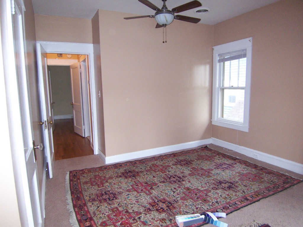
Here’s the before, with her gorgeous rugs but also, tragically, with semi-gloss walls the color of rye toast.

Tan room with pretty rugs

Red rug tan walls

Beautiful rug with tan walls

Here’s a closeup of the larger rug. It’s beyond gorgeous.
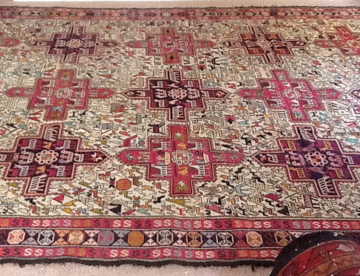
Closeup of flatweave silk rug

Those reds are closer to dark pink. And there’s a light aqua, a light but intense yellow-green, lots of cream, various oranges…just beautiful. It’s a silk flatweave that my client bought years ago at a store called Paysage in Cleveland. (I tried going to the site, but it seems to be having some issues.) She insists that the rug indestructible, despite being silk. Ask Harry and Duncan, her dogs. They’ll tell you.

Anyhoo, what color would YOU have put with this rug? Would you have MATCHED it by pulling out the yellow-green? The aqua? Cream? Here’s what we went with in the end:

2069-50 Blue Orchid

Silk rug lavender walls

Benjamin Moore’s 2069-50 Blue Orchid, a blue with quite a bit of lavender in it. Isn’t it great with the silk rug? It JUST PLAIN WORKS.

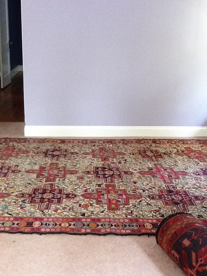
Benjamin Moore's 2069-50 Blue Orchid

Closeup lavender walls with silk rug

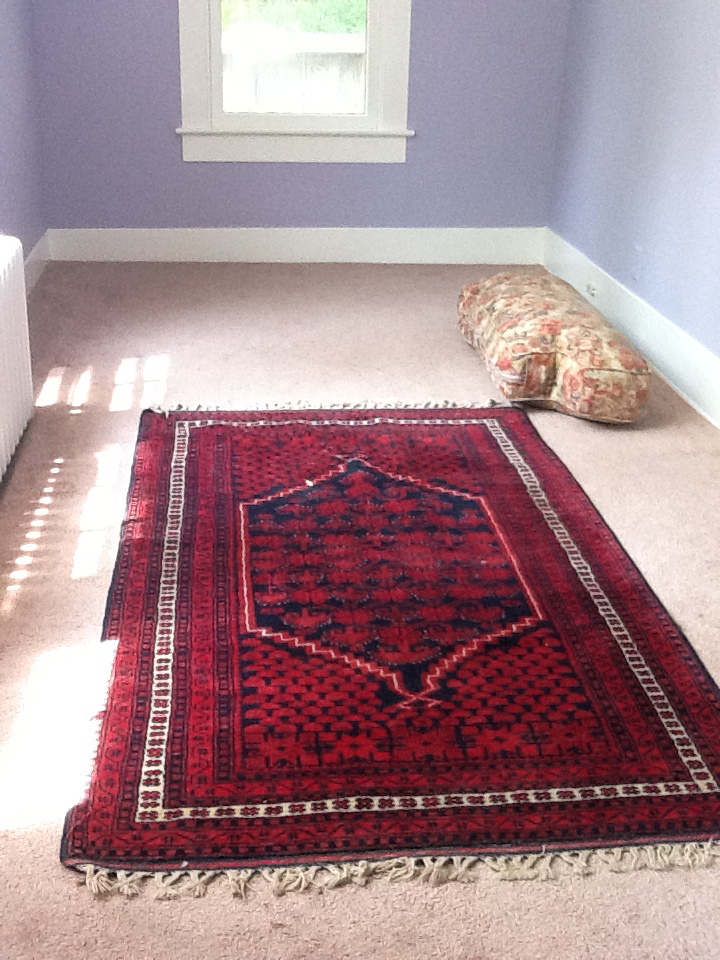
It really brings out the pinks, somehow. I even like it with the navy and red rug, which the client’s friend brought her from Turkey. (I tell you, if you want nice rugs, make friends with a foreign-service officer today.)Red Turkish rug with Blue Orchid walls
So what are we to make of this? I pulled out a color wheel, and this is not a cut-and-dried case of COMPLEMENTING colors. (Sick of the caps? Sorry. But it’s helpful, right?)

If it were a true complement, we could have put, I dunno, yellow-green on the walls to complement those pink hues in the larger rug.
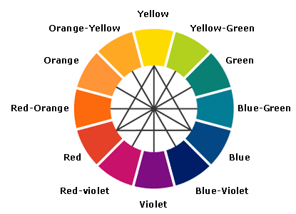
Color wheel

Or a truer blue or aqua on the walls to complement its orangey-ness. Maybe the lavender works because the large silk rug reads yellowy cream overall?

I’m about to embark upon a series of podcasts with 5 kick-a$% color experts, so maybe I’ll just ask them. (More on that later.)

But for now, let’s just say that the Blue Orchid just plain works with the rugs. That’s good enough for the client. And, frankly, it’s good enough for me.

Annie Elliott – aka bossy color – is an interior decorator and design blogger in Washington, D.C. She’s also the creator of the “bossy basic,” a one-time service to jump-start the interior design process in your home.

Category: Color + paint color, Dining roomTag: Benjamin Moore's 2062-50 Blue Jean, Benjamin Moore's 2069-50 Blue Orchid, colors that just work together but you don't know why, complementary colors, complementing colors, lavender, matching colors, periwinkle blue

Sidebar

Subscribe


Bossy Color Blog

Categories

  • Art + accessories »
  • Bedroom »
  • Color + paint color »
  • Dining room »
  • Furniture + upholstery »
  • Kids »
  • Kitchen + bath »
  • Lighting »
  • Living Room + Family Room »
  • Renovation »
  • Rugs »
  • Wallpaper »
  • Window treatments »

View Portfolio

view Bossy Color's portfolio

Instagram

annieelliottdesign

View Instagram post by annieelliottdesign

Aug 27

Open post by annieelliottdesign with ID 18339370936281789
SO much fun to create this entertainment space! This client already had a living room and kitchen…this space is for friends and family to relax, talk, and just BE. What’s your favorite feature?

annieelliottdesign

View Instagram post by annieelliottdesign

Aug 26

Open post by annieelliottdesign with ID 18618812233051872
Happy Wallpaper Wednesday! There’s no better paper to feature in August than Schumacher’s Citrus Garden 🍋 🍊.The Swedish designer, artist, and architect Josef Frank created the Citrus Garden pattern as a fabric in 1947. The hand-drawn, whimsical, quintessentially mid-century, irresistibly cheerful design exemplifies Frank’s philosophy: “The freer the pattern, the better.” I’ve used Citrus Garden fabric a few times, but shockingly, the pattern wasn’t on wallpaper until 2017!! 🤯 Deprived for so long!! As soon as the opportunity arises, I’m running, not walking, to get my hands on this wallpaper.@schumacher_midatlantic 📸 @angieseckinger

annieelliottdesign

View Instagram post by annieelliottdesign

Aug 19

Open post by annieelliottdesign with ID 17979208500097924
All of a sudden, novelty accent lamps are EVERYWHERE! Some are cute, some are…inadvisable ;) If you just can’t resist a lamp in the shape of a snail, my latest blog post has recommendations for proceeding responsibly💡

annieelliottdesign

View Instagram post by annieelliottdesign

Aug 12

Open post by annieelliottdesign with ID 18109874522009739
Happy Wallpaper Wednesday! Let’s talk about Cole & Son’s Acquario, shall we?Iconic Italian artist Piero Fornasetti designed Acquario for Cole & Son in the early 2010s. He was going through an ocean phase, captivated by its mysterious depths 🐠, so he developed this fish design and put it first on plates and fabrics, and then, luckily for us, on wallpaper. We just installed Acquario in the Print Room Blue colorway in a client’s tiny practice room (he plays classical guitar), and we LOVE it! That big old blowfish, just gliding along…he kills me.Featuring: @cole_and_son_wallpapers @fornasetti

annieelliottdesign

View Instagram post by annieelliottdesign

Aug 9

Open post by annieelliottdesign with ID 18436273279134156
Green, light blue, and a touch of navy come together to create a room that's bright, welcoming, and incredibly summery 🥰 🥰 🥰 #interiordesign #summercolors

annieelliottdesign

View Instagram post by annieelliottdesign

Aug 7

Open post by annieelliottdesign with ID 18065703698744445
Given that my brain is still on an academic calendar 🤷‍♀️ , I thought I'd do a little review and see which blog posts resonated with you the most in 2025-26. Who knew that a post from 2011 (!!!) is still in the top 5! Click over to the post to to see the year’s greatest hits. #interiordesign #designinspo

annieelliottdesign

View Instagram post by annieelliottdesign

Jul 24

Open post by annieelliottdesign with ID 18007861235943398
Get ready for a dramatic before and after! We transformed a playroom into a dining room, and the result is pretty amazing. (But still fun!) #wallpaper #interiordesign #diningroominspo

annieelliottdesign

View Instagram post by annieelliottdesign

Jul 22

Open post by annieelliottdesign with ID 18113978008731617
For today’s Wallpaper Wednesday, we discuss the chinoiserie wallpaper in the Great Hall at  @citytavern_dc  in Washington, DC. Ooooohh - field trip!I was delighted to visit City Tavern recently. It’s a historic 1796 Federal building in the heart of Georgetown, and all the cool kids hung out there. You know, George Washington, Thomas Jefferson…those guys. At one point, the building boasted the largest room in Washington.I, of course, was captivated by the Great Hall, which is covered in @graciestudio hand-painted wallpaper — which was selected by none other than Jackie Kennedy! EVEN THOUGH at that time the building was a club that didn’t admit women. Harumph.The chinoiserie walls are gorgeous from far away, but they’re amazing up close, also: you can see faint brushstrokes left by the painters. Doesn’t that give you a shiver? I love it.

annieelliottdesign

View Instagram post by annieelliottdesign

Jul 21

Open post by annieelliottdesign with ID 17880979779674102
For a recent article in @vogueliving, I was asked how to mix wallpapers — either in the same room or adjacent rooms. I have a few pieces of advice to offer 😊See my latest blog post for more…#interiordesign #designblog #wallpaperinspo
Follow

Looking for something?

Don’t miss a single post


Where classic and modern hang out and drink gin.

  • Instagram
  • TikTok
  • Pinterest
  • Facebook
American Society of Interior Designers Firm Partner

© 2026 · Annie Elliott Design · privacy policy