• Skip to main content
  • Skip to header left navigation
  • Skip to header right navigation
  • Skip to site footer
  • about
    • services
    • team
  • portfolio
  • press
Annie Elliott Design, Washington DC

Annie Elliott Design

Greater Washington DC

  • book
  • blog
  • contact

Cottagecore vs. Maximalism: What’s the difference? (And what the heck is Goblincore?)

Annie Elliott | September 19, 2021

I have a confession, Gentle Readers. Until the article in the Washington Post last week, I wasn’t really aware of Cottagecore as an interior design trend.

Sunny cottage style porch
Cottagecore reading room
Cottagey bedroom
An adaptation of Cottagecore

I knew that, thanks to the pandemic, some people were adopting a Little House On the Prairie meets Laura Ashley back-to-the-land-as-long-as-we-have-internet lifestyle, complete with peasant dresses and the occasional chicken.

woman in peasant dress holding chicken
Brwak brawk
Charmingly cluttered kitchen
There’s a LOT going on here

So I made a little TikTok about Cottagecore and pushed it aside.

Rustic cottage-style bedroom with layered rugs and plants
A bedroom loosely interpreted in Cottagecore style. Photo by Sara McDaniel

But I got to thinking: if the hallmarks of Cottagecore are vintage furniture, bright colors and patterns, layers of materials, and nostalgia, then what’s the difference between it and Maximalism?

Lavish Maximalist green room by designer Tony Duquette
Maximalism is synonymous with designer Tony Duquette

Well, not to put too fine a point on it, but I believe it comes down to 2 things: dirt and money.

Maximalist room in orange and green by Ben Pentreath
By Ben Pentreath. I love him

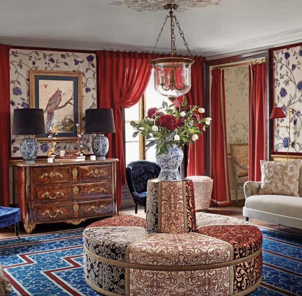
Maximalism is a celebration of excess. An explosion of color and pattern, and yes, even clutter — a crossover characteristic of the 2 styles — combined with antique furniture, richly patterned rugs, and, if you’re me, a brass Martini table from West Elm. (They REALLY should be paying me.)

Blue Maximalist library by Nick Olsen
By Nick Olsen

But while the rug might be from your great-aunt and the furniture is old, chances are good that the fabrics of Maximalism are fresh and new. The colors are saturated jewel tones, not muddy earth tones. City house, not country house. And Maximalism generally looks expensive, even if it isn’t.

Luxurious maximalist room by Alessandra Branca
Alessandra Branca’s Maximalist style

Cottagecore, on the other hand, is musty. It’s more vintage than antique. American frontier, not English manor. The floral patterns might be faded, the painted furniture mismatched, and the inhabitants’ feet bare. It’s rustic. And Cottagecore can look, well, a bit unclean, even if it isn’t.

Living room with light green floral wallpaper and shabby ripped velvet tufted sofa
Almost shabby, right?

This is not to say that I find Cottagecore devoid of charm. Au contraire, mon frère! The style can be EXTREMELY charming, especially when it comes to kitchens, with their open hutches of chipped teacups and sun-bleached rose-print café curtains.

Cottage dining room with open hutch
Cottagecore dining room. Photo by Kasia Fiszer

Oh, and what IS “Goblincore,” you ask?

Goblincore - or Cottagecore - style room: rustic interior with plants and wooden plank floor
Riiiiiggghttt on the edge of Goblincore…

Goblincore is the seamy underbelly of the Cottagecore fairy tale.

dining room outside Goblincore
…and there it is

It’s the forest creeping through your windows. Address: Hobbiton, The Shire.

There you have it, Gentle Readers. Never again will you mistake Cottagecore for Maximalism, or vice-versa. WHEW.

Annie Elliott Design is based in Washington, DC, with offices in St. Michaels, Maryland and Middlebury, Vermont. Annie’s design work and insights have appeared in numerous local and national publications, including HGTV Magazine, The Wall Street Journal, The New York Times, The Washington Post, and Washingtonian Magazine. Annie recently appeared on NBC4 for a story about author Jason Reynolds’ Kingman Park home.

Category: TrendsTag: cottage style, Cottagecore, Maximalism, shabby chic, trends

Sidebar

Subscribe


Bossy Color Blog

Categories

  • Art + accessories »
  • Bedroom »
  • Color + paint color »
  • Dining room »
  • Furniture + upholstery »
  • Kids »
  • Kitchen + bath »
  • Lighting »
  • Living Room + Family Room »
  • Renovation »
  • Rugs »
  • Wallpaper »
  • Window treatments »

View Portfolio

view Bossy Color's portfolio

Instagram

annieelliottdesign

View Instagram post by annieelliottdesign

Apr 28

Open post by annieelliottdesign with ID 17870996082665526
Your house should reflect *you*. My recent visits to Eudora Welty’s house and the Mississippi Museum of Art reminded me of that. If the wallpaper you put up makes you happy, it’s a success! If you need help figuring out how to translate your personality and lifestyle into your home’s function and appearance, I’m here 😉.Read my new blog post for more!

annieelliottdesign

View Instagram post by annieelliottdesign

Apr 24

Open post by annieelliottdesign with ID 18099336653042952
Annie Elliott Design is a proud sponsor of the 87th annual @flowermartdc! I hope to see you all there! I will be there on May 1st shopping for peonies, yellow roses, and Black-Eyed Susans. 🌸 🌹 💐 #flowermartdc #springflowers #interiordesign

annieelliottdesign

View Instagram post by annieelliottdesign

Apr 22

Open post by annieelliottdesign with ID 18064935869348067
The star of today’s Wallpaper Wednesday is Farrow & Ball’s Lotus!The dramatic Lotus pattern is in the Art Nouveau style of the late 19th century and veeeeery early part of the 20th. (The pattern’s curved, stylized, botanical shapes are a classic indicator of Art Nouveau style.) Today, Lotus wallpaper is available in 19 colorways — or coloUrways, since Farrow & Ball is British ☺️ — and the metallic ones are quite spectacular. F&B changes its wallpaper colorways with annoying regularity; once they cease making a paper, that colorway is considered “archived.” But fear not: ANY F&B wallpaper pattern can be made in ANY F&B paint…all it takes is time and money.If you’re a Succession fan (I struggled, but I made it through), you may remember Lotus from Season 3, in Rava Roy’s foyer.#interiordesign #wallpaper

annieelliottdesign

View Instagram post by annieelliottdesign

Apr 20

Open post by annieelliottdesign with ID 18113514817783580
You know my thoughts about small rooms and wallpaper: bold, large-scale paper totally works! Your gateway drug is powder rooms. They’re the perfect place to experiment with whimsical patterns and bright colors because you don’t spend a ton of time in there. Although * I * argue that when you have the right wallpaper, you’ll want to ;)

annieelliottdesign

View Instagram post by annieelliottdesign

Apr 8

Open post by annieelliottdesign with ID 18338258239300458
When you come home after a long day, do you want your foyer to rev you up or calm you down? Decide which approach you need and run with it. Add large-scale wallpaper and layered rugs for excitement, or paint the walls off-white and be selective with your artwork and mirrors for calm. #foyer #homedesign #foyerinspiration

annieelliottdesign

View Instagram post by annieelliottdesign

Apr 1

Open post by annieelliottdesign with ID 17918392215338642
This will come as no surprise, but I think about window treatments a LOT. Especially during the transition from winter to spring, with the change in temperature and light…I’m reminded what a critical design element window treatments are. And then I get to thinking about window treatments through the ages. Who invented drapes? Did the Romans *really* invent Roman shades?I decided to do some digging. Check out my blog to see what I discovered!📸 @stacyzaringoldberg📸 @jennverrierphoto#windowtreatments #drapes #interiordesign

annieelliottdesign

View Instagram post by annieelliottdesign

Mar 25

Open post by annieelliottdesign with ID 18088729466185965
It’s Wallpaper Wednesday! Today we feature Brunschwig & Fils’ Les Touches. @brunschwigfils introduced Les Touches in 1965, and the pattern soon became a Brunschwig classic. (Interestingly, “touches” translates to “keys” or “strokes…” I guess that’s close to “dabs,” which is what I’d assumed.) According to handwritten records, Les Touches is inspired by post-WWII black and white photographs, but the connection between this inspiration and the pattern remains a mystery. Referred to most often as a stylized animal print, Les Touches is a staple of the Le Jardin Chinois collection.Today, Les Touches comes in 18 colorways, but the blue colorway remains iconic. I’ve used Les Touches for window treatments and upholstery, but I can’t wait to try it as wallpaper!

annieelliottdesign

View Instagram post by annieelliottdesign

Mar 23

Open post by annieelliottdesign with ID 17860517745617635
Let’s talk about what fabric doesn’t work ❌ for the Roman shades in this teenage girl’s bedroom with 2 big windows and a statement ceiling. Even though these fabrics are beautiful on their own… they don’t work here. Biggest mistake: repeating the same motif (moths, butterflies, etc.) across the room. It starts to feel themed instead of designed.Watch part 1 for the full context, and watch part 3 to find out what I would choose.#interiordesign #wallpaper #interiorsandhome

annieelliottdesign

View Instagram post by annieelliottdesign

Mar 18

Open post by annieelliottdesign with ID 18097450855812440
The star of today’s Wallpaper Wednesday is Schumacher’s Acanthus Stripe. If you’ve studied Green and Roman architecture, the Acanthus motif is an old friend: Acanthus leaves were a common ornament on Corinthian capitals as early as 500 BC. Celerie Kemble’s interpretation of the motif in her Acanthus Stripe wallpaper is streamlined and clever, with the leaves serving both as capitals and as the columns themselves. @schumacher1889 has created three types of Acanthus Stripe wallcovering: paper, vinyl, and sisal, with the latter my favorite by far. The sisal roughs up the pattern a little bit, making the paint a tad uneven and the edges of the design blurry in parts. It’s a little more real, a little more appropriate for a spiky leaf rendered in stone exposed to the sun and wind for thousands of years.Acanthus Stripe Sisal in Fog and Chalk is classic (ask Mabel from the show, *Only Murders in the Building*; she didn’t want to go too crazy redecorating her aunt’s apartment, I guess), but my favorite colorways are Turmeric and Mocha. In these colors, on this material, the design couldn’t be more elegant.#wallpaperins #interiordesign #onlymurdersinthebuilding
Follow

Looking for something?

Don’t miss a single post


Where classic and modern hang out and drink gin.

  • Instagram
  • TikTok
  • Pinterest
  • Facebook

© 2026 · Annie Elliott Design · privacy policy