
Happy New Year, Gentle Readers! I’m going to begin 2015 with a declaration: BOSSY COLOR’S COLOR OF THE YEAR FOR 2015 IS BRIGHT NAVY.
I don’t usually have a color of the year, but this year is different.
It’s been several weeks since the announcement that “Marsala,” (18-1438, for those keeping track) is Pantone’s color of the year for 2015. I reacted with shock and disgust, and alas, I still loathe it. It’s a wimpy cop-out, and as a cousin of Pantone’s 2014 color of the year (Radiant Orchid), it’s simply not an interesting choice.
Plus it’s gross. And I don’t look good in it. So.
But one has to have some sort of guiding principle for the year, doesn’t one? So Bright Navy it is. I’m going to pretend that Marsala doesn’t exist.
If you, like me, plan to embrace Bright Navy as the color for 2015, here are some paint colors to consider. I’ve selected these from real-life swatches, by the way, not from on-screen pictures:
From Fine Paints of Europe, MV22 Canton China Blue (part of their Mount Vernon collection). This would be amazing on a front door:

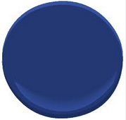
Benjamin Moore’s 2066-10 Blue would be beautiful in a Dining Room:
And I’d love to see Farrow & Ball’s Drawing Room Blue 253 in a tiny guest room with crisp white bedding. (You’ll have to trust me on this one; it looks dark and gray here, but it has zip in real life):

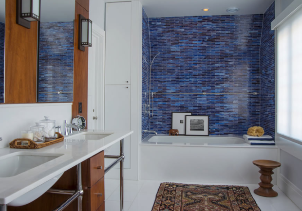
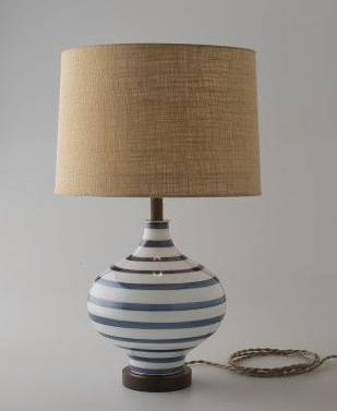
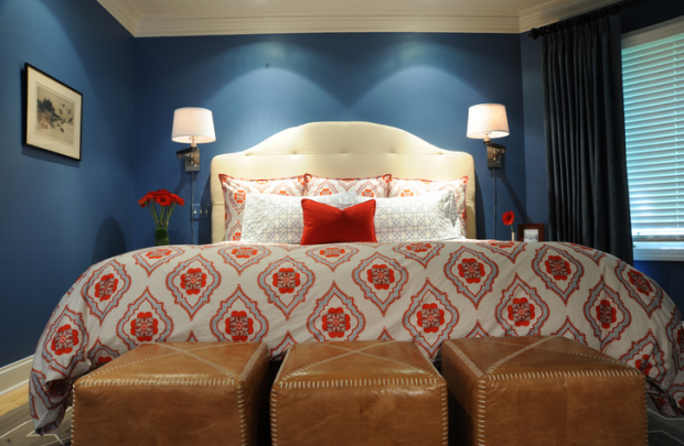
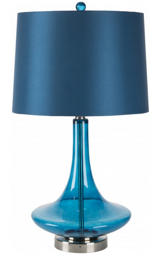
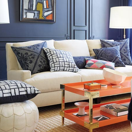
I’m seeing a lot of terrific dark blue accessories to support my declaration.
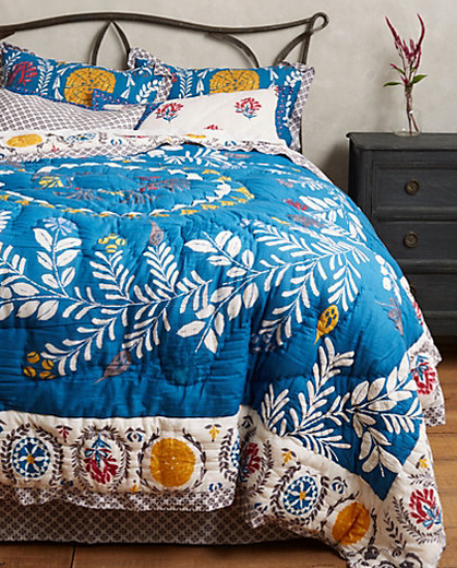
(Admittedly, to call that quilt any sort of navy is a stretch — it veers toward a Royal Blue, in my opinion — but the point is that it is NOT Marsala. And isn’t it pretty?)
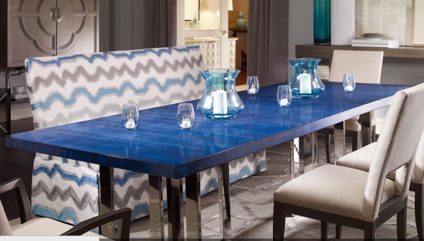
If you really want to be bossy about Bright Navy as the color of the year, you’ll consider this dining table from Century Furniture. I think it’s amazing.
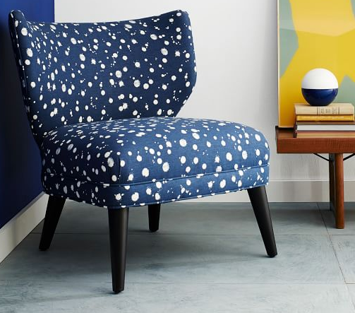
It looks like Kate Spade is a fan of Bright Navy — or at least navy. I mean, this pops up immediately on her website…

…and this chair is part of her brand-spanking new Kate Spade Saturday collection for West Elm:
How ’bout it, Kate? Will you join me in taking a stand against Marsala?
I hope you’ll join me, Gentle Readers. The next time you’re in a home furnishings shop, let your hand linger over an object the color of lox left out overnight — that would be Marsala — and then, deliberately and decisively, pick up something bright navy instead.

A small gesture, perhaps, but I know you’ll make it a heartfelt one.
Bossy color | Annie Elliott interior design is a full-service design firm in Washington, D.C. We create outrageously beautiful homes for fascinating people.