• Skip to main content
  • Skip to header left navigation
  • Skip to header right navigation
  • Skip to site footer
  • about
    • services
    • team
  • portfolio
  • press
Annie Elliott Design, Washington DC

Annie Elliott Design

Greater Washington DC

  • book
  • blog
  • contact

Chinoiserie backsplash, installed!

Annie Elliott | September 24, 2017

Gentle Readers, the journey is over. And what a journey it’s been.

This blog post was the last time I could bear to write about the nightmare that had become my dream of a gorgeous, gigantic, hand-painted Chinoiserie backsplash. You remember, the one that arrived in about a million pieces.

Large broken painted ceramic tile with birds and flowers
Yep. Believe it

I bounced back pretty quickly, I must say. Once I started talking with my friends at Billet Collins about a reverse-painted glass Chinoiserie backsplash…well, I became much more hopeful.

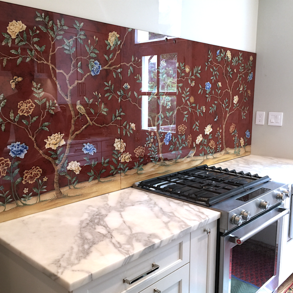
Fast-forward a few months, and Gentle Readers: it is now installed.

What can I say? It’s amazing.

Large red hand-painted Chinoiserie backsplash with birds and flowers
Behold!

It’s shinier than I expected, which I love in person. It does make photographing it difficult…
Large red painted backsplash panel with birds and flowers
Glare

…but that’s why professional photographers get paid the big bucks ;)

Contractors applying caulk to the back of one of the panels
Applying the glue. Or caulk. Or whatever
Installation of one large red hand-painted backsplash tile
Installation in progress

Roberta Marovelli, the artist, is BRILLIANT. I was so concerned about the attention to detail. “An English engraving.” I kept saying. Or sometimes, “I want it to look like an Audubon drawing.” Done and done.

There are around seven layers behind the glass. First, Roberta painted the tiniest details (because remember: it’s reverse-painted glass); then she added some of the slightly larger elements; then gold leaf; then even larger things; then there’s muslin in there somewhere; and the background, of course; and then whatever is on the very back to keep it all together…

It’s a lot.

What made working with Billet Collins so special is their commitment to customization. It wasn’t enough that these panels were being made for me, for my kitchen, for this space, in the colors I want. No, Roberta and Kellie asked me to send some of my favorite flowers and birds so they could incorporate them into the painting. So I sent off peonies and some of the birds that we see on the Eastern Shore. It’s pretty fun to see this little guy when I’m cooking.

Close-up picture of the red tile showing a red bluebird and a pomegranate
Eastern Bluebird. It’s hard to see the flashes of gold leaf, but it’s there!

I couldn’t be more thrilled.

My poor contractor, though. When he came to re-install the hood, I told him that if he nicked the glass, I would kill him with my bare hands.

He believed me. Which he should have.

As for the wall opposite the Chinoiserie? The sink wall? I’d decided to wait until these panels were in before finalizing that side of the room. As you know, I really went through some ideas: green tile; beige tile; WHITE tile, for crying out loud; a sheet of brass; metallic tiles; and then, reverse-painted glass with gold leaf (gorgeous, but possibly just a tad too competitive with the counters, and super expensive….)

Gold-leaf reverse-painted glass tile
[Sound of angels singing]
…and finally, reverse-painted glass with metallic paint. The winner. Thank you, Billet Collins, once again.

Large gold glass tile next to marble counter
See the wavy diagonal line that separates the 2 finishes? I like the bottom one, which doesn’t have a bumpy, orange-peel effect

This wall will be finished much sooner. And then I can photograph the kitchen. And then I can rest.

Although I have been thinking about wallpapering the dining room ;)

Bossy color | Annie Elliott interiors is a design firm based in Washington, DC. Annie’s design work and decorating insights have appeared in such publications as Better Homes & Gardens, HGTV Magazine, The New York Times, The Washington Post, Bethesda Magazine, and Washingtonian Magazine.

Category: Kitchen + bathTag: backsplash, chinoiserie, eglomisé, gold, gold leaf, hand-painted, kitchen, renovation, tile

Sidebar

Subscribe


Bossy Color Blog

Categories

  • Art + accessories »
  • Bedroom »
  • Color + paint color »
  • Dining room »
  • Furniture + upholstery »
  • Kids »
  • Kitchen + bath »
  • Lighting »
  • Living Room + Family Room »
  • Renovation »
  • Rugs »
  • Wallpaper »
  • Window treatments »

View Portfolio

view Bossy Color's portfolio

Instagram

annieelliottdesign

View Instagram post by annieelliottdesign

Sep 18

Open post by annieelliottdesign with ID 17989063023104856
Best part of being an interior designer is using your own home as a playground for creative ideas! We changed the paint in our living room again and here’s how it looks now! #interiordesign

annieelliottdesign

View Instagram post by annieelliottdesign

Sep 17

Open post by annieelliottdesign with ID 18125330714481993
When you become an empty nester, when is it ok to reclaim your adult child’s space? Check out my latest blog post for my recommendations on how to approach empty nesting!📸 @stacyzaringoldberg📸 @kipdawkinsphoto📸 Michael Wilkinson📸 @angieseckinger

annieelliottdesign

View Instagram post by annieelliottdesign

Sep 10

Open post by annieelliottdesign with ID 17906571285498443
Pink, green, and a splash of dark orange come together to create this sunny, summery bedroom 🪷

annieelliottdesign

View Instagram post by annieelliottdesign

Sep 9

Open post by annieelliottdesign with ID 18104009318233584
It’s Wallpaper Wednesday! This week, feast your eyes on @timorous_beasties Fruit Looters. TB claims that William Morris’s Strawberry Thief pattern inspired Fruit Looters, but only the name indicates the connection: Strawberry Thief, Fruit Looters…get it? Whereas Morris’s iconic pattern is medium-scale, rhythmic, 2-D, cartoon-like, and muted, Fruit Looters is the opposite in every way but subject matter. The scale is huge, with the foliage “stripes” providing a geometric order, and it oozes TB’s trademark edginess. The crisp pattern is finely drawn; pull it apart, and each element — a flower, a bird — could be in an English botanical print. Fruit Looters comes in vivid, saturated colorways, some with a metallic sheen, and dramatic black is present in all.Recently, a client (who originally introduced me to Timorous Beasties!) and I used Fruit Looters wallpaper in her stairwell, in the Alabaster colorway. The drama. Oh, the drama!

annieelliottdesign

View Instagram post by annieelliottdesign

Aug 27

Open post by annieelliottdesign with ID 18339370936281789
SO much fun to create this entertainment space! This client already had a living room and kitchen…this space is for friends and family to relax, talk, and just BE. What’s your favorite feature?

annieelliottdesign

View Instagram post by annieelliottdesign

Aug 26

Open post by annieelliottdesign with ID 18618812233051872
Happy Wallpaper Wednesday! There’s no better paper to feature in August than Schumacher’s Citrus Garden 🍋 🍊.The Swedish designer, artist, and architect Josef Frank created the Citrus Garden pattern as a fabric in 1947. The hand-drawn, whimsical, quintessentially mid-century, irresistibly cheerful design exemplifies Frank’s philosophy: “The freer the pattern, the better.” I’ve used Citrus Garden fabric a few times, but shockingly, the pattern wasn’t on wallpaper until 2017!! 🤯 Deprived for so long!! As soon as the opportunity arises, I’m running, not walking, to get my hands on this wallpaper.@schumacher_midatlantic 📸 @angieseckinger

annieelliottdesign

View Instagram post by annieelliottdesign

Aug 19

Open post by annieelliottdesign with ID 17979208500097924
All of a sudden, novelty accent lamps are EVERYWHERE! Some are cute, some are…inadvisable ;) If you just can’t resist a lamp in the shape of a snail, my latest blog post has recommendations for proceeding responsibly💡

annieelliottdesign

View Instagram post by annieelliottdesign

Aug 12

Open post by annieelliottdesign with ID 18109874522009739
Happy Wallpaper Wednesday! Let’s talk about Cole & Son’s Acquario, shall we?Iconic Italian artist Piero Fornasetti designed Acquario for Cole & Son in the early 2010s. He was going through an ocean phase, captivated by its mysterious depths 🐠, so he developed this fish design and put it first on plates and fabrics, and then, luckily for us, on wallpaper. We just installed Acquario in the Print Room Blue colorway in a client’s tiny practice room (he plays classical guitar), and we LOVE it! That big old blowfish, just gliding along…he kills me.Featuring: @cole_and_son_wallpapers @fornasetti

annieelliottdesign

View Instagram post by annieelliottdesign

Aug 9

Open post by annieelliottdesign with ID 18436273279134156
Green, light blue, and a touch of navy come together to create a room that's bright, welcoming, and incredibly summery 🥰 🥰 🥰 #interiordesign #summercolors
Follow

Looking for something?

Don’t miss a single post


Where classic and modern hang out and drink gin.

  • Instagram
  • TikTok
  • Pinterest
  • Facebook
American Society of Interior Designers Firm Partner

© 2026 · Annie Elliott Design · privacy policy