• Skip to main content
  • Skip to header left navigation
  • Skip to header right navigation
  • Skip to site footer
  • about
    • services
    • team
  • portfolio
  • press
Annie Elliott Design, Washington DC

Annie Elliott Design

Greater Washington DC

  • book
  • blog
  • contact

My kitchen renovation, part 13: backsplash

Annie Elliott | January 6, 2017

Hello, Gentle Readers! Backsplash update: the custom Chinoiserie panel situation has been, shall we say, challenging. I won’t sleep until it’s safely on my wall. It’s literally on a slow boat from China as I type, and it’s expected to arrive in another, oh, 4 weeks or so. Pray for calm seas.

Painted red painting of birds, leaves, trees for kitchen backsplash
A detail of the final, final Chinoiserie panels, right before they were crated and shipped

Today’s post is not about the Chinoiserie, though; we’ve talked plenty about that. Today’s post is about the journey that is the backsplash on the OPPOSITE wall, the sink wall.

What could I possibly do that complements but doesn’t compete with a giant red painting of birds and trees? I’m not worthy of the bossy color moniker if I go with white, right? But white may end up being the answer.

One unanticipated challenge has been the marble counters, which I LOVE. They’re not Carrara, which is really gray and not always veiny. They’re Calacatta Belgia, which has these orangey, caramel-y tones in it.

Calacatta Belgia marble kitchen counters
See the orangey tones near the sink?

So originally, I was thinking — I know you’re not going to approve, so I’m almost hesitant to tell you, but here it goes — I was thinking about green tile on this wall.

Green and red. I know. But *I* like green and red! (As you can see in my “Decorating with Red” article in last month’s Better Homes and Gardens ;) .) Especially if the Chinoiserie panel was going to veer toward orange. (Which I’d hoped, but which it isn’t, which crushes me, and there’s nothing I can do about it. But I digress.)

Feelings about green with red aside, turns out the green tile looks kind of pukey with the Belgia marble.

Green textured tile on marble counter
Actually, this doesn’t look that bad. Wait for the next one…
Red tile sample, green tile, marble kitchen counter
There we go. I’m just not loving the green with the marble counter

Just to confirm the pukiness, let’s add the wall color:
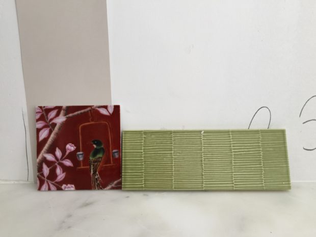
Green tile, red tile, paint swatch with marble kitchen counter
Not that these 3 things will ever be touching. But even so…

Blech. Then I thought about trying to match those warmer tones in the marble. A warm beige, kind of.

Oh, ugh. It kind of matches, but it’s KHAKI. I would jump out the window if I had to look at this color every morning

Please keep in mind that it takes about a week for each of these sample tiles to be made. I select the color from a 1″ square sample board in the tile showroom, and then the lovely, ever-patient Kelly from Aidan Design arranges to have a sample made. So it isn’t as though I can just put 20 different tiles down and evaluate.

Color aside, here’s what I like about this tile, which, incidentally, is from Pratt & Larson. I love the shape we chose, 2 x 8″. I also love the texture, which is appropriate opposite the fine details in the Chinoiserie panel.

So no to the green and green-y neutral-y tones. Then I thought about blues. Do I just take the cheap way out and use a color similar to the cabinets in the Butler’s Pantry?

Red tile and blue paint sample on a marble kitchen countertop
Chinoiserie sample with the Butler’s Pantry cabinetry sample, along with the wall color and counters
Blue paint swatches on marble kitchen counter
Blue paint swatches

I’m worried about that wall being dark, though. Too heavy?

Ultimately, the question is whether to balance this galley kitchen with strong color on both sides, or whether to let the red Chinoiserie panel shine and keep everything else super neutral.

Hence, the possibility of white textured 2 x 8″ Pratt & Larson tiles. Sigh.

OR.

I got this wild hair a month or so ago, and I don’t know if it’s a “so crazy it just might work” idea or a “just crazy” idea:

What about shiny brass on the sink wall?

Kitchen with white cabinets and brass backsplash
???
Painted red painting of birds, leaves, trees for kitchen backsplash
???

Tragically, I’m just going to have to wait until the darn Chinoiserie is here and installed before I can make a final decision about the sink wall backsplash. And then I’ll have to order it. Then wait for the tile/brass to arrive. Then schedule the installers. Then watch it being installed.

HGTV, are you listening? You’re not fooling us! We know that none of this happens overnight!

Gentle Readers, I hope it makes you feel better to know that professional designers agonize over the same decisions you do. There’s nothing more to do on the kitchen until the darn Chinese panels are here.

Luckily, I’m re-thinking our living room.

Bossy color | Annie Elliott interiors is based in Washington, D.C. We create outrageously beautiful homes, starting with color.

Category: Kitchen + bathTag: backsplash, blue cabinets, brass, chinoiserie, counters, countertops, HGTV, kitchen, kitchen renovation, marble, Pratt & Larson, red, subway tile, tile, white cabinets

Sidebar

Subscribe


Bossy Color Blog

Categories

  • Art + accessories »
  • Bedroom »
  • Color + paint color »
  • Dining room »
  • Furniture + upholstery »
  • Kids »
  • Kitchen + bath »
  • Lighting »
  • Living Room + Family Room »
  • Renovation »
  • Rugs »
  • Wallpaper »
  • Window treatments »

View Portfolio

view Bossy Color's portfolio

Instagram

annieelliottdesign

View Instagram post by annieelliottdesign

May 28

Open post by annieelliottdesign with ID 18102883841082172
For those of you lucky enough to have a beach house, now’s the time to start thinking about decorating beyond traditional “costal decor!” Step one? Consider a color palette other than blue and white ;) See my latest blog post for more! 🏖️ 🐚#beachhouseinteriors #interiordesign #eastcoast

annieelliottdesign

View Instagram post by annieelliottdesign

May 22

Open post by annieelliottdesign with ID 18125488516719287
I follow two rules when mixing patterns in the same space: vary the scale, and vary the subject.I was excited to share this and other insights on pattern splicing with @ericafinamore from @apartmenttherapy! #interiordesign #patternsplicing #patternmixing #designopinions #annieelliottdesign

annieelliottdesign

View Instagram post by annieelliottdesign

May 20

Open post by annieelliottdesign with ID 18082241465136951
It’s Wallpaper Wednesday! This week we’re featuring Deconstructed Stripe by Schumacher (in collaboration with Miles Redd).This pattern pays tribute to the legendary decorator Albert Hadley. Redd was inspired by Hadley’s contemporary, streamlined designs that played with scale and proportion. Deconstructed Stripe is impactful on its own but also looks INCREDIBLE next to other patterns.@schumacher1889 #designinspo #wallpaper #interiordesigner

annieelliottdesign

View Instagram post by annieelliottdesign

May 19

Open post by annieelliottdesign with ID 17926257288321853
HuffPost asked for my thoughts about the new White House ballroom. As you can imagine, I have many. I was so delighted to be included in this conversation! Thank you, @huffpost and @carsar91!#interiordesign #whitehouse #designopinions #annieelliottdesign

annieelliottdesign

View Instagram post by annieelliottdesign

May 13

Open post by annieelliottdesign with ID 18340156693174785
I was thrilled to attend Imar Lyman’s exhibition opening at the Kreeger recently! I’ve loved his work for years and am lucky enough to own one of his silkscreens (ours is of Frederick Douglass). He’s moved from portraiture to abstraction, but he still does some work in collage, which I confess is my favorite ;) The exhibition is up through July 11. Play hooky one afternoon and go.(The last painting is by Frank Stella, by the way — an influence on the artist, as you can see!)@imarhutchins @kreegermuseum

annieelliottdesign

View Instagram post by annieelliottdesign

May 11

Open post by annieelliottdesign with ID 18089647349356601
I’ve decided that spring cleaning is not enough this year. Spring MAKEOVERS are in store!Read my latest blog post to see before-and-after photos of some past and current projects. It’s heavy on pictures, light on commentary…the blog version of a beach read to give you a jump on summer 🏖️.

annieelliottdesign

View Instagram post by annieelliottdesign

May 8

Open post by annieelliottdesign with ID 18121007992638464
It was an honor to be a sponsor of the 87th annual Flower Mart at the National Cathedral! My  daughters have been trekking up to the Cathedral for this event since they were little - wonderful memories. This year, my favorite flower display was the Hong Kong Economic and Trade office; those peonies smelled UNBELIEVABLE! 🌺 🌼 🌷 🌻! Switzerland was a close second ;)

annieelliottdesign

View Instagram post by annieelliottdesign

May 6

Open post by annieelliottdesign with ID 17979927968845150
For today’s Wallpaper Wednesday, we discuss Hicks Grand by David Hicks.The British interior designer created the smaller-scale Hicks Hexagon in the 1960s and later scaled up the pattern to create Hicks Grand. The contemporary, geometric, honeycomb repeat adds intrigue and depth to any room. I have only used the smaller Hicks Hexagon (stairway picture), but I LOVE the scale of Hicks Grand. Fun fact: The Hicks Hexagon pattern was used on the rugs in the Overlook Hotel’ hallways in The Shining 😱#wallpaperinspo #interiorinspiration #hicksandgrand

annieelliottdesign

View Instagram post by annieelliottdesign

Apr 30

Open post by annieelliottdesign with ID 18088806227011860
Florals? For spring? Groundbreaking.But nothing says spring like flowers! 🌷 🌻 🌸 (And birds!)
Follow

Looking for something?

Don’t miss a single post


Where classic and modern hang out and drink gin.

  • Instagram
  • TikTok
  • Pinterest
  • Facebook
American Society of Interior Designers Firm Partner

© 2026 · Annie Elliott Design · privacy policy