
The news is out: Pantone’s color of the year for 2014 is 18-3224, Radiant Orchid.
UGH.

Now, you may be thinking, “Hold it right there, missy! Mere weeks ago you were telling us about your new-found acceptance of purple. Are you backpedaling? Are you now against it after being for it, or whatever?”

NO, Gentle Readers. NO. I am not backpedaling. Many shades of purple – including aubergine and lavender – have found their way into my portfolio, and subsequently my heart.
But Radiant Orchid? What IS it? Is it purple? Fuchsia? I think The Wall Street Journal might have it right in calling Radiant Orchid PINK. Their headline is, “Love It, Hate It, a New Pink Is Coming.”
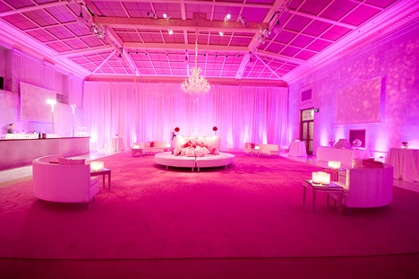
Radiant Orchid is just so…so IN YOUR FACE. (This from bossy color.) The more saturated it gets, the less I like it. There will be broad interpretations of this color in 2014 — there always are — but in it’s purest form, on Pantone’s swatch, I intensely dislike it.
I think Pantone often gets the Color of the Year right. Let’s do a quick bossy color blog review, shall we? I’ve been blogging since 2009 (holy cow), so in reverse date order:
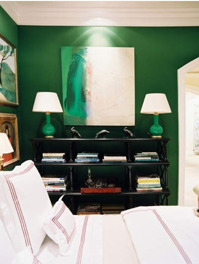
2013: Pantone’s 17-5641 Emerald Green. Fabulous.
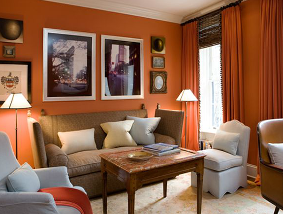
2012: Pantone’s 17-1463 Tangerine Tango. I thought this was stating the obvious – orange had been big for a year – but the color was great.
2011: Pantone’s 18-2120 Honeysuckle Pink. Festive! (This, btw, is NOT Radiant Orchid; it is pink with a dash of magenta in it. There’s a difference.)
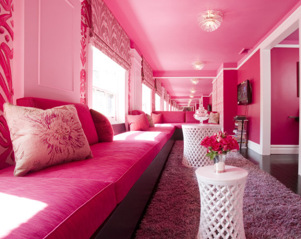

See?
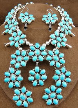
2010: Pantone’s 15-5519, Turquoise. I struggled with this one initially. But add a lot of white and call it “Robin’s Egg Blue,” and I grew fond of this color. After all, my office at that time was Benjamin Moore‘s 2052-70, Ice Blue, which, as many of you argued, was actually a super duper light turquoise.
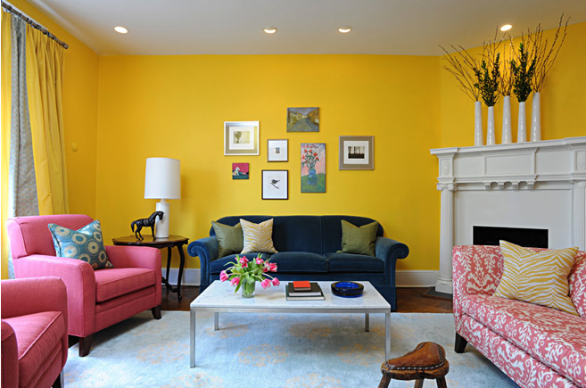
And finally, 2009: Pantone’s 14-0848, Mimosa: A delightful shade of yellow! Very close to the color of my living room!
I’ll be honest: the Bossettes are laughing at me right now. Katherine is reminding me that Emerald Green took some getting used to, and New Nola thinks it’s silly to get all worked up about a color. (She’ll learn :) )
You know what? OK.
Pantone: you’re on: I ACCEPT YOUR CHALLENGE. I am going to find a way to work with this color, even if it kills me (and it might). I am going to search high and low and CREATE A PINTEREST BOARD with purplish pinkish fuchsia-ish images that don’t make me sick to my stomach. Maybe it will help the thousands – nay, millions? – of you who are similarly struggling.
Together, we’ll get through this. Onward!

Quoted most recently in The Wall Street Journal and on Washingtonian.com, Annie Elliott is an expert in curated interiors, brilliant color palettes, and telling busy professionals what to do in the nicest way possible. For picture attributions, please click through to the links, and you’ll see them. Thanks.
