• Skip to main content
  • Skip to header left navigation
  • Skip to header right navigation
  • Skip to site footer
  • about
    • services
    • team
  • portfolio
  • press
Annie Elliott Design, Washington DC

Annie Elliott Design

Greater Washington DC

  • book
  • blog
  • contact

You have got to be kidding me. Pantone’s Color of the Year for 2026…

Annie Elliott | December 7, 2025

…is white. That’s correct Gentle Readers: Pantone’s daring selection for 2026’s color of the year is WHITE. Aka Cloud Dancer, 11-4201. Here it is:

I’m just kidding. Here it is:
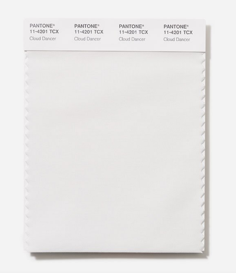
White Pantone fabric swatch

According to Pantone, Cloud Dancer is “a billowy white imbued with a feeling of serenity.”

Imbued with? It’s so serene I’m dead.

Person in white jumping against a blue sky with clouds
Pantone announcement or GAP ad? Laundry detergent ad? Person ascending into heaven?

The selection of WHITE — let’s call it what it is — is perhaps the biggest cop-out in Pantone’s history. 2025’s Color of the Year was the soothing Mocha Mousse, which, surprisingly, I did not hate. (Compared with Cloud Dancer, it was downright eye searing.)
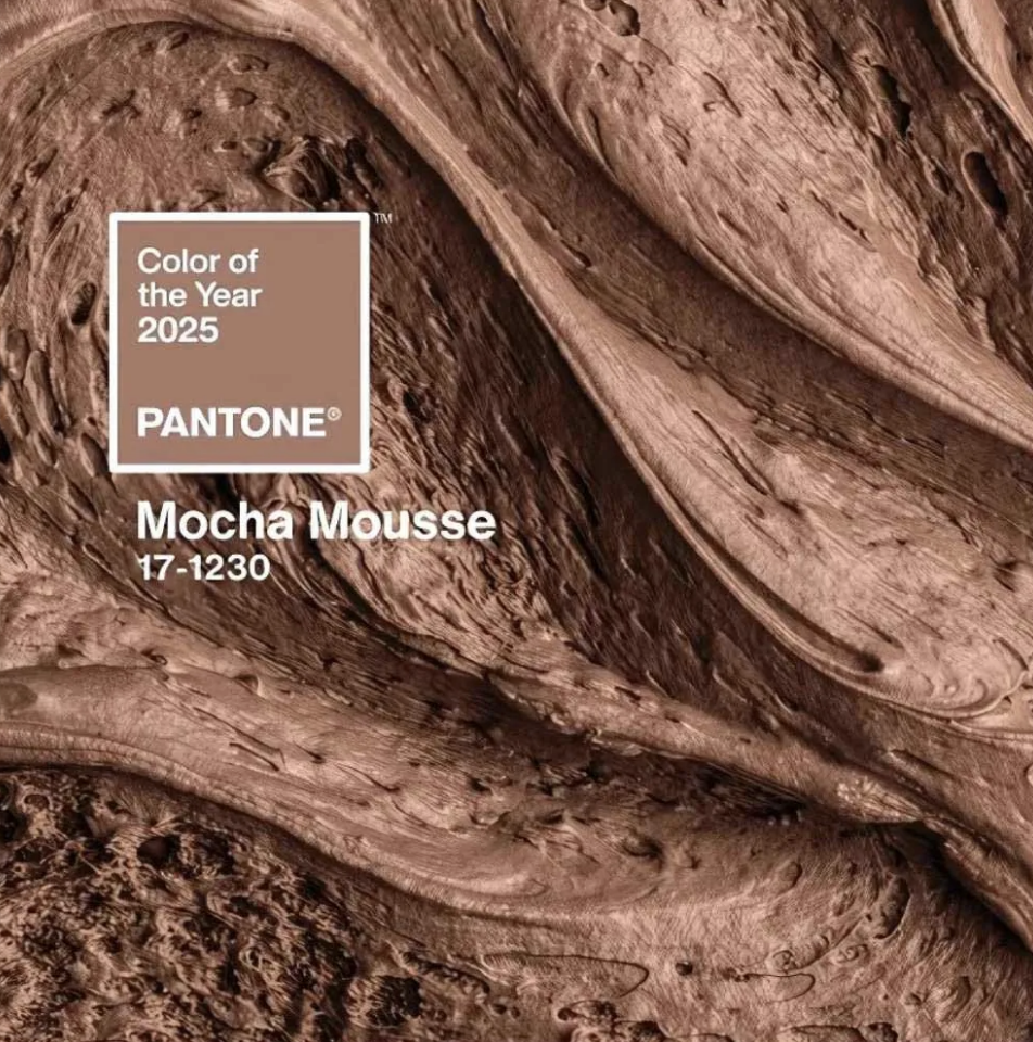
Pantone's 2025 color of the year Mocha Mousse

I’ve been tolerant of some other years’ colors, also. I found a way to cope with 2022’s Very Peri, for example. And in 2021, I didn’t completely hate Pantone’s *two* colors, a yellow and a gray — even though my daughter Ruthie thought that using a neutral was cheating.

You know what’s interesting? Pantone doesn’t try to pretend that Cloud Dancer is any color but pure white. They don’t mention any undertones. They don’t say it’s a cool white or a warm white, a bluish, grayish, or yellowish white.

They’re sticking to non-visual descriptors such as, “lofty white,” “ethereal white,” “discrete white hue,” “airy white.”

They are ALL IN on white.

White bedroom at the end of a white hallway
Photo by Michael K. Wilkinson

Here’s why Cloud Dancer doesn’t work as a Color of the Year. You can’t have a default thing be the special thing. Does that make sense? It’s too much pressure! White was never meant to be the star of the show!

Regarding its use in interiors specifically, Pantone explains:

With its expansive presence…Cloud Dancer invites a space where function and feeling intertwine to build atmospheres of serenity and spaciousness, providing a refuge of visual cleanliness that inspires well-being and lightness, whether introduced in furniture or furnishings throughout the home.

Let’s not talk about how poorly written that is.

Is Pantone predicting — or advocating for? — white on white interiors? You know what I think of when I think of white on white on white?
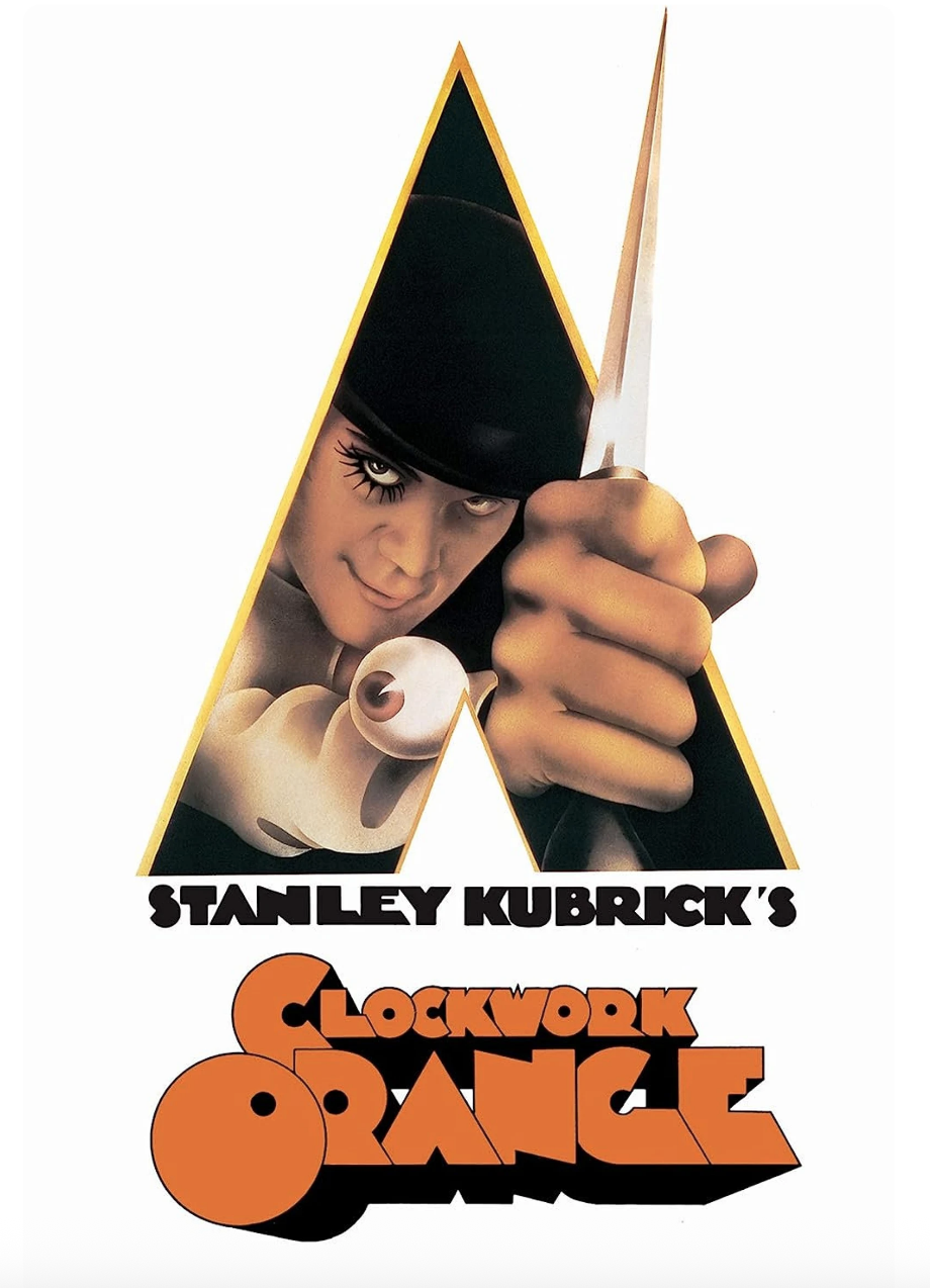
Poster for Stanley Kubrick's movie, Clockwork Orange

Or

White operating room

You’re not trying something new if you paint a room white. You’re not taking a risk. It’s the OTHER stuff you do in a white room that makes the space interesting.
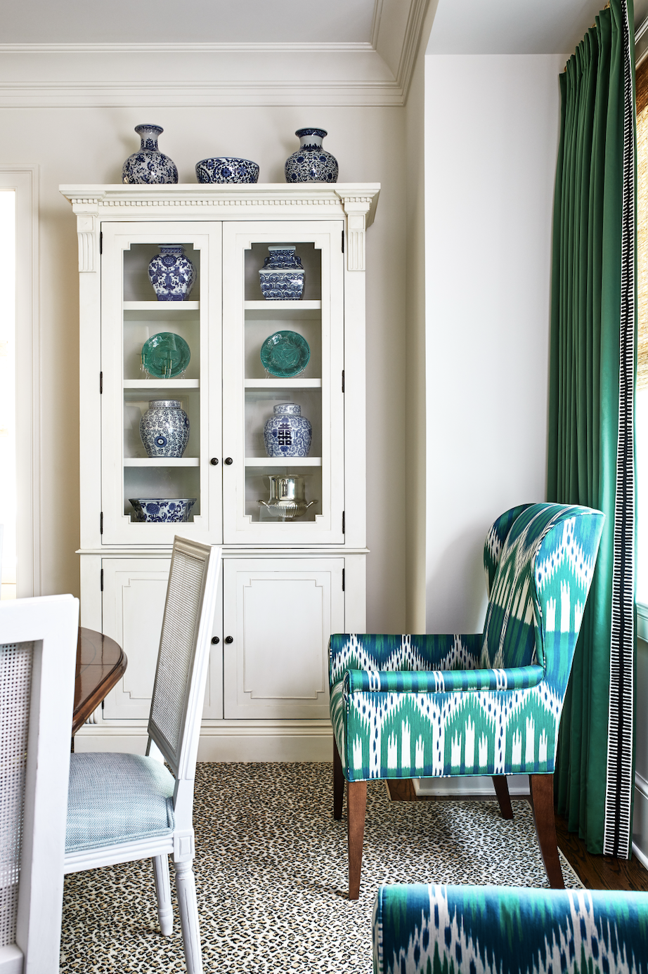
Dining room with white cabinet and chairs and green drapes and host chair
Photo by Stacy Zarin Goldberg

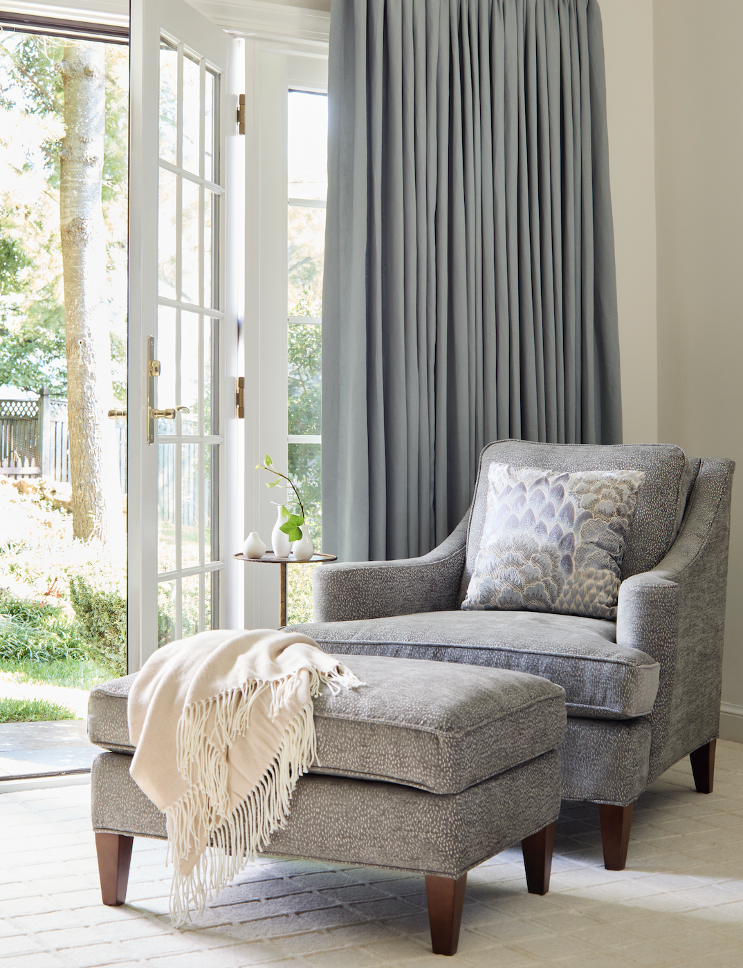
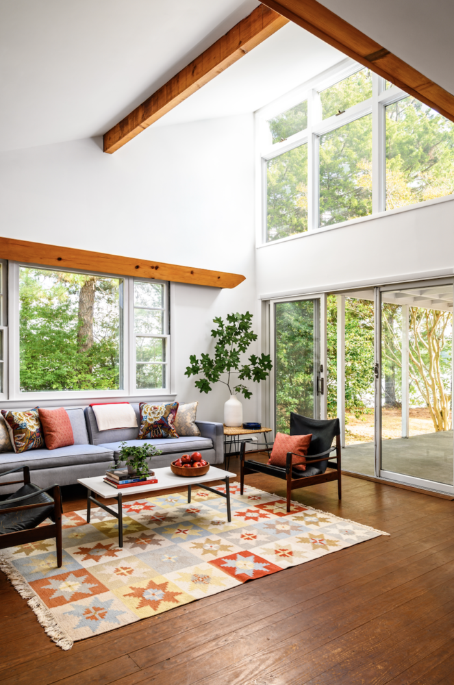
You can create a room that embodies all of the buzzwords above — serenity, refuge, cleanliness, lightness, the ubiquitous “well-being” — by pairing white with anything else. The green above, say, or, light blue.
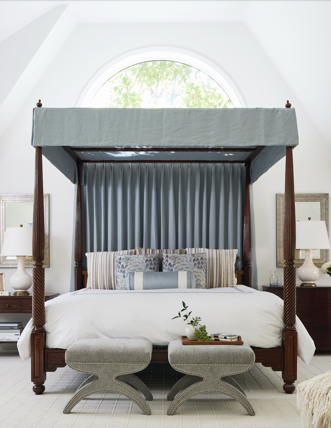
Bedroom with white walls and light blue canopy bed
Photo by Kip Dawkins
Double height white room with light blue sofa
Photo by Markus Wilborn
Light blue chair against white walls
Photo by Kip Dawkins
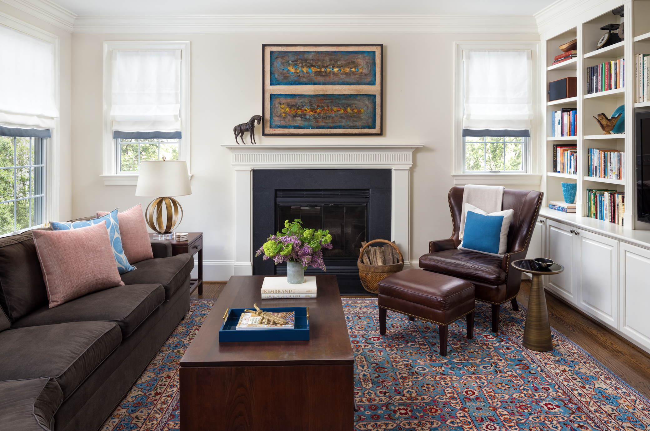
Family room with white walls and blue patterned rug
Photo by Jenn Verrier

Right? White needs a friend or it’s too sterile. Or frightening.

A quick note about Cloud Dancer-branded items, because it’s hilarious that they exist. Be on the lookout for notebooks:
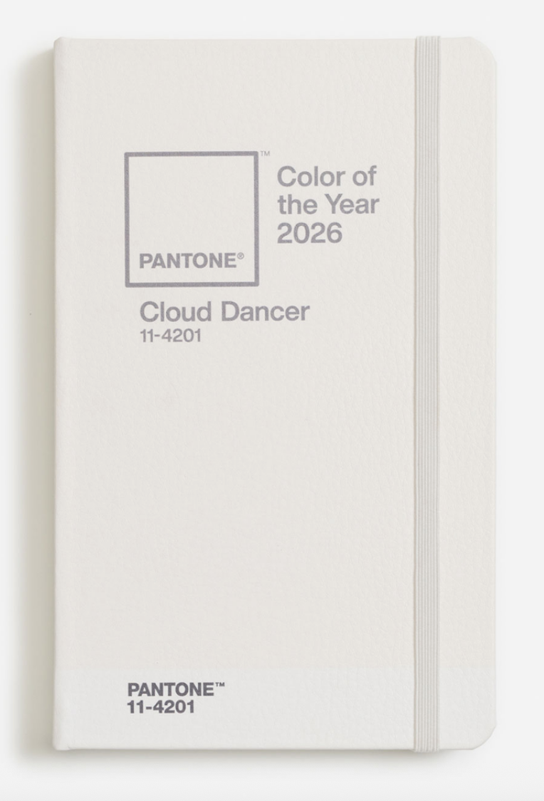
White notebook cover
fNotebook

(I’m going to write in Cloud Dancer ink):
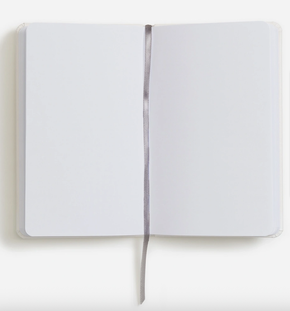
Notebook open to blank pages

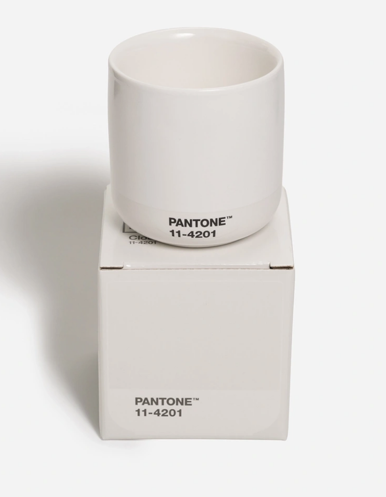
Cortado mugs:

White coffee mug

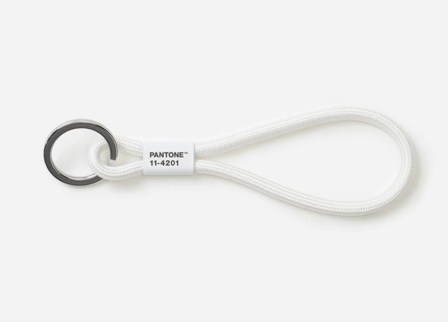
And keychains.

White key lanyard
How long before this thing is disgustingly dirty?

Here’s an upside! Think of all of the Cloud Dancer items you already own! Bedsheets! Ceilings! Pieces of paper! Tile! Redi-whip!
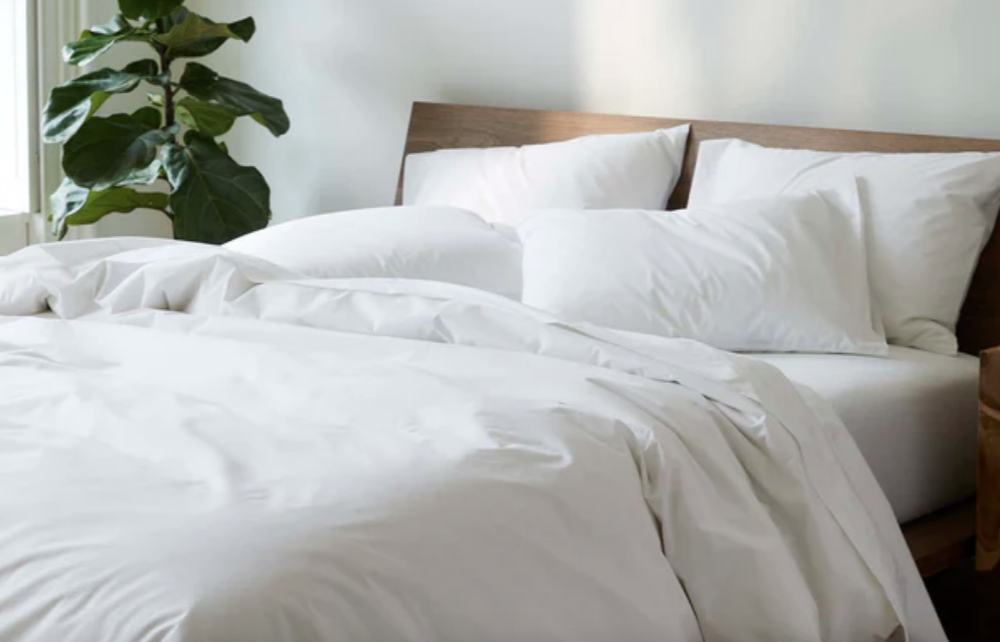
White sheets on a bed
Brooklinen

You’re cutting edge and you didn’t even know it ;)

You know what, Gentle Readers? In the time it took me to write this post, I went from angry to sad. You failed me, Pantone. Cloud Dancer doesn’t give me hope or serenity; it makes me feel adrift and resigned.

What color is the flag of surrender?

Cloud Dancer.

My book, My Neighbor Saw Me Naked, and Other Reasons You Need Drapes: The Essential Decorating Handbook, is the ideal gift! It’s a great bottle-of-wine alternative for parties; a lovely gift for fellow decorating enthusiasts; and, of course, a thoughtful present for anyone who is moving, has recently moved, is thinking about moving, or should move.

Annie Elliott Design is booking projects for spring 2026. Please be in touch to discuss.

Category: Color + paint colorTag: Cloud Dancer, color of the year, paint color trends, Pantone, trend

Sidebar

Subscribe


Bossy Color Blog

Categories

  • Art + accessories »
  • Bedroom »
  • Color + paint color »
  • Dining room »
  • Furniture + upholstery »
  • Kids »
  • Kitchen + bath »
  • Lighting »
  • Living Room + Family Room »
  • Renovation »
  • Rugs »
  • Wallpaper »
  • Window treatments »

View Portfolio

view Bossy Color's portfolio

Instagram

annieelliottdesign

View Instagram post by annieelliottdesign

May 22

Open post by annieelliottdesign with ID 18125488516719287
I follow two rules when mixing patterns in the same space: vary the scale, and vary the subject.I was excited to share this and other insights on pattern splicing with @ericafinamore from @apartmenttherapy! #interiordesign #patternsplicing #patternmixing #designopinions #annieelliottdesign

annieelliottdesign

View Instagram post by annieelliottdesign

May 20

Open post by annieelliottdesign with ID 18082241465136951
It’s Wallpaper Wednesday! This week we’re featuring Deconstructed Stripe by Schumacher (in collaboration with Miles Redd).This pattern pays tribute to the legendary decorator Albert Hadley. Redd was inspired by Hadley’s contemporary, streamlined designs that played with scale and proportion. Deconstructed Stripe is impactful on its own but also looks INCREDIBLE next to other patterns.@schumacher1889 #designinspo #wallpaper #interiordesigner

annieelliottdesign

View Instagram post by annieelliottdesign

May 19

Open post by annieelliottdesign with ID 17926257288321853
HuffPost asked for my thoughts about the new White House ballroom. As you can imagine, I have many. I was so delighted to be included in this conversation! Thank you, @huffpost and @carsar91!#interiordesign #whitehouse #designopinions #annieelliottdesign

annieelliottdesign

View Instagram post by annieelliottdesign

May 13

Open post by annieelliottdesign with ID 18340156693174785
I was thrilled to attend Imar Lyman’s exhibition opening at the Kreeger recently! I’ve loved his work for years and am lucky enough to own one of his silkscreens (ours is of Frederick Douglass). He’s moved from portraiture to abstraction, but he still does some work in collage, which I confess is my favorite ;) The exhibition is up through July 11. Play hooky one afternoon and go.(The last painting is by Frank Stella, by the way — an influence on the artist, as you can see!)@imarhutchins @kreegermuseum

annieelliottdesign

View Instagram post by annieelliottdesign

May 11

Open post by annieelliottdesign with ID 18089647349356601
I’ve decided that spring cleaning is not enough this year. Spring MAKEOVERS are in store!Read my latest blog post to see before-and-after photos of some past and current projects. It’s heavy on pictures, light on commentary…the blog version of a beach read to give you a jump on summer 🏖️.

annieelliottdesign

View Instagram post by annieelliottdesign

May 8

Open post by annieelliottdesign with ID 18121007992638464
It was an honor to be a sponsor of the 87th annual Flower Mart at the National Cathedral! My  daughters have been trekking up to the Cathedral for this event since they were little - wonderful memories. This year, my favorite flower display was the Hong Kong Economic and Trade office; those peonies smelled UNBELIEVABLE! 🌺 🌼 🌷 🌻! Switzerland was a close second ;)

annieelliottdesign

View Instagram post by annieelliottdesign

May 6

Open post by annieelliottdesign with ID 17979927968845150
For today’s Wallpaper Wednesday, we discuss Hicks Grand by David Hicks.The British interior designer created the smaller-scale Hicks Hexagon in the 1960s and later scaled up the pattern to create Hicks Grand. The contemporary, geometric, honeycomb repeat adds intrigue and depth to any room. I have only used the smaller Hicks Hexagon (stairway picture), but I LOVE the scale of Hicks Grand. Fun fact: The Hicks Hexagon pattern was used on the rugs in the Overlook Hotel’ hallways in The Shining 😱#wallpaperinspo #interiorinspiration #hicksandgrand

annieelliottdesign

View Instagram post by annieelliottdesign

Apr 30

Open post by annieelliottdesign with ID 18088806227011860
Florals? For spring? Groundbreaking.But nothing says spring like flowers! 🌷 🌻 🌸 (And birds!)

annieelliottdesign

View Instagram post by annieelliottdesign

Apr 28

Open post by annieelliottdesign with ID 17870996082665526
Your house should reflect *you*. My recent visits to Eudora Welty’s house and the Mississippi Museum of Art reminded me of that. If the wallpaper you put up makes you happy, it’s a success! If you need help figuring out how to translate your personality and lifestyle into your home’s function and appearance, I’m here 😉.Read my new blog post for more!
Follow

Looking for something?

Don’t miss a single post


Where classic and modern hang out and drink gin.

  • Instagram
  • TikTok
  • Pinterest
  • Facebook
American Society of Interior Designers Firm Partner

© 2026 · Annie Elliott Design · privacy policy