• Skip to main content
  • Skip to header left navigation
  • Skip to header right navigation
  • Skip to site footer
  • about
    • services
    • team
  • portfolio
  • press
Annie Elliott Design, Washington DC

Annie Elliott Design

Greater Washington DC

  • book
  • blog
  • contact

You asked…about a safari bedroom, Part 1

Annie Elliott | July 5, 2010

I just found your blog through Young House Love…and I just swoon!! I’m a huge color fan and have always been into Interior Design… picture of blue kitchen gold mustard living room paint
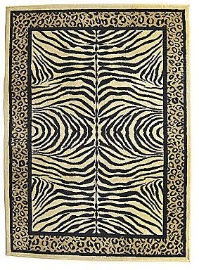
We were thinking of a deep orange. We are going for a mildly themed safari/African vibe. I attached pics of our rug and pillows.

My question has to do with our new home. We are moving in a few weeks and while we had the builder paint the kitchen and living room, we are going to do the bedroom ourselves.

black and cream zebra pattern zebra print area rugI am thinking creme colored bedding. We aren’t 100% sure on the orange….all of a sudden it seems overwhelming to me! Any help would be appreciated!
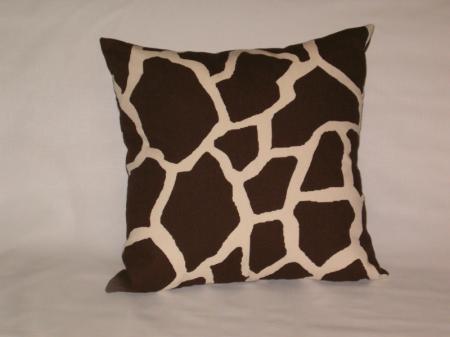
brown and cream giraffe pattern giraffe print pillow
Dear Gentle Reader,

Of all the adventures possible in one’s bedroom, I had no idea that going on safari was one of them. Thank you for expanding bossy color’s horizons.

I agree that orange might not be the best choice for the wall color, but I’m having a hard time articulating why. Too expected? Too African sunset-y? Too bold for a bedroom?

If “safari” is what you’re after, let’s make it a grown-up interpretation. Remember when Banana Republic stores were travel-themed, complete with jungle vines, vintage luggage with stickers on them, binoculars, jeeps…

pages from vintage Banana Republic catalog safari-themed
This is NOT an appropriate look for your bedroom.

Instead, let’s think about…

  • Neutral, earthy wall color
  • Your zebra rug
  • Natural woven shades on the windows
  • Shots of color – green or orange
  • And a bonus suggestion if you just can’t stay away from the whole safari thing.

WALL COLORbedroom with brown walls and green wood dresserHow do you feel about dark brown? Dark brown walls with cream trim and bedding – and your zebra rug – would be stunning. You may recall that Benjamin Moore’s HC-67 Clinton Brown is a “best of bossy’s colors” color.

Green accents, as in the picture at right, add spunk to a brown bedroom.

Or you could bring in your orange through bedding and accessories.

bedroom with brown walls, white shelves, orange boxes, orange bedding
The other wall color I recommend is a taupe, or tan – a safari-reminiscent khaki, if you will. Something that works with that gold-y wall color shown in the picture you sent.

bedroom with tan walls, grey upholstered headboard, Madeleine Weinrib rug
Benjamin Moore HC-90 Crown Point SandTake a look at Benjamin Moore’s HC-90 Crown Point Sand or the appropriately named OC-8 Elephant Tusk, which is lighter. Both have yellow undertones.

I’ll let this sink in. Tune in tomorrow for windows, accent recommendations and the bonus suggestion!

Vintage Banana Republic catalog pages from the blog Street Etiquette. Brown bedroom with green dresser picture is from Zimbio. Bedroom with orange quilt is from xJavierx’s Flickr photostream, as is the taupe bedroom.Annie Elliott – aka bossy color – is an interior decorator and design blogger in Washington, D.C. She has been quoted in publications from The Washington Post to The Seattle Times and is considered an expert on color, residential space planning, and telling people what to do in the nicest way possible.

Category: Bedroom, Color + paint colorTag: Bedding, bedroom, bedroom makeover, Benjamin Moore, color, HC-67 Clinton Brown, HC-90 Crown Point Sand, OC-8 Elephant Tusk, paint, safari-themed bedroom

Sidebar

Subscribe


Bossy Color Blog

Categories

  • Art + accessories »
  • Bedroom »
  • Color + paint color »
  • Dining room »
  • Furniture + upholstery »
  • Kids »
  • Kitchen + bath »
  • Lighting »
  • Living Room + Family Room »
  • Renovation »
  • Rugs »
  • Wallpaper »
  • Window treatments »

View Portfolio

view Bossy Color's portfolio

Instagram

annieelliottdesign

View Instagram post by annieelliottdesign

Jun 23

Open post by annieelliottdesign with ID 18095254961251333
Having sworn I never would wield a paintbrush again, I recently found myself helping my daughter paint her first apartment. Thus a tutorial about paint sheens for her, thus a recap for you!My latest blog post explains the differences between paint sheens and tells you what goes where ;)Link in bio to read. #interiordesigner #paintinspo #apartmenrdecor

annieelliottdesign

View Instagram post by annieelliottdesign

Jun 22

Open post by annieelliottdesign with ID 18011049497869192
There’s no other word for it: Sheila Bridges’ pattern Harlem Toile De Jouy has become an American icon. Iconic and ironic: the pattern conflates her experiences as a Black woman living in Harlem with pastoral motifs from 1700s French toile. Delightful and lighthearted at first glance, the pattern gives you plenty to think about. Bridges created Harlem Toile as a wallpaper but later expanded the collection to include fabric, bedding, plates, glassware, umbrellas, and clothing. I strongly recommend getting a piece of this pattern any way you can. @harlemtoilegirl#interiordesign #harlemtoile #patterninspo

annieelliottdesign

View Instagram post by annieelliottdesign

Jun 17

Open post by annieelliottdesign with ID 18106157639319026
“Much of the wallpaper [in the Victorian era]—fabric, too—was made with arsenic,’ explains Elliott. ‘There are worse ways to go, I suppose.’”I loved speaking with @allisonpduncan @vogueliving about the art of using two wallpapers in one room. Happy Wallpaper Wednesday!#interiordesign #wallpaper #vogueliving #designopinions #annieelliottdesignSlide 1 📸  by Stacy Zarin Goldberg, Design by Annie ElliottSlide 2 📸 by Leslee Mitchell, Design by Kim ScodroSlide 3 📸 by Donna Dotan, Design by Ariel OkinSlide 4 📸 by Gordon Gregory, Design by Jenny Holladay

annieelliottdesign

View Instagram post by annieelliottdesign

Jun 13

Open post by annieelliottdesign with ID 17913412296404982
Pink, light yellow, and gold-y tan combine to create a soft, unexpected color palette. The quiet colors are sophisticated together, and the palette will age beautifully as this tween moves through high school and college. (Her parents won’t even have to redecorate if it becomes a guest bedroom someday! But one step at a time…)#homedesign #paintinspo #bedroomdesign

annieelliottdesign

View Instagram post by annieelliottdesign

Jun 10

Open post by annieelliottdesign with ID 17929516656341682
Deep down, I believe that a house isn’t a home without wallpaper 😊 My latest blog post identifies five unexpected places you can use wallpaper — and some are small! Wallpapering the space behind your island stools could be your gateway to my favorite home furnishing. If you have other creative spots for wallpaper, I’d love to hear about them!#wallpaperinspo #interiordesign #wallpaper

annieelliottdesign

View Instagram post by annieelliottdesign

Jun 9

Open post by annieelliottdesign with ID 18112589929761575
Welcome to my new before-and-after series! 🥰 I take you through my thinking as I design a space — my “process,” as it were. Pretty pictures are involved too, of course. I hope you enjoy it!This was a super fun project: a historic townhouse with the challenge of a loooong shoebox-shaped front room. You know the kind. Here’s how we made this color-and-pattern-loving client’s challenging space amazing. Like this series? Please let me know! #interiordesigner #windowtreatments #wallpaper

annieelliottdesign

View Instagram post by annieelliottdesign

Jun 5

Open post by annieelliottdesign with ID 18087273683080656
Don’t let your porch be a throwaway space! Make it a room. Get a high quality indoor/outdoor rug. Make sure your furniture is COMFY. Find a cordless lamp (they’re everywhere now!). Hang art! You can even add a vintage console table or cabinet if you’re ok with it weathering over time 🕰️. #interiordesign #porchdesign

annieelliottdesign

View Instagram post by annieelliottdesign

Jun 3

Open post by annieelliottdesign with ID 18314336014263171
It’s Wallpaper Wednesday! This week we feature Paper Trail by Lewis and Wood. Lewis and Wood launched Paper Trail in the fall of 2025 as one of four patterns in their History Papers Collection. Paper Trail was inspired by ancient rock carvings - 600–2,000 years old! - from various sites in America. It was named after the site Newspaper Rock, Utah.You know I love anything with an animal :) But there are 2 genres, right? Juvenile and…let’s call it *versatile*. To me, Paper Trail falls into the latter category, featuring deer, horses, buffalo, and foxes on a background that resembles the texture of rocks. It’s primitive, not cartoonish. I could see using this in a small bedroom; a breakfast nook (why? Can’t tell you, it’s just a feeling); or a hallway, because the pattern isn’t overwhelming.#wallpaperinspo #interiordesign #homedesign

annieelliottdesign

View Instagram post by annieelliottdesign

May 28

Open post by annieelliottdesign with ID 18102883841082172
For those of you lucky enough to have a beach house, now’s the time to start thinking about decorating beyond traditional “costal decor!” Step one? Consider a color palette other than blue and white ;) See my latest blog post for more! 🏖️ 🐚#beachhouseinteriors #interiordesign #eastcoast
Follow

Looking for something?

Don’t miss a single post


Where classic and modern hang out and drink gin.

  • Instagram
  • TikTok
  • Pinterest
  • Facebook
American Society of Interior Designers Firm Partner

© 2026 · Annie Elliott Design · privacy policy