• Skip to main content
  • Skip to header left navigation
  • Skip to header right navigation
  • Skip to site footer
  • about
    • services
    • team
  • portfolio
  • press
Annie Elliott Design, Washington DC

Annie Elliott Design

Greater Washington DC

  • book
  • blog
  • contact

Tips for choosing paint colors in This Old House Magazine

Annie Elliott | September 27, 2020

“Read This Before You Pick a Paint Color,” reads the title of Kathryn O’Shea Evans’ excellent article in the September/October issue of This Old House Magazine. Putting aside the fact that I participated, (thank you, Kathryn and This Old House!), the article is chock full of helpful tips.
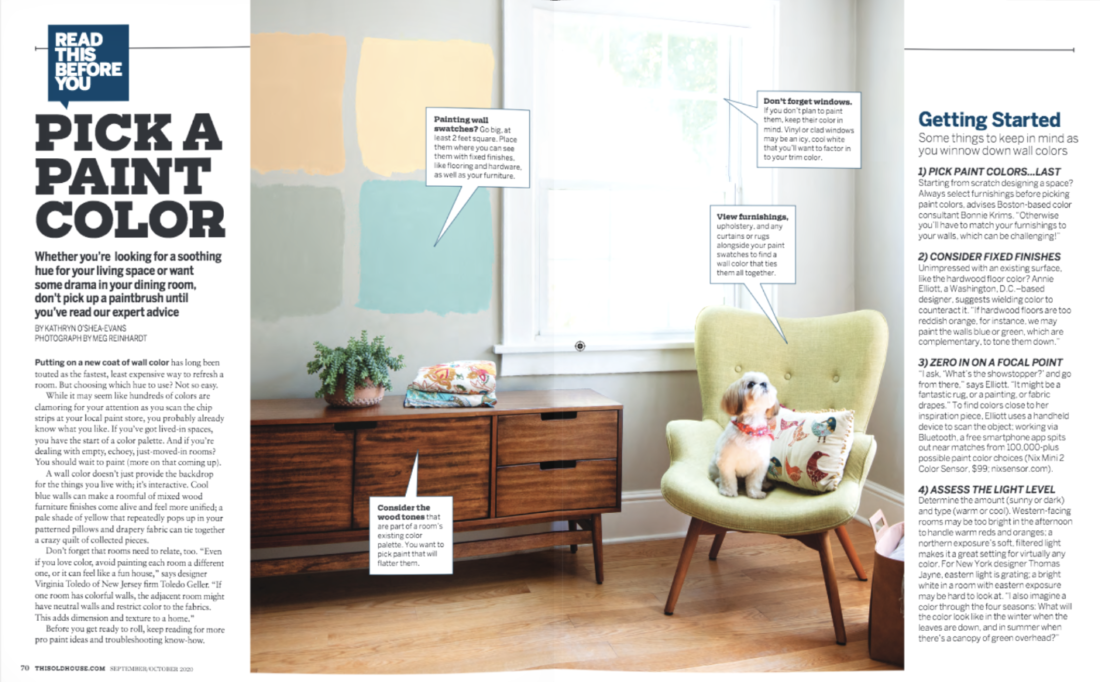
As you know, Gentle Readers, painting a room is the cheapest, easiest, most instant-gratification-est of home improvement projects.

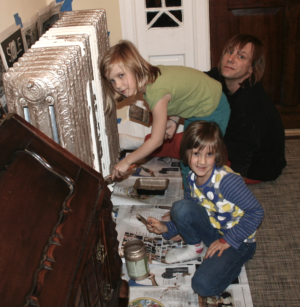
Me painting my former office in 2009 (!)
Even painting a radiator can make a difference! My brother James, Georgie, and Ruthie, circa 2011. Georgie gives me that look a lot now that she’s 16 ;)

You probably already know my favorite tips for selecting paint colors. The one I repeat most often is to choose the paint color last, after you know what else is happening in the room. The other is to paint a sample on posterboard (leaving some white around the edges) and move it around the room so you can see it on different walls at different times of day. It’s not as effective as painting a huge area of the wall white and then putting the paint on that, but it sure is easier.

But here are some tips for choosing a paint color that you may not have known:

  • Paint finish affects how dark or light a color appears. Paint in a matte finish appears darker than the same color in a glossy, high sheen finish.
Can you see how the satin finish makes the blue shelves look a tad lighter than the matte blue on the walls? It’s subtle, but it’s there
  • Contrast, not a dark wall color, makes a room appear smaller. More contrast between colors = a smaller-looking room. If you want to enlarge a room, use all dark colors or all light colors. (That’s from Bonnie Krims, a color consultant in Boston. Good one, right?)
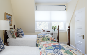
Ahhh. Note to self: use more yellow
  • Use warm or cool tones throughout your house for a cohesive flow. Choose, then be consistent. 
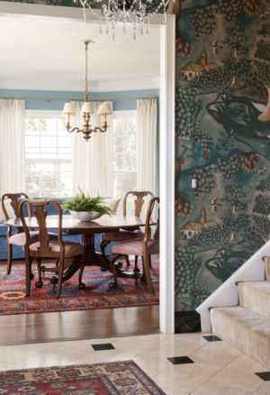
https://annieelliottdesign.com/bethesda-traditional/
Warm tones: limestone floor and rich green wallpaper (by Zoffany) in the foyer, red and orange rugs everywhere, and a WARM blue – Robin’s egg – in the adjacent dining room

For tips specifically about trim colors, take a look at this blog post: 7 Sanity-Restoring Rules About Trim Color, first written in 2011, and last updated in 2016. It’s my most-read blog post OF ALL TIME. Even today. Isn’t that nuts? At least we know the information has held up!

The pandemic continues…it’s time to paint. Now you’re armed.

Thank you to all who attended the ASPIRE House! It was so fun to meet you. Thanks also to you, Gentle Readers, for sticking with me on my show house “journey” (said ironically, if the quotation marks aren’t enough). It was quite an experience.

Annie Elliott Design is based in Washington, DC, and we travel for fun projects. Annie’s design work and insights have appeared in numerous local and national publications, including HGTV Magazine, The Wall Street Journal, The New York Times, The Washington Post, and Washingtonian Magazine. 

Category: Color + paint colorTag: color, paint color, paint color tips, This Old House

Sidebar

Subscribe


Bossy Color Blog

Categories

  • Art + accessories »
  • Bedroom »
  • Color + paint color »
  • Dining room »
  • Furniture + upholstery »
  • Kids »
  • Kitchen + bath »
  • Lighting »
  • Living Room + Family Room »
  • Renovation »
  • Rugs »
  • Wallpaper »
  • Window treatments »

View Portfolio

view Bossy Color's portfolio

Instagram

annieelliottdesign

View Instagram post by annieelliottdesign

Sep 28

Open post by annieelliottdesign with ID 18630011602021777
Happy Fall! Ironic, isn’t it, that fall weather is cool, but the colors we associate with the season are warm? The earthy orange grasscloth in this foyer is undeniably “fall” to me. Add deep, warm versions of green and blue, et voilà: a cozy, inviting, autumnal space.

annieelliottdesign

View Instagram post by annieelliottdesign

Sep 23

Open post by annieelliottdesign with ID 17881497900529047
For this week’s Wallpaper Wednesday we go into the Woods… Woods is a great example of Cole & Son’s innovation in serigraphy, a traditional method of screen printing. The pattern is available on fabric and wallpaper in a variety of soothing yet elegant colorways. Due (I’m sure) to the booming success of the original, there are now some whimsical variations on Woods: Cole & Son added metallic stars to some colorways and pears to others. As you may imagine, however, this traditionalist prefers the original 🙂For some reason, Woods is especially popular for nurseries. Maybe those babies really wanted out of their cribs. 👶🏼In 2005, Woods deservedly won the ELLE Decoration International Design Award for Wallcovering of the Year. And it’s still going strong.

annieelliottdesign

View Instagram post by annieelliottdesign

Sep 22

Open post by annieelliottdesign with ID 17934708156387896
“Isn’t ‘modern farmhouse’ over yet?” I loved speaking with @authordinacheney @washingtonpost about the worst interior design trends! Turns out I’m not the only designer with strong opinions 😊@vincentewolfdesigns @kimletgordon @maxsinsteden #interiordesign #washingtonpost #designopinions #annieelliottdesign

annieelliottdesign

View Instagram post by annieelliottdesign

Sep 18

Open post by annieelliottdesign with ID 17989063023104856
Best part of being an interior designer is using your own home as a playground for creative ideas! We changed the paint in our living room again and here’s how it looks now! #interiordesign

annieelliottdesign

View Instagram post by annieelliottdesign

Sep 17

Open post by annieelliottdesign with ID 18125330714481993
When you become an empty nester, when is it ok to reclaim your adult child’s space? Check out my latest blog post for my recommendations on how to approach empty nesting!📸 @stacyzaringoldberg📸 @kipdawkinsphoto📸 Michael Wilkinson📸 @angieseckinger

annieelliottdesign

View Instagram post by annieelliottdesign

Sep 10

Open post by annieelliottdesign with ID 17906571285498443
Pink, green, and a splash of dark orange come together to create this sunny, summery bedroom 🪷

annieelliottdesign

View Instagram post by annieelliottdesign

Sep 9

Open post by annieelliottdesign with ID 18104009318233584
It’s Wallpaper Wednesday! This week, feast your eyes on @timorous_beasties Fruit Looters. TB claims that William Morris’s Strawberry Thief pattern inspired Fruit Looters, but only the name indicates the connection: Strawberry Thief, Fruit Looters…get it? Whereas Morris’s iconic pattern is medium-scale, rhythmic, 2-D, cartoon-like, and muted, Fruit Looters is the opposite in every way but subject matter. The scale is huge, with the foliage “stripes” providing a geometric order, and it oozes TB’s trademark edginess. The crisp pattern is finely drawn; pull it apart, and each element — a flower, a bird — could be in an English botanical print. Fruit Looters comes in vivid, saturated colorways, some with a metallic sheen, and dramatic black is present in all.Recently, a client (who originally introduced me to Timorous Beasties!) and I used Fruit Looters wallpaper in her stairwell, in the Alabaster colorway. The drama. Oh, the drama!

annieelliottdesign

View Instagram post by annieelliottdesign

Aug 27

Open post by annieelliottdesign with ID 18339370936281789
SO much fun to create this entertainment space! This client already had a living room and kitchen…this space is for friends and family to relax, talk, and just BE. What’s your favorite feature?

annieelliottdesign

View Instagram post by annieelliottdesign

Aug 26

Open post by annieelliottdesign with ID 18618812233051872
Happy Wallpaper Wednesday! There’s no better paper to feature in August than Schumacher’s Citrus Garden 🍋 🍊.The Swedish designer, artist, and architect Josef Frank created the Citrus Garden pattern as a fabric in 1947. The hand-drawn, whimsical, quintessentially mid-century, irresistibly cheerful design exemplifies Frank’s philosophy: “The freer the pattern, the better.” I’ve used Citrus Garden fabric a few times, but shockingly, the pattern wasn’t on wallpaper until 2017!! 🤯 Deprived for so long!! As soon as the opportunity arises, I’m running, not walking, to get my hands on this wallpaper.@schumacher_midatlantic 📸 @angieseckinger
Follow

Looking for something?

Don’t miss a single post


Where classic and modern hang out and drink gin.

  • Instagram
  • TikTok
  • Pinterest
  • Facebook
American Society of Interior Designers Firm Partner

© 2026 · Annie Elliott Design · privacy policy