• Skip to main content
  • Skip to header left navigation
  • Skip to header right navigation
  • Skip to site footer
  • about
    • services
    • team
  • portfolio
  • press
Annie Elliott Design, Washington DC

Annie Elliott Design

Greater Washington DC

  • book
  • blog
  • contact

Our 5 favorite interior design moments of 2018

Annie Elliott | January 3, 2019

We were thrilled to work on so many amazing projects in 2018 — and with such fantastic clients! (Seriously: we can’t overstate the importance of that.) But there are a few things we’re especially proud of. Here are 5 decorating highlights from Annie Elliott | bossy color in 2018.

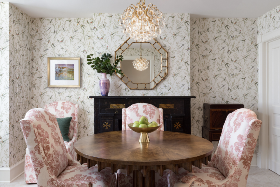
1. The dramatic dining room transformation. You remember this one — you can see more before ‘n after pictures in this blog post. We had been considering a blushy wall color, but when Amy and I saw this wallpaper, we knew that was the way to go. Luckily, the clients agreed.

dining room, red walls, tablecloth, fireplace
Before: sad
Dining room, wallpaper, chandelier, mirror
After: deliriously happy! The wallpaper is Augustine by Thibaut

2. Cheetah carpeting. And not in a swinging ’70’s bachelor pad. It’s a gorgeous, classic family home with lovely clients. As my colleagues always say: “Animal prints are a neutral!” You be the judge.

cheetah carpeting with wall mural and white chair
Cheetah carpeting with Schumacher wallpaper
dining room, white dining chairs, chandelier, sideboard, green drapes
We obviously haven’t had this professionally photographed yet!

3. The twofer: wallpaper with TWO zingy trim colors. How bold is this client, please? The egg-yolk yellow paneling goes down the stairs, and wallpaper with light blue trim waits at the bottom. Ah. Mazing.

Stairwell with yellow wall, wallpaper sample, light blue trim
Will it work?
GP & J Baker Nympheus wallpaper
Why, yes it will!
Stairway, yellow paneling, light blue wood trim
GP & J Baker Nympheus wallpaper

4. Complementing — not competing with — a client’s fabulous art collection. We feel so lucky when clients collect interesting art. The trick is to show it off while not going totally neutral on the furnishings. (I mean, that’s ONE approach; it’s just not OUR approach.) We were really excited about how this residence turned out.

Living Room, Family Room, large painting, purple sofa
The painting is by abstract artist Karen Silve
Living room with large-scale artwork
The three paintings on the long wall are by Carol Barsha, and the blue painting on the left is by L.A. artist Chris Trueman

5. Standing up to neutral with DARK BLUE WALLS! There was nothing wrong with this living room, but the clients didn’t feel that it reflected them. (And it’s true: this family is so much more fun and interesting than the “before” picture would have you believe.) We did want to keep the amazing drapes, though — we were tickled to learn that they were purchased from a recent design house. The darker walls really show them off.

Neutral living room with gray sofa and chairs
Before
Dark blue living room with orange sofa and chairs
After!! The wall color is Benjamin Moore’s Gentleman’s Gray

Happy New Year, Gentle Readers! Please remember that we can always find room in our schedule for interesting, challenging projects like these. If you or a friend is ready to make your home beautiful and livable, please be in touch. We’d love to hear from you.

Annie Elliott | bossy color is a design firm based in Washington, DC. Annie’s design work has appeared in numerous local and national publications, most recently The Washington Post, Home & Design, Washingtonian magazine, and The New York Times.

Category: Dining roomTag: art, artwork, Augustine, Benjamin Moore, breakfast room, buffet, Carol Barsha, cheetah, Chris Trueman, dining chairs, dining room, drapes, Gentleman's Gray, GP & J Baker, green lamp, Karen Silve, Lee Jofa, Living room, navy blue, Nympheus, painting, sideboard, staircase, stairs, Thibaut, Trim color, wallpaper, white chairs

Sidebar

Subscribe


Bossy Color Blog

Categories

  • Art + accessories »
  • Bedroom »
  • Color + paint color »
  • Dining room »
  • Furniture + upholstery »
  • Kids »
  • Kitchen + bath »
  • Lighting »
  • Living Room + Family Room »
  • Renovation »
  • Rugs »
  • Wallpaper »
  • Window treatments »

View Portfolio

view Bossy Color's portfolio

Instagram

annieelliottdesign

View Instagram post by annieelliottdesign

Apr 13

Open post by annieelliottdesign with ID 18085288493580590
Let’s talk about what fabric doesn’t work ❌ for the sectional upholstery in this beach house TV Room. Even though these fabrics are beautiful on their own… they don’t work here. The dark stripes were not lighthearted enough and the smaller scale blue and white pattern was too predictable. Watch to listen to me plead my case for lavender and green! 🏖️#interiordetails #colorfulinteriors #beachhousedesign

annieelliottdesign

View Instagram post by annieelliottdesign

Apr 13

Open post by annieelliottdesign with ID 18321246121271986
Here’s the challenge: Imagine you are designing a lighthearted, summer beach house. In the TV Room, there are bookcases, a neutral rug, and a large sectional.What upholstery would you put on the sectional?Comment your pick before you see part 2 👇#designchallenge #interiorsandhome #interiorinspiration

annieelliottdesign

View Instagram post by annieelliottdesign

Apr 8

Open post by annieelliottdesign with ID 18338258239300458
When you come home after a long day, do you want your foyer to rev you up or calm you down? Decide which approach you need and run with it. Add large-scale wallpaper and layered rugs for excitement, or paint the walls off-white and be selective with your artwork and mirrors for calm. #foyer #homedesign #foyerinspiration

annieelliottdesign

View Instagram post by annieelliottdesign

Apr 3

Open post by annieelliottdesign with ID 17848603689678580
Q: What is one thing you can do to elevate a room❓💬 The first thing you see when you walk into a room needs to look great. In your office, get a nice, big vintage desk. In a living room, paint all the walls a dark color. Avoid satin brass hardware, pills on sofa fabric, and fake wood!#interiordesign #dcdesigner #decorinspo

annieelliottdesign

View Instagram post by annieelliottdesign

Apr 1

Open post by annieelliottdesign with ID 17918392215338642
This will come as no surprise, but I think about window treatments a LOT. Especially during the transition from winter to spring, with the change in temperature and light…I’m reminded what a critical design element window treatments are. And then I get to thinking about window treatments through the ages. Who invented drapes? Did the Romans *really* invent Roman shades?I decided to do some digging. Check out my blog to see what I discovered!📸 @stacyzaringoldberg📸 @jennverrierphoto#windowtreatments #drapes #interiordesign

annieelliottdesign

View Instagram post by annieelliottdesign

Mar 25

Open post by annieelliottdesign with ID 18088729466185965
It’s Wallpaper Wednesday! Today we feature Brunschwig & Fils’ Les Touches. @brunschwigfils introduced Les Touches in 1965, and the pattern soon became a Brunschwig classic. (Interestingly, “touches” translates to “keys” or “strokes…” I guess that’s close to “dabs,” which is what I’d assumed.) According to handwritten records, Les Touches is inspired by post-WWII black and white photographs, but the connection between this inspiration and the pattern remains a mystery. Referred to most often as a stylized animal print, Les Touches is a staple of the Le Jardin Chinois collection.Today, Les Touches comes in 18 colorways, but the blue colorway remains iconic. I’ve used Les Touches for window treatments and upholstery, but I can’t wait to try it as wallpaper!

annieelliottdesign

View Instagram post by annieelliottdesign

Mar 23

Open post by annieelliottdesign with ID 18102457048819740
Here’s what ✨ I ✨ would do… Instead of matching everything, you balance it. Pull one color. Shift the scale. Let each piece do something different. Here’s what ✨ I ✨ would do… Instead of matching everything, you balance it. Pull one color. Shift the scale. Let each piece do something different. Bonus: Change the rug! Suddenly you’d make a completely different window choice.Did you guess it?!Watch part 1 for the challenge context and part 2 for what doesn’t work.#interiorsandhome #fabricdesign #romanshades

annieelliottdesign

View Instagram post by annieelliottdesign

Mar 23

Open post by annieelliottdesign with ID 17860517745617635
Let’s talk about what fabric doesn’t work ❌ for the Roman shades in this teenage girl’s bedroom with 2 big windows and a statement ceiling. Even though these fabrics are beautiful on their own… they don’t work here. Biggest mistake: repeating the same motif (moths, butterflies, etc.) across the room. It starts to feel themed instead of designed.Watch part 1 for the full context, and watch part 3 to find out what I would choose.#interiordesign #wallpaper #interiorsandhome

annieelliottdesign

View Instagram post by annieelliottdesign

Mar 23

Open post by annieelliottdesign with ID 18038018090572669
Here’s the challenge: a teenage girl’s bedroom. Not huge. Two big windows. Statement ceiling. White walls.Which fabric would you choose for the Roman shades?There’s a right answer… a safe answer… and a couple very wrong ones. Comment your pick before you see part 2 👇#interiordesigner #wallpaper #romanshades
Follow

Looking for something?

Don’t miss a single post


Where classic and modern hang out and drink gin.

  • Instagram
  • TikTok
  • Pinterest
  • Facebook

© 2026 · Annie Elliott Design · privacy policy