• Skip to main content
  • Skip to header left navigation
  • Skip to header right navigation
  • Skip to site footer
  • about
    • services
    • team
  • portfolio
  • press
Annie Elliott Design, Washington DC

Annie Elliott Design

Greater Washington DC

  • book
  • blog
  • contact

Lacquered walls: why, when, and how

Annie Elliott | March 14, 2014

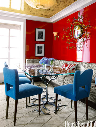
So: LACQUER. Elegant. Elusive. SHINY.

Aren’t they fantastic? Lacquered walls, Gentle Readers, are very “go big or go home.” Frankly, lacquered walls are so bold and bossy (is it still legal to use that word, or has the ban been successful?) that it’s shocking I don’t do them every day.

Emerald green lacquered entry hall

I mean, wow, right?! But lacquered walls are a commitment. If you’re thinking of taking the plunge, here are my thoughts.

Cobalt blue lacquered walls

WHY. Why would you do lacquered walls in the first place? Because you’re amazingly cool. Because simply painting a wall JUST ISN’T ENOUGH for you. Because you’re a maximalist. Because you have untamed children and you need walls you can hose down.

Ultimately, this may be one of those instances that calls for the snooty and generally useless retort, “If you have to ask, you just don’t get it.” I hate being snooty and useless, but really, this look appeals to you or it doesn’t.

Coral orange lacquer bookcases

WHEN. I say that you lacquer walls when you want to create a “wow” space. You want a little drama. It’s a special treatment, and it’s a lot of work, so you don’t see it everywhere. Shiny walls bounce light around, so if you have a dark and/or windowless space, lacquering walls is super effective.

Light blue lacquered walls

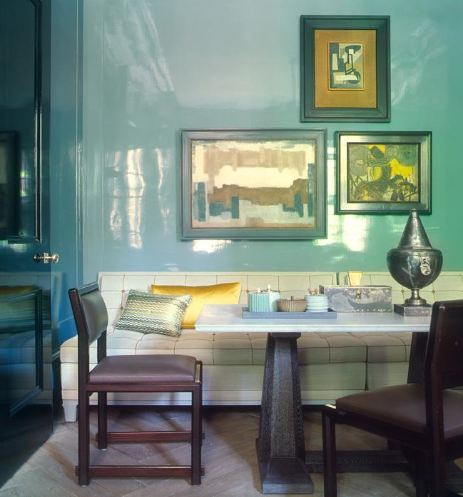
HOW. From a design perspective, I prefer my lacquered walls to be in rich, saturated colors, on really smooth walls (more on that in a second).

Black lacquer Foyer/Entry Hall

Many designers use white lacquer walls to great effect. Victoria Hagan, for example:

[Please picture a lovely room with really glossy white walls. We had to remove the picture: I was accused of copyright infringement and was commanded to pay an exorbitant amount of money as a retroactive “licensing fee.” Extortion? Or just a new interpretation of the term, “cyber bully?”]

But I don’t know. There’s something Stanley Kubrickian about shiny white walls to me.

From the nuts-and-bolts perspective on HOW: prepping walls for lacquer is no joke. They have to be really, really smooth. Because, as we all know, shiny surfaces show every bump and ripple. (This is why most people use a flat finish on walls, especially in older houses: it hides imperfections.)

Red lacquered walls in a Dining Room

If prepping for lacquer is no joke, the actual application thereof is REALLY unfunny. It involves layer upon layer of paint, then sanding, then paint, sanding, and probably varnish at some point…in sum, you really shouldn’t try this yourself. (Nor should your regular painter if s/he’s never done it before.) Hire a team of professionals, and it will be money well spent. A GOOD lacquer job should look like glass. BAD will show brushstrokes, or worse, roller marks — that orange-peel effect we work so hard to avoid.

Orange lacquered walls in Living Room

As a side note, you can cheat. Phillip Jeffries makes lacquer wallcovering. (They discontinued the lipstick red, tragically, but the navy and bronze are pretty great.) I used Schumacher’s faux shagreen wallcovering in black not so very long ago, which gave us a little shine and depth without requiring uber-perfect walls underneath:

Black shagreen wallpapered Foyer by bossy color

 What say you, Gentle Readers? Any lacquer successes or horror stories out there? Do tell!

Quoted most recently in The Washington Post and on Washingtonian.com, Annie Elliott is an expert in curated interiors, brilliant color palettes, and telling people what to do in the nicest way possible. Which is not bossy. It’s helpful.

Category: Color + paint color

Sidebar

Subscribe


Bossy Color Blog

Categories

  • Art + accessories »
  • Bedroom »
  • Color + paint color »
  • Dining room »
  • Furniture + upholstery »
  • Kids »
  • Kitchen + bath »
  • Lighting »
  • Living Room + Family Room »
  • Renovation »
  • Rugs »
  • Wallpaper »
  • Window treatments »

View Portfolio

view Bossy Color's portfolio

Instagram

annieelliottdesign

View Instagram post by annieelliottdesign

Apr 13

Open post by annieelliottdesign with ID 18085288493580590
Let’s talk about what fabric doesn’t work ❌ for the sectional upholstery in this beach house TV Room. Even though these fabrics are beautiful on their own… they don’t work here. The dark stripes were not lighthearted enough and the smaller scale blue and white pattern was too predictable. Watch to listen to me plead my case for lavender and green! 🏖️#interiordetails #colorfulinteriors #beachhousedesign

annieelliottdesign

View Instagram post by annieelliottdesign

Apr 13

Open post by annieelliottdesign with ID 18321246121271986
Here’s the challenge: Imagine you are designing a lighthearted, summer beach house. In the TV Room, there are bookcases, a neutral rug, and a large sectional.What upholstery would you put on the sectional?Comment your pick before you see part 2 👇#designchallenge #interiorsandhome #interiorinspiration

annieelliottdesign

View Instagram post by annieelliottdesign

Apr 8

Open post by annieelliottdesign with ID 18338258239300458
When you come home after a long day, do you want your foyer to rev you up or calm you down? Decide which approach you need and run with it. Add large-scale wallpaper and layered rugs for excitement, or paint the walls off-white and be selective with your artwork and mirrors for calm. #foyer #homedesign #foyerinspiration

annieelliottdesign

View Instagram post by annieelliottdesign

Apr 3

Open post by annieelliottdesign with ID 17848603689678580
Q: What is one thing you can do to elevate a room❓💬 The first thing you see when you walk into a room needs to look great. In your office, get a nice, big vintage desk. In a living room, paint all the walls a dark color. Avoid satin brass hardware, pills on sofa fabric, and fake wood!#interiordesign #dcdesigner #decorinspo

annieelliottdesign

View Instagram post by annieelliottdesign

Apr 1

Open post by annieelliottdesign with ID 17918392215338642
This will come as no surprise, but I think about window treatments a LOT. Especially during the transition from winter to spring, with the change in temperature and light…I’m reminded what a critical design element window treatments are. And then I get to thinking about window treatments through the ages. Who invented drapes? Did the Romans *really* invent Roman shades?I decided to do some digging. Check out my blog to see what I discovered!📸 @stacyzaringoldberg📸 @jennverrierphoto#windowtreatments #drapes #interiordesign

annieelliottdesign

View Instagram post by annieelliottdesign

Mar 25

Open post by annieelliottdesign with ID 18088729466185965
It’s Wallpaper Wednesday! Today we feature Brunschwig & Fils’ Les Touches. @brunschwigfils introduced Les Touches in 1965, and the pattern soon became a Brunschwig classic. (Interestingly, “touches” translates to “keys” or “strokes…” I guess that’s close to “dabs,” which is what I’d assumed.) According to handwritten records, Les Touches is inspired by post-WWII black and white photographs, but the connection between this inspiration and the pattern remains a mystery. Referred to most often as a stylized animal print, Les Touches is a staple of the Le Jardin Chinois collection.Today, Les Touches comes in 18 colorways, but the blue colorway remains iconic. I’ve used Les Touches for window treatments and upholstery, but I can’t wait to try it as wallpaper!

annieelliottdesign

View Instagram post by annieelliottdesign

Mar 23

Open post by annieelliottdesign with ID 18102457048819740
Here’s what ✨ I ✨ would do… Instead of matching everything, you balance it. Pull one color. Shift the scale. Let each piece do something different. Here’s what ✨ I ✨ would do… Instead of matching everything, you balance it. Pull one color. Shift the scale. Let each piece do something different. Bonus: Change the rug! Suddenly you’d make a completely different window choice.Did you guess it?!Watch part 1 for the challenge context and part 2 for what doesn’t work.#interiorsandhome #fabricdesign #romanshades

annieelliottdesign

View Instagram post by annieelliottdesign

Mar 23

Open post by annieelliottdesign with ID 17860517745617635
Let’s talk about what fabric doesn’t work ❌ for the Roman shades in this teenage girl’s bedroom with 2 big windows and a statement ceiling. Even though these fabrics are beautiful on their own… they don’t work here. Biggest mistake: repeating the same motif (moths, butterflies, etc.) across the room. It starts to feel themed instead of designed.Watch part 1 for the full context, and watch part 3 to find out what I would choose.#interiordesign #wallpaper #interiorsandhome

annieelliottdesign

View Instagram post by annieelliottdesign

Mar 23

Open post by annieelliottdesign with ID 18038018090572669
Here’s the challenge: a teenage girl’s bedroom. Not huge. Two big windows. Statement ceiling. White walls.Which fabric would you choose for the Roman shades?There’s a right answer… a safe answer… and a couple very wrong ones. Comment your pick before you see part 2 👇#interiordesigner #wallpaper #romanshades
Follow

Looking for something?

Don’t miss a single post


Where classic and modern hang out and drink gin.

  • Instagram
  • TikTok
  • Pinterest
  • Facebook

© 2026 · Annie Elliott Design · privacy policy