• Skip to main content
  • Skip to header left navigation
  • Skip to header right navigation
  • Skip to site footer
  • about
    • services
    • team
  • portfolio
  • press
Annie Elliott Design, Washington DC

Annie Elliott Design

Greater Washington DC

  • book
  • blog
  • contact
Jamie Drake's Grasse Sconce

Lighting by Jamie Drake and AERIN. An exercise in fabulousness.

Annie Elliott | March 11, 2015

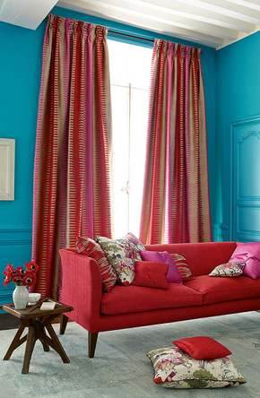
Designing light fixtures can’t be easy. If it were, wouldn’t everyone be doing it? Scale alone is a tricky thing. Then you have to consider where it might go, create the design, choose finishes…then — goodness! — there’s wattage to think about, and probably something involving wiring… It seems complicated. Which is why we all should appreciate truly …
Read more »Lighting by Jamie Drake and AERIN. An exercise in fabulousness.
» Color + paint color, Lighting

5 questions to ask yourself before you hire an interior designer

Annie Elliott | February 12, 2015

You’ve been thinking about it…you’ve talked to your friends…you’ve been tooling around on the Internet looking at different designers’ websites… You’re ready to live in an outrageously beautiful home. You’re ready to hire an interior designer. Before you start making calls, though, I suggest asking yourself the following 5 questions. Having run my interior design business for …

Read more »5 questions to ask yourself before you hire an interior designer
» Color + paint color

Bossy color’s 2015 color of the year: BRIGHT NAVY

Annie Elliott | December 31, 2014

Happy New Year, Gentle Readers! I’m going to begin 2015 with a declaration: BOSSY COLOR’S COLOR OF THE YEAR FOR 2015 IS BRIGHT NAVY. I don’t usually have a color of the year, but this year is different. It’s been several weeks since the announcement that “Marsala,” (18-1438, for those keeping track) is Pantone’s color of the year for …

Read more »Bossy color’s 2015 color of the year: BRIGHT NAVY
» Color + paint color
Pantone's color of the year 2015 in action

Pantone’s Color of the Year for 2015: Marsala

Annie Elliott | December 8, 2014

We’re in for a rough year, Gentle Readers. By now you’ve heard the news that Pantone’s Color of the Year for 2015 is 18-1438 Marsala. Yes. That Marsala. Jura Koncius at The Washington Post broke the news to me, and my reaction was less than positive. I sat with the news for a few days. And …

Read more »Pantone’s Color of the Year for 2015: Marsala
» Color + paint color
1980s floral chintz matching furniture and walls

Matchy-matchy walls and upholstery: Cool again, or too soon?

Annie Elliott | December 1, 2014

Remember in the ’80s, how fashion-forward it was to upholster furniture in the same pattern as the wallpaper? And sometimes carry the pattern onto the drapes, too? Well, everything old is new again…again. I am an ’80s survivor, so you’d think I’d have trouble with this particular “new again.” Au contraire, mon frere! Today’s matchy-matchiness is …

Read more »Matchy-matchy walls and upholstery: Cool again, or too soon?
» Color + paint color, Furniture + upholstery, Wallpaper
Green upholstered door into gray room

That edgy color combo, green and gray

Annie Elliott | October 26, 2014

I feel like I’m seeing green and gray (aka grey) everywhere! From excellent designers… In catalogs… Everywhere! I smell a trend. I wasn’t sure what I thought of the green/gray combo at first. But it’s grown on me. There may be a green and gray room in bossy color’s future sooner rather than later. What …

Read more »That edgy color combo, green and gray
» Art + accessories, Bedroom, Color + paint color, Dining room, Window treatments

Flow? What flow? At Colonial Williamsburg

Annie Elliott | October 12, 2014

Thanks for bearing with me, Gentle Readers. Here is my final observation about Colonial Williamsburg. And then I promise to go on vacation somewhere else. As an interior designer, I spend a lot of time thinking how I can achieve flow within a house. How can I make each room a little different while maintaining a cohesive feel? It helps if the …

Read more »Flow? What flow? At Colonial Williamsburg
» Color + paint color, Wallpaper
  • Previous
  • Page 1
  • Interim pages omitted …
  • Page 32
  • Page 33
  • Page 34
  • Page 35
  • Page 36
  • Interim pages omitted …
  • Page 102
  • Next

Sidebar

Subscribe


Bossy Color Blog

Categories

  • Art + accessories »
  • Bedroom »
  • Color + paint color »
  • Dining room »
  • Furniture + upholstery »
  • Kids »
  • Kitchen + bath »
  • Lighting »
  • Living Room + Family Room »
  • Renovation »
  • Rugs »
  • Wallpaper »
  • Window treatments »

View Portfolio

view Bossy Color's portfolio

Instagram

annieelliottdesign

View Instagram post by annieelliottdesign

Nov 16

Open post by annieelliottdesign with ID 18347185603261293
What wallpaper do you use in a bathroom that’s next to the PERFECT bedroom? Let’s see what you choose! It’s a twofer: Before and After AND a Design Challenge!

annieelliottdesign

View Instagram post by annieelliottdesign

Nov 16

Open post by annieelliottdesign with ID 18081887666416484
Taking this basement bedroom from glum to glam was so much fun!!! Hint: It all starts with the wallpaper 😊

annieelliottdesign

View Instagram post by annieelliottdesign

Nov 12

Open post by annieelliottdesign with ID 18116363537141007
Grays and blues don’t automatically = un-cozy! Textures support the cool, low-contrast palette to create an inviting, serene space.

annieelliottdesign

View Instagram post by annieelliottdesign

Nov 6

Open post by annieelliottdesign with ID 17977466751149764
Let’s call it like it is: this library-slash-tv room was…boring. BEFORE: dull, a pass-through space, not inviting. AFTER: So fun! with its shiny purple walls and dramatic window treatments!! Makes you want to stay a while, doesn’t it?

annieelliottdesign

View Instagram post by annieelliottdesign

Nov 4

Open post by annieelliottdesign with ID 18117490325589401
This Wallpaper Wednesday we feature Nanjing by @schumacher1889!This  pattern is a modern take on classic chinoiserie motifs: trees, pagodas and fretwork fences. It is named after Nanjing, Jiangsu, East China, one of the four great ancient capitals of China. You may recognize the pattern on your Blue Willow dishes, too :) I used this wallpaper in a client’s Powder Room, and it bring so much energy and brightness to the space. I love the green colorway, too 😊📸 @angieseckinger @schumacher_midatlantic

annieelliottdesign

View Instagram post by annieelliottdesign

Nov 2

Open post by annieelliottdesign with ID 18092508983228146
Where do those gorgeous but multitudinous pillows go at night? See some ideas in my latest blog post… 😌#interiordesign #pillowinspo

annieelliottdesign

View Instagram post by annieelliottdesign

Oct 28

Open post by annieelliottdesign with ID 18167021635426020
My home is my lab :) As evidenced by my constant tinkering. Today: replacing my own DR chandelier.

annieelliottdesign

View Instagram post by annieelliottdesign

Oct 23

Open post by annieelliottdesign with ID 18138180424725389
One could argue that each element in this New York living room is dramatic, from the mirrored (wallpaper) ceilings to the purple sofa. If we had put an antique rug in this room — which, let’s be honest, is often my first thought — the effect could have been dowdy. It would have been cozy, it would have been consistent with the moody vibe, and it still would have been kind of interesting given the other things in the room.But the contemporary rug, Danika by @starkcarpet, makes the room SING. The huge geometric scale is a beautiful contrast to the smaller patterns on the chair and the Roman shade. The light background brightens the room while making the darker colors more intense. And the black…well, black always adds drama.It’s hard to explain, but you see it, right?@schumacher_midatlantic @timorous_beasties @starkcarpet_dc#schustagram

annieelliottdesign

View Instagram post by annieelliottdesign

Oct 21

Open post by annieelliottdesign with ID 17995465526842775
Happy Wallpaper Wednesday! This week, we dive into Martinique by CW Stockwell.This small, family-run print facility in Los Angeles was founded in 1905. Clifton Stockwell’s daughter and son-in-law traveled to the Bahamas in 1942 and were so enchanted by the foliage that they collaborated with illustrator and textile designer Albert Stockdale to create a wallpaper pattern. The result was Martinique — also known as “The Original Banana Leaf Print.” (Martinique is not to be confused with Brazilliance by Dorothy Draper 😉 .)Martinique famously adorns the Beverly Hills Hotel’s halls, stairwells, and Fountain Coffee Room.CW Stockwell now sells the Martinique pattern in seven colorways as wallpaper, grasscloth, and linen fabric.@cwstockwell @scalamandre#interiordesign #wallpaperinspo
Follow

Looking for something?

Don’t miss a single post


Where classic and modern hang out and drink gin.

  • Instagram
  • TikTok
  • Pinterest
  • Facebook
American Society of Interior Designers Firm Partner

© 2026 · Annie Elliott Design · privacy policy