
If I were REALLY on top of things, Gentle Readers, I would have timed this post to coincide with Valentine’s Day. But alas, I was caught up in the moment, and the mid-century cabin won out ;)
Here’s what prompted the pink ponder, though:

My friend Sarah was painting her kitchen. She had inspo photos, so I (unfortunately) can’t take credit for the genius combo of light pink walls with green and butter yellow cabinetry, which are behind us in these pictures. But I did help her with the exact hues ;)

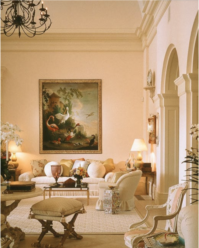
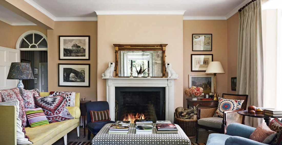
They barely look pink, right? That’s what I’m saying. It’s subtle and sophisticated. Off-white with a hint of pink.
Here’s are two more rooms that are off-white with a pinkish cast:


I’m even going to broaden my definition of “pink” to include very light coral tones. If a white is closer to red or orange than yellow, I’ll call it pink. Closer to yellow is ivory. Closer to blue is gray and perhaps should be avoided.

I’m talking about the “public” spaces in your house: living rooms, family rooms, dining rooms, and kitchens. And front halls and hallways. We all know pink is fine for bedrooms — and even baths — but I’m proposing that we expand our thinking.


Going beyond paint, here’s a faux bois wallpaper with a pinkish tinge:

Then there’s light pink that is definitely pink. My living room is this way, because the off-white pinks washed out in the northern light.


So. The next time you’re contemplating which off-white to use in a room, remember: barely there pink is an elegant option.
Annie Elliott Design is based in Washington, D.C. We’re experts in creating colorful, pattern-filled, highly personalized homes for wonderful people.