• Skip to main content
  • Skip to header left navigation
  • Skip to header right navigation
  • Skip to site footer
  • about
    • services
    • team
  • portfolio
  • press
Annie Elliott Design, Washington DC

Annie Elliott Design

Greater Washington DC

  • book
  • blog
  • contact

How to choose the right paint sheen

Annie Elliott | June 21, 2026

Gentle Readers, it’s been a minute since I’ve painted a room myself. As with childbirth, one tends to forget the pain the minute you see the delivered result.

Man and woman painting a room
My brother James helping me paint our dining room in…holy cow: 2010!!!

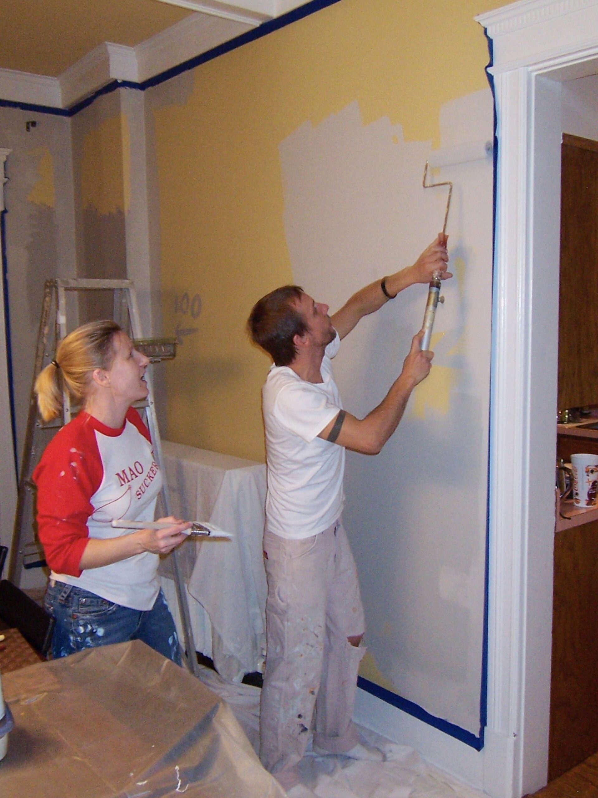
Recalling the painting adventures of my own early adulthood, when money was scarce and time was plentiful, I thought it would be appropriate for Georgie (with Ruthie’s help) to do the painting in her new apartment in Philadelphia.

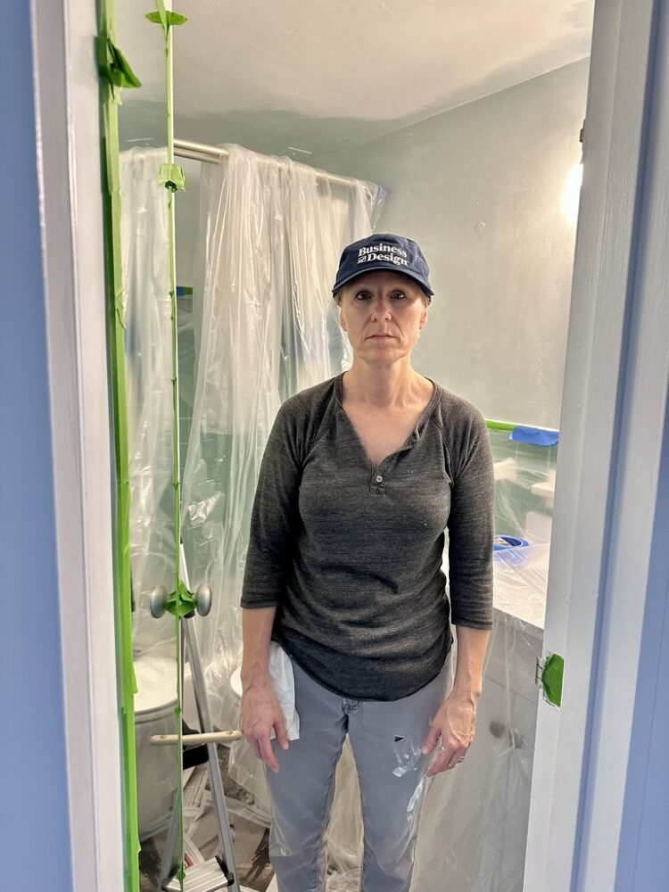
How, you may ask, did *I* end up getting roped into it? Well, the girls (recent college graduates, but what can I say besides “the girls”?) didn’t quite finish during their allotted time. So on the next visit, I agreed to help.

It started out fine…

Mom and daughter holding paintbrushes
Woman painting a white room

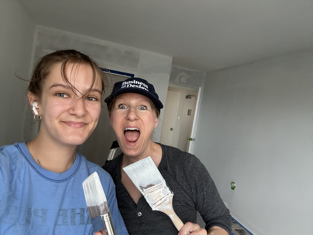
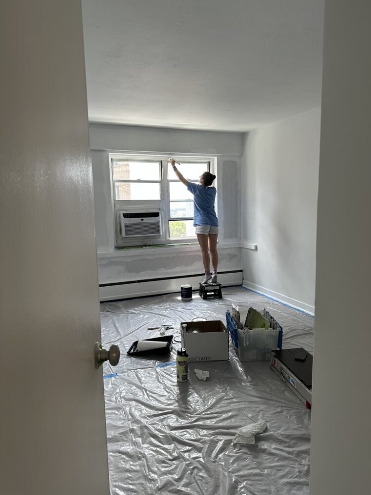
…but deteriorated quickly.

Sad woman in half-painted bathroom

Anyway, I found myself giving my daughters a tutorial about paint sheens, so I thought that you might benefit from a refresher, too.

Practically speaking, please keep two things in mind. First, that the higher the sheen (semi-gloss, high gloss), the greater the cleanability. Second, even for the same sheen there may be different rules for walls and trim, so please pay attention.

White bedroom with artwork

HIGH-GLOSS

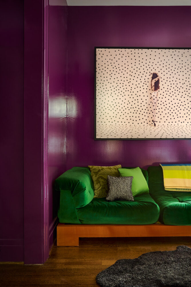
I ADORE a high-gloss paint finish. It’s classic and gorgeous.

You may use a brush when putting high-gloss paint on trim. You’ll see the brushstrokes, but that’s charming :) For a finish as glassy and smooth as a 31-year-old’s Botoxed forehead, you must apply the paint with a sprayer. (This is best done by a professional.)

Look closely at the picture below: the ceiling beams were painted with a sprayer, but a brush was used on the French doors. Can you see how the doors have a teeny bit of texture? Interesting, right?

Dining room with blue floral patterned walls and glossy trim
Photo by Rebecca McAlpin

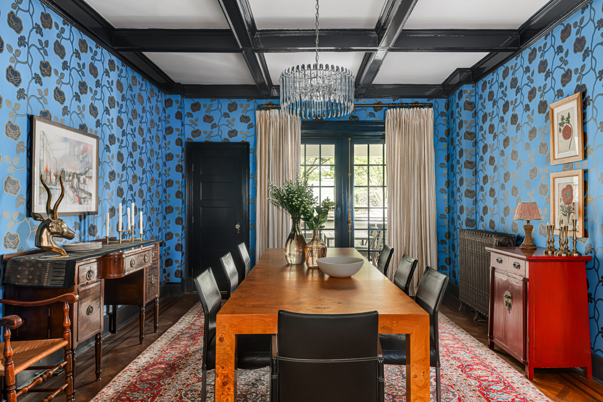
Now, high-gloss paint on walls = high drama! Here, you MUST use a sprayer. Never, ever use a brush — or worse, a roller! — to apply high-gloss paint to walls. A roller will leave an orange-peel texture in its wake. It’s disgusting, and you should be embarrassed to allow anyone to see it.
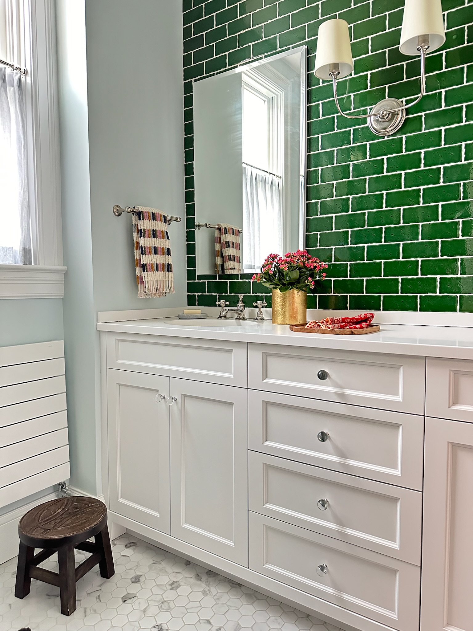
Room with glossy shiny purple walls
Photo by Trevor B. Parker

SEMI-GLOSS

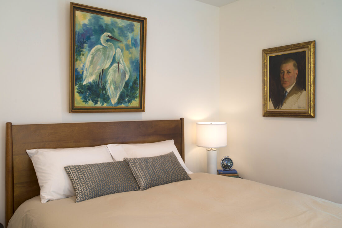
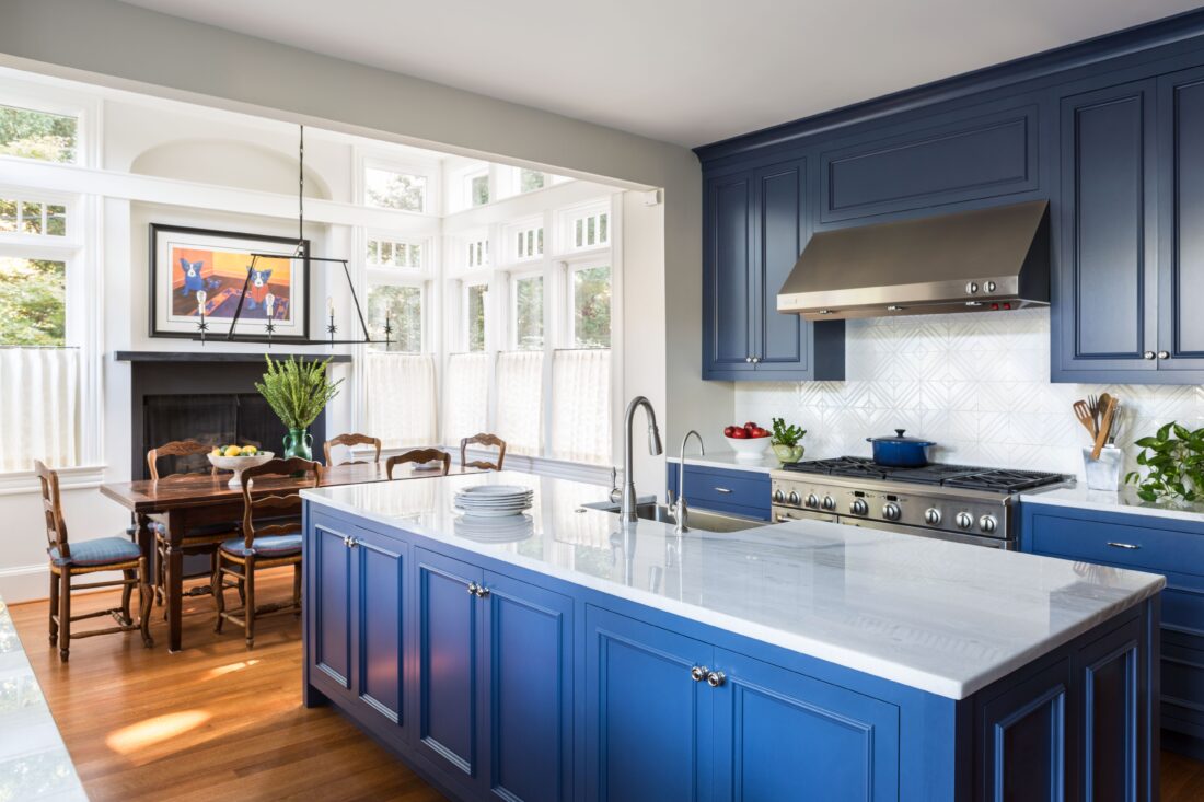
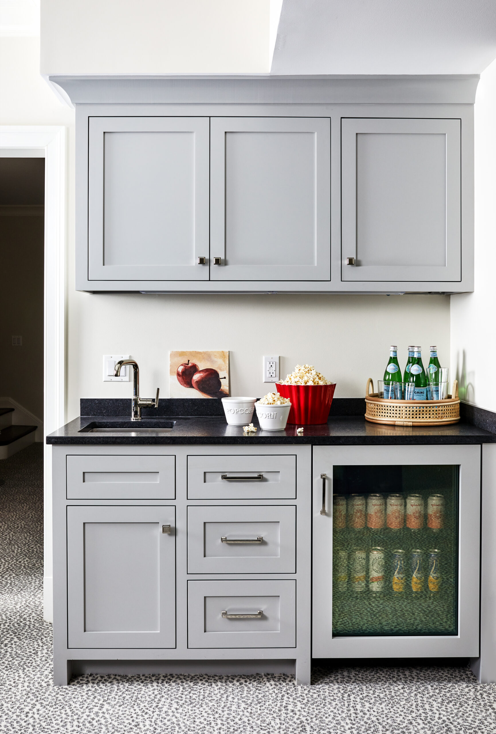
This is the most common finish for trim. It’s cleanable, has a little bit of a shine, and provides a subtle contrast with walls in a flatter finish. You cannot go wrong using a semi-gloss finish on your doors, trim, and the exterior of cabinetry. (More on that in a sec.)

Stair hallway with grid of varying pink squares with white trim.
Photo by Markus Wilborn

Some people think you should use a semi-gloss finish on walls in bathrooms and kitchens. NO. That is incorrect. I never, ever use a semi-gloss finish on walls. Applying it with a roller will give you that orange-peel effect to which I referred earlier, and using a brush…well, seeing brushstrokes on walls is NOT charming, as brushstrokes on trim and cabinetry can be. If your painter gives you a hard time about this, I advise you to hire someone else.

Kitchen with blue cabinets
Photo by Angie Seckinger

SATIN

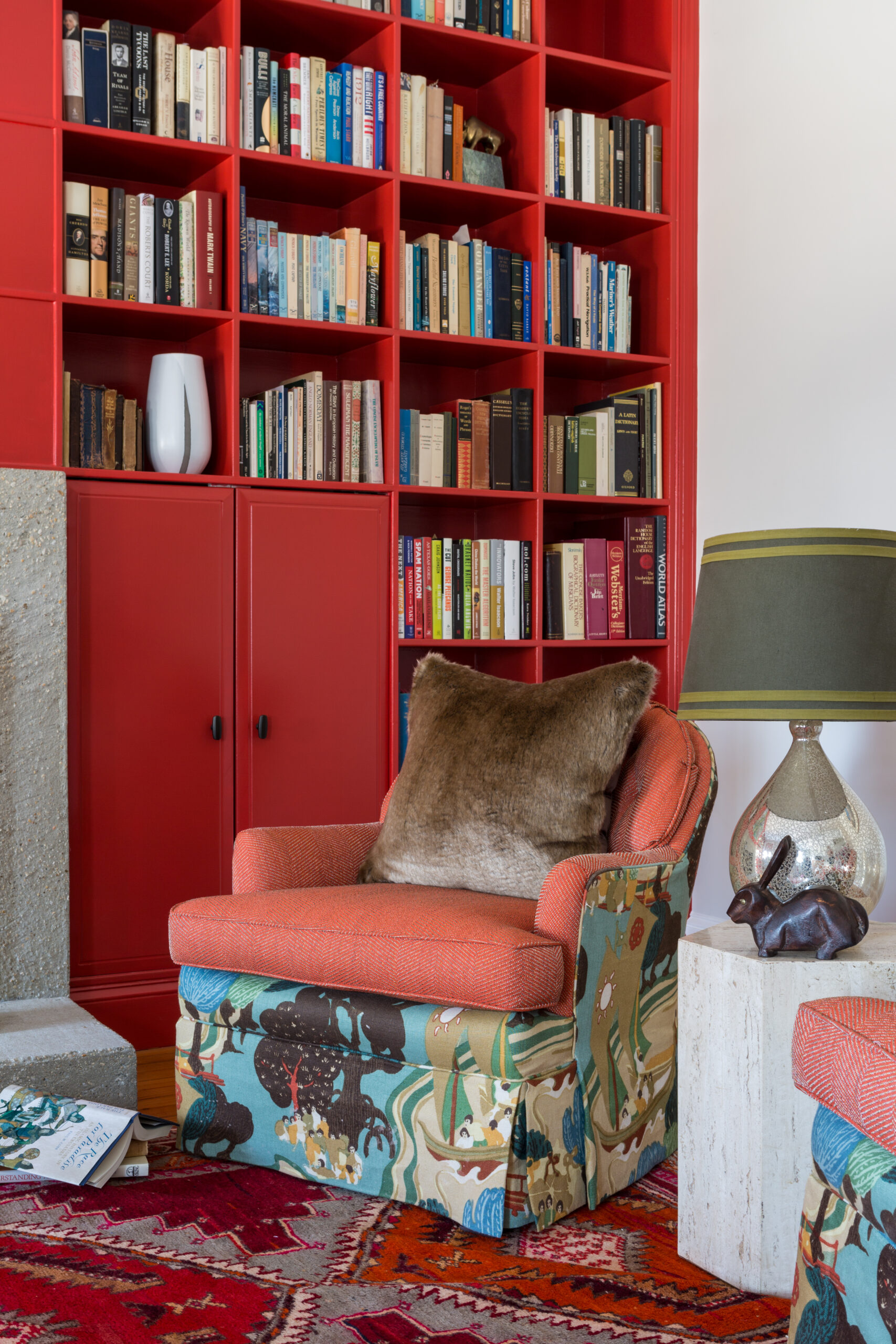
Slightly less shiny than semi-gloss, satin is my preferred paint finish for trim in contemporary houses, as the dullish sheen reads modern to me. I also use it on bookshelves, because a semi-gloss finish can stick to books over time.

Cabinet doors can be painted in a satin, semi-gloss, or high-gloss finish (something wipeable, in other words), but I strongly suggest that the interior of cabinets be satin. Same reason as for shelves: it’s durable and won’t feel sticky over time.

Room with red built-in bookcases
Photo by Angie Seckinger

The nice people who make custom cabinets often use satin paint when they do a “shop finish,” which means they use a sprayer. It’s sooooo smooth and pretty.

Bar with gray cabinets and beverage fridge
Photo by Stacy Zarin Goldberg

EGGSHELL

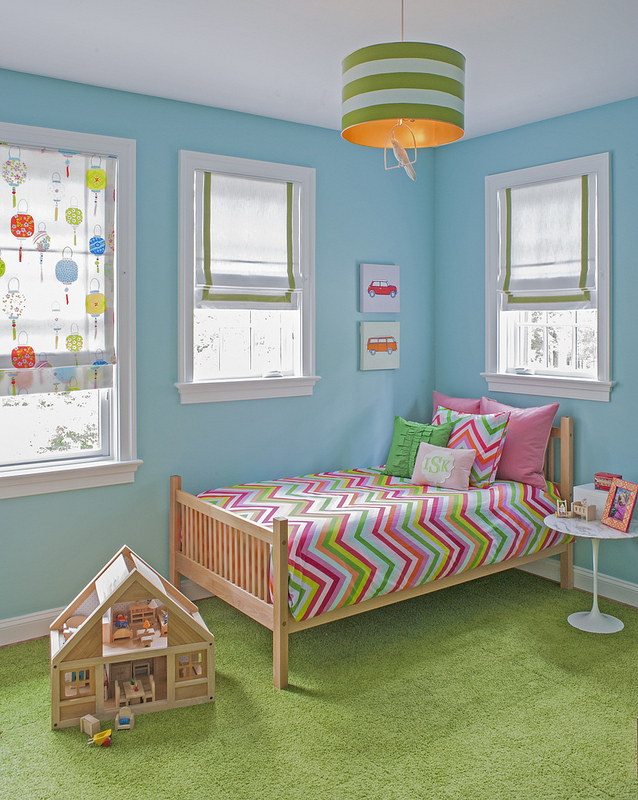
Eggshell is the finish to use on kitchen, bathroom, laundry room, and kids’ bedroom walls. Anywhere prone to splashes or marks. It’s wipeable and moderately moisture-resistant, and you can apply it with a roller. (Finally! A roller-friendly finish!)

Kid's bedroom with blue walls, multicolored bed, and green rug
Photo by Michael K. Wilkinson

If you have a bathroom with no fan and/or terrible ventilation and your painter insists that you use a satin finish on the walls because it’s more moisture-resistant than eggshell, the only way I would approve it is if the painter uses a sprayer. Which they won’t. So stick with eggshell. Please.

Bathroom with white cabinets, blue walls, and green tile.

FLAT

A flat sheen is tricky. Pro: It visually smooths out bumpy, imperfect walls, which are especially common in historic houses. Con: Flat walls are difficult to clean. Magic Erasers are fantastic, but if you scrub too hard, you’ll get a shiny spot.

So. Please feel free to use flat paint in historic houses with bumpy plaster walls; in child- and dog-free homes (sad!); and in low-traffic places such as bedrooms. On a staircase in a house from 1890, flat paint is the last thing I would advise. (The FIRST thing I’d advise, of course, would be wallpaper ;) ).

Arched entrance to bedroom with wooden bed and floral bedspread
Photo by Angie Seckinger
Bed with green and white headboard and wall sconce
Photo by Kip Dawkins

OTHER SHEENS

The sheens above are the most common, but manufacturers get tricky sometimes. Benjamin Moore offers a “scrubbable matte” finish for certain lines of their paint, and I use that quite a lot. As the name suggests, it has a flat look and doesn’t get shiny when you clean it.

Many manufacturers offer a “pearl” finish. I don’t really get it; I think it’s somewhere between eggshell and satin, but I’ve never used it.

As for Farrow & Ball, forget it. They do everything differently, and I literally have to make a chart reminding me of the difference between “Estate Eggshell” and “Modern Emulsion.” It’s great paint, but they don’t make it easy to use.

Yellow room with open door

I hope this is helpful, Gentle Readers! Please feel free to forward this to the young adults in your life when they ask if you’ll pay for a painter. Send them a copy of my book, too, and point out that YouTube is rife with how-to videos. Then tell them that painting a room builds character. They’ll really appreciate that.

Annie Elliott Design is based in Washington, D.C., but we also love working in NYC and on Maryland’s Eastern Shore. We’re now scheduling projects for fall. Please contact us to discuss.

Category: Color + paint colorTag: bedroom, Benjamin Moore, bookcases, bookshelves, cabinets, eggshell, Farrow & Ball, flat finish, high-gloss, historic house, paint color, paint finish, paint sheen, satin finish, semi-gloss

Sidebar

Subscribe


Bossy Color Blog

Categories

  • Art + accessories »
  • Bedroom »
  • Color + paint color »
  • Dining room »
  • Furniture + upholstery »
  • Kids »
  • Kitchen + bath »
  • Lighting »
  • Living Room + Family Room »
  • Renovation »
  • Rugs »
  • Wallpaper »
  • Window treatments »

View Portfolio

view Bossy Color's portfolio

Instagram

annieelliottdesign

View Instagram post by annieelliottdesign

Jun 23

Open post by annieelliottdesign with ID 18095254961251333
Having sworn I never would wield a paintbrush again, I recently found myself helping my daughter paint her first apartment. Thus a tutorial about paint sheens for her, thus a recap for you!My latest blog post explains the differences between paint sheens and tells you what goes where ;)Link in bio to read. #interiordesigner #paintinspo #apartmenrdecor

annieelliottdesign

View Instagram post by annieelliottdesign

Jun 22

Open post by annieelliottdesign with ID 18011049497869192
There’s no other word for it: Sheila Bridges’ pattern Harlem Toile De Jouy has become an American icon. Iconic and ironic: the pattern conflates her experiences as a Black woman living in Harlem with pastoral motifs from 1700s French toile. Delightful and lighthearted at first glance, the pattern gives you plenty to think about. Bridges created Harlem Toile as a wallpaper but later expanded the collection to include fabric, bedding, plates, glassware, umbrellas, and clothing. I strongly recommend getting a piece of this pattern any way you can. @harlemtoilegirl#interiordesign #harlemtoile #patterninspo

annieelliottdesign

View Instagram post by annieelliottdesign

Jun 17

Open post by annieelliottdesign with ID 18106157639319026
“Much of the wallpaper [in the Victorian era]—fabric, too—was made with arsenic,’ explains Elliott. ‘There are worse ways to go, I suppose.’”I loved speaking with @allisonpduncan @vogueliving about the art of using two wallpapers in one room. Happy Wallpaper Wednesday!#interiordesign #wallpaper #vogueliving #designopinions #annieelliottdesignSlide 1 📸  by Stacy Zarin Goldberg, Design by Annie ElliottSlide 2 📸 by Leslee Mitchell, Design by Kim ScodroSlide 3 📸 by Donna Dotan, Design by Ariel OkinSlide 4 📸 by Gordon Gregory, Design by Jenny Holladay

annieelliottdesign

View Instagram post by annieelliottdesign

Jun 13

Open post by annieelliottdesign with ID 17913412296404982
Pink, light yellow, and gold-y tan combine to create a soft, unexpected color palette. The quiet colors are sophisticated together, and the palette will age beautifully as this tween moves through high school and college. (Her parents won’t even have to redecorate if it becomes a guest bedroom someday! But one step at a time…)#homedesign #paintinspo #bedroomdesign

annieelliottdesign

View Instagram post by annieelliottdesign

Jun 10

Open post by annieelliottdesign with ID 17929516656341682
Deep down, I believe that a house isn’t a home without wallpaper 😊 My latest blog post identifies five unexpected places you can use wallpaper — and some are small! Wallpapering the space behind your island stools could be your gateway to my favorite home furnishing. If you have other creative spots for wallpaper, I’d love to hear about them!#wallpaperinspo #interiordesign #wallpaper

annieelliottdesign

View Instagram post by annieelliottdesign

Jun 9

Open post by annieelliottdesign with ID 18112589929761575
Welcome to my new before-and-after series! 🥰 I take you through my thinking as I design a space — my “process,” as it were. Pretty pictures are involved too, of course. I hope you enjoy it!This was a super fun project: a historic townhouse with the challenge of a loooong shoebox-shaped front room. You know the kind. Here’s how we made this color-and-pattern-loving client’s challenging space amazing. Like this series? Please let me know! #interiordesigner #windowtreatments #wallpaper

annieelliottdesign

View Instagram post by annieelliottdesign

Jun 5

Open post by annieelliottdesign with ID 18087273683080656
Don’t let your porch be a throwaway space! Make it a room. Get a high quality indoor/outdoor rug. Make sure your furniture is COMFY. Find a cordless lamp (they’re everywhere now!). Hang art! You can even add a vintage console table or cabinet if you’re ok with it weathering over time 🕰️. #interiordesign #porchdesign

annieelliottdesign

View Instagram post by annieelliottdesign

Jun 3

Open post by annieelliottdesign with ID 18314336014263171
It’s Wallpaper Wednesday! This week we feature Paper Trail by Lewis and Wood. Lewis and Wood launched Paper Trail in the fall of 2025 as one of four patterns in their History Papers Collection. Paper Trail was inspired by ancient rock carvings - 600–2,000 years old! - from various sites in America. It was named after the site Newspaper Rock, Utah.You know I love anything with an animal :) But there are 2 genres, right? Juvenile and…let’s call it *versatile*. To me, Paper Trail falls into the latter category, featuring deer, horses, buffalo, and foxes on a background that resembles the texture of rocks. It’s primitive, not cartoonish. I could see using this in a small bedroom; a breakfast nook (why? Can’t tell you, it’s just a feeling); or a hallway, because the pattern isn’t overwhelming.#wallpaperinspo #interiordesign #homedesign

annieelliottdesign

View Instagram post by annieelliottdesign

May 28

Open post by annieelliottdesign with ID 18102883841082172
For those of you lucky enough to have a beach house, now’s the time to start thinking about decorating beyond traditional “costal decor!” Step one? Consider a color palette other than blue and white ;) See my latest blog post for more! 🏖️ 🐚#beachhouseinteriors #interiordesign #eastcoast
Follow

Looking for something?

Don’t miss a single post


Where classic and modern hang out and drink gin.

  • Instagram
  • TikTok
  • Pinterest
  • Facebook
American Society of Interior Designers Firm Partner

© 2026 · Annie Elliott Design · privacy policy