
When we last left our heroines…
Senior Designer Amy Oliver Beaupré and I decided that yes, we would apply for a spot in the ASPIRE HOUSE.

We selected a bedroom as our ideal space to design. Now remember: just because you apply to design Bedroom #2 doesn’t mean you’ll be assigned Bedroom #2; you may be assigned the dining room instead. (Or you may not be selected to design anything at all, which would be a huge bummer.)
What exactly did the application consist of, we wondered? Here, verbatim, is the description:
That’s it. Oh – and there was a very pretty watercolor as an example of a rendering the editor of ASPIRE DESIGN AND HOME likes:
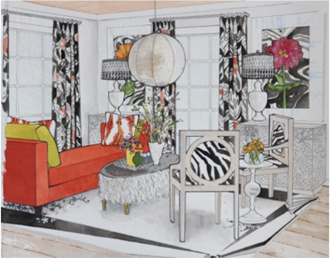
See how specific that drawing is? The designer had to know what particular table, chairs, fabrics, and light fixtures s/he was going to use to create this rendering.
Bottom line: we had to design the room completely in order to apply. It’s like writing your dissertation before you’ve been accepted into the program. Kinda nuts.
But Amy and I were up for the challenge.
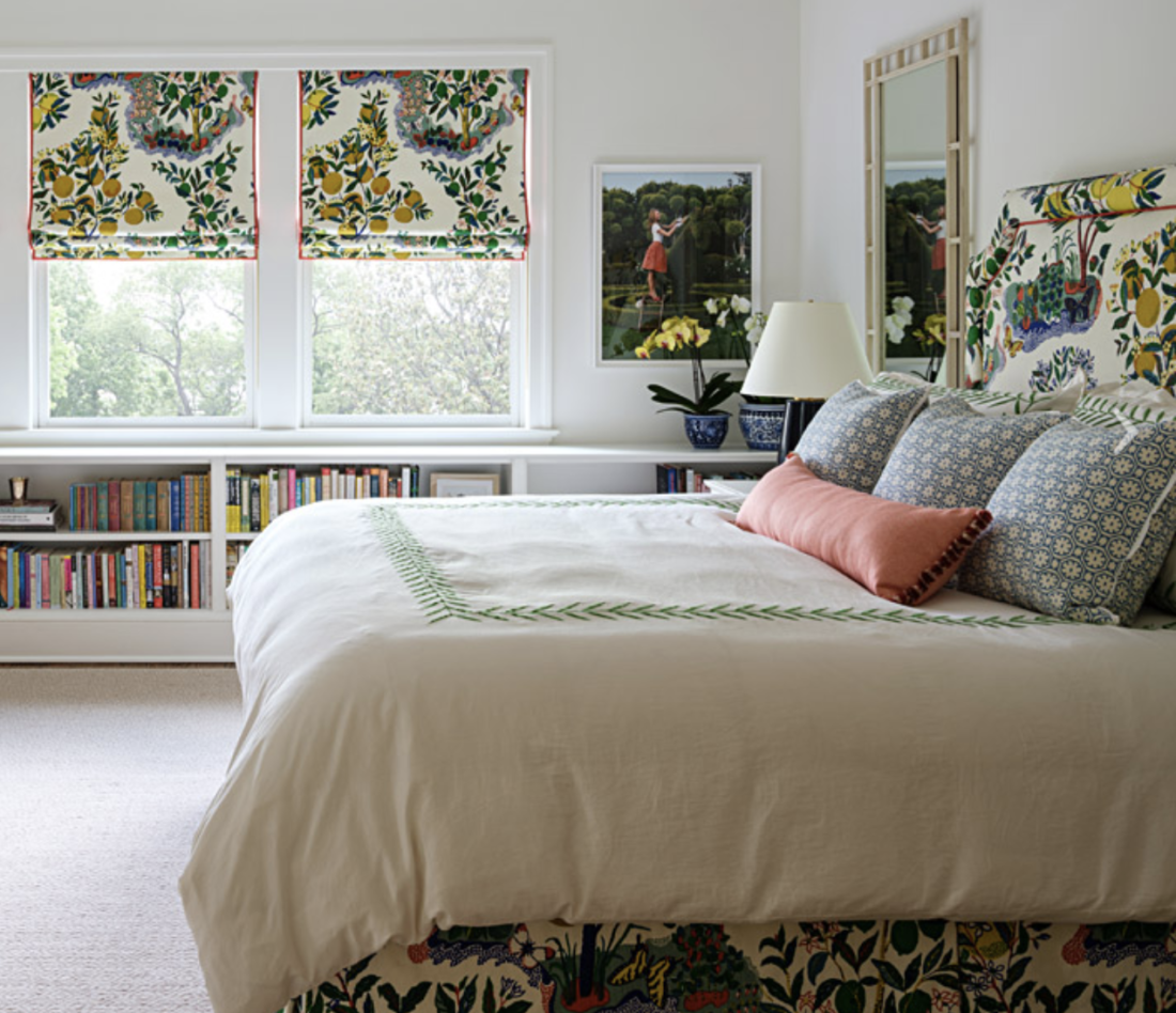
First, we had to invent a client. We had chosen a bright, sunny bedroom. Whose room is this? A baby, teenager, adult, guest? Personality? Likes, dislikes, interests?
So. Let’s say…a guest room. For an uncle. A favorite uncle who visits often, so the room should feel homey and personalized. He’s an academic. Why do we care? Because this information = maybe we don’t need a dresser in the room, but a desk would be nice. And books. There must be books.
I had an actual uncle in mind, and while his taste is classic, he wouldn’t need dark colors and plaid. (I used Schumacher wallpaper when I designed his Philadelphia dining room, if that helps.) He would appreciate a canopy bed, too, which we REALLY wanted to do…
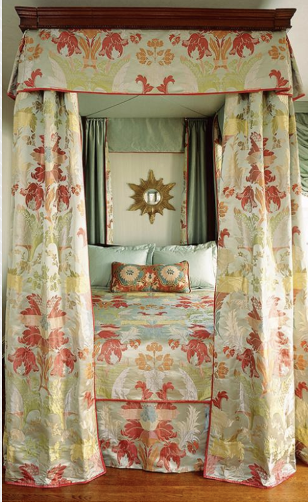
Although, to save money on fabric (which is expensive, as you know), maybe we’d do a half-canopy bed. If you want to be fancy, you can call it a “half-tester” or “pelmet with bed drapery.”

We usually have a color palette in mind when we start designing a room. Remember, the name of my firm used to be bossy color.
So we decided to do blush. EVERYONE does light blue and cream bedrooms, so we wanted to avoid that. And we’d temper the blush with an olive green. Depending, of course, on what fabric we fell in love with…because we undoubtedly would, and one has to be a bit flexible…
We knew we wanted a classic English-y floral. Left to our own devices, which we were, Merrie Olde England is Amy’s and my favorite place to start. So there really was only one place to go: Cowtan & Tout, for C&T and Colefax & Fowler fabrics.
These were our finalists:
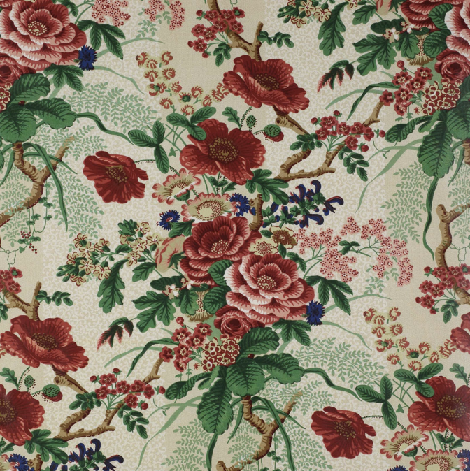
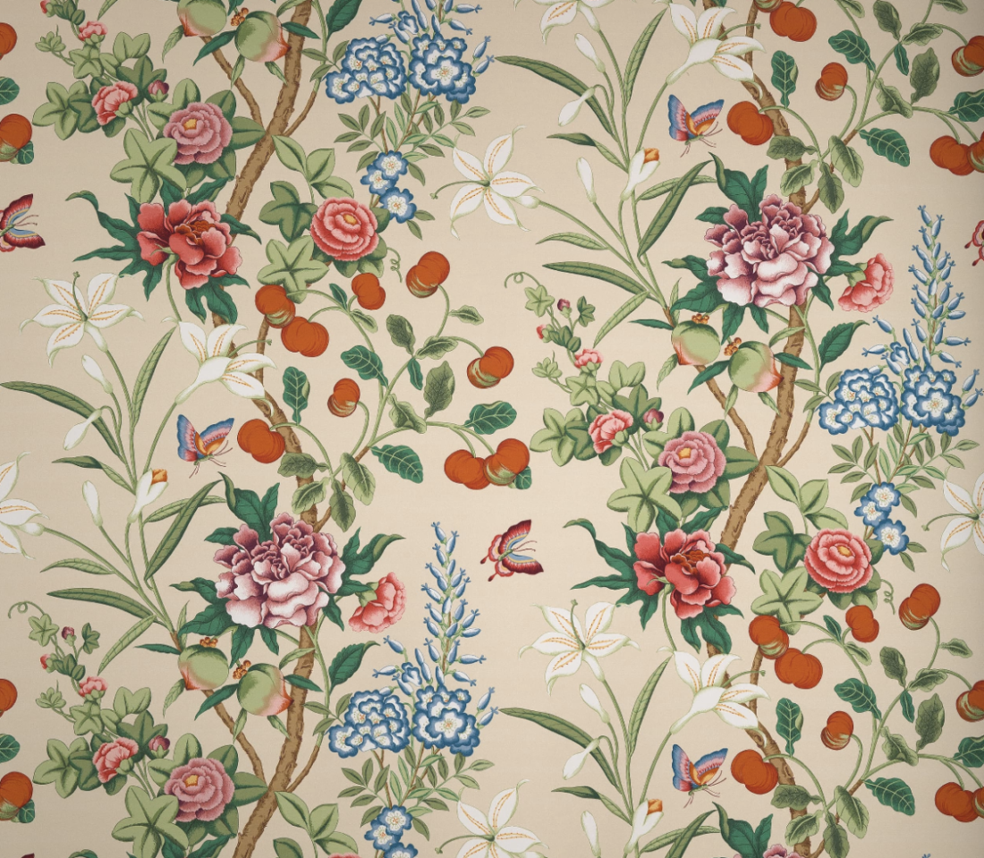

Because we like rooms that combine masculine and feminine elements, we chose the Rutland fabric, which is more leafy than flowery. It’s also on linen, which is more casual than the fine percale-like cotton used for the other two. PLUS, there’s no actual pink in the Rutland pattern, so the room wouldn’t be too matchy-matchy with blush walls.
Vibe, palette, and primary fabric selected, furniture was our next step. Next time, I’ll tell you about that, along with the actual application, the decision…AND a curve ball. A big one.
Annie Elliott Design is based in Washington, DC. Annie’s design work and insights have appeared in numerous local and national publications, including The Wall Street Journal, The New York Times, The Washington Post, and Washingtonian Magazine. **NEW DATES** The ASPIRE HOUSE will be open every Wednesday through Sunday from June 13 – July 12. See you there!