
Kristie at The Decorologist broke the news to me first. Pantone’s color of the year for 2012 is a dark reddish orange called Tangerine Tango.
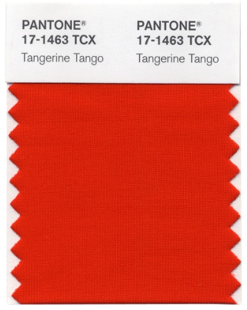
Sigh. Was it too much to hope for a nice, grassy green?
Leatrice Eisman describes Tangerine Tango thus:
Reminiscent of the radiant shadings of a sunset, Tangerine Tango marries the vivaciousness and adrenaline rush of red with the friendliness and warmth of yellow, to form a high-visibility, magnetic hue that emanates heat and energy.
Now THERE’s a concise little description. Sheesh.
Why am I so cranky about this? You know I’m a fan of bold colors. And there’s nothing WRONG with Tangerine Tango per se. I like red, I like depth…everything Ms. Eisman says about the color is true.
But here’s the thing: I’m still recovering from orange.
Wasn’t it just yesterday that orange was EVERYWHERE?
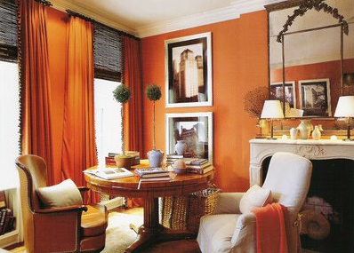
Especially with olive and kiwi greens?

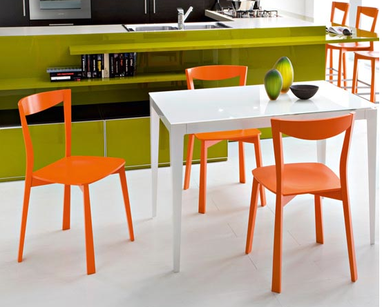
Granted, it was a much lighter orange – tangerine without the tango, if you will – but I feel as though stores from West Elm to CB2 were just reveling in it, especially for accessories.
Habitually Chic has a wonderful post about the positives of orange. But here’s the thing: it was written 11 months ago. See what I mean?
To be honest, I’m still grooving on Pantone’s color of the year for 2011: Honeysuckle pink.
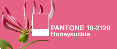
In fact, I’d finally traded out those goofy half-orange chairs (and they ARE close to Tangerine Tango)…

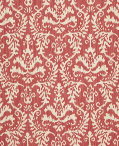
…for new pink chairs, and I’d just reupholstered my little Mitchell Gold Mona sofette in a pretty pink and cream Ikat from Schumacher.
Is that it? Am I feeling left behind? (I still have those darn two-tone chairs, but you couldn’t pay me enough to put them back in the living room.)
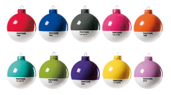
Or maybe I’m angry with Pantone for creating these awesome Christmas tree ornaments but not selling them in the U.S. this year.
Look. I’m sure I’ll get with the program eventually. But for now, Tangerine Tango doesn’t feel fresh as much as recycled. In a lame way, not a cool eco way. A strong, grassy or blue-green would have been much fresher.
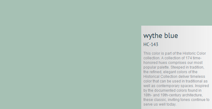
As for Benjamin Moore’s color of the year for 2012, HC-143 Wythe Blue…that’s a subject for another time. (One word, though: tired.)
Annie Elliott – aka bossy color – is an interior decorator and design blogger in Washington, D.C. She has been quoted by The Washington Post, the Associated Press, and most recently, she had a full-page interview in USA Today’s glossy magazine, American Life Home. Look for it. And when you find it, please send it to her, because she only has it on a PDF.
