
We all know that when you’re decorating a room from scratch, my advice is to start with the rug.
One of my most loyal, blog-reading, bossy-bossing clients is moving into a darling bungalow, and she took this advice to heart. (Advice, gentle suggestion, command…tomato, tomahto, tomuto.)
Remember how I said recently that blue dining rooms are all the rage? In part because they pull the blues from Oriental rugs so beautifully – blues MATCH well. That was the case here. This client’s bungalow dining room was a “before” in the blue dining room post.

(Can you believe that’s the same color above and below? Yeesh. Without flash, mustard. With flash, Merry Marigold. Either way…yeesh.)

Anyway, we’d decided that we’d make the most of her beautiful rug by using Benjamin Moore’s 2062-50 Blue Jean on the walls.

Ta-DA, right? It looks fantastic. It MATCHES :)
What’s doesn’t quite match but doesn’t quite qualify as a complement (try saying that 5 times fast) is what we did in the L-shaped back room.
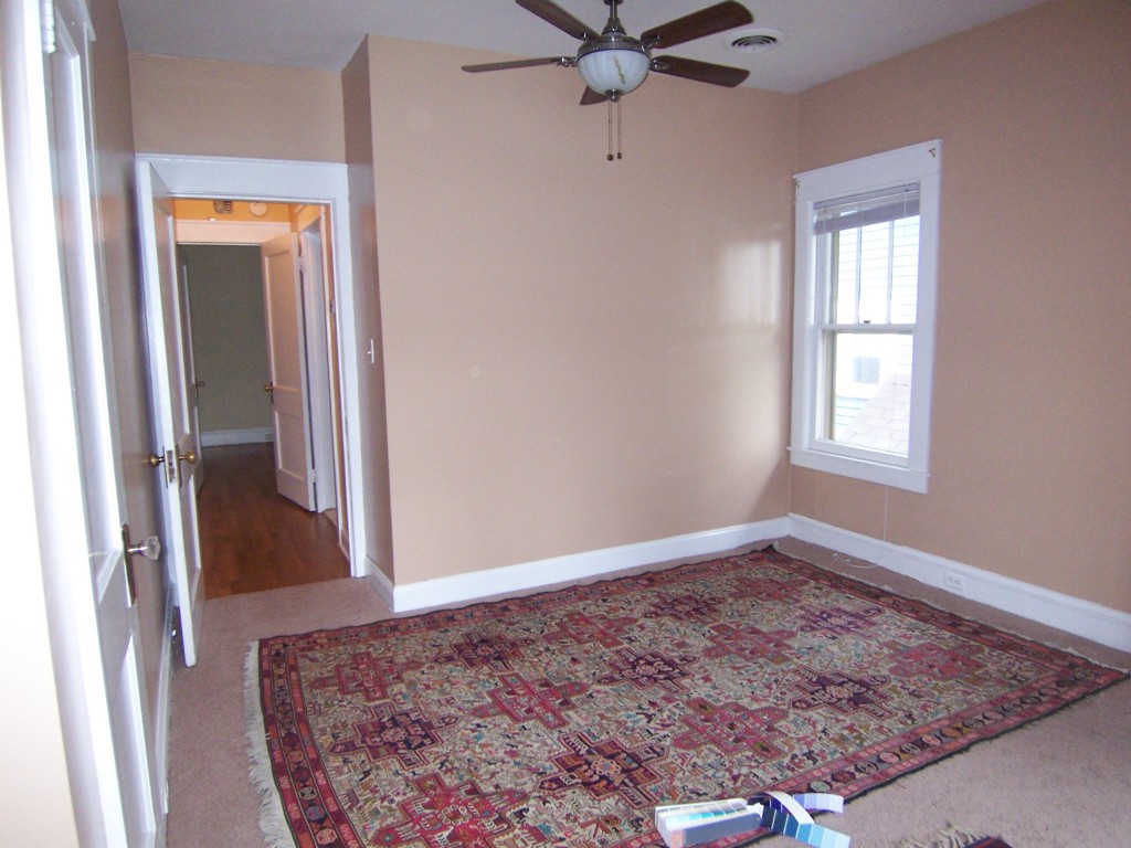
Here’s the before, with her gorgeous rugs but also, tragically, with semi-gloss walls the color of rye toast.


Here’s a closeup of the larger rug. It’s beyond gorgeous.
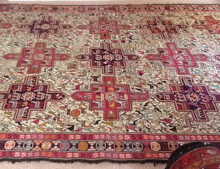
Those reds are closer to dark pink. And there’s a light aqua, a light but intense yellow-green, lots of cream, various oranges…just beautiful. It’s a silk flatweave that my client bought years ago at a store called Paysage in Cleveland. (I tried going to the site, but it seems to be having some issues.) She insists that the rug indestructible, despite being silk. Ask Harry and Duncan, her dogs. They’ll tell you.
Anyhoo, what color would YOU have put with this rug? Would you have MATCHED it by pulling out the yellow-green? The aqua? Cream? Here’s what we went with in the end:


Benjamin Moore’s 2069-50 Blue Orchid, a blue with quite a bit of lavender in it. Isn’t it great with the silk rug? It JUST PLAIN WORKS.

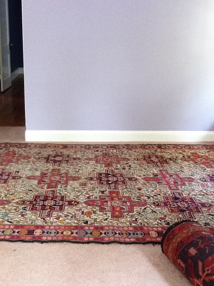
It really brings out the pinks, somehow. I even like it with the navy and red rug, which the client’s friend brought her from Turkey. (I tell you, if you want nice rugs, make friends with a foreign-service officer today.)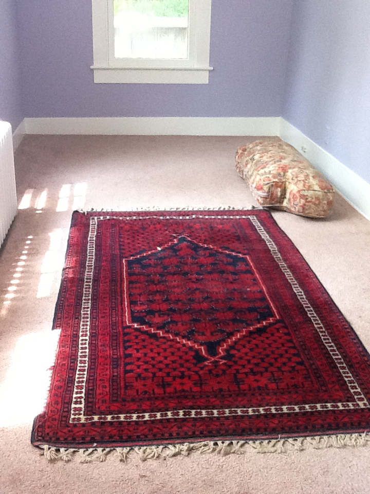
So what are we to make of this? I pulled out a color wheel, and this is not a cut-and-dried case of COMPLEMENTING colors. (Sick of the caps? Sorry. But it’s helpful, right?)
If it were a true complement, we could have put, I dunno, yellow-green on the walls to complement those pink hues in the larger rug.
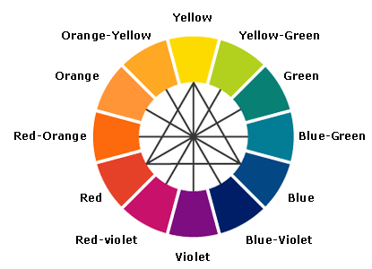
Or a truer blue or aqua on the walls to complement its orangey-ness. Maybe the lavender works because the large silk rug reads yellowy cream overall?
I’m about to embark upon a series of podcasts with 5 kick-a$% color experts, so maybe I’ll just ask them. (More on that later.)
But for now, let’s just say that the Blue Orchid just plain works with the rugs. That’s good enough for the client. And, frankly, it’s good enough for me.
Annie Elliott – aka bossy color – is an interior decorator and design blogger in Washington, D.C. She’s also the creator of the “bossy basic,” a one-time service to jump-start the interior design process in your home.
