• Skip to main content
  • Skip to header left navigation
  • Skip to header right navigation
  • Skip to site footer
  • about
    • services
    • team
  • portfolio
  • press
Annie Elliott Design, Washington DC

Annie Elliott Design

Greater Washington DC

  • book
  • blog
  • contact

Is light pink the new (sophisticated) neutral?

Annie Elliott | February 27, 2023

If I were REALLY on top of things, Gentle Readers, I would have timed this post to coincide with Valentine’s Day. But alas, I was caught up in the moment, and the mid-century cabin won out ;)

Here’s what prompted the pink ponder, though:

Empty kitchen with green cabinets and pink walls
Sarah’s kitchen, with walls in Benjamin Moore’s Pink Damask

My friend Sarah was painting her kitchen. She had inspo photos, so I (unfortunately) can’t take credit for the genius combo of light pink walls with green and butter yellow cabinetry, which are behind us in these pictures. But I did help her with the exact hues ;)

Kitchen with built-in banquette and pink walls
Moved back in

They barely look pink, right? That’s what I’m saying. It’s subtle and sophisticated. Off-white with a hint of pink.

Here’s are two more rooms that are off-white with a pinkish cast:

Simple wicker table with rustic wood mirror
Bedroom with light pink walls and green ceiling
Farrow & Ball’s Peignoir on the walls
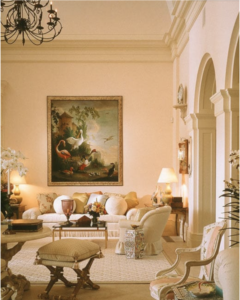
Grand room with light pink walls
By Mario Buatta. I bet that in normal light the walls appear off-white; the light makes everything look yellow in this picture

I’m even going to broaden my definition of “pink” to include very light coral tones. If a white is closer to red or orange than yellow, I’ll call it pink. Closer to yellow is ivory. Closer to blue is gray and perhaps should be avoided.

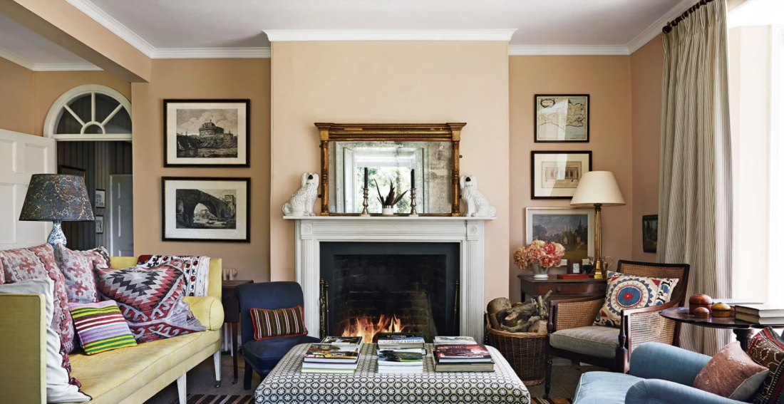
Eclectic living room with bookcase and settee
The late designer William Yeoward’s apartment, in orangey pink with a plaster effect.
Casual traditional living room with pink walls
Ben Pentreath

I’m talking about the “public” spaces in your house: living rooms, family rooms, dining rooms, and kitchens. And front halls and hallways. We all know pink is fine for bedrooms — and even baths — but I’m proposing that we expand our thinking.

Traditional living room with secretary
Ben Pentreath again
Overstuffed chair and sofa in pink living room
William Yeoward?

Going beyond paint, here’s a faux bois wallpaper with a pinkish tinge:

Hallway with yellow settee
Tom Scheerer

Then there’s light pink that is definitely pink. My living room is this way, because the off-white pinks washed out in the northern light.

Blush pink living room with green sofa
My living room, with walls in Benjamin Moore’s Pink Moire
Overdecorated light pink living room
I believe this is Bunny Williams. I apologize: I didn’t pay enough attention when I was searching for pictures!
By Yellow London

So. The next time you’re contemplating which off-white to use in a room, remember: barely there pink is an elegant option.

Annie Elliott Design is based in Washington, D.C. We’re experts in creating colorful, pattern-filled, highly personalized homes for wonderful people.

Category: Color + paint colorTag: blush, faux bois, kitchen, light pink, Mario Buatta, paint, paint color, Pen Bentreath, pink, William Yeoward

Sidebar

Subscribe


Bossy Color Blog

Categories

  • Art + accessories »
  • Bedroom »
  • Color + paint color »
  • Dining room »
  • Furniture + upholstery »
  • Kids »
  • Kitchen + bath »
  • Lighting »
  • Living Room + Family Room »
  • Renovation »
  • Rugs »
  • Wallpaper »
  • Window treatments »

View Portfolio

view Bossy Color's portfolio

Instagram

annieelliottdesign

View Instagram post by annieelliottdesign

Oct 7

Open post by annieelliottdesign with ID 18635567182053307
Happy Wallpaper Wednesday! Today we’re talking about one of my favorite things in the whole world: grasscloth. (Which technically makes today *Wallcovering* Wednesday, but tomayto tomahto.) Most grasscloth is made of actual grasses that have been washed, dried, bleached or dyed, and glued to paper. Wallcovering made of sisal, seagrass, raffia, or hemp also is placed under the heading “grasscloth.” Talk about timeless style: while grasscloth had a popularity surge in the 1960s and 70s (thanks to a cultural obsession with living in nature), its first known use was in 107 AD, in China ;) Grasscloth has long been appreciated for its insulative properties and durability. From a decorating perspective, I love it because it adds warmth, texture, and dimension to any space. Picture a room painted white, and then imagine that room with an off-white grasscloth on the walls (and, if you’re me, the ceiling). The second room is still light and bright, but it’s cozier and more interesting.Grasscloth can be minimalist in neutral earth tones or maximalist, dyed bold colors, colorfully painted, or appliquéd with spangles, embroidery, or tape trim. It shows its seams when installed, but that’s part of the charm. I love grasscloth in hallways, living spaces, and bedrooms, but I avoid using it in kitchens and steamy bathrooms because I’m nervous about odor retention and excessive moisture.Enough school for the day, but if you remember nothing else: grasscloth enriches every room it graces. Highly recommend.📸 Michael K. Wilkinson@schumacher_midatlantic @schumacher1889 @phillipjeffriesltd

annieelliottdesign

View Instagram post by annieelliottdesign

Oct 3

Open post by annieelliottdesign with ID 18482506054114649
You likely know where I stand on pillows: they NEVER should be an afterthought. Check out my latest blog post for recommendations on size, shape, style, and placement. Link in bio. 📸 @stacyzaringoldberg📸 @kipdawkinsphoto📸 @angieseckinger

annieelliottdesign

View Instagram post by annieelliottdesign

Oct 2

Open post by annieelliottdesign with ID 18103510994172389
This client’s gorgeous collection of gold icons in the bookcases puts this room in a league of its own. Whenever you have a collection — of ANYTHING: frog figurines, English engravings of flowers or dogs, snow globes — maximize its impact by bringing the objects together and placing them in a prominent place. These icons are breathtaking, and the sheer number invites you to go closer and study them. With reverence.#eastlake #vintagerug #antiquerug

annieelliottdesign

View Instagram post by annieelliottdesign

Sep 28

Open post by annieelliottdesign with ID 18630011602021777
Happy Fall! Ironic, isn’t it, that fall weather is cool, but the colors we associate with the season are warm? The earthy orange grasscloth in this foyer is undeniably “fall” to me. Add deep, warm versions of green and blue, et voilà: a cozy, inviting, autumnal space.

annieelliottdesign

View Instagram post by annieelliottdesign

Sep 23

Open post by annieelliottdesign with ID 17881497900529047
For this week’s Wallpaper Wednesday we go into the Woods… Woods is a great example of Cole & Son’s innovation in serigraphy, a traditional method of screen printing. The pattern is available on fabric and wallpaper in a variety of soothing yet elegant colorways. Due (I’m sure) to the booming success of the original, there are now some whimsical variations on Woods: Cole & Son added metallic stars to some colorways and pears to others. As you may imagine, however, this traditionalist prefers the original 🙂For some reason, Woods is especially popular for nurseries. Maybe those babies really wanted out of their cribs. 👶🏼In 2005, Woods deservedly won the ELLE Decoration International Design Award for Wallcovering of the Year. And it’s still going strong.

annieelliottdesign

View Instagram post by annieelliottdesign

Sep 22

Open post by annieelliottdesign with ID 17934708156387896
“Isn’t ‘modern farmhouse’ over yet?” I loved speaking with @authordinacheney @washingtonpost about the worst interior design trends! Turns out I’m not the only designer with strong opinions 😊@vincentewolfdesigns @kimletgordon @maxsinsteden #interiordesign #washingtonpost #designopinions #annieelliottdesign

annieelliottdesign

View Instagram post by annieelliottdesign

Sep 18

Open post by annieelliottdesign with ID 17989063023104856
Best part of being an interior designer is using your own home as a playground for creative ideas! We changed the paint in our living room again and here’s how it looks now! #interiordesign

annieelliottdesign

View Instagram post by annieelliottdesign

Sep 17

Open post by annieelliottdesign with ID 18125330714481993
When you become an empty nester, when is it ok to reclaim your adult child’s space? Check out my latest blog post for my recommendations on how to approach empty nesting!📸 @stacyzaringoldberg📸 @kipdawkinsphoto📸 Michael Wilkinson📸 @angieseckinger

annieelliottdesign

View Instagram post by annieelliottdesign

Sep 10

Open post by annieelliottdesign with ID 17906571285498443
Pink, green, and a splash of dark orange come together to create this sunny, summery bedroom 🪷
Follow

Looking for something?

Don’t miss a single post


Where classic and modern hang out and drink gin.

  • Instagram
  • TikTok
  • Pinterest
  • Facebook
American Society of Interior Designers Firm Partner

© 2026 · Annie Elliott Design · privacy policy