• Skip to main content
  • Skip to header left navigation
  • Skip to header right navigation
  • Skip to site footer
  • about
    • services
    • team
  • portfolio
  • press
Annie Elliott Design, Washington DC

Annie Elliott Design

Greater Washington DC

  • book
  • blog
  • contact

5 things you need to know about wallpaper

Annie Elliott | September 21, 2015

I hope that by now, I’ve convinced all of you to have wallpaper SOMEWHERE in your lovely homes. Maybe you’re still getting comfortable with wallpaper — using it as an accent wall in a bedroom or trying it out in your powder room — or maybe you’ve gone whole hog and are hanging it faster than the factories can print it.

Either way, here are 5 things you need to know to wallpaper responsibly today.

1. Wallpapering adjacent rooms is a DON’T. 

Unless you’re in Colonial Williamsburg, using different patterned wallpaper in adjacent rooms isn’t a good idea. This might be my 1980s Waverly hangover talking, but flowers into flowers into flowers just doesn’t feel current. (Exceptions: a textured wallcovering in one room and a pattern in the next, or a powder room off of a wallpapered room. Powder rooms live by their own rules.)

Historic wallpaper
Wythe House at Colonial Williamsburg

2. Large scale patterns are more modern. When in doubt, go bigger on the pattern.

Yellow and white wallpaper
Sigourney wallpaper by Quadrille. Interior design by Amanda Nisbet
Dragon wallpaper in foyer
Schumacher’s Chiang Mai wallpaper. Bossy color, photo by Andrew Propp for Washingtonian Magazine

3. You can end wallpaper at the top of the stairs.

This is a big one, because it means that you can wallpaper your foyer without having to carry it all the way through your house. Permission to stop the wallpaper is hereby granted.

Nina Campbell's Paradiso wallpaper in my stairwell
Nina Campbell’s Paradiso wallpaper in my stairwell
Peacock wallpaper
Paradiso wallpaper in stairwell

4. Texture adds elegance.

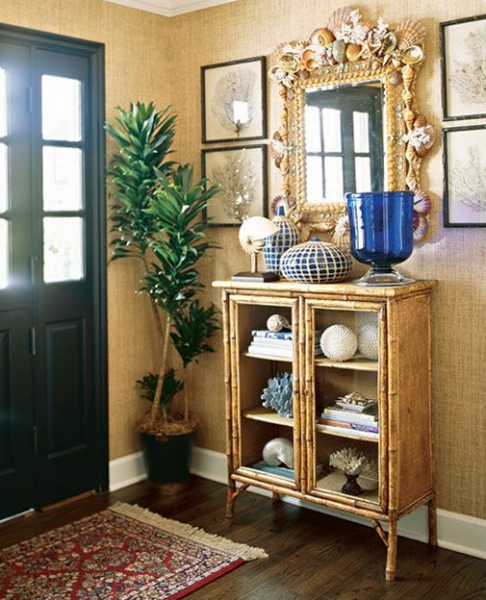
Grasscloth, strie…you don’t have to love pattern for wallpaper to be effective. Texture adds depth, interest, and sophistication.

Bamboo and grasscloth in entry hall
Grasscloth in foyer. From the blog, The Inspired Room
Green wallpapered powder room
Farrow & Ball’s dragged paper. Michael K. Wilkinson for bossy color

5. Ceilings are an option.

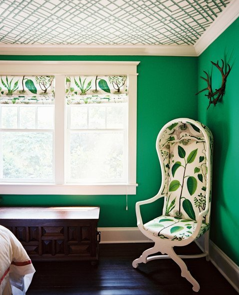
Wallpapering a ceiling — and not the walls — can have a wonderful effect, especially if the wallpaper has some shimmer. You need to be careful here: the pattern has to look good from every angle. This is one of my favorite pictures ever:

Grasscloth in child's room
Lonny, via Apartment Therapy. Note the grasscloth walls next to stars on the ceiling!
Green walls with graphic wallpaper on ceiling
Lonny, via Apartment Therapy
Blue lacquered foyer with gilded ceiling
Lilly Bunn Interiors

There you have it, Gentle Readers! I’ve done what I can. The wallpaper is in your court.

Bossy color | Annie Elliott interior design is based in Washington, D.C. We create outrageously beautiful for fascinating people — starting with color. Don’t miss our recent interview with The Washington Post about Oriental rugs…

Category: WallpaperTag: blue foyer, Colonial Williamsburg, dragged paper, gold ceiling, grasscloth, green room, lacquer walls, Lilly Bunn, Nina Campbell, paradiso, powder room, strie, wallcovering, wallpaper, wallpaper accent wall, wallpapering foyer, wallpapering stairwells

Sidebar

Subscribe


Bossy Color Blog

Categories

  • Art + accessories »
  • Bedroom »
  • Color + paint color »
  • Dining room »
  • Furniture + upholstery »
  • Kids »
  • Kitchen + bath »
  • Lighting »
  • Living Room + Family Room »
  • Renovation »
  • Rugs »
  • Wallpaper »
  • Window treatments »

View Portfolio

view Bossy Color's portfolio

Instagram

annieelliottdesign

View Instagram post by annieelliottdesign

Mar 23

Open post by annieelliottdesign with ID 18102457048819740
Here’s what ✨ I ✨ would do… Instead of matching everything, you balance it. Pull one color. Shift the scale. Let each piece do something different. Here’s what ✨ I ✨ would do… Instead of matching everything, you balance it. Pull one color. Shift the scale. Let each piece do something different. Bonus: Change the rug! Suddenly you’d make a completely different window choice.Did you guess it?!Watch part 1 for the challenge context and part 2 for what doesn’t work.#interiorsandhome #fabricdesign #romanshades

annieelliottdesign

View Instagram post by annieelliottdesign

Mar 23

Open post by annieelliottdesign with ID 17860517745617635
Let’s talk about what fabric doesn’t work ❌ for the Roman shades in this teenage girl’s bedroom with 2 big windows and a statement ceiling. Even though these fabrics are beautiful on their own… they don’t work here. Biggest mistake: repeating the same motif (moths, butterflies, etc.) across the room. It starts to feel themed instead of designed.Watch part 1 for the full context, and watch part 3 to find out what I would choose.#interiordesign #wallpaper #interiorsandhome

annieelliottdesign

View Instagram post by annieelliottdesign

Mar 23

Open post by annieelliottdesign with ID 18038018090572669
Here’s the challenge: a teenage girl’s bedroom. Not huge. Two big windows. Statement ceiling. White walls.Which fabric would you choose for the Roman shades?There’s a right answer… a safe answer… and a couple very wrong ones. Comment your pick before you see part 2 👇#interiordesigner #wallpaper #romanshades

annieelliottdesign

View Instagram post by annieelliottdesign

Mar 20

Open post by annieelliottdesign with ID 18081942074583086
Behind the scenes at an AED photoshoot! 📸. It is all hands on deck — even Tilly did her part! Shoutout to @stacyzaringoldberg #interiordesign #dcdesigner #interiorsandhome

annieelliottdesign

View Instagram post by annieelliottdesign

Mar 18

Open post by annieelliottdesign with ID 18097450855812440
The star of today’s Wallpaper Wednesday is Schumacher’s Acanthus Stripe. If you’ve studied Green and Roman architecture, the Acanthus motif is an old friend: Acanthus leaves were a common ornament on Corinthian capitals as early as 500 BC. Celerie Kemble’s interpretation of the motif in her Acanthus Stripe wallpaper is streamlined and clever, with the leaves serving both as capitals and as the columns themselves. @schumacher1889 has created three types of Acanthus Stripe wallcovering: paper, vinyl, and sisal, with the latter my favorite by far. The sisal roughs up the pattern a little bit, making the paint a tad uneven and the edges of the design blurry in parts. It’s a little more real, a little more appropriate for a spiky leaf rendered in stone exposed to the sun and wind for thousands of years.Acanthus Stripe Sisal in Fog and Chalk is classic (ask Mabel from the show, *Only Murders in the Building*; she didn’t want to go too crazy redecorating her aunt’s apartment, I guess), but my favorite colorways are Turmeric and Mocha. In these colors, on this material, the design couldn’t be more elegant.#wallpaperins #interiordesign #onlymurdersinthebuilding

annieelliottdesign

View Instagram post by annieelliottdesign

Mar 17

Open post by annieelliottdesign with ID 18332961886216904
Does your kitchen backsplash inspire you? It should! Try using patterned or textured tiles, mix bold colors, or partner with an artist to create a special design. If you have a great view or no wall at all, you won’t need a full backsplash, of course ;) Just wrap the countertop material up 4-6” to protect the wall.#dcdesigner #backsplash #kitcheninspiration

annieelliottdesign

View Instagram post by annieelliottdesign

Mar 12

Open post by annieelliottdesign with ID 17998975517873970
The Dorothy-Draper-designed Greenbrier Resort in West Virginia is a pilgrimage for interior designers. The edgy color combos, repetition of patterns, and Draper’s fascination with scale make it a must-visit for anyone interested in interior design. I’m not a fan of everything, though ;)Check out my blog post about the Greenbrier to see what’s ❤️ and what’s 💔.

annieelliottdesign

View Instagram post by annieelliottdesign

Mar 9

Open post by annieelliottdesign with ID 18200417014327302
Thanks for watching 💚 #aresenicgreen #interiorinspiration #farrowandball

annieelliottdesign

View Instagram post by annieelliottdesign

Mar 9

Open post by annieelliottdesign with ID 18000887054878693
What color would you pair with Arsenic? See part 2 in my reels grid #paintinspo #interiordesign #farrowandball
Follow

Looking for something?

Don’t miss a single post


Where classic and modern hang out and drink gin.

  • Instagram
  • TikTok
  • Pinterest
  • Facebook

© 2026 · Annie Elliott Design · privacy policy