Hi Annie, I’m going to apologize in advance because this question is somewhat similar to one that you answered in February, but if you bear with me, the ultimate problem does differ.
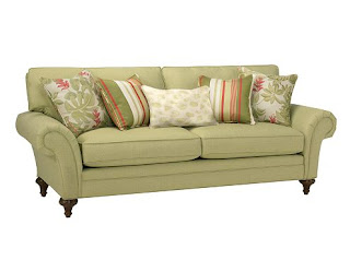
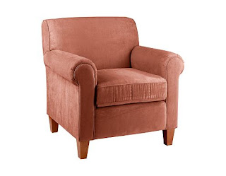
 I am working on decorating the living room in my new apartment and just purchased a sofa (leaf green) and a chair/ottoman (paprika); the seashell and fern pillows have “disappeared” because floral just isn’t our style.
 The floorplan is open, and I am looking for an area rug to draw the space together. The problem comes in choosing an appropriate color/pattern. Most rugs that I have found online that incorporate both orange and green have very loud patterns. The artwork we plan to purchase, however, is geometric with bright colors…

and I’m afraid that mixing a large patterned rug with a large modern painting will just be too much for the space to handle. How should we reconcile this issue? (The living area in the apartment has beige carpeting and the walls are beige with white crown molding–we’re desperate for some color.)
Thank you so much for your help!
Elizabeth
PS: I’m working on a graduate student’s budget…
Dear Elizabeth: First of all, WHO is this fantastic artist?!? You’re so right to work with your new pictures, but it’s critical that we don’t over-coordinate or the edginess of the art will be lost. We don’t want your living room to look like a page from Home Decorating for the Meek and Mild.
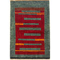
 If you had sent me only a picture of the art, I would have guessed that your furniture was dark brown or black leather, low-slung, boxy, possibly mid-century, possibly with some teak involved… In that case, I would have recommended a “tribal” rug, such as a Gabbeh – this particular one isn’t the right size, but the design is great – or
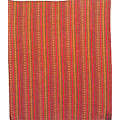
  a Hashtrood. (Btw, both of these are from my favorite rug resource, Rugman.com.) So I’m delighted that you included pictures of your furniture, or I would have been way off-base!
Given that your sofa and primary chair are different colors, one solution is to choose a solid rug that’s a darker shade of one of those colors. If you promise to add some pillows and additional art, it’s a totally respectable option.
 A green rug would be interesting if you add some texture and choose an offbeat shade. Your sofa looks like it has a lot of yellow in it – pear rather than sage, is that right? If you’re as bold as your taste in art suggests, this Surya Aros Shag Collection wool rug in Aros Green from RugsUSA.com (a budget-friendly resource) would be ideal. It’s a perfect example of the importance of context: I might think this rug was pukey if I saw it in a showroom, but it would be smashing with your furniture and art.
 If that color is too simply too intense for you (these rugs are returnable, though, so you can take a risk…), here’s the Rug One Retro Collection rug in Olive. I wish is were a hair darker, but it certainly would work. You must promise me you’ll get some funky pillows for the sofa and chairs to break things up, though.
These suggestions notwithstanding, you shouldn’t feel you need to shy away from pattern just because you have dynamic art. Just make sure you move beyond green and orange, because the art is way too edgy to get all matchy-matchy with the furnishings.
 Take a look at Garnet Hill’s Chambord Flat-Weave Wool Rug. In addition to the green and orange, there’s gold in there, and dark red, chocolate brown, light blue, etc. This rug would look best if the painting you choose has some graphic black strokes in it to help it stand up to the rug.
The Capel Chincoteague Collection Rug f rom RugsUSA.com is more subtle, but it will pull the sofa and chair together, and the presence of the taupes and blues will prevent the room from looking over-coordinated.
Good luck, Elizabeth. Please let me know what you decide. And if you hit upon a different solution, I’d love to hear about it.