• Skip to main content
  • Skip to header left navigation
  • Skip to header right navigation
  • Skip to site footer
  • about
    • services
    • team
  • portfolio
  • press
Annie Elliott Design, Washington DC

Annie Elliott Design

Greater Washington DC

  • book
  • blog
  • contact

You asked…about colors for a Western retreat

Annie Elliott | June 10, 2010

Hi Annie – i stumbled across your blog while hunting out paint colors/ideas for our house we just purchased….

The new house is a lovely post and beam.


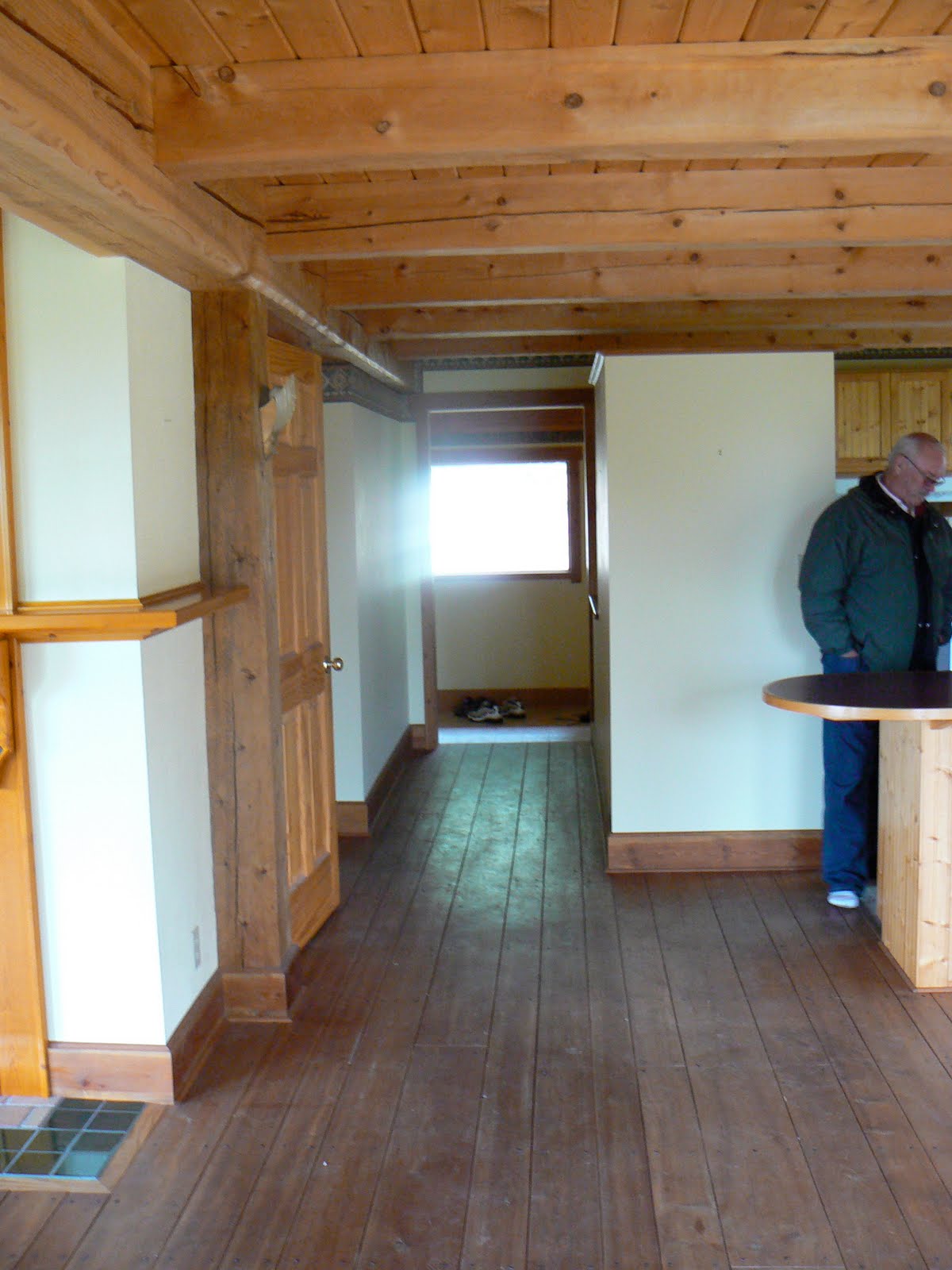
All the walls throughout the house are currently painted a slightly outdated looking yellow. There is a wallpaper border…It needs to go…


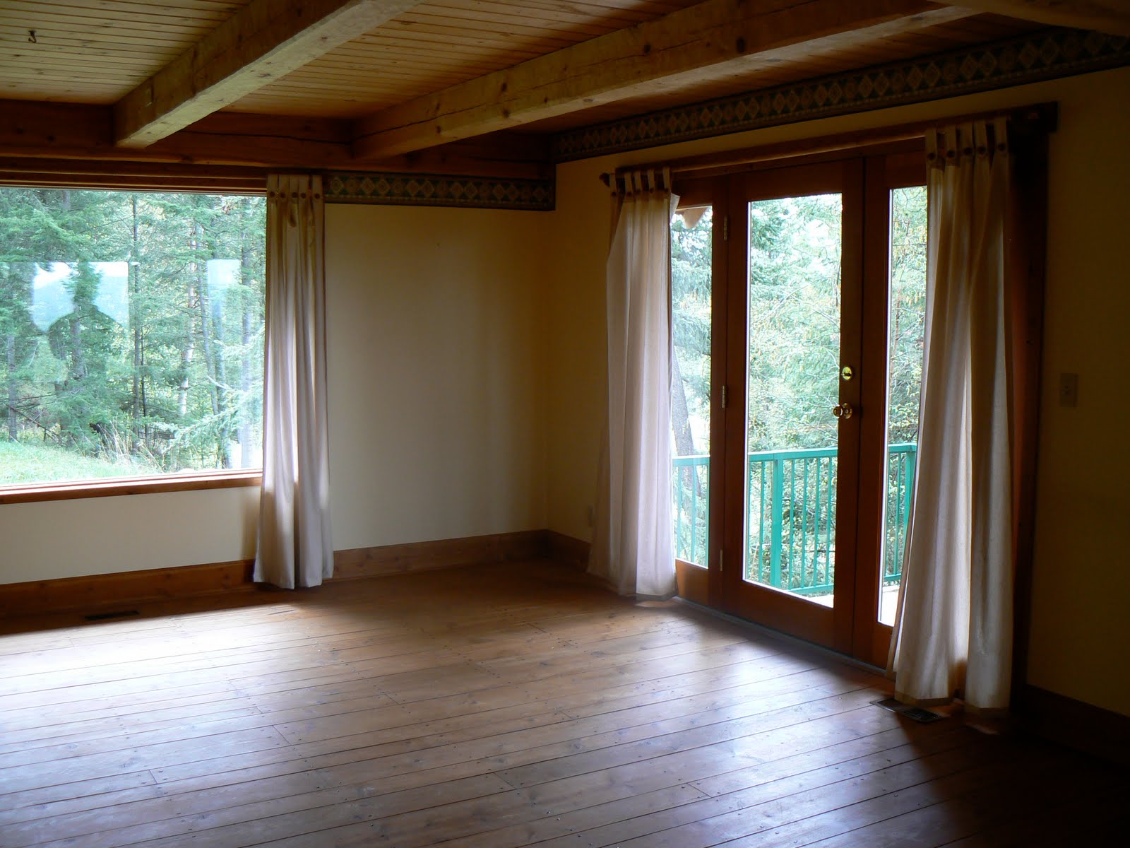
So we are contemplating colors. Currently we are leaning towards a light beige as the main color throughout the house (or at least the main floor).

I would like to paint the one wall in the kitchen/hall a complimentary color…I’m thinking a dark burgundy/maroon I like Benjamin Moore AF 300. Having read your post about accent walls, I am now reconsidering if this is a good idea….


Also, having read your post on “starting with the rug“, our rug is a southwest kind of design, with different shades of beige, with navy blue and burgundy/maroon accents. We have 2 western style large tan leather couches.….Our style leans to western…


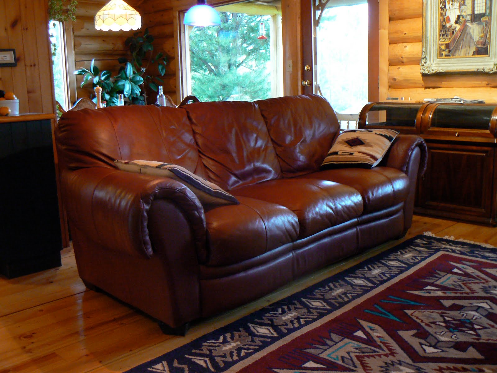
So do we do the whole house in one color, or do we mix and match colors, or do we do each room in different colors? Any suggestions on a nice beige color?

After looking at the pictures, any other idea/suggestions would be greatly appreciated-I didn’t inherit a decorating gene!!
Thanks in advance!!
– Isabella MacQuarrie


Dearest Isabella,

Your reconsideration of the accent wall is warranted. It is not the correct solution for this space.

I’m not entirely confident I understand which wall is in question, but in looking at your photographs, I see no wall that warrants the attention painting it a different color would bring.

It’s the view that demands our attention. Don’t you agree?


So let’s take the pressure off and scrap the idea of the accent wall. (We can talk about bossy color’s feelings about burgundy another time.) If your taste were more contemporary, I’d advise you to keep all of the walls very light. It’s a gorgeous look with those ceilings.


But given that your preference is for the wild West, you are on exactly the right track in thinking about a beige – or taupe, or warm gray – for the walls.

Take a look at this bossy color favorite: Benjamin Moore’s HC-173 Edgecomb Gray. Your search may very well end there. (This picture makes it look a little yellowy, but in real life, I haven’t seen the color go that route.)


OC-5 Maritime White is another color to consider. It’s slightly warmer, but still not yellowy.

If you’re miffed about not being allowed to do an accent wall, consider painting your kitchen cabinets instead.


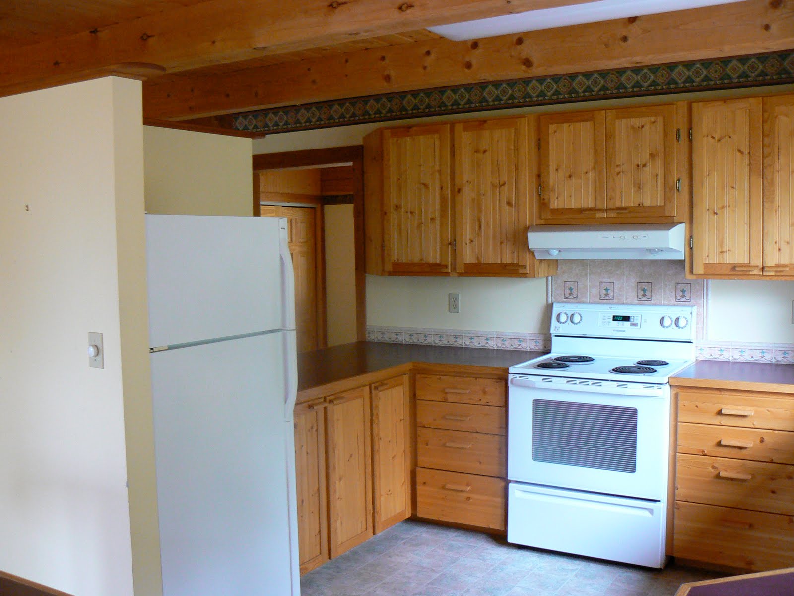
Not burgundy, though. A nice strong navy would be beautiful and wouldn’t detract from the view. It also would relate to the colors in the living room rug.

Try 1680 Hudson Bay, which is a subtle, grayish dark blue, or the super SUPER dark 2063-10 Old Navy, which is blackish.

I hope this is helpful, Isabella! Good luck with your beautiful house, and please let us know what you decide.


Picture of Edgecomb Gray room is from Domino (sigh) via xJavierx’s Flickr photostream.

Category: Color + paint color, Living Room + Family Room

Sidebar

Subscribe


Bossy Color Blog

Categories

  • Art + accessories »
  • Bedroom »
  • Color + paint color »
  • Dining room »
  • Furniture + upholstery »
  • Kids »
  • Kitchen + bath »
  • Lighting »
  • Living Room + Family Room »
  • Renovation »
  • Rugs »
  • Wallpaper »
  • Window treatments »

View Portfolio

view Bossy Color's portfolio

Instagram

annieelliottdesign

View Instagram post by annieelliottdesign

Apr 13

Open post by annieelliottdesign with ID 18085288493580590
Let’s talk about what fabric doesn’t work ❌ for the sectional upholstery in this beach house TV Room. Even though these fabrics are beautiful on their own… they don’t work here. The dark stripes were not lighthearted enough and the smaller scale blue and white pattern was too predictable. Watch to listen to me plead my case for lavender and green! 🏖️#interiordetails #colorfulinteriors #beachhousedesign

annieelliottdesign

View Instagram post by annieelliottdesign

Apr 13

Open post by annieelliottdesign with ID 18321246121271986
Here’s the challenge: Imagine you are designing a lighthearted, summer beach house. In the TV Room, there are bookcases, a neutral rug, and a large sectional.What upholstery would you put on the sectional?Comment your pick before you see part 2 👇#designchallenge #interiorsandhome #interiorinspiration

annieelliottdesign

View Instagram post by annieelliottdesign

Apr 8

Open post by annieelliottdesign with ID 18338258239300458
When you come home after a long day, do you want your foyer to rev you up or calm you down? Decide which approach you need and run with it. Add large-scale wallpaper and layered rugs for excitement, or paint the walls off-white and be selective with your artwork and mirrors for calm. #foyer #homedesign #foyerinspiration

annieelliottdesign

View Instagram post by annieelliottdesign

Apr 3

Open post by annieelliottdesign with ID 17848603689678580
Q: What is one thing you can do to elevate a room❓💬 The first thing you see when you walk into a room needs to look great. In your office, get a nice, big vintage desk. In a living room, paint all the walls a dark color. Avoid satin brass hardware, pills on sofa fabric, and fake wood!#interiordesign #dcdesigner #decorinspo

annieelliottdesign

View Instagram post by annieelliottdesign

Apr 1

Open post by annieelliottdesign with ID 17918392215338642
This will come as no surprise, but I think about window treatments a LOT. Especially during the transition from winter to spring, with the change in temperature and light…I’m reminded what a critical design element window treatments are. And then I get to thinking about window treatments through the ages. Who invented drapes? Did the Romans *really* invent Roman shades?I decided to do some digging. Check out my blog to see what I discovered!📸 @stacyzaringoldberg📸 @jennverrierphoto#windowtreatments #drapes #interiordesign

annieelliottdesign

View Instagram post by annieelliottdesign

Mar 25

Open post by annieelliottdesign with ID 18088729466185965
It’s Wallpaper Wednesday! Today we feature Brunschwig & Fils’ Les Touches. @brunschwigfils introduced Les Touches in 1965, and the pattern soon became a Brunschwig classic. (Interestingly, “touches” translates to “keys” or “strokes…” I guess that’s close to “dabs,” which is what I’d assumed.) According to handwritten records, Les Touches is inspired by post-WWII black and white photographs, but the connection between this inspiration and the pattern remains a mystery. Referred to most often as a stylized animal print, Les Touches is a staple of the Le Jardin Chinois collection.Today, Les Touches comes in 18 colorways, but the blue colorway remains iconic. I’ve used Les Touches for window treatments and upholstery, but I can’t wait to try it as wallpaper!

annieelliottdesign

View Instagram post by annieelliottdesign

Mar 23

Open post by annieelliottdesign with ID 18102457048819740
Here’s what ✨ I ✨ would do… Instead of matching everything, you balance it. Pull one color. Shift the scale. Let each piece do something different. Here’s what ✨ I ✨ would do… Instead of matching everything, you balance it. Pull one color. Shift the scale. Let each piece do something different. Bonus: Change the rug! Suddenly you’d make a completely different window choice.Did you guess it?!Watch part 1 for the challenge context and part 2 for what doesn’t work.#interiorsandhome #fabricdesign #romanshades

annieelliottdesign

View Instagram post by annieelliottdesign

Mar 23

Open post by annieelliottdesign with ID 17860517745617635
Let’s talk about what fabric doesn’t work ❌ for the Roman shades in this teenage girl’s bedroom with 2 big windows and a statement ceiling. Even though these fabrics are beautiful on their own… they don’t work here. Biggest mistake: repeating the same motif (moths, butterflies, etc.) across the room. It starts to feel themed instead of designed.Watch part 1 for the full context, and watch part 3 to find out what I would choose.#interiordesign #wallpaper #interiorsandhome

annieelliottdesign

View Instagram post by annieelliottdesign

Mar 23

Open post by annieelliottdesign with ID 18038018090572669
Here’s the challenge: a teenage girl’s bedroom. Not huge. Two big windows. Statement ceiling. White walls.Which fabric would you choose for the Roman shades?There’s a right answer… a safe answer… and a couple very wrong ones. Comment your pick before you see part 2 👇#interiordesigner #wallpaper #romanshades
Follow

Looking for something?

Don’t miss a single post


Where classic and modern hang out and drink gin.

  • Instagram
  • TikTok
  • Pinterest
  • Facebook

© 2026 · Annie Elliott Design · privacy policy