Hi Annie,
I have noticed that you recommend BM Shaker Beige a lot, so I am hoping you can help me with the elusive paint color I am looking for.
Most of the first floor of my home has recently been painted in BM Shaker Beige but I am looking for a deeper color that works well with this for the large, 2 story living room which is the front of the house and basically visible from everywhere!
Because of the scale and double height (also visible from 2nd floor landing), it tends to be cavernous and echo-y. I originally changed the color from builders white to a warm terracotta but have grown tired of this and feel I want something more soothing….
Hope you can help, thanks so much!
Gail Veary
Hi, Gail! That terracotta can get old, can’t it? And doing such a strong color in a semi-open plan is tricky, for sure.
This suggestion may surprise you, coming from bossy color, but this is about what will look best in YOUR space. Here it is:
Ssslllllmmmmmffffnnnnlllll.
Huh?
A SSSSllldrrrrNNNrrrrrrlllll.
WHAT?
Oh, all right:
A slightly different neutral.
In this double-story room, a bold color like this terra cotta can chop up the space more than energize it.
A brown or grey will keep the space fresh and contemporary while adding some color interest. It could be a color slightly darker than the HC-45 Shaker Beige.
The walls in the picture below are Benjamin Moore’s HC-46 Jackson Tan. Looking at this swatch against the Shaker Beige swatch, I think it will be too dark for you. But the way it appears in this picture, with the lighter, creamy color of the chairs…that’s the look we’re after.

 To get this effect, test some of Benjamin Moore’s Affinity colors, which work beautifully with the HC (Historic Colors) series. Affinity colors are available only as the high-end Aura paint, but it’s really good stuff. Try AF-135 Interlude, which is a brown slightly darker than the Shaker Beige, and AF-155 Weimeraner, which is darker still, but slightly greyer.
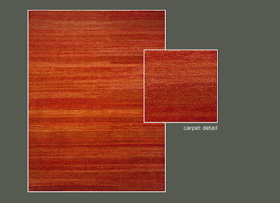
 Since you have art and accessories that pick up on the current orange walls, consider a rug with orange in it to bring some color to the space once the walls are more neutral.
This design is called Grass, by Michaelian & Kohlberg. In D.C., I’d buy it through Timothy Paul Carpets & Textiles:
 Or a big old Persian rug…pairing one of those with neutral walls and contemporary furniture is one of my favorite looks.
Do any of my fellow colorists out there have a suggestion? Agree or disagree? I’d love your input!
Jackson Tan photograph by Youngna Park via xJavierx on Flickr. “Grass” carpet photo from Timothy Paul‘s website.