• Skip to main content
  • Skip to header left navigation
  • Skip to header right navigation
  • Skip to site footer
  • about
    • services
    • team
  • portfolio
  • press
Annie Elliott Design, Washington DC

Annie Elliott Design

Greater Washington DC

  • book
  • blog
  • contact

What’s That Wallpaper? Classic, Elegant Farrow & Ball on Inventing Anna

Annie Elliott | February 14, 2022

For once, I am not behind on my TV watching! Inventing Anna just came out last week, evidently, and once I got past Julia Garner’s bizarro accent (I KNOW it’s intentional, teenage children!), I started enjoying it immensely. (That Shonda Rhimes. Such a superstar.) Plus you already know every single actor in it, which makes it very satisfying to watch.

You know; everyone. From L, Laverne Cox, Anna Chlumsky, Julia Garner, Katie Lowes, Alexis Floyd

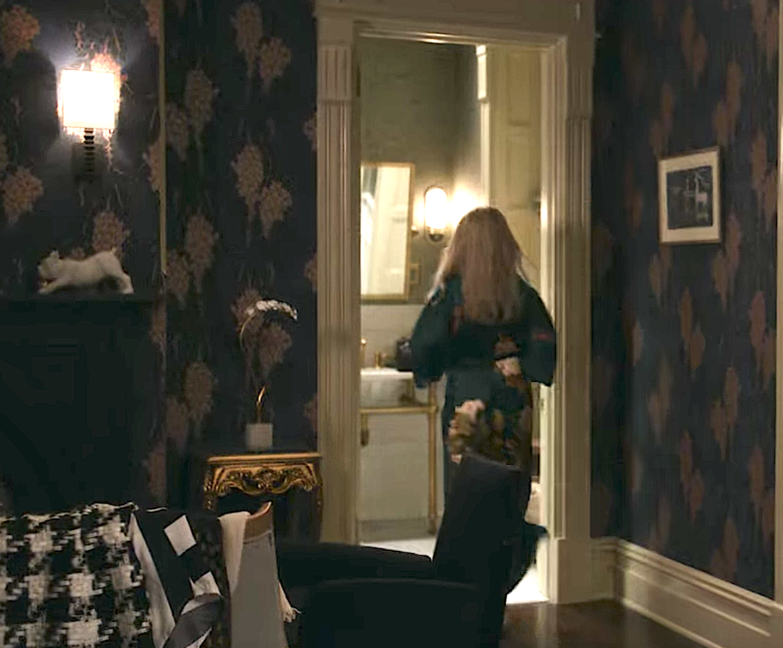
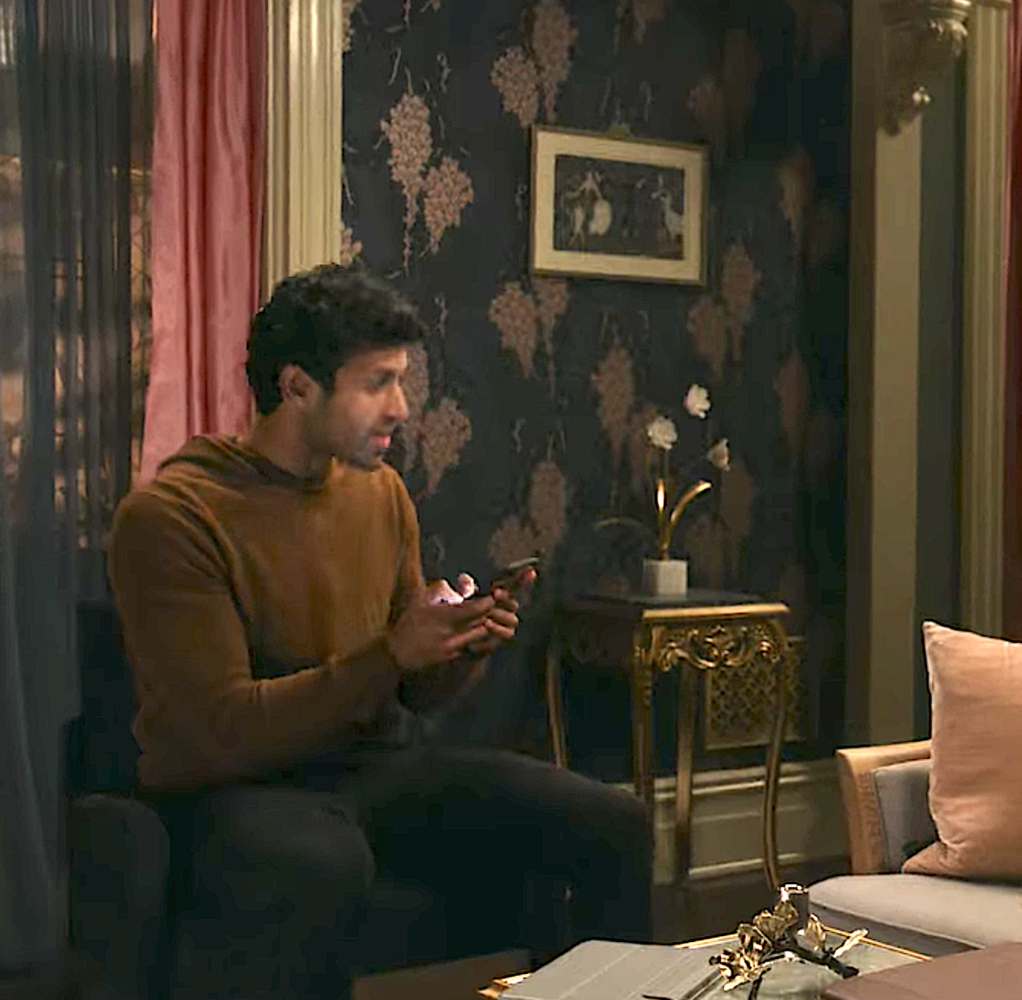
Anyhoo, there I was, minding my own business, when whammo! Episode 3! Nora’s guest bedroom, where Anna and Chase are staying!

Woman in robe walking out of bathroom into fancy bedroom
Farrow & Ball wallpaper

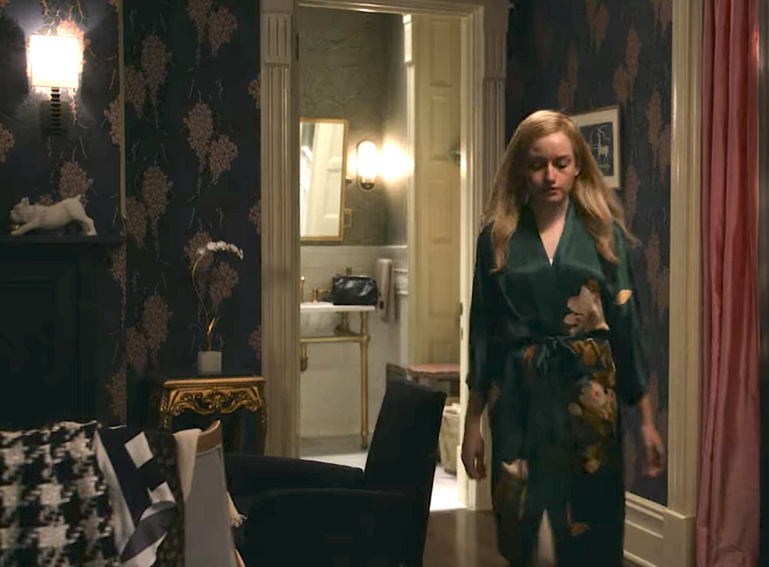
Farrow & Ball’s classic Wisteria wallpaper! In the navy and pink colorway, the catchily named BP 2223.

Farrow & Ball Wisteria wallpaper blue and pink
All of these pictures are from the Farrow & Ball website
Woman in robe entering bathroom from fancy bedroom
The robe is pretty great, too, actually

I LOVE that colorway. Dark, moody, but the pink lights it up. It’s rich but cheerful, which is a tricky combo.

Man with cell phone in room with dark blue wallpaper
Chase. Always on the phone, that one

Some of the other colorways are really pretty, too, though. The coral is beautiful,

Farrow & Ball Wisteria wallpaper in coral and yellow
Wisteria in BP 2222

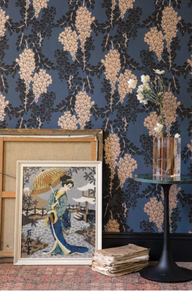
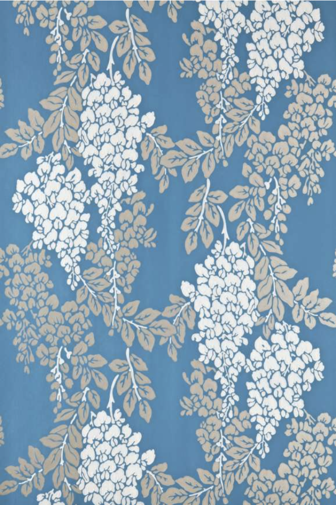
And the blue is super special (I’ve used this one before). You can’t tell here, but what looks beige is actually metallic gold. It’s lovely.

Farrow & Ball Wisteria floral wallpaper in blue and white
BP 2218

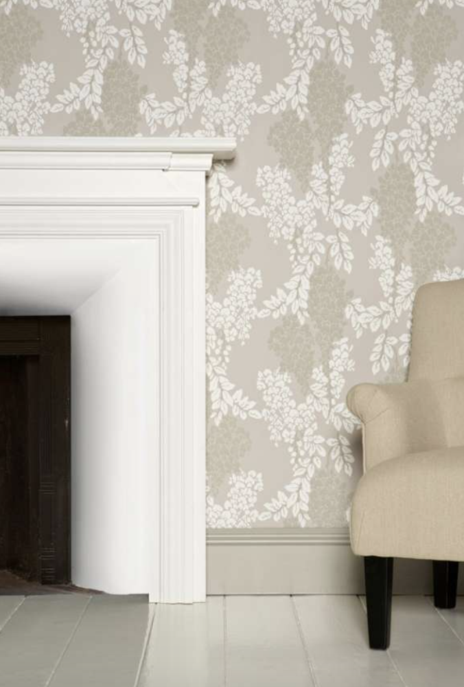
You know I’m not much of a neutrals gal, but I think the gray/beige/white colorway is interesting. (Please note that the mantel is painted a different color than the baseboard in this vignette. Really makes the mantel pop!)

Farrow & Ball Wisteria floral wallpaper in neutrals
Wisteria BP 2202

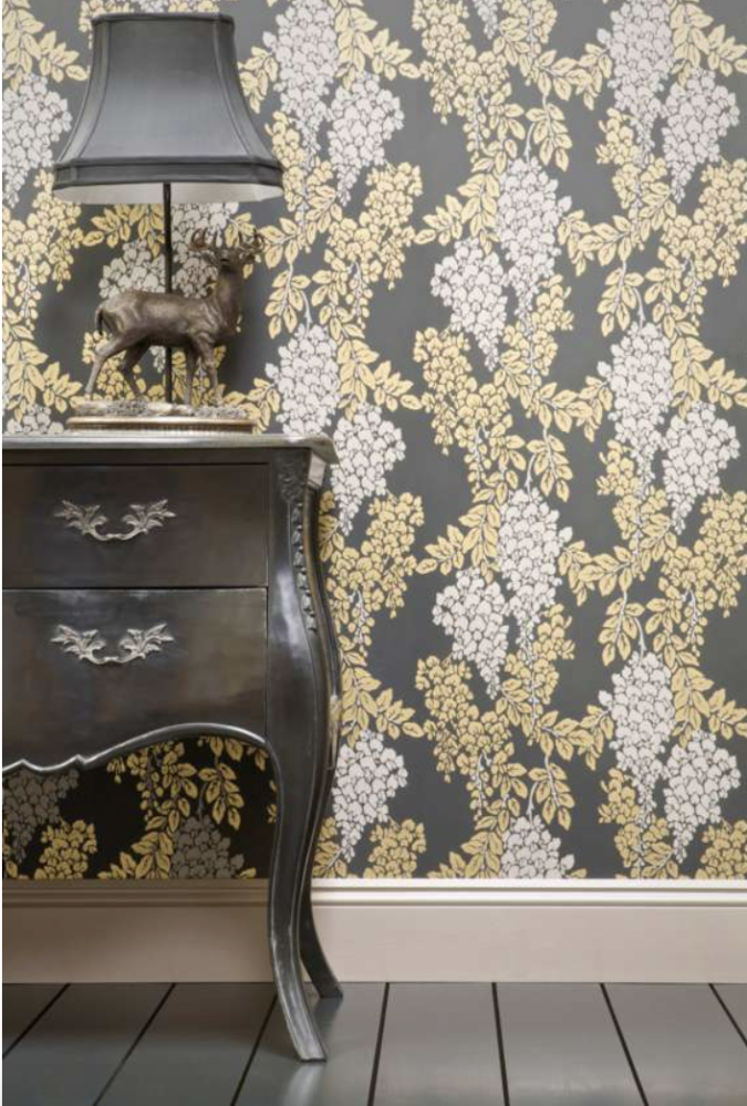
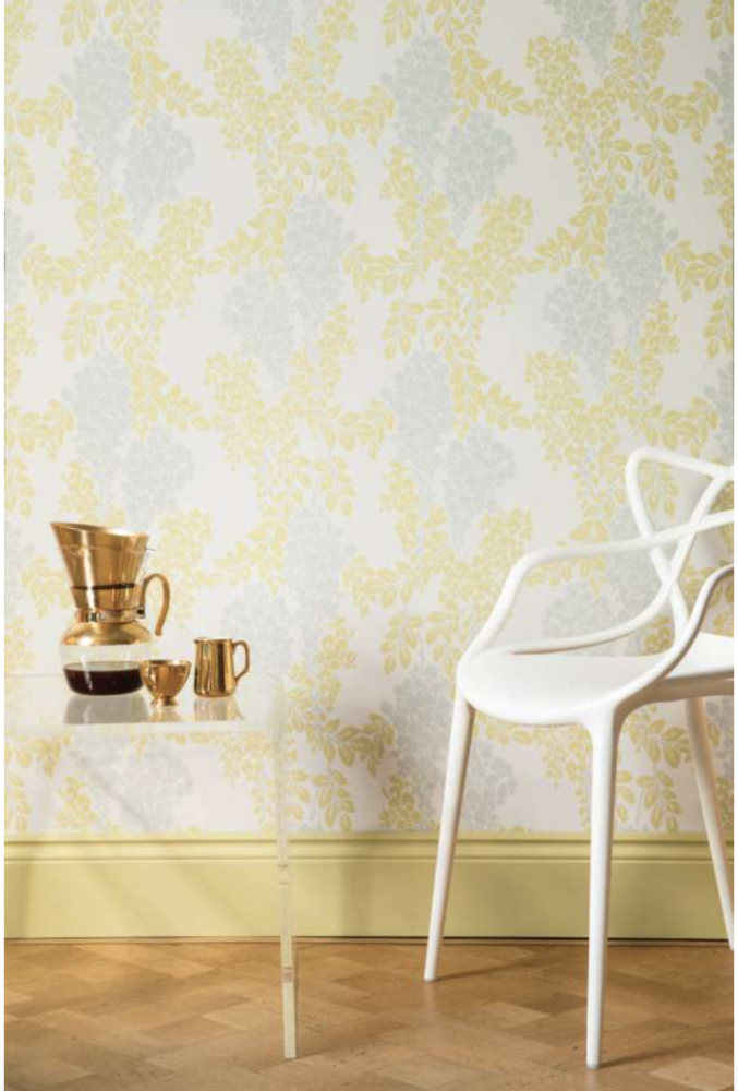
The black and yellow is kind of rock-and-roll,

Farrow & Ball Wisteria floral wallpaper in black and yellow
BP 2206

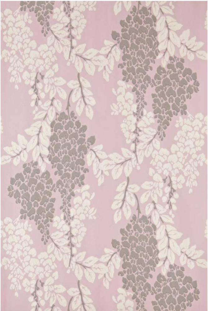
Whereas the pastel colorways are what you’d expect from a floral: light and feminine.

Farrow & Ball Wisteria floral wallpaper in lavender and gray
Wisteria in BP 2209
Farrow & Ball Wisteria floral wallpaper in yellow and white
Wisteria in BP 2221

One note to the set designer, though. When you look closely at the rest of the room, you see some inconsistencies. The drapes should be FAR fuller, for one thing (the pink is fine, if obvious), and probably outside-mount…but the sheers are an absolute disaster. No one with money or taste — two things character Nora Radford has in abundance — would do such skimpy sheers. In GRAY, no less. In NYLON, no less!!!

Man with cell phone in room with dark blue wallpaper
Eeeek!

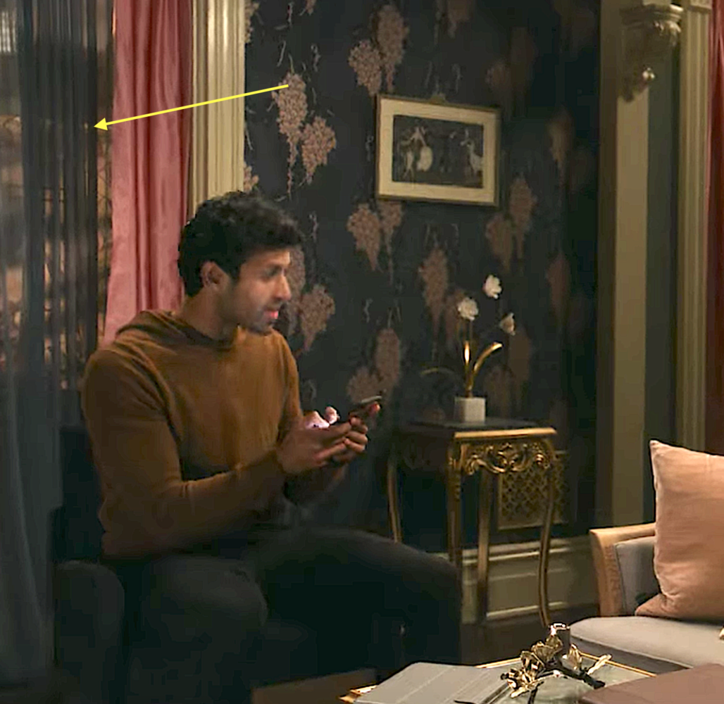
Yeesh. I’m sure there is a good production-related reason they made those decisions, though. Shonda wouldn’t let me down ;)

Annie Elliott Design is based in Washington, DC, with offices in St. Michaels, Maryland and Middlebury, Vermont. Thank you, Houzz, for voting us Best of Houzz – Design for the third time!

Category: Color + paint colorTag: Farrow & Ball, floral wallpaper, Inventing Anna, set design, Shonda Rhimes, wallpaper, Wisteria

Sidebar

Subscribe


Bossy Color Blog

Categories

  • Art + accessories »
  • Bedroom »
  • Color + paint color »
  • Dining room »
  • Furniture + upholstery »
  • Kids »
  • Kitchen + bath »
  • Lighting »
  • Living Room + Family Room »
  • Renovation »
  • Rugs »
  • Wallpaper »
  • Window treatments »

View Portfolio

view Bossy Color's portfolio

Instagram

annieelliottdesign

View Instagram post by annieelliottdesign

Apr 13

Open post by annieelliottdesign with ID 18085288493580590
Let’s talk about what fabric doesn’t work ❌ for the sectional upholstery in this beach house TV Room. Even though these fabrics are beautiful on their own… they don’t work here. The dark stripes were not lighthearted enough and the smaller scale blue and white pattern was too predictable. Watch to listen to me plead my case for lavender and green! 🏖️#interiordetails #colorfulinteriors #beachhousedesign

annieelliottdesign

View Instagram post by annieelliottdesign

Apr 13

Open post by annieelliottdesign with ID 18321246121271986
Here’s the challenge: Imagine you are designing a lighthearted, summer beach house. In the TV Room, there are bookcases, a neutral rug, and a large sectional.What upholstery would you put on the sectional?Comment your pick before you see part 2 👇#designchallenge #interiorsandhome #interiorinspiration

annieelliottdesign

View Instagram post by annieelliottdesign

Apr 8

Open post by annieelliottdesign with ID 18338258239300458
When you come home after a long day, do you want your foyer to rev you up or calm you down? Decide which approach you need and run with it. Add large-scale wallpaper and layered rugs for excitement, or paint the walls off-white and be selective with your artwork and mirrors for calm. #foyer #homedesign #foyerinspiration

annieelliottdesign

View Instagram post by annieelliottdesign

Apr 3

Open post by annieelliottdesign with ID 17848603689678580
Q: What is one thing you can do to elevate a room❓💬 The first thing you see when you walk into a room needs to look great. In your office, get a nice, big vintage desk. In a living room, paint all the walls a dark color. Avoid satin brass hardware, pills on sofa fabric, and fake wood!#interiordesign #dcdesigner #decorinspo

annieelliottdesign

View Instagram post by annieelliottdesign

Apr 1

Open post by annieelliottdesign with ID 17918392215338642
This will come as no surprise, but I think about window treatments a LOT. Especially during the transition from winter to spring, with the change in temperature and light…I’m reminded what a critical design element window treatments are. And then I get to thinking about window treatments through the ages. Who invented drapes? Did the Romans *really* invent Roman shades?I decided to do some digging. Check out my blog to see what I discovered!📸 @stacyzaringoldberg📸 @jennverrierphoto#windowtreatments #drapes #interiordesign

annieelliottdesign

View Instagram post by annieelliottdesign

Mar 25

Open post by annieelliottdesign with ID 18088729466185965
It’s Wallpaper Wednesday! Today we feature Brunschwig & Fils’ Les Touches. @brunschwigfils introduced Les Touches in 1965, and the pattern soon became a Brunschwig classic. (Interestingly, “touches” translates to “keys” or “strokes…” I guess that’s close to “dabs,” which is what I’d assumed.) According to handwritten records, Les Touches is inspired by post-WWII black and white photographs, but the connection between this inspiration and the pattern remains a mystery. Referred to most often as a stylized animal print, Les Touches is a staple of the Le Jardin Chinois collection.Today, Les Touches comes in 18 colorways, but the blue colorway remains iconic. I’ve used Les Touches for window treatments and upholstery, but I can’t wait to try it as wallpaper!

annieelliottdesign

View Instagram post by annieelliottdesign

Mar 23

Open post by annieelliottdesign with ID 18102457048819740
Here’s what ✨ I ✨ would do… Instead of matching everything, you balance it. Pull one color. Shift the scale. Let each piece do something different. Here’s what ✨ I ✨ would do… Instead of matching everything, you balance it. Pull one color. Shift the scale. Let each piece do something different. Bonus: Change the rug! Suddenly you’d make a completely different window choice.Did you guess it?!Watch part 1 for the challenge context and part 2 for what doesn’t work.#interiorsandhome #fabricdesign #romanshades

annieelliottdesign

View Instagram post by annieelliottdesign

Mar 23

Open post by annieelliottdesign with ID 17860517745617635
Let’s talk about what fabric doesn’t work ❌ for the Roman shades in this teenage girl’s bedroom with 2 big windows and a statement ceiling. Even though these fabrics are beautiful on their own… they don’t work here. Biggest mistake: repeating the same motif (moths, butterflies, etc.) across the room. It starts to feel themed instead of designed.Watch part 1 for the full context, and watch part 3 to find out what I would choose.#interiordesign #wallpaper #interiorsandhome

annieelliottdesign

View Instagram post by annieelliottdesign

Mar 23

Open post by annieelliottdesign with ID 18038018090572669
Here’s the challenge: a teenage girl’s bedroom. Not huge. Two big windows. Statement ceiling. White walls.Which fabric would you choose for the Roman shades?There’s a right answer… a safe answer… and a couple very wrong ones. Comment your pick before you see part 2 👇#interiordesigner #wallpaper #romanshades
Follow

Looking for something?

Don’t miss a single post


Where classic and modern hang out and drink gin.

  • Instagram
  • TikTok
  • Pinterest
  • Facebook

© 2026 · Annie Elliott Design · privacy policy