 This is part two of the previous post –
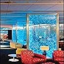
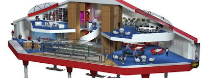
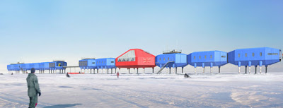
In Saturday’s Financial Times article, “Comfort in Strange Places,” two case studies illustrate the trend toward making commercial or “otherwise impersonal environments” more home-like: Heathrow’s Terminal 5 (at right, opening in a few weeks) and the British Antarctic Survey’s new research station (below, slated to open in 2010).

British “colour psychologist” Angela Wright, founder of Colour Affects, was brought in to determine the color palettes for the research station. The FT summarizes Wright’s work well and succinctly:
“Wright…has developed a theory of colour based on four basic groups that are not defined by hues but by tones that relate to human personality types. Group one and group three colours are the warm extroverts while the colours in groups two and four are cooler and related to internally motivated personalities.”
So for the Antarctica project, Wright focused on Groups 1 and 3, the “warm extrovert” groups. (Because I’m color obsessed and maybe just a little bit pathetic, I pulled some Benjamin Moore swatches based on the color descriptions on Wright’s Colour Affects website to get a better sense of these two groups.)
– Wright contends that Group 1 colors would brighten the space, because they “contain more light,” and Antarctica is dark for much of each year (I would absolutely expire, I tell you). The Colour Affects website lists Group 1 colors as including “scarlet, coral, peach, daffodil yellow, emerald green, sky blue, and cobalt.”
– And Group 3 to create a homey feeling, because, as the FT article states, these colors “have warm, earth tones and contain black in their mixing, such as tomato red, burnt orange, rust, butter yellow, leaf green, olive, teal blue, peacock and aubergine.”
Now don’t get me wrong: I think it’s FANTASTIC that the Antarctic Survey people brought in a color consultant for this project. Good for them for acknowledging the huge impact that color will have. I even think that there’s some validity to Angela Wright’s system.
However, I’m having a little trouble picturing how Wright is going to meld Groups 1 and 3 into a single overall palette down there in Antarctica. I’m all for colors that “contain more light,” but when I look at the actual Group 1 colors, they look a little washed out and cold to me.
Even though the Group 3 colors are darker, their warmth is more pronounced. If it were me shivering down there at the bottom of the earth, warmth would trump light any day of the week…
The renderings of the Halley VI research station were taken from www.aecom.com.
