• Skip to main content
  • Skip to header left navigation
  • Skip to header right navigation
  • Skip to site footer
  • about
    • services
    • team
  • portfolio
  • press
Annie Elliott Design, Washington DC

Annie Elliott Design

Greater Washington DC

  • book
  • blog
  • contact

Wes Anderson exhibition in London. It’s worth the trip.

Annie Elliott | February 1, 2026

I’m not kidding, Gentle Readers. If you’re as big a Wes Anderson fan as my family is (or, as they say in England, “as my family are”), you can’t miss it. It’s at The Design Museum in London. But don’t let that stop you.

Exhibition with red walls and white text

To catch you up, Wes Anderson is an American director of quirky, highly stylized films. They include Rushmore (1998 — John’s and my first date!),

Movie costumes on display in front of a red curtain

The Royal Tenenbaums (2001),

Pencil sketch of a grand city house

and Fantasic Mr. Fox (2009), a stop-motion film with the characters voiced by Meryl Streep, George Clooney, and other people you’ve totally heard of.

Furry models of foxes and a an opossum wearing clothes

If you’re really a fan, you will have seen Anderson’s first movie, Bottle Rocket (1996), starring his best friends Owen Wilson and Luke Wilson. Before they were, you know, who they are.

Black and white photographs hung on a red wall

ANYWAY, this is a design blog, so I went into the exhibition with an eye towards sets and locations.

Pen and ink drawing of a large pink building
For The Grand Budapest Hotel
Man standing in front of a large-scale model of a grand, symmetrical pink building
For The Grand Budapest Hotel

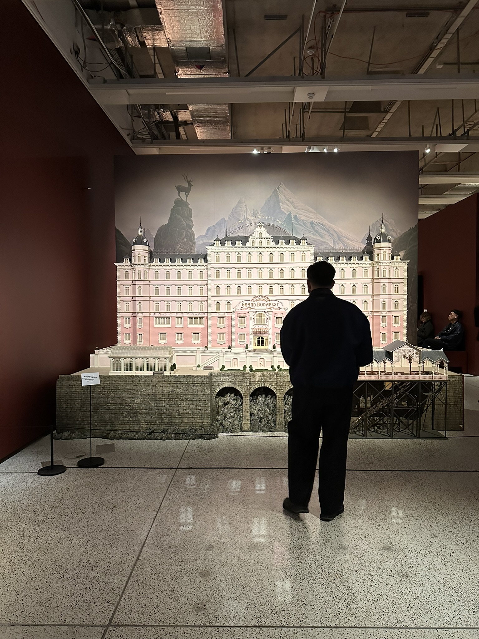
But I can’t write only about the sets. The films are too tightly constructed. The settings and sets, costumes, props, dialogue…it’s the combo that makes them so stylish.

Checkbook and pen laid on a red surface
From The Royal Tenenbaums. Side note: Anjelica Huston as Etheline appears in a blog post I wrote about the iconic Zebras wallpaper in the Tenenbaum mansion.

Every single item in every single scene has been carefully created or chosen. That’s one reason the exhibition was so fun. Many of these things wouldn’t register on screen, but the cast and crew knew they were there. They’re in-jokes.

Watercolor book jacket of a children's book
Moonrise Kingdom
Magazine covers on a red surface
The Royal Tenenbaums

Details like these indicate intentionality and thoughtfulness. A commitment to the artistic vision.

A boy scout costume and pink girl's coat  on display
Moonrise Kingdom

Here’s a great example from Moonrise Kingdom. (My picture was terrible, so this is from the film.)

Letter on pink paper written in a child's cursive handwriting

To get the handwriting exactly as he wanted it, Anderson had students from a Catholic girls’ school write this note, and then he selected one. AI says that’s not true, but I saw the exhibition label, so screw you, Gemini. (I just didn’t take a picture of said label. You’ll just have to take my word for it.)

Orange bicycle on display against orange modern paintings
The French Dispatch

As of this typing, Wes Anderson: The Archives is NOT scheduled to travel. So go to London. Make a 3-day weekend of it. The jet lag isn’t that bad.

Then you, too, will be in on the joke.

People observing a row of vintage pastel-colored vending machines
Asteroid City

Wes Anderson: The Archives will be on view through July 26 at The Design Museum, 224–238 Kensington High Street, London W8 6AG.

Annie Elliott Design is booking projects for spring 2026. Please contact us to discuss.

Category: ArtTag: exhibition, set design, Wes Anderson

Sidebar

Subscribe


Bossy Color Blog

Categories

  • Art + accessories »
  • Bedroom »
  • Color + paint color »
  • Dining room »
  • Furniture + upholstery »
  • Kids »
  • Kitchen + bath »
  • Lighting »
  • Living Room + Family Room »
  • Renovation »
  • Rugs »
  • Wallpaper »
  • Window treatments »

View Portfolio

view Bossy Color's portfolio

Instagram

annieelliottdesign

View Instagram post by annieelliottdesign

Feb 17

Open post by annieelliottdesign with ID 18173285884384256
My fireplace filler recommendations:Try: Dried forsythia or Hydrangeas (a single type of flower, in other words).Don’t even think about it: Wine bottles.Try: Multiple real plants or a single fern (very southern!).Eeew: A wispy, random, combustible-looking arrangement of multiple dried flowers.Solid yes: Logs in any form, birch logs on an andiron, or regular logs filling the fireplace front to back.Maybe: Books. I have mixed feelings about this one. What do you all think?...Photo Credit: Domino MagPepper Design BlogCasoliaThe KitchnLiving EtcMolly In Main#interiordesign #fireplace #livingroominspo

annieelliottdesign

View Instagram post by annieelliottdesign

Feb 14

Open post by annieelliottdesign with ID 18093445414983874
I LOVE dark rooms. Don’t be afraid to go dark in a small space; dark walls and ceilings actually can make a room seem bigger because you can’t see the corners very well! The type of room matters, of course – I prefer to embrace the dark and select rooms that do NOT have many windows. Rooms with a lot of windows obviously invite a lighter, brighter feel. In any room you want to feel cozy – a Powder Room, enclosed TV room, dining room, guest bedroom (or any bedroom!) – try experimenting with dark wallpaper.#interiordesign #wallpaper

annieelliottdesign

View Instagram post by annieelliottdesign

Feb 11

Open post by annieelliottdesign with ID 17914886685277222
It’s Wallpaper Wednesday! Birds by @galbraithandpaul! The technique of hand-block printing is a few thousand years old, and Galbraith & Paul is doing a fabulous job keeping the tradition alive. In its Manayunk (Philadelphia) studio, G+P creates joyful, *thoughtful* hand-block prints in amazing colorways. The Birds pattern is near and dear to my heart; I used the fabric on my very own headboard many many years ago. On wallpaper, Birds is simply magical. Whether in the bright Lake colorway, the moody Midnight, or the low-contrast Pale Yellow, Birds makes a room sing. 🕊️Photo 2 photographed by Angie SeckingerPhoto 3 photographed by Stacy Zarin GoldbergPhotos 1, 4, 5 & 6 by Galbraith & Paul#wallpaper #interiordesign #designinspo

annieelliottdesign

View Instagram post by annieelliottdesign

Feb 5

Open post by annieelliottdesign with ID 17864112744573508
Hie thee to London! The exhibition, "Wes Anderson: The Archives" at The @designmuseum is worth the trip. His films are so stylish, and that’s due to no single element. It’s the combination of the settings, sets, costumes, props, actor selection, and dialogue that’s magic. As a designer, I’m inspired by Anderson’s careful curation of every item in every scene and his commitment to his artistic vision. Check out my new blog post for more thoughts about the show!

annieelliottdesign

View Instagram post by annieelliottdesign

Feb 4

Open post by annieelliottdesign with ID 18201074062333456
It’s Wallpaper Wednesday! @schumacher1889 Queen Fruit, designed by Neisha Crosland. This stunning wallpaper was inspired by Mangosteen plants, a fruit native to the Malay Peninsula and Borneo. Evidently, the gold-outlined flowers mimic a 16th-century English needlework bed hanging. Who knew?! Without knowing any of that ;) I used this wallpaper in the Lapis colorway in my own Dining Room. The metallic accents brighten the room, and because I’ve never seen a blue quite like this one (the field), I had to use it. The other two colorways are pretty interesting, too.#interiordesign #wallpaper #schumacher

annieelliottdesign

View Instagram post by annieelliottdesign

Jan 28

Open post by annieelliottdesign with ID 18114059557619726
It’s Wallpaper Wednesday!  Today we feature Strawberry Thief, by @williammorriscollection Recognize this pattern? It’s 140 years old, so I’m sure you’ve seen it somewhere. (Perhaps on the walls of the Atlanta coffee shop my daughter frequents!). William Morris was known primarily as a fabric designer when he designed Strawberry Thief in 1881-83. The story goes that he was inspired by the thrushes that stole fruit from his garden. It’s a nice thought, isn’t it?It’s unclear when Strawberry Thief began to appear on wallpaper, but boy am glad it did. The pattern is classic, cozy, colorful, and just all-around charming. I believe the Indigo/Mineral colorway is the OG, but, like every other manufacturer with an icon on its hands, today it’s available in several colorways. (I strenuously object to the horrific Miami Strip. What genius thought THAT was a good idea?)Strawberry Thief appears on merch from coasters (which I own) to footstools (which I selected for a client!). I don’t mind. As long as it’s also on wallpaper, you can put it on anything you like.

annieelliottdesign

View Instagram post by annieelliottdesign

Jan 23

Open post by annieelliottdesign with ID 18092277167481520
This month marks 1 year since we moved into our new office space! Here is a sneak peek at the installation...#dcdesigner #interiordesign #washingtondc

annieelliottdesign

View Instagram post by annieelliottdesign

Jan 21

Open post by annieelliottdesign with ID 17853266193576715
My wish list for 2026! 🌟1. Design another house with the gracious proportions and strong (not ornate) details of the 1910s and 1920s.2. Design a bedroom around a super tall headboard, à la Kit Kemp.3. Paint a room “Arsenic.”4. Find a fantastic resource for high-end bedding.5. Cover a living room in a low-contrast, small-scale wallpaper such as @Schumacher’s Burley in Straw.See my latest blog post for more!

annieelliottdesign

View Instagram post by annieelliottdesign

Jan 17

Open post by annieelliottdesign with ID 17973751106822908
Blue Rooms: When you think of being cozy in the winter months, I’m sure you think of warm tones. But this is proof that blue can be cozy too! 💙 🟦Hint: deep colors are always comforting. #roominspo #interiordesign #blue
Follow

Looking for something?

Don’t miss a single post


Where classic and modern hang out and drink gin.

  • Instagram
  • TikTok
  • Pinterest
  • Facebook

© 2026 · Annie Elliott Design · privacy policy