• Skip to main content
  • Skip to header left navigation
  • Skip to header right navigation
  • Skip to site footer
  • about
    • services
    • team
  • portfolio
  • press
Annie Elliott Design, Washington DC

Annie Elliott Design

Greater Washington DC

  • book
  • blog
  • contact

The Mondrian hotel, South Beach, Miami: scale, edginess, and what it means to be Dutch

Annie Elliott | January 16, 2011

There’s so much to say that I’ll have to do this in several posts, but let me start first by talking about the DESIGN of the Mondrian hotel in South Beach, Miami. Creator: the products and interiors designer, Marcel Wanders.

In short, it’s wacky. In a good way. Fresh, crazy, perspective-defying, and yes, a little bit indulgent, but it totally works, so who cares?

Today I’ll show you the public spaces of the hotel. The Mondrian’s website says Mr. Wanders was after a “design homage” to “Sleeping Beauty’s Castle.” Wish they hadn’t told me that.

This is the lobby as you walk in.
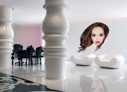
Mondrian hotel lobby
Picture from Design 21 Social Design Network. The Mondrian's website wouldn't give up the pictures, for some reason

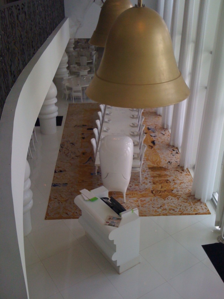
My crappy pictures really don’t do justice – although I’ll include them anyway – but professional pics really capture the lighting effects. Those gigantic turned table leg-like columns are everywhere. Lots of repeated elements, which contributes to the success of the design.

Behind that wall with the floating girl head – I know, just go with it – is the restaurant, Asia de Cuba.

Mondrian's restaurant
The restaurant at the Mondrian, Asia de Cuba

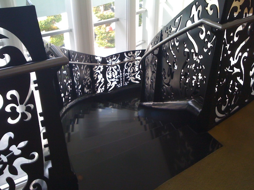
Sort of between that and the entrance is the “floating staircase.”
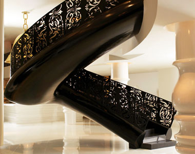
Mondrian hotel's floating staircase
From concierge.com
Mondrian's restaurant
View of restaurant from the floating staircase

Note the enormous gold bell lamps. More playing with scale. More Sleeping Beauty/Alice in Wonderland nuttiness.
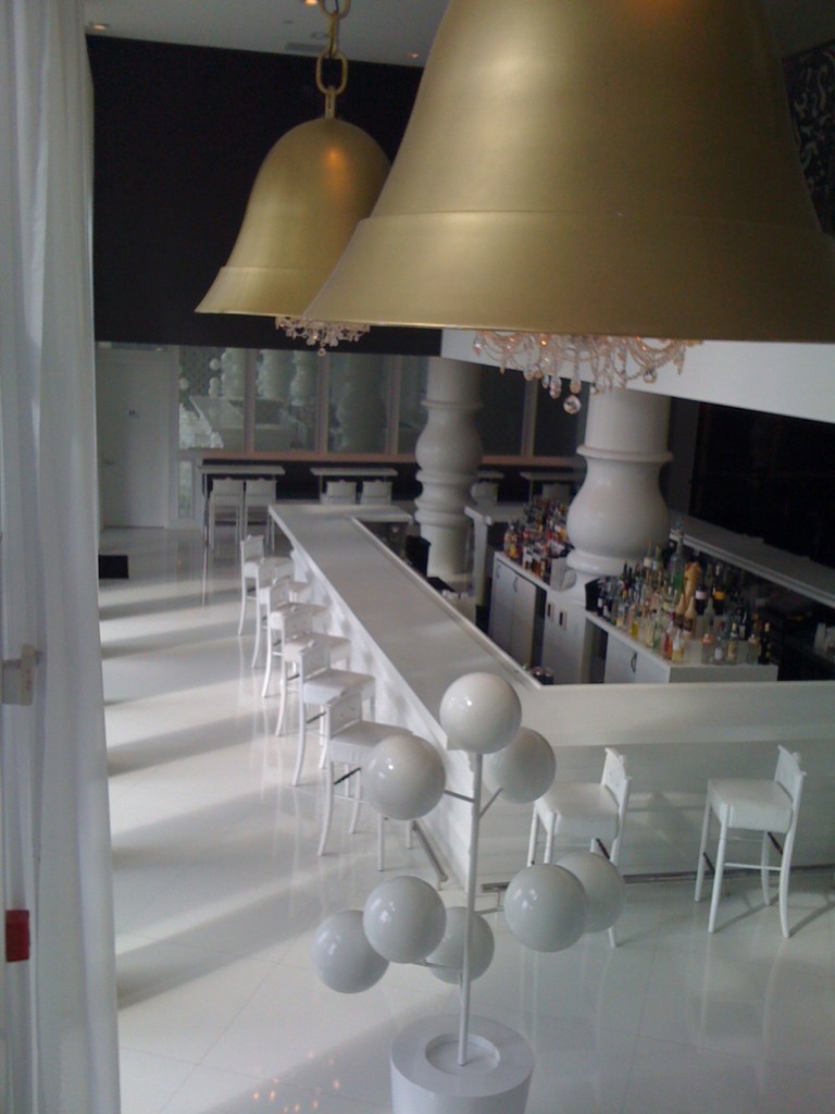
Mondrian's bar
The Mondrian's bar from the floating staircase
Descending the Mondrian's "floating staircase"

Back to the front desk.

Mondrian hotel front desk

Mondrian hotel's front desk
From concierge.com

So we have:

– Oversize elements, like the chandeliers and the turned table leg-columns

– Repeated medallion elements (we’ll see more of that in the rooms)

– A repeated floral design, on the lobby floor, on the rugs, on the staircase banister, on the elevator walls (later), and, amazingly, etched into the pool deck.
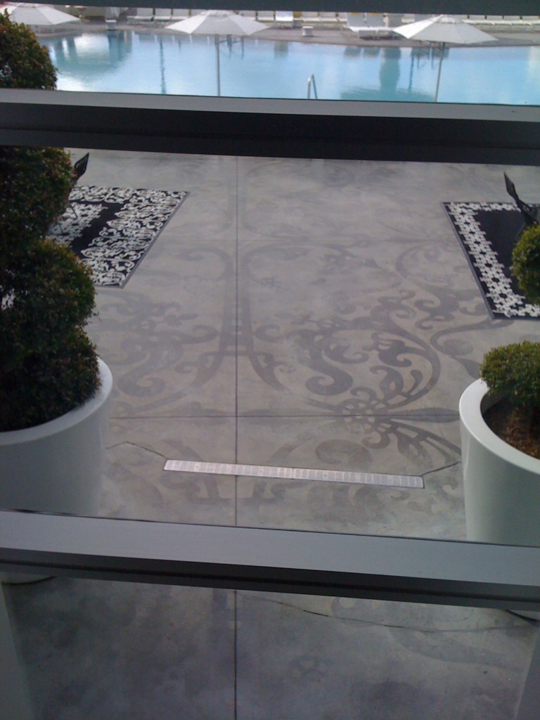
Mondrian pool deck
The Mondrian's pool deck

Definitely unlike anyplace I’ve ever been. Check out Mr. Wanders’ much better, professional photographs on his website.

As for edginess, the Mondrian is so cool it thinks it doesn’t need a sign in the front. Or anywhere. Which would have been helpful. But whatever.

Have to check out right this very minute – more soon!

Category: Color + paint colorTag: black staircase, contemporary hotel, designer hotel, floating staircase, hotel, luxury hotel, Marcel Wanders, Miami, Mondrian hotel, South Beach

Sidebar

Subscribe


Bossy Color Blog

Categories

  • Art + accessories »
  • Bedroom »
  • Color + paint color »
  • Dining room »
  • Furniture + upholstery »
  • Kids »
  • Kitchen + bath »
  • Lighting »
  • Living Room + Family Room »
  • Renovation »
  • Rugs »
  • Wallpaper »
  • Window treatments »

View Portfolio

view Bossy Color's portfolio

Instagram

annieelliottdesign

View Instagram post by annieelliottdesign

Oct 21

Open post by annieelliottdesign with ID 17995465526842775
Happy Wallpaper Wednesday! This week, we dive into Martinique by CW Stockwell.This small, family-run print facility in Los Angeles was founded in 1905. Clifton Stockwell’s daughter and son-in-law traveled to the Bahamas in 1942 and were so enchanted by the foliage that they collaborated with illustrator and textile designer Albert Stockdale to create a wallpaper pattern. The result was Martinique — also known as “The Original Banana Leaf Print.” (Martinique is not to be confused with Brazilliance by Dorothy Draper 😉 .)Martinique famously adorns the Beverly Hills Hotel’s halls, stairwells, and Fountain Coffee Room.CW Stockwell now sells the Martinique pattern in seven colorways as wallpaper, grasscloth, and linen fabric.@cwstockwell @scalamandre#interiordesign #wallpaperinspo

annieelliottdesign

View Instagram post by annieelliottdesign

Oct 19

Open post by annieelliottdesign with ID 17884583844691170
I love this cocoon of a bedroom :) And what makes it REALLY interesting? The red lamps. There’s no other red in the room. Oranges, yes, so the red has something to relate to, but the exact shade appears nowhere else.It’s these unexpected elements that can take a room from beautiful to fabulous.Hats off to: @visualcomfort @cowtanandtout @cowtanwashingtondc#dcdesigner #interiordesign

annieelliottdesign

View Instagram post by annieelliottdesign

Oct 16

Open post by annieelliottdesign with ID 17947598421345387
I stand by my decision to drywall the window 🤭. See how we created a dark and cozy boudoir in a spacious sunny condo in DC…#interiordesign #dcdesigner

annieelliottdesign

View Instagram post by annieelliottdesign

Oct 14

Open post by annieelliottdesign with ID 18133519813736018
Your bed is the biggest piece of visual real estate in your bedroom. It needs pillows! Check out my latest blog post for ideas about arranging pillows on your bed 🛏️.

annieelliottdesign

View Instagram post by annieelliottdesign

Oct 7

Open post by annieelliottdesign with ID 18635567182053307
Happy Wallpaper Wednesday! Today we’re talking about one of my favorite things in the whole world: grasscloth. (Which technically makes today *Wallcovering* Wednesday, but tomayto tomahto.) Most grasscloth is made of actual grasses that have been washed, dried, bleached or dyed, and glued to paper. Wallcovering made of sisal, seagrass, raffia, or hemp also is placed under the heading “grasscloth.” Talk about timeless style: while grasscloth had a popularity surge in the 1960s and 70s (thanks to a cultural obsession with living in nature), its first known use was in 107 AD, in China ;) Grasscloth has long been appreciated for its insulative properties and durability. From a decorating perspective, I love it because it adds warmth, texture, and dimension to any space. Picture a room painted white, and then imagine that room with an off-white grasscloth on the walls (and, if you’re me, the ceiling). The second room is still light and bright, but it’s cozier and more interesting.Grasscloth can be minimalist in neutral earth tones or maximalist, dyed bold colors, colorfully painted, or appliquéd with spangles, embroidery, or tape trim. It shows its seams when installed, but that’s part of the charm. I love grasscloth in hallways, living spaces, and bedrooms, but I avoid using it in kitchens and steamy bathrooms because I’m nervous about odor retention and excessive moisture.Enough school for the day, but if you remember nothing else: grasscloth enriches every room it graces. Highly recommend.📸 Michael K. Wilkinson@schumacher_midatlantic @schumacher1889 @phillipjeffriesltd

annieelliottdesign

View Instagram post by annieelliottdesign

Oct 3

Open post by annieelliottdesign with ID 18482506054114649
You likely know where I stand on pillows: they NEVER should be an afterthought. Check out my latest blog post for recommendations on size, shape, style, and placement. Link in bio. 📸 @stacyzaringoldberg📸 @kipdawkinsphoto📸 @angieseckinger

annieelliottdesign

View Instagram post by annieelliottdesign

Oct 2

Open post by annieelliottdesign with ID 18103510994172389
This client’s gorgeous collection of gold icons in the bookcases puts this room in a league of its own. Whenever you have a collection — of ANYTHING: frog figurines, English engravings of flowers or dogs, snow globes — maximize its impact by bringing the objects together and placing them in a prominent place. These icons are breathtaking, and the sheer number invites you to go closer and study them. With reverence.#eastlake #vintagerug #antiquerug

annieelliottdesign

View Instagram post by annieelliottdesign

Sep 28

Open post by annieelliottdesign with ID 18630011602021777
Happy Fall! Ironic, isn’t it, that fall weather is cool, but the colors we associate with the season are warm? The earthy orange grasscloth in this foyer is undeniably “fall” to me. Add deep, warm versions of green and blue, et voilà: a cozy, inviting, autumnal space.

annieelliottdesign

View Instagram post by annieelliottdesign

Sep 23

Open post by annieelliottdesign with ID 17881497900529047
For this week’s Wallpaper Wednesday we go into the Woods… Woods is a great example of Cole & Son’s innovation in serigraphy, a traditional method of screen printing. The pattern is available on fabric and wallpaper in a variety of soothing yet elegant colorways. Due (I’m sure) to the booming success of the original, there are now some whimsical variations on Woods: Cole & Son added metallic stars to some colorways and pears to others. As you may imagine, however, this traditionalist prefers the original 🙂For some reason, Woods is especially popular for nurseries. Maybe those babies really wanted out of their cribs. 👶🏼In 2005, Woods deservedly won the ELLE Decoration International Design Award for Wallcovering of the Year. And it’s still going strong.
Follow

Looking for something?

Don’t miss a single post


Where classic and modern hang out and drink gin.

  • Instagram
  • TikTok
  • Pinterest
  • Facebook
American Society of Interior Designers Firm Partner

© 2026 · Annie Elliott Design · privacy policy