• Skip to main content
  • Skip to header left navigation
  • Skip to header right navigation
  • Skip to site footer
  • about
    • services
    • team
  • portfolio
  • press
Annie Elliott Design, Washington DC

Annie Elliott Design

Greater Washington DC

  • book
  • blog
  • contact

Pottery Barn alternative: LL Bean’s Cottage line

Annie Elliott | May 6, 2008

I have a confession to make. I like LL Bean.

Not the clothes, although I do have a certain nostalgia for the duck boot. Not the camping gear…no qualification required on that one. The Boat & Tote is such an American icon that it probably should have its own postage stamp, but that’s not why I’m writing.

If you routinely dog-ear the Pottery Barn catalog for your kids’ rooms, mudroom, or weekend house, you may want to take a look at LL Bean’s “Cottage” line.


It’s not just that the proportions tend to be smaller than Pottery Barn’s; the designs are a little less fussy. LL Bean offers more color options for some pieces, and on the whole, the prices are better.

This is the perfectly respectable Blakely Rustic Bench from Pottery Barn. It comes in two sizes (for $149 and $199) and 4 colors – the green happens to be on sale right now:


And this is LL Bean’s Painted Cottage Bench, available in 8 colors ($99 – sorry about the microscopic picture – LL Bean, take note):

Customer comments on the site indicate that it can be difficult to put together, but hey, if you’ve got to have a bench in yellow or dark green or royal blue, it might be worth a few extra turns of the Allen wrench.

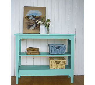
I like LL Bean’s horizontal Painted Cottage Bookcase, also in 8 colors:


And for a mudroom or casual front hall, the Painted Cottage storage bench and the Painted Cottage locker are not bad at all.

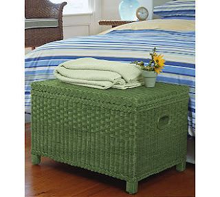
p.s. The green wicker blanket chest at the top of this post? Not part of the Cottage collection. I just thought it was cute.

Category: Furniture + upholstery

Sidebar

Subscribe


Bossy Color Blog

Categories

  • Art + accessories »
  • Bedroom »
  • Color + paint color »
  • Dining room »
  • Furniture + upholstery »
  • Kids »
  • Kitchen + bath »
  • Lighting »
  • Living Room + Family Room »
  • Renovation »
  • Rugs »
  • Wallpaper »
  • Window treatments »

View Portfolio

view Bossy Color's portfolio

Instagram

annieelliottdesign

View Instagram post by annieelliottdesign

Apr 28

Open post by annieelliottdesign with ID 17870996082665526
Your house should reflect *you*. My recent visits to Eudora Welty’s house and the Mississippi Museum of Art reminded me of that. If the wallpaper you put up makes you happy, it’s a success! If you need help figuring out how to translate your personality and lifestyle into your home’s function and appearance, I’m here 😉.Read my new blog post for more!

annieelliottdesign

View Instagram post by annieelliottdesign

Apr 24

Open post by annieelliottdesign with ID 18099336653042952
Annie Elliott Design is a proud sponsor of the 87th annual @flowermartdc! I hope to see you all there! I will be there on May 1st shopping for peonies, yellow roses, and Black-Eyed Susans. 🌸 🌹 💐 #flowermartdc #springflowers #interiordesign

annieelliottdesign

View Instagram post by annieelliottdesign

Apr 22

Open post by annieelliottdesign with ID 18064935869348067
The star of today’s Wallpaper Wednesday is Farrow & Ball’s Lotus!The dramatic Lotus pattern is in the Art Nouveau style of the late 19th century and veeeeery early part of the 20th. (The pattern’s curved, stylized, botanical shapes are a classic indicator of Art Nouveau style.) Today, Lotus wallpaper is available in 19 colorways — or coloUrways, since Farrow & Ball is British ☺️ — and the metallic ones are quite spectacular. F&B changes its wallpaper colorways with annoying regularity; once they cease making a paper, that colorway is considered “archived.” But fear not: ANY F&B wallpaper pattern can be made in ANY F&B paint…all it takes is time and money.If you’re a Succession fan (I struggled, but I made it through), you may remember Lotus from Season 3, in Rava Roy’s foyer.#interiordesign #wallpaper

annieelliottdesign

View Instagram post by annieelliottdesign

Apr 20

Open post by annieelliottdesign with ID 18113514817783580
You know my thoughts about small rooms and wallpaper: bold, large-scale paper totally works! Your gateway drug is powder rooms. They’re the perfect place to experiment with whimsical patterns and bright colors because you don’t spend a ton of time in there. Although * I * argue that when you have the right wallpaper, you’ll want to ;)

annieelliottdesign

View Instagram post by annieelliottdesign

Apr 8

Open post by annieelliottdesign with ID 18338258239300458
When you come home after a long day, do you want your foyer to rev you up or calm you down? Decide which approach you need and run with it. Add large-scale wallpaper and layered rugs for excitement, or paint the walls off-white and be selective with your artwork and mirrors for calm. #foyer #homedesign #foyerinspiration

annieelliottdesign

View Instagram post by annieelliottdesign

Apr 1

Open post by annieelliottdesign with ID 17918392215338642
This will come as no surprise, but I think about window treatments a LOT. Especially during the transition from winter to spring, with the change in temperature and light…I’m reminded what a critical design element window treatments are. And then I get to thinking about window treatments through the ages. Who invented drapes? Did the Romans *really* invent Roman shades?I decided to do some digging. Check out my blog to see what I discovered!📸 @stacyzaringoldberg📸 @jennverrierphoto#windowtreatments #drapes #interiordesign

annieelliottdesign

View Instagram post by annieelliottdesign

Mar 25

Open post by annieelliottdesign with ID 18088729466185965
It’s Wallpaper Wednesday! Today we feature Brunschwig & Fils’ Les Touches. @brunschwigfils introduced Les Touches in 1965, and the pattern soon became a Brunschwig classic. (Interestingly, “touches” translates to “keys” or “strokes…” I guess that’s close to “dabs,” which is what I’d assumed.) According to handwritten records, Les Touches is inspired by post-WWII black and white photographs, but the connection between this inspiration and the pattern remains a mystery. Referred to most often as a stylized animal print, Les Touches is a staple of the Le Jardin Chinois collection.Today, Les Touches comes in 18 colorways, but the blue colorway remains iconic. I’ve used Les Touches for window treatments and upholstery, but I can’t wait to try it as wallpaper!

annieelliottdesign

View Instagram post by annieelliottdesign

Mar 23

Open post by annieelliottdesign with ID 17860517745617635
Let’s talk about what fabric doesn’t work ❌ for the Roman shades in this teenage girl’s bedroom with 2 big windows and a statement ceiling. Even though these fabrics are beautiful on their own… they don’t work here. Biggest mistake: repeating the same motif (moths, butterflies, etc.) across the room. It starts to feel themed instead of designed.Watch part 1 for the full context, and watch part 3 to find out what I would choose.#interiordesign #wallpaper #interiorsandhome

annieelliottdesign

View Instagram post by annieelliottdesign

Mar 18

Open post by annieelliottdesign with ID 18097450855812440
The star of today’s Wallpaper Wednesday is Schumacher’s Acanthus Stripe. If you’ve studied Green and Roman architecture, the Acanthus motif is an old friend: Acanthus leaves were a common ornament on Corinthian capitals as early as 500 BC. Celerie Kemble’s interpretation of the motif in her Acanthus Stripe wallpaper is streamlined and clever, with the leaves serving both as capitals and as the columns themselves. @schumacher1889 has created three types of Acanthus Stripe wallcovering: paper, vinyl, and sisal, with the latter my favorite by far. The sisal roughs up the pattern a little bit, making the paint a tad uneven and the edges of the design blurry in parts. It’s a little more real, a little more appropriate for a spiky leaf rendered in stone exposed to the sun and wind for thousands of years.Acanthus Stripe Sisal in Fog and Chalk is classic (ask Mabel from the show, *Only Murders in the Building*; she didn’t want to go too crazy redecorating her aunt’s apartment, I guess), but my favorite colorways are Turmeric and Mocha. In these colors, on this material, the design couldn’t be more elegant.#wallpaperins #interiordesign #onlymurdersinthebuilding
Follow

Looking for something?

Don’t miss a single post


Where classic and modern hang out and drink gin.

  • Instagram
  • TikTok
  • Pinterest
  • Facebook

© 2026 · Annie Elliott Design · privacy policy