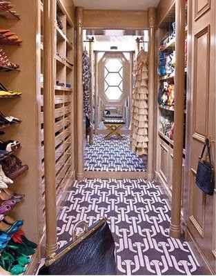
Over the weekend, the fabulous Rita Konig (you know, of Domino Magazine fame) had a snappy article in the Wall Street Journal called, “Not Your Grandma’s Patterned Carpet: It’s time to reconsider wall-to-wall.”

Super fun. Here’s my favorite part:
Generally speaking, I think we shy away from such bold moves for two reasons: first, we worry that it will be overpowering, and second, that we will tire of it. So out comes the beige—as if there’s no chance of tiring of something that starts out boring!
But I think there’s a third reason we’re reluctant to take the plunge. We’re unsure how to balance a bold, geometric pattern – especially in such large quantities.
Ms. Konig is correct that the layering upon layering of mixed-up patterns is so three decades ago.
But you have to support a graphic rug somehow. A strong and/or interesting wall color (as in that pink DR above), bold art, wallpaper…SOMETHING visually interesting. I think it’s would be unwise to put a Kelly Wearstler rug in a white box and hope for the best.

So where MIGHT we consider graphic wall-to-wall carpeting? We’re perfectly comfortable with wall-to-wall in:
– Basements (we definitely could take more risks there, don’t you think? I think we’ve taken oatmeal berber as far as it can go)
– Bedrooms (so cozy)
– Family rooms

– And kids’ playrooms – FLOR carpet tiles have made it easier to faux wall-to-wall in these areas…

But what would it take for you to put some graphic wall-to-wall carpeting in your living room? Or, even bolder, in your dining room?
Do tell.
Annie Elliott – aka bossy color – is an interior decorator and design blogger in Washington, D.C. She has been quoted in publications from The Washington Post to Real Simple and is considered an expert on color, residential space planning, and telling people what to do in the nicest way possible.
