• Skip to main content
  • Skip to header left navigation
  • Skip to header right navigation
  • Skip to site footer
  • about
    • services
    • team
  • portfolio
  • press
Annie Elliott Design, Washington DC

Annie Elliott Design

Greater Washington DC

  • book
  • blog
  • contact

Matchy-matchy walls and upholstery: Cool again, or too soon?

Annie Elliott | December 1, 2014

Remember in the ’80s, how fashion-forward it was to upholster furniture in the same pattern as the wallpaper? And sometimes carry the pattern onto the drapes, too?

1980s floral chintz matching furniture and walls
1980s chintz explosion

Well, everything old is new again…again.

I am an ’80s survivor, so you’d think I’d have trouble with this particular “new again.” Au contraire, mon frere! Today’s matchy-matchiness is a far cry from the chintz explosions of yesteryear.

Today’s matchy-matchiness exhibits restraint.

Same pattern on chairs and walls
Thibaut
Matching chair and walls
Cath Kidston

Which doesn’t mean the patterns themselves can’t be bold…
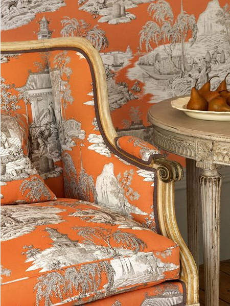
Furniture matching walls
Manuel Canovas

…but it does mean that you should limit the matching elements to two.

Matching furniture + walls = fine.

Furniture matching wallpaper
Thibaut again

Matching wallcovering + drapes =  fine.

Matching drapes and wallcovering
From the blog, “girl learning along the way”

Matching headboard + wallcovering + lampshades = really not fine. I think this headboard against the wallpaper is pretty terrific, but the lampshades are twee. Unnecessary. Perilously reminiscent of the ’80s.

Screen Shot 2014-12-01 at 7.59.43 PM
Ellen Niven

Let’s file this last one under, “strong intent.” How fabulous is this pattern? Large-scale crazy birds, an amazing level of detail, the use of black for edginess…the pattern looks like a giant illustration. And the fact that the designer shows it on the walls AND on a chair is super bold. I love it. (A propos of nothing, please note the black painted baseboard. Great move. I wish it were larger, but you can’t have everything.)
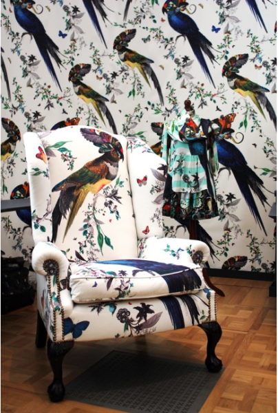
Furniture matching walls
Kristjana S. Williams

What say you, Gentle Readers? Would you be bold enough to try this in your own home? In which room? It’s a commitment, for sure, but it’s a pretty edgy look. Again.

Bossy color | Annie Elliott interior design is a full-service design firm in Washington, D.C. We create outrageously beautiful homes for fascinating people.

Category: Color + paint color, Furniture + upholstery, WallpaperTag: Cath Kidston, chair upholstery, Ellen Niven, headboard, Kristjana S. Williams, Manuel Canovas, matching fabric and wallpaper, matchy-matchy, pattern, Thibaut, toile

Sidebar

Subscribe


Bossy Color Blog

Categories

  • Art + accessories »
  • Bedroom »
  • Color + paint color »
  • Dining room »
  • Furniture + upholstery »
  • Kids »
  • Kitchen + bath »
  • Lighting »
  • Living Room + Family Room »
  • Renovation »
  • Rugs »
  • Wallpaper »
  • Window treatments »

View Portfolio

view Bossy Color's portfolio

Instagram

annieelliottdesign

View Instagram post by annieelliottdesign

Oct 3

Open post by annieelliottdesign with ID 18482506054114649
You likely know where I stand on pillows: they NEVER should be an afterthought. Check out my latest blog post for recommendations on size, shape, style, and placement. Link in bio. 📸 @stacyzaringoldberg📸 @kipdawkinsphoto📸 @angieseckinger

annieelliottdesign

View Instagram post by annieelliottdesign

Oct 2

Open post by annieelliottdesign with ID 18103510994172389
This client’s gorgeous collection of gold icons in the bookcases puts this room in a league of its own. Whenever you have a collection — of ANYTHING: frog figurines, English engravings of flowers or dogs, snow globes — maximize its impact by bringing the objects together and placing them in a prominent place. These icons are breathtaking, and the sheer number invites you to go closer and study them. With reverence.#eastlake #vintagerug #antiquerug

annieelliottdesign

View Instagram post by annieelliottdesign

Sep 28

Open post by annieelliottdesign with ID 18630011602021777
Happy Fall! Ironic, isn’t it, that fall weather is cool, but the colors we associate with the season are warm? The earthy orange grasscloth in this foyer is undeniably “fall” to me. Add deep, warm versions of green and blue, et voilà: a cozy, inviting, autumnal space.

annieelliottdesign

View Instagram post by annieelliottdesign

Sep 23

Open post by annieelliottdesign with ID 17881497900529047
For this week’s Wallpaper Wednesday we go into the Woods… Woods is a great example of Cole & Son’s innovation in serigraphy, a traditional method of screen printing. The pattern is available on fabric and wallpaper in a variety of soothing yet elegant colorways. Due (I’m sure) to the booming success of the original, there are now some whimsical variations on Woods: Cole & Son added metallic stars to some colorways and pears to others. As you may imagine, however, this traditionalist prefers the original 🙂For some reason, Woods is especially popular for nurseries. Maybe those babies really wanted out of their cribs. 👶🏼In 2005, Woods deservedly won the ELLE Decoration International Design Award for Wallcovering of the Year. And it’s still going strong.

annieelliottdesign

View Instagram post by annieelliottdesign

Sep 22

Open post by annieelliottdesign with ID 17934708156387896
“Isn’t ‘modern farmhouse’ over yet?” I loved speaking with @authordinacheney @washingtonpost about the worst interior design trends! Turns out I’m not the only designer with strong opinions 😊@vincentewolfdesigns @kimletgordon @maxsinsteden #interiordesign #washingtonpost #designopinions #annieelliottdesign

annieelliottdesign

View Instagram post by annieelliottdesign

Sep 18

Open post by annieelliottdesign with ID 17989063023104856
Best part of being an interior designer is using your own home as a playground for creative ideas! We changed the paint in our living room again and here’s how it looks now! #interiordesign

annieelliottdesign

View Instagram post by annieelliottdesign

Sep 17

Open post by annieelliottdesign with ID 18125330714481993
When you become an empty nester, when is it ok to reclaim your adult child’s space? Check out my latest blog post for my recommendations on how to approach empty nesting!📸 @stacyzaringoldberg📸 @kipdawkinsphoto📸 Michael Wilkinson📸 @angieseckinger

annieelliottdesign

View Instagram post by annieelliottdesign

Sep 10

Open post by annieelliottdesign with ID 17906571285498443
Pink, green, and a splash of dark orange come together to create this sunny, summery bedroom 🪷

annieelliottdesign

View Instagram post by annieelliottdesign

Sep 9

Open post by annieelliottdesign with ID 18104009318233584
It’s Wallpaper Wednesday! This week, feast your eyes on @timorous_beasties Fruit Looters. TB claims that William Morris’s Strawberry Thief pattern inspired Fruit Looters, but only the name indicates the connection: Strawberry Thief, Fruit Looters…get it? Whereas Morris’s iconic pattern is medium-scale, rhythmic, 2-D, cartoon-like, and muted, Fruit Looters is the opposite in every way but subject matter. The scale is huge, with the foliage “stripes” providing a geometric order, and it oozes TB’s trademark edginess. The crisp pattern is finely drawn; pull it apart, and each element — a flower, a bird — could be in an English botanical print. Fruit Looters comes in vivid, saturated colorways, some with a metallic sheen, and dramatic black is present in all.Recently, a client (who originally introduced me to Timorous Beasties!) and I used Fruit Looters wallpaper in her stairwell, in the Alabaster colorway. The drama. Oh, the drama!
Follow

Looking for something?

Don’t miss a single post


Where classic and modern hang out and drink gin.

  • Instagram
  • TikTok
  • Pinterest
  • Facebook
American Society of Interior Designers Firm Partner

© 2026 · Annie Elliott Design · privacy policy