• Skip to main content
  • Skip to header left navigation
  • Skip to header right navigation
  • Skip to site footer
  • about
    • services
    • team
  • portfolio
  • press
Annie Elliott Design, Washington DC

Annie Elliott Design

Greater Washington DC

  • book
  • blog
  • contact

How to use two wallpapers in one space

Annie Elliott | July 17, 2026

Gentle Readers, I know that some of you are hesitant to use wallpaper. It’s my life’s work to change that. I spread joy. Wallpaper = joy. Ergo…you get it.
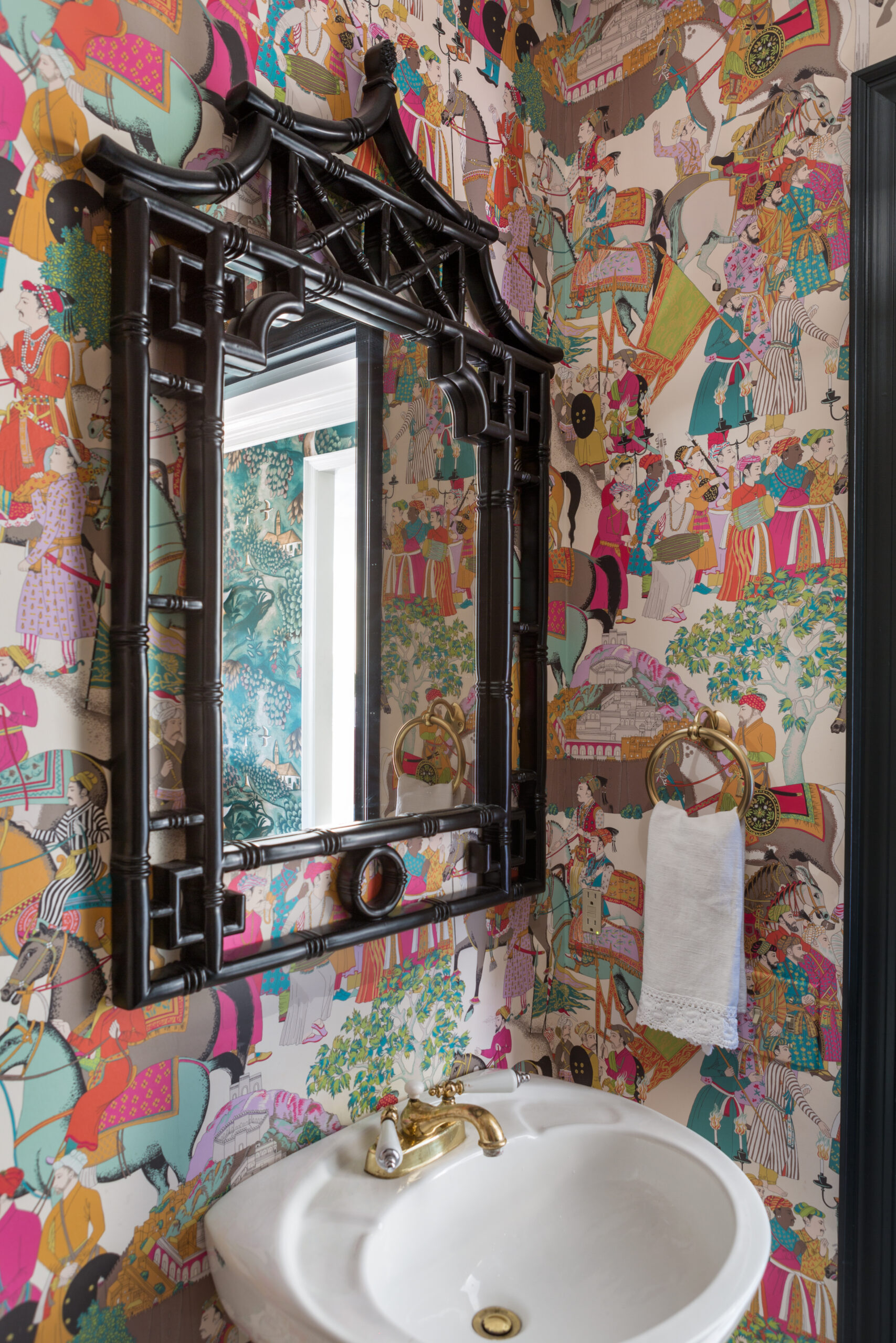
Powder room with mirror and colorful wallpaper.
Photo by Angie Seckinger

Let’s just imagine for a second that you’re 100% comfortable using wallpaper — at least in a powder room — and are considering the next step in your decorating “journey.”

The next step, of course, is more wallpaper.

For a recent article in Vogue, I was asked how one goes about mixing wallpapers, whether that’s putting different wallpapers in adjacent rooms or installing 2 wallpapers in the same room. Talk about BOLD!

I’ve done at least one TikTok and a blog post about mixing patterns. Bottom line: Mix the motif, mix the scale, make color the throughline.
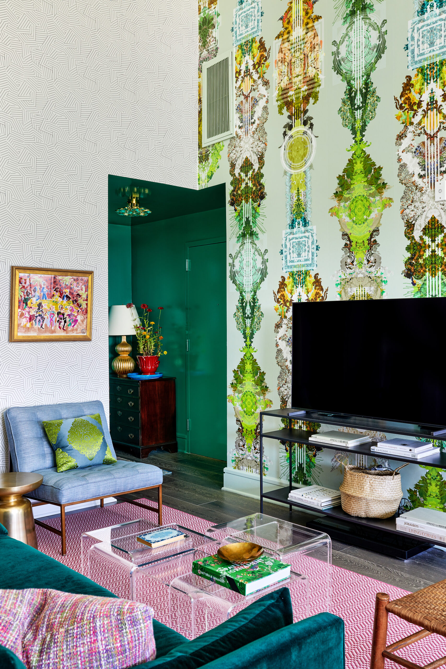
Living room with a black and white wallpaper and a green patterned wallpaper.
Photo by Stacy Zarin Goldberg

Above, we installed a medium-scale geometric pattern with an oversized quasi-floral in the same space. (That’s Deconstructed Stripe by Schumacher on the left and Totem Damask by Timorous Beasties on the right.) Crisp white is the common denominator.

To get us grounded, here’s a history nugget. Wallpaper was invented in China around 200 BCE and made its way to Europe in the 12th century. France and England starting producing it in the 1500s. Thanks in large part to the British Arts & Crafts designer William Morris, by the mid-19th century, wallpaper was practically de rigeur across Europe.
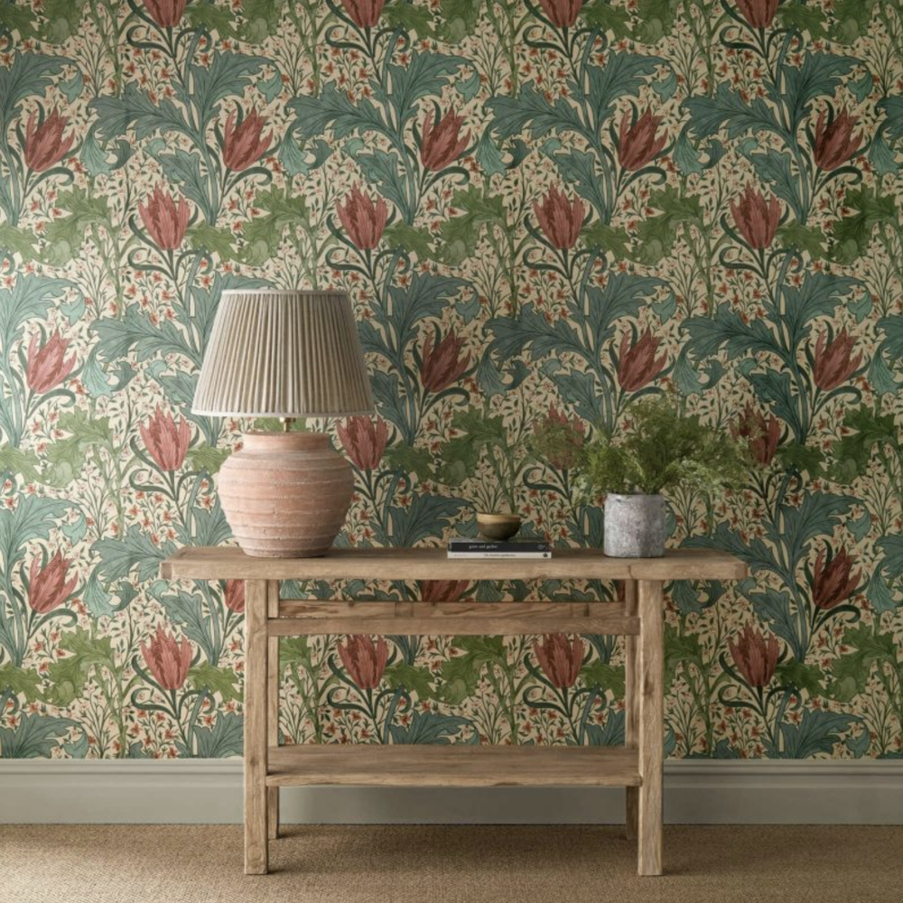
William Morris’s Lent Lily

Morris and those Victorians set wallpaper on fire, figuratively speaking. For them, it wasn’t enough to use a single wallpaper in a room; they routinely installed one paper on the lower portion of a wall (the dado), another above it, and a wallpaper border just under the crown moulding. Bonus points were earned by wallpapering the ceiling as well. (Never mind that much of the wallpaper at that time — fabric, too — was made with arsenic. There are worse ways to go, I suppose.)
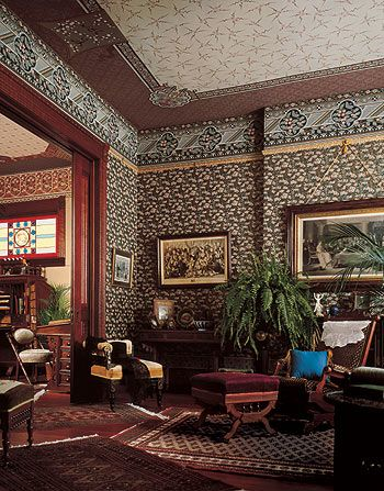
Crowded living room with wallpaper on walls and ceiling
Victorian style

Laura Ashley re-popularized wallpaper on wallpaper in the 1970s when she expanded her business into home furnishings. Pattern, pattern everywhere: there are two wallpapers plus a border in the picture below. For many Americans (and others, I assume), Laura Ashley defined English country style, but some of us still have a hangover from her sickly sweet, floral-forward spaces.
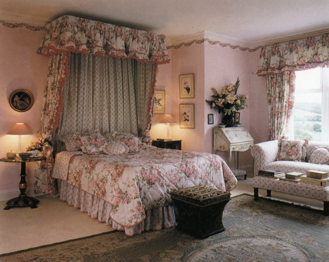
Laura Ashley

But that was then, Gentle Readers! This is now! Placing two wallpapers next to or near each other can feel fresh and modern. It’s a strategic, thoughtful way to make a space really, really special. (And a terrific hack if you don’t have a huge art collection.) Below, a smallish geometric pattern next to a larger floral, with blue in common.
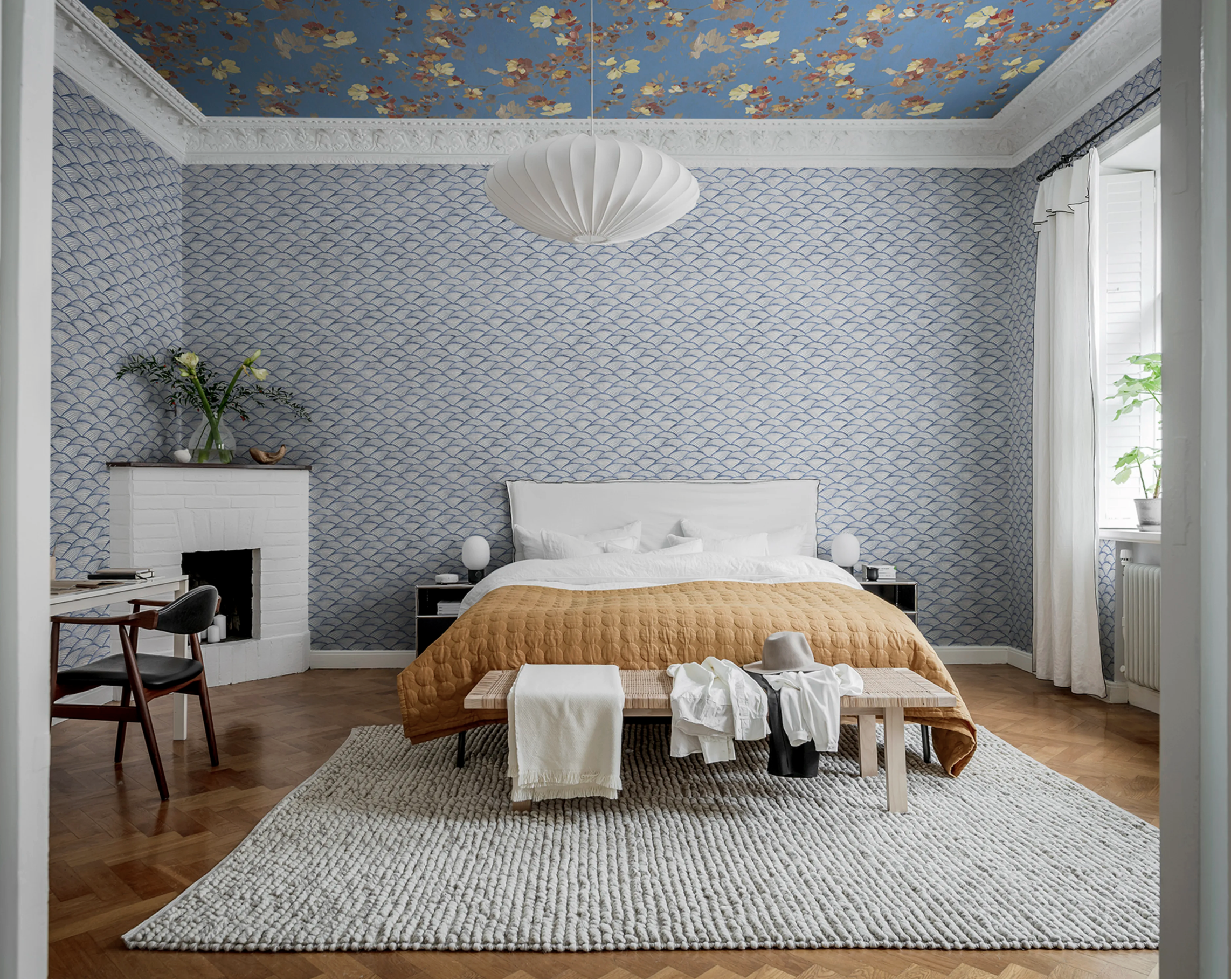
Room with different blue wallpapers on walls and ceiling.
From Rebel Walls

Textured grasscloth pairs beautifully next to patterned wallpaper, either in the same room…

Room with blue sofa, natural grasscloth wallpaper on walls, and star wallpaper on ceiling.
Photo by Angie Seckinger

…or in rooms next to each other.

Foyer with blue and white leafy wallpaper next to dining room with blue grasscloth wallpaper.
Photo by Angie Seckinger

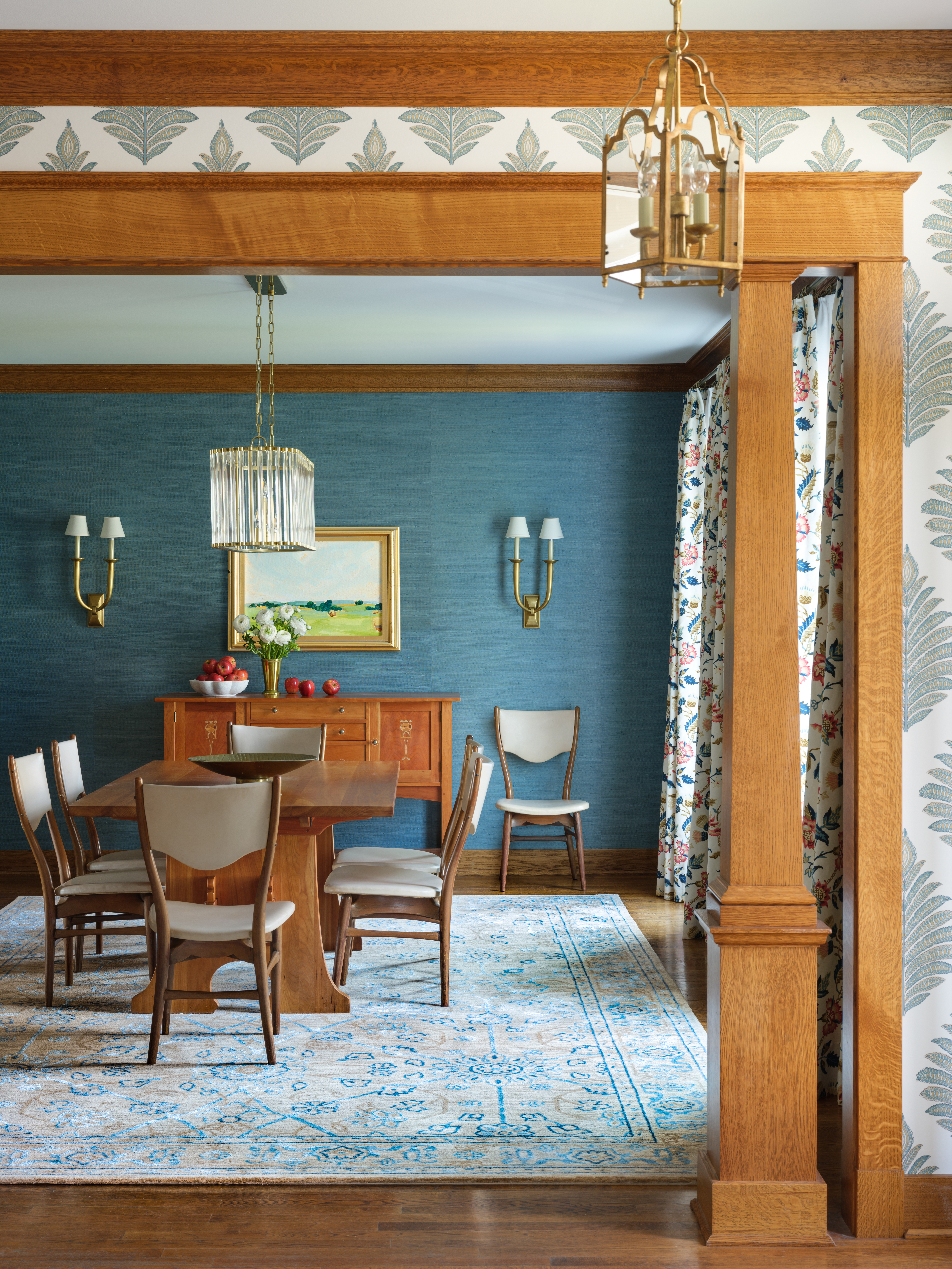
I used to hesitate before putting patterned wallpaper in room after room. No longer! This is my dining room:
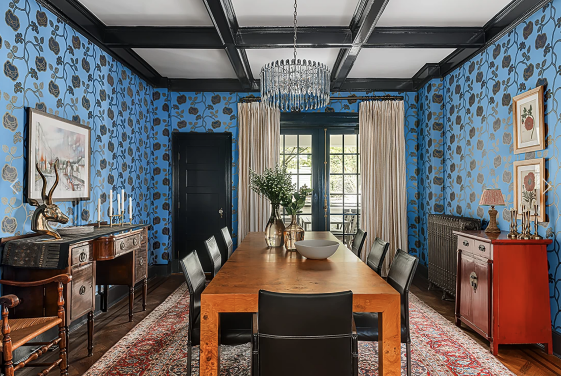
Photo by Rebecca McAlpin

And through that navy blue door on the left is our powder room:
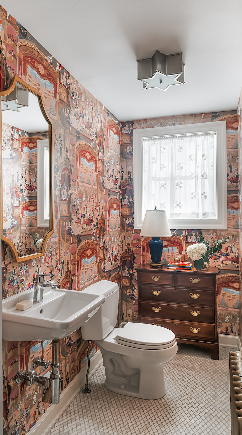
Powder room with colorful scenic wallpaper
Photo by Rebecca McAlpin

It’s hard to justify, but I suppose a people-filled, scenic wallpaper next to a large floral counts as mixing motifs. Right?

Here’s another room-by-room wallpaper progression. You walk into my client’s foyer,
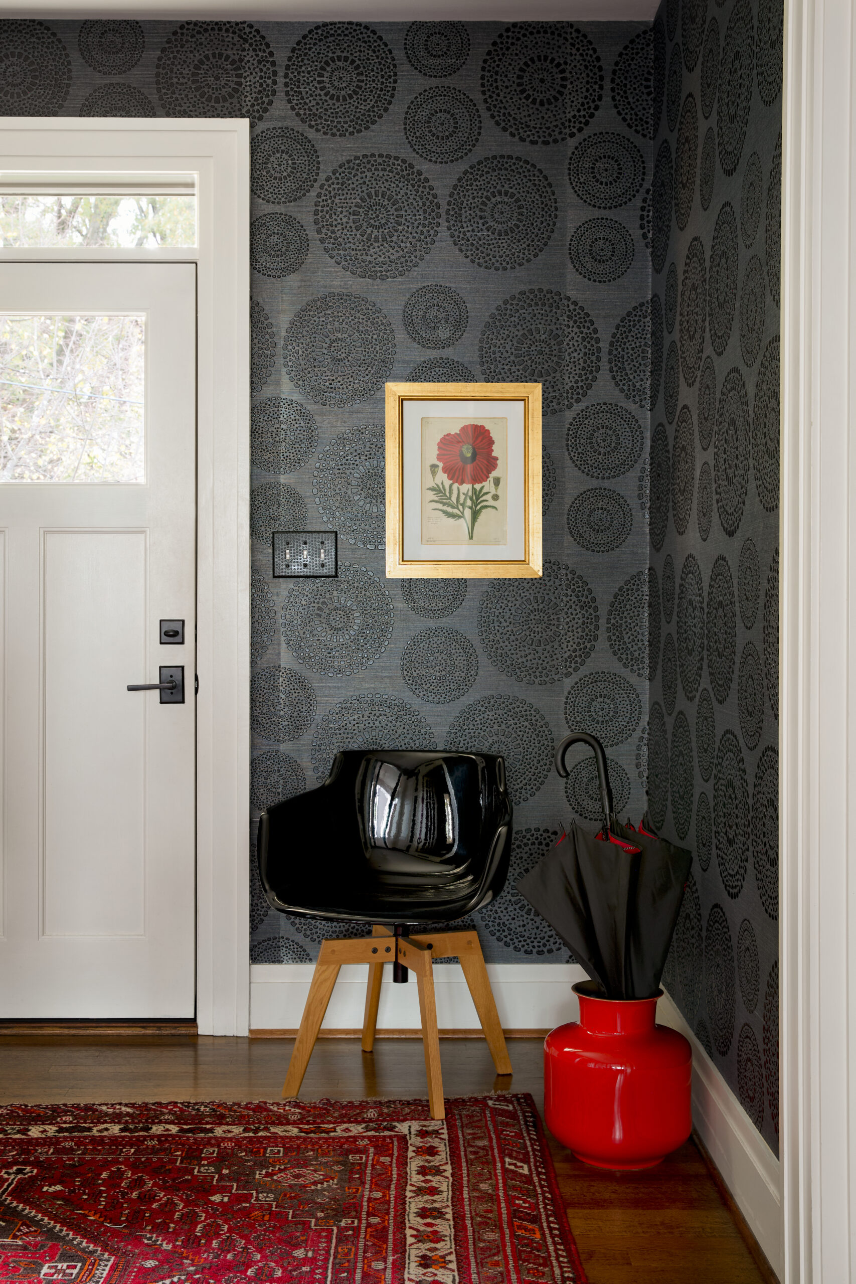
Foyer with black patterned wallpaper, red rug, black chair and red pot.
Photo by Trevor B. Parker

and from there you can see the kitchen.

Bird and flower wallpaper behind staircase.
Photo by Trevor B. Parker

You go from dark geometric to quasi floral, which works even though both scales are large. If the colorful wallpaper — Fruit Looters by Timorous Beasties — didn’t have black in it, this juxtaposition wouldn’t have worked as well.

From THERE, the kitchen, you go into the dining room, which is has gold silk wallcovering. It isn’t patterned, just textured, muted, soft…it’s so much richer and more interesting than paint, and, as I hope you agree, it looks fantastic in the context of the other wallcoverings.
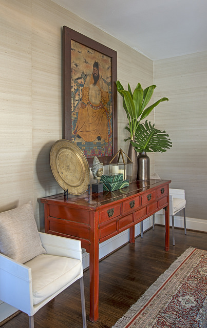
Natural grasscloth wallpaper on walls behind red sideboard.
Photo by Trevor B. Parker

This was a fun post to write, because I don’t think this way when I’m actually designing: “Mix the motif, mix the scale, make color the throughline.” I just do things, and then I cross my fingers that I followed my own rules. (I create the rules by working backwards anyway: I look at what I’ve done time and time again and ask myself why it worked.)
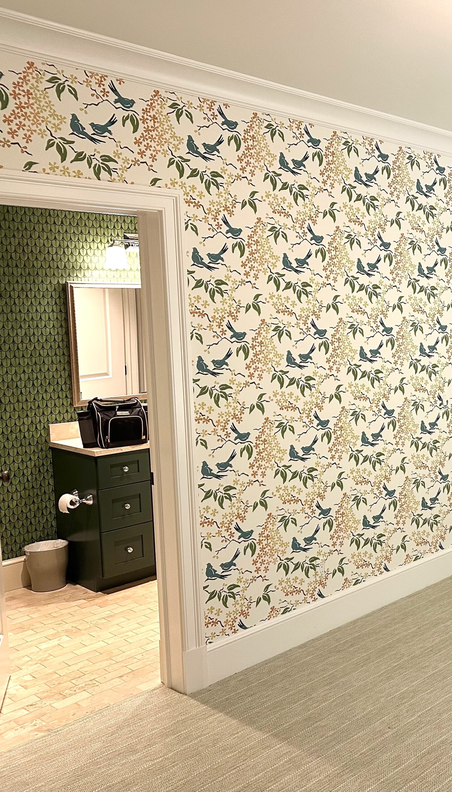
Bird wallpaper on walls outside of bathroom with geometric, green wallpaper.

I know wallpaper is in your future, Gentle Readers. Call me if you need encouragement.

Annie Elliott Design is based in Washington, D.C., but we also love working in NYC and on Maryland’s Eastern Shore. We’re now scheduling projects for fall. Please contact us to discuss.

Category: Wallpaper

Sidebar

Subscribe


Bossy Color Blog

Categories

  • Art + accessories »
  • Bedroom »
  • Color + paint color »
  • Dining room »
  • Furniture + upholstery »
  • Kids »
  • Kitchen + bath »
  • Lighting »
  • Living Room + Family Room »
  • Renovation »
  • Rugs »
  • Wallpaper »
  • Window treatments »

View Portfolio

view Bossy Color's portfolio

Instagram

annieelliottdesign

View Instagram post by annieelliottdesign

Jul 8

Open post by annieelliottdesign with ID 18120991804793828
Star-studded wallpaper on the ceiling childish? Not necessarily! Here are the differences between babyish and grown-up star themed wallpaper. #wallpaper #interiordesign

annieelliottdesign

View Instagram post by annieelliottdesign

Jul 4

Open post by annieelliottdesign with ID 18098048903219045
Happy Independence Day! I happen to love a room decorated in red, white, and blue. It’s not always gimmicky; wouldn’t you agree that the dining room below is bold and sophisticated? 🤪 My advice: vary the shades (clash those blues if you have to!), throw some large-scale patterns into the mix, and add texture. A grasscloth ceiling, for example 😉 Have a great 4th, everyone!#interiordesign #homedecor #pattermixing

annieelliottdesign

View Instagram post by annieelliottdesign

Jul 3

Open post by annieelliottdesign with ID 17934768423090149
I was honored to co-chair — with the inimitable @ianthainteriors — the design competition, America at 250: The New Look of American Design, a project conceived by the nonprofit MADE: In America.Design students from Howard University partnered with Washington Design Center showrooms to create storyboards and vignettes reflecting their vision of “American style.” The Design Center is showcasing the students’ work through July 10; admission is free and open to the public. Details may be found at the link in the @washingtondesigncenter’s bio.I encourage you to visit! It’s so important to support the next generation of designers, and I was delighted to participate in this event. Iantha and I are grateful to James De Lorbe, Chairman of MADE: In America; and we extend our warmest thanks to jurors @melissacolganinteriors, @mariella.cruzado,  @gaildavisdesigns, @val_hawkins_architect, @hadleykeller, @byronrisdon, and @jazmynedesignstudio.

annieelliottdesign

View Instagram post by annieelliottdesign

Jul 1

Open post by annieelliottdesign with ID 18345901804173891
Happy Wallpaper Wednesday! This week’s guest star: Schumacher’s Birds & Butterflies. It’s so whimsical, yet so grown up! Creatures on wallpaper can be a tough sell to adults, but Birds & Butterflies’ black and white background is quite sophisticated. (That’s why the Multi on White is my favorite colorway. I wouldn’t bother with the others.)The pattern is derived from a hand-printed 1960s wallpaper in the Schumacher archive. It’s certainly earned its place in the Exuberant Prints collection, don’t you think?#wallpaperinspo #interiordesign #roomdesign

annieelliottdesign

View Instagram post by annieelliottdesign

Jun 26

Open post by annieelliottdesign with ID 18423163795132747
Before and after part 2: a NYC pied-a-terre part deux! In this video we move to the primary bedroom, guest bedroom/office/workout area (remember: it’s NY! Gotta maximize your space!) and the tiniest powder room in the world. Such a fabulous, fun project!Mentioned:@Schumacher_midatlantic@leejofa@visualcomfort@fornasetti#interiordesign #wallpaper #nycdesign

annieelliottdesign

View Instagram post by annieelliottdesign

Jun 26

Open post by annieelliottdesign with ID 18095719559219273
Another installment of my Before and After video series! This project is in NYC. SO fun!!! We start with a VERY challenging living space/kitchen and then…well, then there’s Part 2!Mentioned:@Schumacher_midatlantic@leejofa@visualcomfort@fornasetti

annieelliottdesign

View Instagram post by annieelliottdesign

Jun 23

Open post by annieelliottdesign with ID 18095254961251333
Having sworn I never would wield a paintbrush again, I recently found myself helping my daughter paint her first apartment. Thus a tutorial about paint sheens for her, thus a recap for you!My latest blog post explains the differences between paint sheens and tells you what goes where ;)Link in bio to read. #interiordesigner #paintinspo #apartmenrdecor

annieelliottdesign

View Instagram post by annieelliottdesign

Jun 22

Open post by annieelliottdesign with ID 18011049497869192
There’s no other word for it: Sheila Bridges’ pattern Harlem Toile De Jouy has become an American icon. Iconic and ironic: the pattern conflates her experiences as a Black woman living in Harlem with pastoral motifs from 1700s French toile. Delightful and lighthearted at first glance, the pattern gives you plenty to think about. Bridges created Harlem Toile as a wallpaper but later expanded the collection to include fabric, bedding, plates, glassware, umbrellas, and clothing. I strongly recommend getting a piece of this pattern any way you can. @harlemtoilegirl#interiordesign #harlemtoile #patterninspo

annieelliottdesign

View Instagram post by annieelliottdesign

Jun 17

Open post by annieelliottdesign with ID 18106157639319026
“Much of the wallpaper [in the Victorian era]—fabric, too—was made with arsenic,’ explains Elliott. ‘There are worse ways to go, I suppose.’”I loved speaking with @allisonpduncan @vogueliving about the art of using two wallpapers in one room. Happy Wallpaper Wednesday!#interiordesign #wallpaper #vogueliving #designopinions #annieelliottdesignSlide 1 📸  by Stacy Zarin Goldberg, Design by Annie ElliottSlide 2 📸 by Leslee Mitchell, Design by Kim ScodroSlide 3 📸 by Donna Dotan, Design by Ariel OkinSlide 4 📸 by Gordon Gregory, Design by Jenny Holladay
Follow

Looking for something?

Don’t miss a single post


Where classic and modern hang out and drink gin.

  • Instagram
  • TikTok
  • Pinterest
  • Facebook
American Society of Interior Designers Firm Partner

© 2026 · Annie Elliott Design · privacy policy