• Skip to main content
  • Skip to header left navigation
  • Skip to header right navigation
  • Skip to site footer
  • about
    • services
    • team
  • portfolio
  • press
Annie Elliott Design, Washington DC

Annie Elliott Design

Greater Washington DC

  • book
  • blog
  • contact

How to make a beach house less beachy

Annie Elliott | May 23, 2026

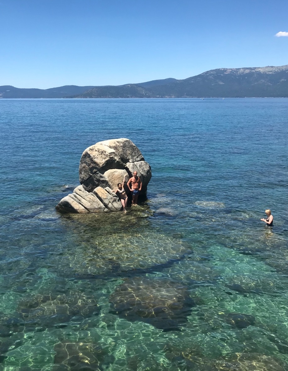
Happy summer, Gentle Readers! It’s officially here, despite the can’t-make-up-its-mind weather. We have sun in our hearts. For those lucky enough to have a house near water, you may be thinking about redecorating right about now. (Oh wait, that’s me ;) I’m ALWAYS thinking about redecorating!)

Three people swimming in a lake with a big rock.

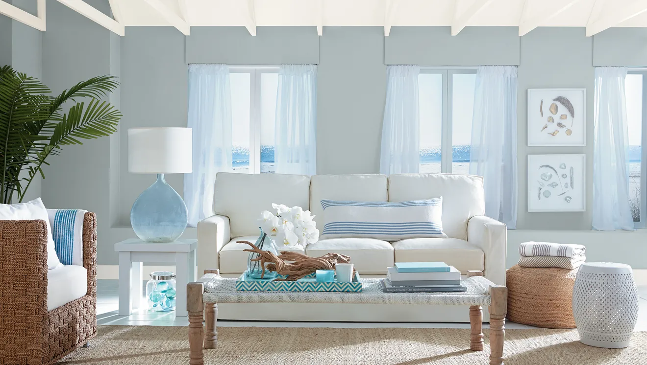
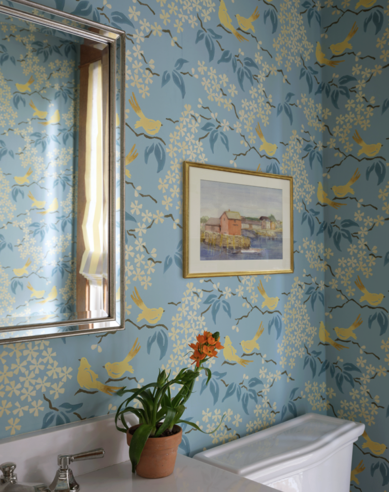
You may even be thinking about decorating beyond traditional “costal decor” that relies heavily on a palette of navy (or light blue) and white. Nothing wrong with blue and white; you just can’t claim that it’s original.

So if you’re ready to get a little more creative with your beach house…

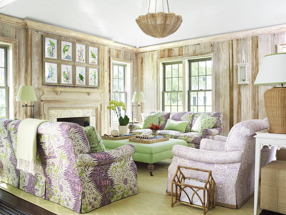
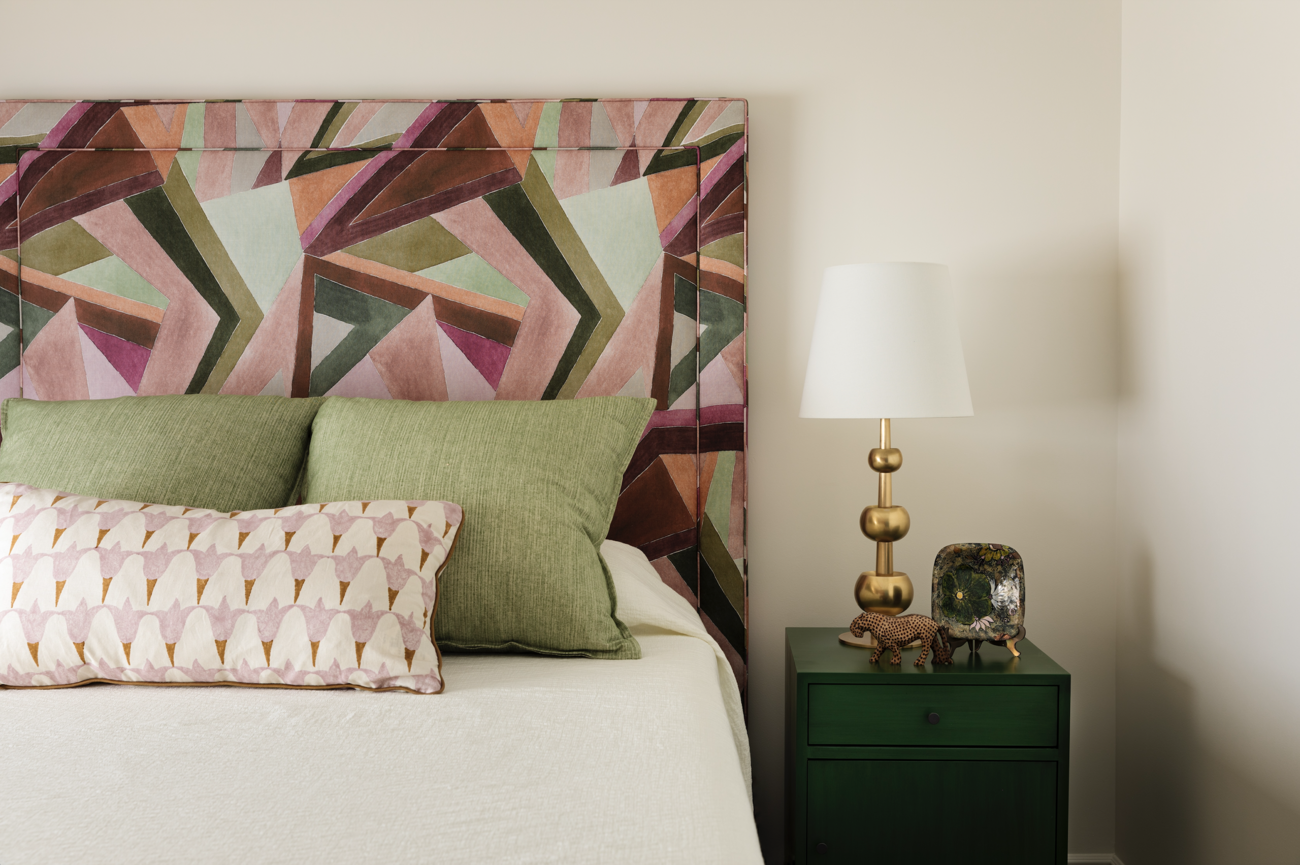
DO: Consider a color palette beyond blue and white :)

Or at least add one more color to the palette: light green, yellow…even red if you’re patriotic. I happen to love red, white and blue together.

I recently proposed a lavender and green palette for a client’s Nantucket house. (If you ever sneak a peek at your teenager’s or young adult’s phone, you can see my TikTok about that project.)

Quadrille’s Les Indiennes – Multi Lilac Plum Green
From Amanda Lindroth
Purple, green and pink bed frame, green beside table.
Photo by Trevor B. Parker

The key to making any color palette beachy is keeping the colors light and using a lot of white. You can limit color to the furnishings if you like; white walls are great.

Colorful living room with high ceilings and many windows.
Photo by Markus Wilborn

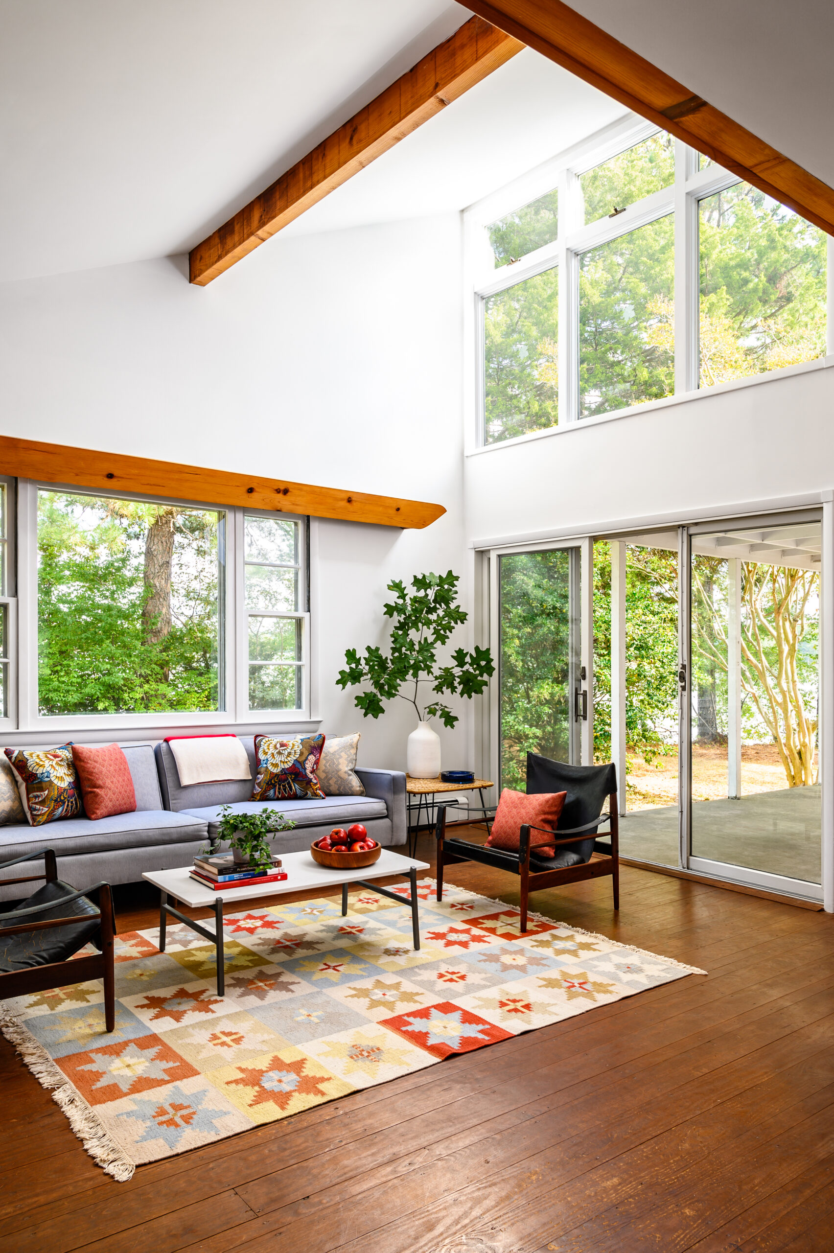
In addition to a light color palette, a key to creating a beachy vibe is using lightweight fabrics such as linen and cotton for your upholstery and window treatments. (I probably didn’t even have to say that; it’s intuitive.) No velvet or chenille, no wool, no boucle – even if it’s white.

DO: Use pattern!

Have you noticed that most aspirational pictures of beach houses use SOLID white and SOLID navy? Sure, maybe there’s an occasional blue and white striped pillow, but there’s certainly very little plaid or floral. Please think about that. In your new colors ;)

DO: Limit the number of seagrass rugs.

Seagrass rugs are popular in beach houses for a reason. They’re durable, the natural material is found near beaches (SEAgrass), and the color is neutral. Plus they’re just awesome. I love seagrass anywhere, and I’m certainly not going to snatch it out of your beach house.

Beige furniture on seagrass rug.

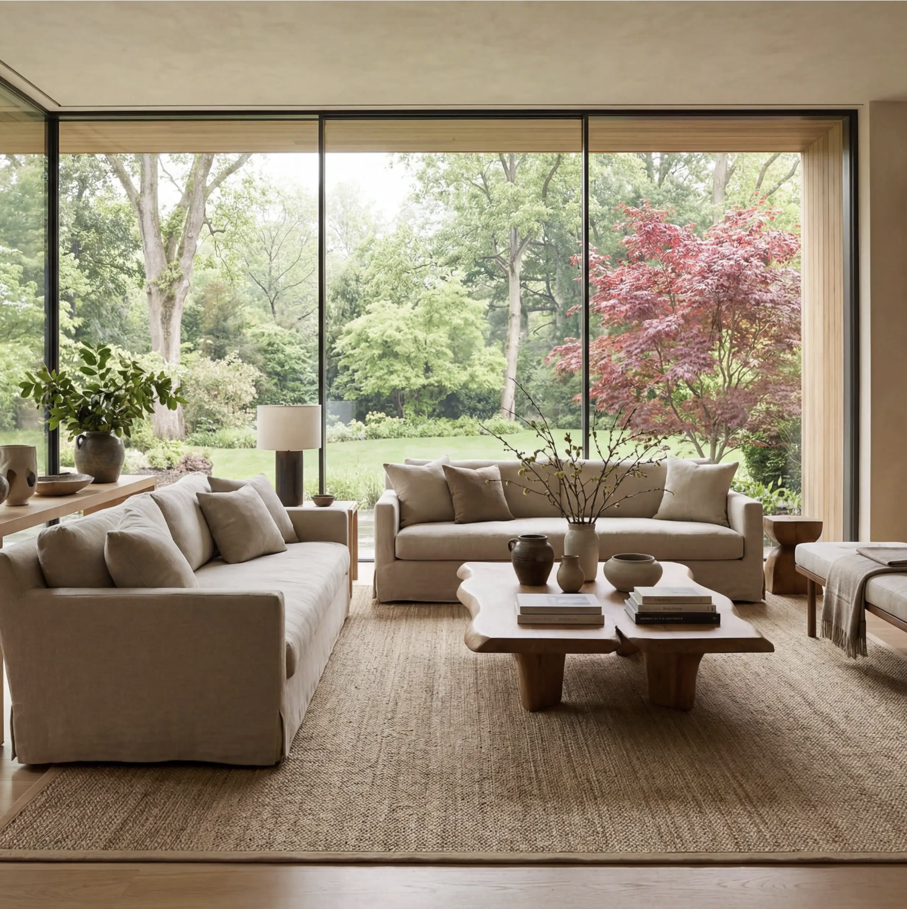
Might I suggest, though, that you use a seagrass rug as a layering piece? Place a large seagrass rug under all of the furniture in your sitting area and then put a smaller, flat rug in the center. You get some color in there and add interest.

Hallway with layered rugs and whimsical wallpaper.
Photo by Stacy Zarin Goldberg

So use seagrass it in your entry, or maybe in your sitting area, but for a less predictable beachy look, don’t use it in every room.

Speaking of grasses… If you have a room with a seagrass rug, no natural woven Roman shades, please. It’s like putting too many different animal motifs in one room: too much of a good thing. (Not to disagree with Mae West, but…)

Other ways to make your beach house less beachy:

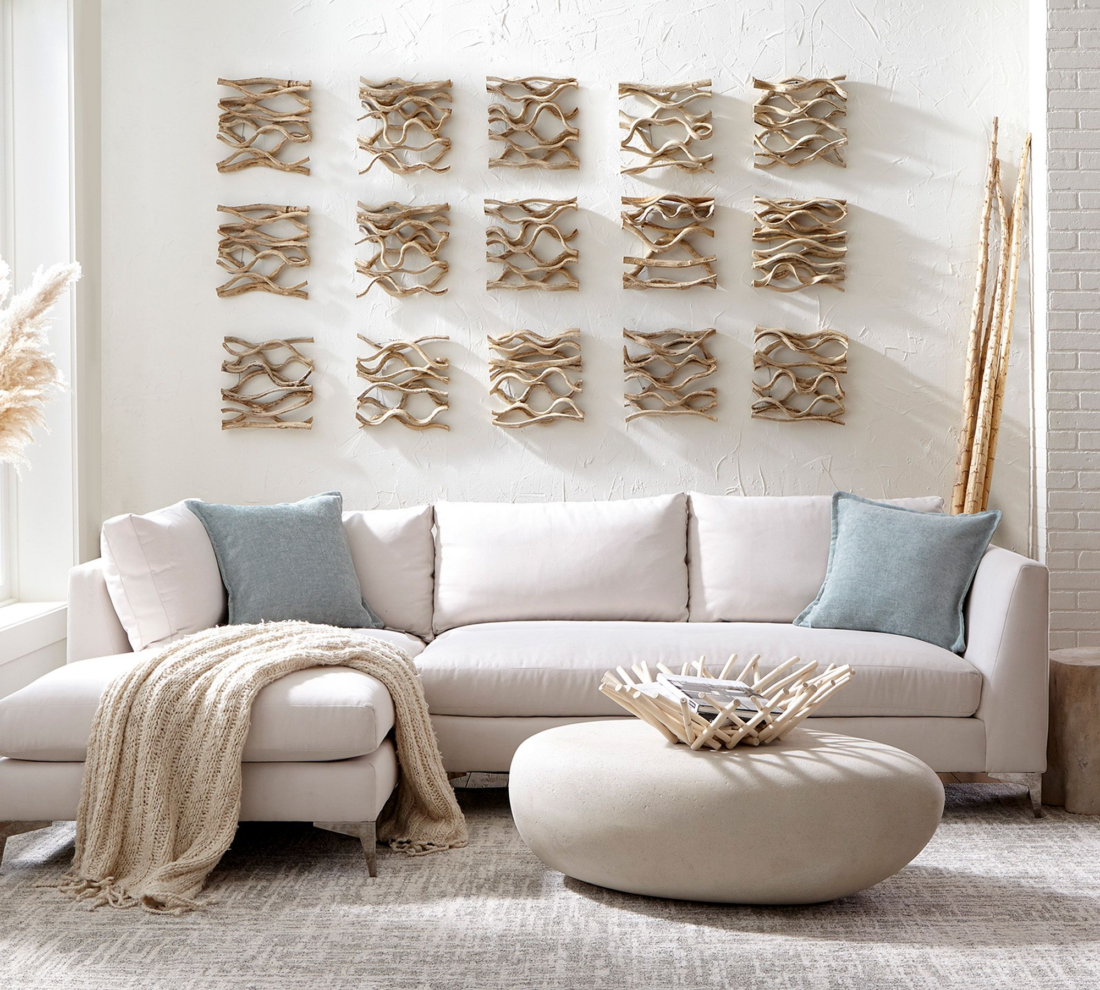
DON’T: Overdo beach-themed decor. Be strategic. I will never deny you kitsch in small doses; I myself have a painting or two of oyster shells. But to make your house look more original and less predictably beachy, here are my thoughts.

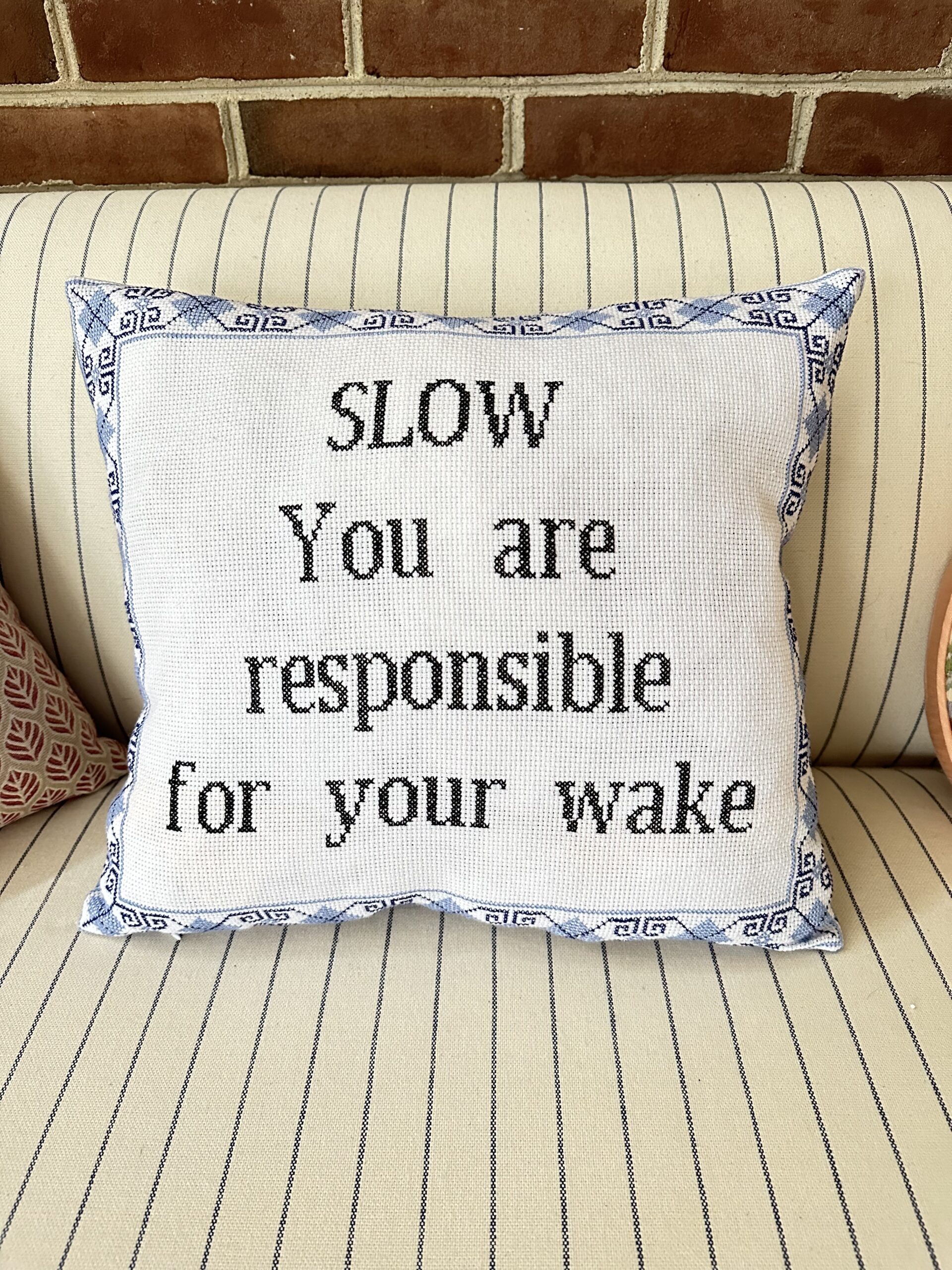
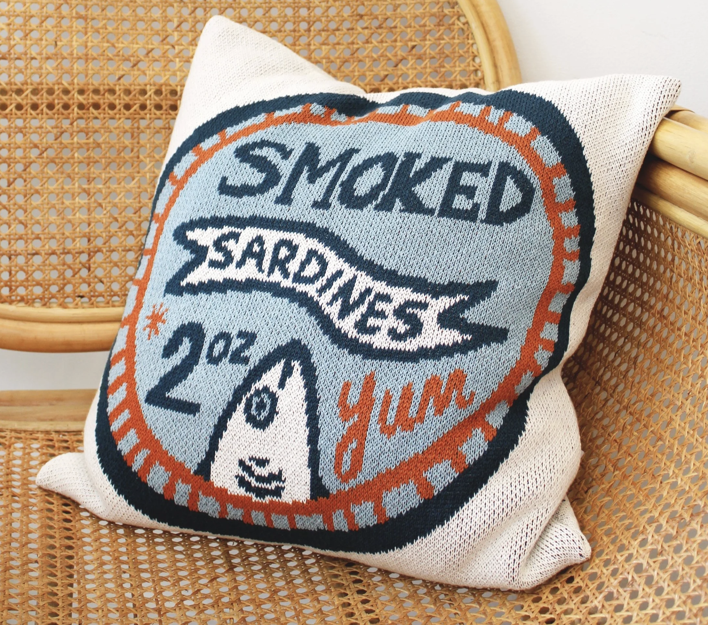
Words are fine on pillows, less awesome on walls.

So pillows, yes:

Pillow that says "SLOW. You are responsible for your wake."
Pillow with a sardines ad.

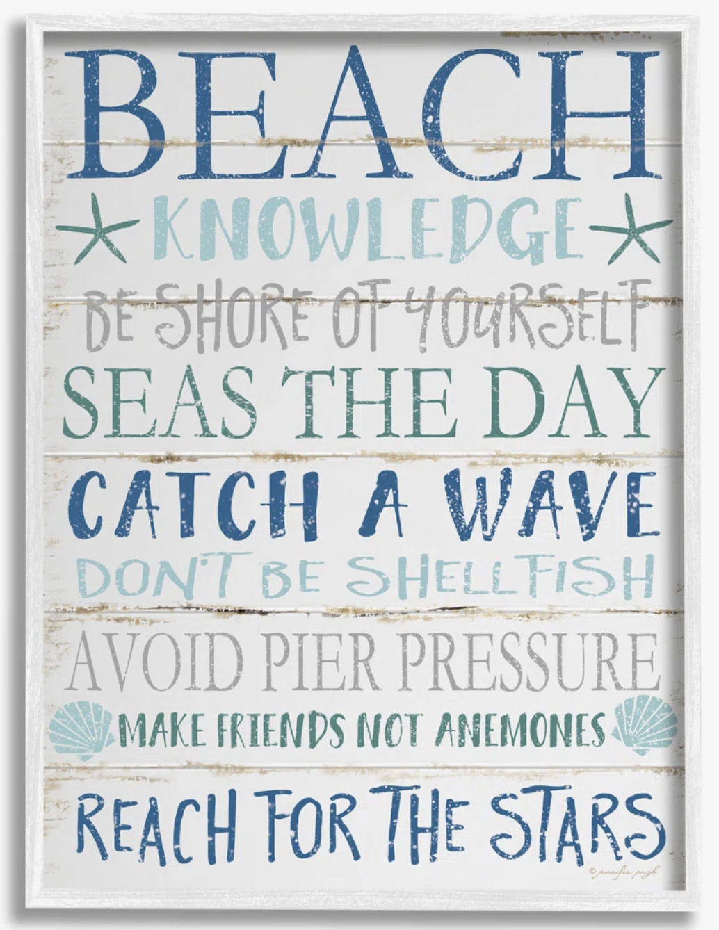
But words on wall, no. (For more on this subject, please see my “Words as Art” blog post.) Can we please agree never to use these signs again?

Eat sleep beach repeat wooden sign
Beach knowledge sign on wood

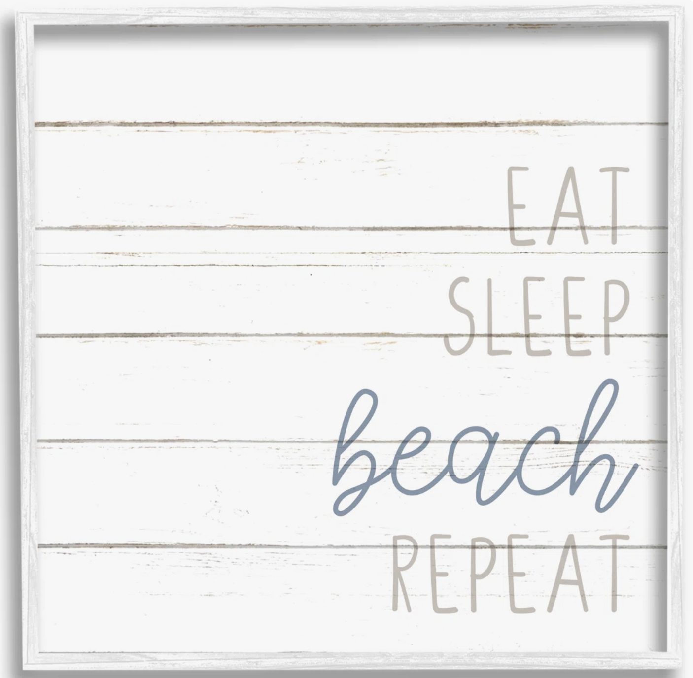
I’ll give you a pass on signs with the specific name or coordinates of the island or town. I don’t know why, but I think those are cute.

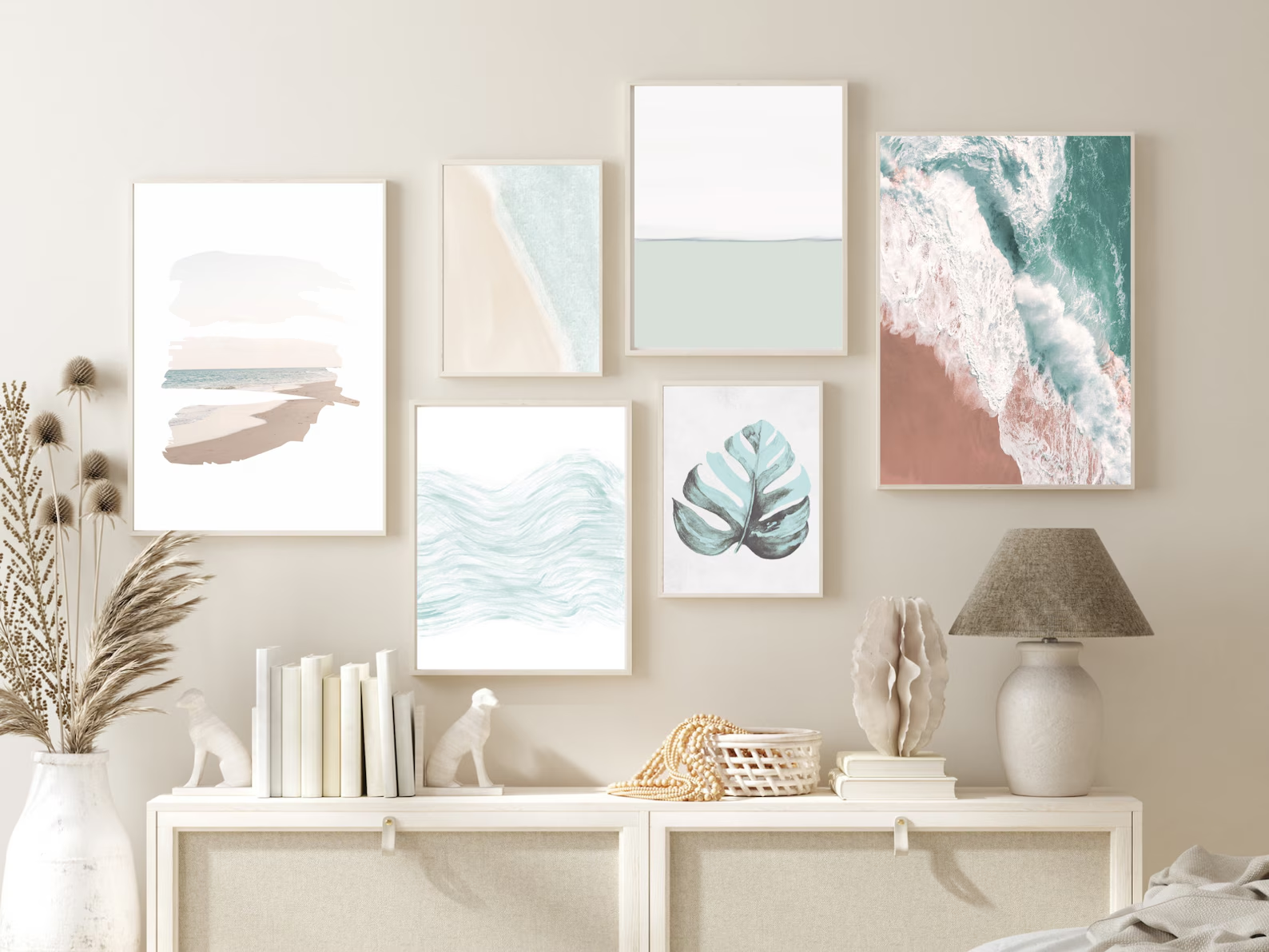
DON’T: Overdo the beach-themed art.

Delving further into things you hang on your walls, integrate beachy art (or vaguely beachy, as I’m considering the blue and white pieces below to be) with other artwork.

Three pieces of art. Two of the three are blue and white.

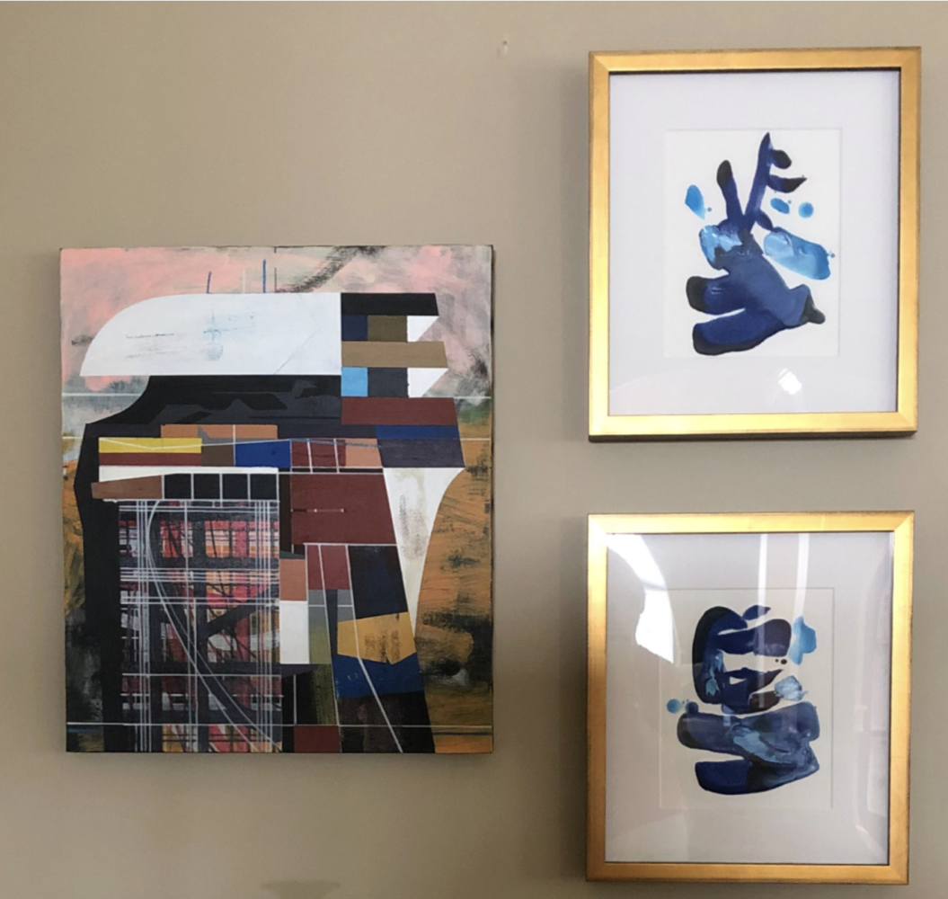
And/or use original art,

Painting of seaside hanging on bird printed wallpaper.
Photo by Angie Seckinger

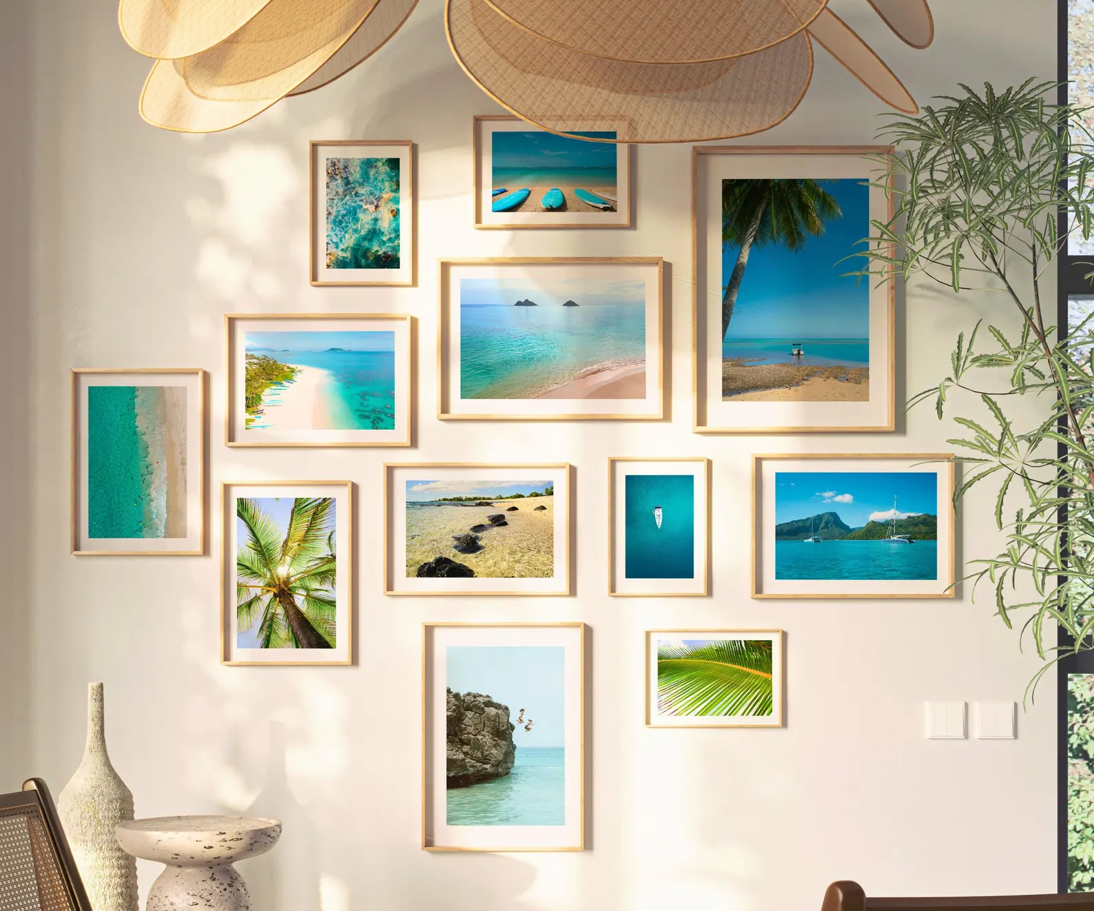
Please do not do this:

Driftwood art on wall

and please do not even think about a pre-fab, themed gallery wall unless you want your house to look like a second-rate hotel.

Gallery art wall of beach photographs
Gallery wall of beach themed art

DO: Be strategic with decorative items.

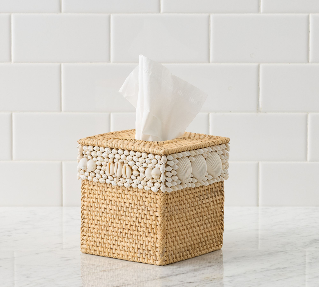
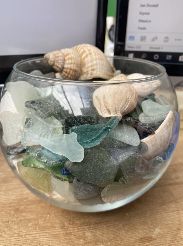
Seashells have their place, and that place is in a bowl, preferably a glass bowl. I’ll also allow shells grouped on a mantel or tabletop. (Strength in numbers.)

I’m less enthusiastic about seashells being used like this:

Kleenex tissue box decorated with shells

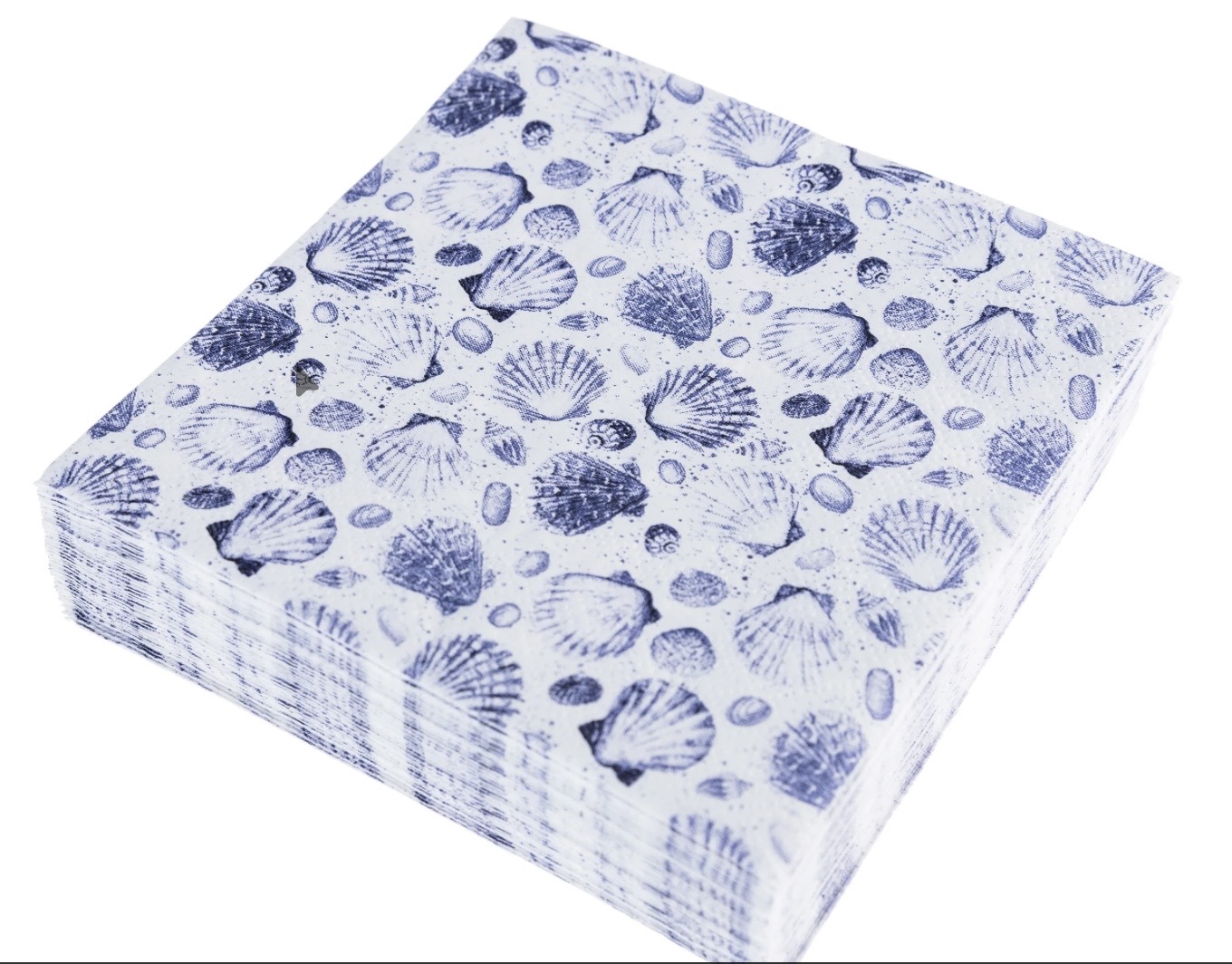
Beach-themed food-related items are fine. Trays, tumblers, dishes…they’re not on view all the time. And in the case of cocktail napkins, they’re disposable.

Stack of cocktail napkins with shells on them

Finally, ditch the sea glass. It’s a controversial position, I know, but I hate sea glass. (It’s two words; I had to look it up.

Sea glass pieces

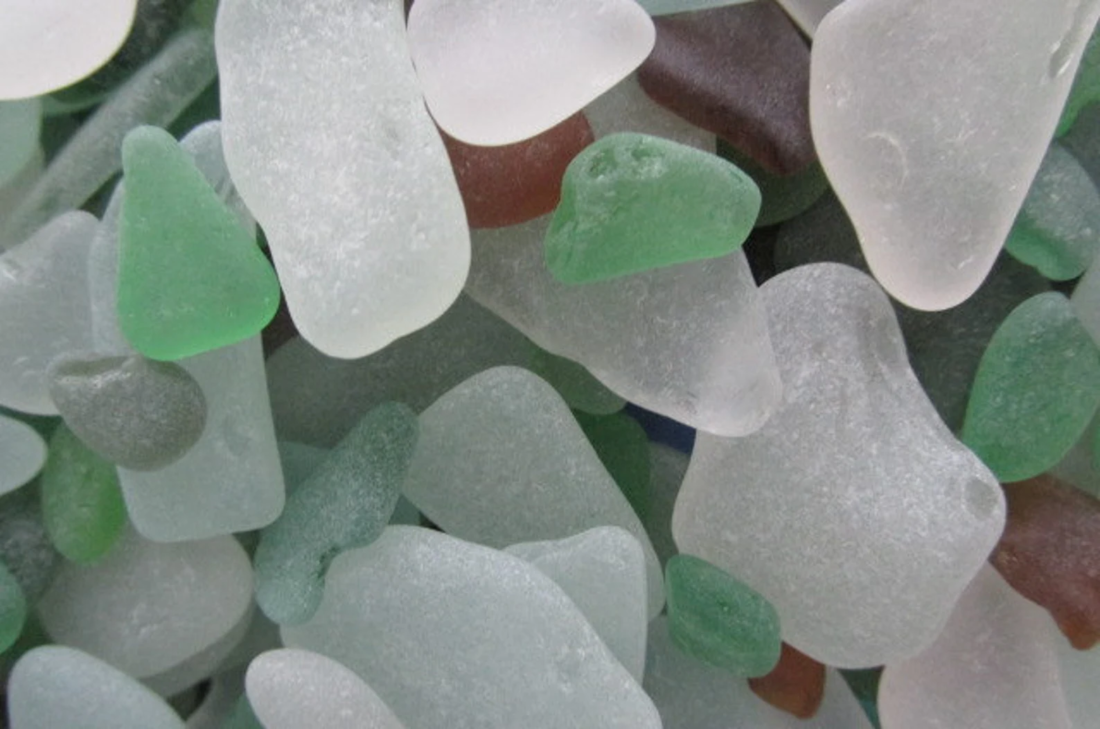
It’s trash that’s been weathered by nature. What’s the appeal?

Mobile made of sea glass

For those of you who LOVE sea glass — I hear you cursing my name! — there is a Sea Glass & Coastal Arts Festival at the St. Michaels Maritime Museum every April. If you see me there, I’ll be in the “oyster art” section. You’re just in time for the 2026 festival in Lewes, DE, though; it’s on June 8-9.

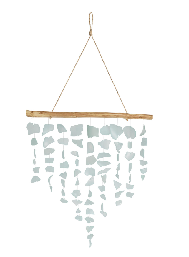
If you MUST collect sea glass, put all of the pieces into a bowl and call it a day.

Bowl of sea glass pieces

As always, these are recommendations, Gentle Readers! Do with them what you will, and I hope your summer is off to an amazing start.

Annie Elliott Design is a Washington, D.C based firm, but we also love working in NYC. We especially love beach houses :) . We’re now scheduling projects for the summer. Please contact us to discuss.

Category: How-toTag: Beach, beach theme, Coastal, color palette, costal decor, country house, Nautical, sea glass, Summer, summer house, weekend house

Sidebar

Subscribe


Bossy Color Blog

Categories

  • Art + accessories »
  • Bedroom »
  • Color + paint color »
  • Dining room »
  • Furniture + upholstery »
  • Kids »
  • Kitchen + bath »
  • Lighting »
  • Living Room + Family Room »
  • Renovation »
  • Rugs »
  • Wallpaper »
  • Window treatments »

View Portfolio

view Bossy Color's portfolio

Instagram

annieelliottdesign

View Instagram post by annieelliottdesign

Jun 10

Open post by annieelliottdesign with ID 17929516656341682
Deep down, I believe that a house isn’t a home without wallpaper 😊 My latest blog post identifies five unexpected places you can use wallpaper — and some are small! Wallpapering the space behind your island stools could be your gateway to my favorite home furnishing. If you have other creative spots for wallpaper, I’d love to hear about them!#wallpaperinspo #interiordesign #wallpaper

annieelliottdesign

View Instagram post by annieelliottdesign

Jun 9

Open post by annieelliottdesign with ID 18112589929761575
Welcome to my new before-and-after series! 🥰 I take you through my thinking as I design a space — my “process,” as it were. Pretty pictures are involved too, of course. I hope you enjoy it!This was a super fun project: a historic townhouse with the challenge of a loooong shoebox-shaped front room. You know the kind. Here’s how we made this color-and-pattern-loving client’s challenging space amazing. Like this series? Please let me know! #interiordesigner #windowtreatments #wallpaper

annieelliottdesign

View Instagram post by annieelliottdesign

Jun 5

Open post by annieelliottdesign with ID 18087273683080656
Don’t let your porch be a throwaway space! Make it a room. Get a high quality indoor/outdoor rug. Make sure your furniture is COMFY. Find a cordless lamp (they’re everywhere now!). Hang art! You can even add a vintage console table or cabinet if you’re ok with it weathering over time 🕰️. #interiordesign #porchdesign

annieelliottdesign

View Instagram post by annieelliottdesign

Jun 3

Open post by annieelliottdesign with ID 18314336014263171
It’s Wallpaper Wednesday! This week we feature Paper Trail by Lewis and Wood. Lewis and Wood launched Paper Trail in the fall of 2025 as one of four patterns in their History Papers Collection. Paper Trail was inspired by ancient rock carvings - 600–2,000 years old! - from various sites in America. It was named after the site Newspaper Rock, Utah.You know I love anything with an animal :) But there are 2 genres, right? Juvenile and…let’s call it *versatile*. To me, Paper Trail falls into the latter category, featuring deer, horses, buffalo, and foxes on a background that resembles the texture of rocks. It’s primitive, not cartoonish. I could see using this in a small bedroom; a breakfast nook (why? Can’t tell you, it’s just a feeling); or a hallway, because the pattern isn’t overwhelming.#wallpaperinspo #interiordesign #homedesign

annieelliottdesign

View Instagram post by annieelliottdesign

May 28

Open post by annieelliottdesign with ID 18102883841082172
For those of you lucky enough to have a beach house, now’s the time to start thinking about decorating beyond traditional “costal decor!” Step one? Consider a color palette other than blue and white ;) See my latest blog post for more! 🏖️ 🐚#beachhouseinteriors #interiordesign #eastcoast

annieelliottdesign

View Instagram post by annieelliottdesign

May 22

Open post by annieelliottdesign with ID 18125488516719287
I follow two rules when mixing patterns in the same space: vary the scale, and vary the subject.I was excited to share this and other insights on pattern splicing with @ericafinamore from @apartmenttherapy! #interiordesign #patternsplicing #patternmixing #designopinions #annieelliottdesign

annieelliottdesign

View Instagram post by annieelliottdesign

May 20

Open post by annieelliottdesign with ID 18082241465136951
It’s Wallpaper Wednesday! This week we’re featuring Deconstructed Stripe by Schumacher (in collaboration with Miles Redd).This pattern pays tribute to the legendary decorator Albert Hadley. Redd was inspired by Hadley’s contemporary, streamlined designs that played with scale and proportion. Deconstructed Stripe is impactful on its own but also looks INCREDIBLE next to other patterns.@schumacher1889 #designinspo #wallpaper #interiordesigner

annieelliottdesign

View Instagram post by annieelliottdesign

May 19

Open post by annieelliottdesign with ID 17926257288321853
HuffPost asked for my thoughts about the new White House ballroom. As you can imagine, I have many. I was so delighted to be included in this conversation! Thank you, @huffpost and @carsar91!#interiordesign #whitehouse #designopinions #annieelliottdesign

annieelliottdesign

View Instagram post by annieelliottdesign

May 13

Open post by annieelliottdesign with ID 18340156693174785
I was thrilled to attend Imar Lyman’s exhibition opening at the Kreeger recently! I’ve loved his work for years and am lucky enough to own one of his silkscreens (ours is of Frederick Douglass). He’s moved from portraiture to abstraction, but he still does some work in collage, which I confess is my favorite ;) The exhibition is up through July 11. Play hooky one afternoon and go.(The last painting is by Frank Stella, by the way — an influence on the artist, as you can see!)@imarhutchins @kreegermuseum
Follow

Looking for something?

Don’t miss a single post


Where classic and modern hang out and drink gin.

  • Instagram
  • TikTok
  • Pinterest
  • Facebook
American Society of Interior Designers Firm Partner

© 2026 · Annie Elliott Design · privacy policy