
Gentle Readers, a lively discussion resulted from last week’s question about the Kiwi green kitchen – and Chloe was kind enough to follow up with us today! I thought it would be easier to see her pictures if I did this as a separate post. Here’s her note:
Thanks so much for the help Annie! And all the other great comments. I like the purple idea (though my husband isn’t sold yet, I may have been too convincing with my previous navy/dark blue idea), and I got a sample can of the Passion Plum. I appreciate the comments about flow, though I think different colors will be fine.
 I am planning on the same trim in the LR and DR. It’s actually a 1926 craftsman, so the rooms are distinct yet open to one another. And I think I have enough purple accents in the living room plus 2 purple chairs to tie it all together.
My thoughts at this stage of the experiment:
- I need a darker purple. I’m not afraid of color, but I am afraid of Barney. Maybe flat would be better? The sample is eggshell.

- I think the bar between the kitchen and DR may need to be painted Chatsworth Cream, as the green is just not working for me from the DR. Even though that’s not ideal with the white tile and cabinets in the kitchen.

- I was going to paint the ceiling Chatsworth Cream too, but maybe something darker would be better?
And of course the pictures! (sorry, it wouldn’t let me insert them as images in the comment) All with indirect morning light and no flash. I think the colors look pretty accurate.

Here’s Annie again. The fear of Barney is a valid one; I hate that damn dinosaur. Yes, taking the finish down to matte/flat would help, because the color will look darker and more sophisticated. I also didn’t realize that your walls are stucco. But I agree that in the pictures above and below…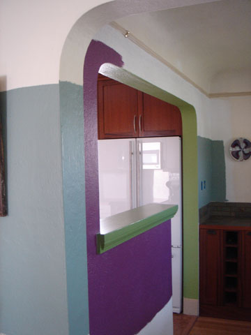
…the Passion Plum is looking a little cheap. I’d thought the room was darker than it actually is – that’s some great light coming in!
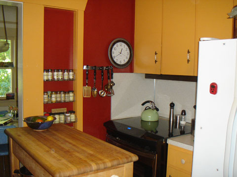
That said, though, here’s the view of the same color from the kitchen:


 Doesn’t that blow your mind? So different. The way the purple looks in the above picture is the effect we want.
Below, Chloe has taped up swatches of Benjamin Moore’s 1379 Eggplant and 2073-20 Autumn Purple.
Both of these colors have more gray in them than the Passion Plum, which is a step in the right direction. Go ahead and test them in a matte finish. I LOVE the way the Autumn Purple swatch looks in this picture, but it is going to look super dark on the opposite wall, and I’m concerned that it could look black coming in from the LR sometimes.
This underscores the importance of putting up actual swaths of paint before finalizing your decision. You can’t be 100% sure what a color will look like until it’s up.
Second, although I don’t mind the green bar/half wall trim between the kitchen and DR, painting the bar cream would be better. If you do that, consider painting the interior of the arched doorway cream instead of the green. I think Chatsworth Cream is a good bet for the ceiling, too – I don’t think you’ll need to go darker.
And finally, Chloe thought it would be fun to show us the “before” picture of her kitchen, pre-remodel. If there were an award for bossiest lifestyle, Chloe, you’d win it!
The reason I’ve devoted so much time to this question is that Chloe’s colors WORK. It’s not a case of bright colors for the sake of bright colors. This is a thoughtful, considered, and ultimately successful application.
What do you all think?