• Skip to main content
  • Skip to header left navigation
  • Skip to header right navigation
  • Skip to site footer
  • about
    • services
    • team
  • portfolio
  • press
Annie Elliott Design, Washington DC

Annie Elliott Design

Greater Washington DC

  • book
  • blog
  • contact

Duralee’s re-imagined Bailey & Griffin fabric: very bossy!

Annie Elliott | May 18, 2014

I love old. I love recycled. And I love “made in the USA.” So imagine my delight when I learned about Bailey & Griffin, a  luxury fabric line that had been out of production for years until Duralee revived it.

Bailey & Griffin, Paradise Toile

The brand’s history is interesting. “Founded in 1923, Bailey & Griffin began as the U.S. distributor for UK-based fabric house, Arthur H. Lee & Co….[the]  designs were quickly embraced by the burgeoning U.S. design community.” Skipping a few corporate steps (because I can’t figure out all of the connections, beyond Arthur H. Lee’s merger with Lee Jofa), Duralee bought the B. Berger companies in 2012 primarily to acquire its window treatment hardware line.

As an unexpected bonus, with it came the fantastic archives of Bailey & Griffin. It must have been like buying an old painting at a flea market because you like the frame, and then the picture turns out to be a Picasso.

Bailey & Griffin
Bailey & Griffin with Anne Hahn

Duralee’s Ann Hahn, the incredibly knowledgeable, gracious designer who gave the presentation I attended at the Duralee showroom, saw the potential in the Bailey & Griffin patterns. She explained their French, English, and Indian influences, which was fascinating.

The Bailey & Griffin designs themselves are lovely — florals, a toile, some Chinoiserie — but Ms. Hahn knew that in order to make these patterns relevant today, some changes were in order. She played with the scale of the designs, in many cases making it bigger, and she created new, fresh colorways.

Bailey & Griffin, Port Royale  in sea green
Bailey & Griffin, Port Royale in sea green

I’ll be honest: were I to have seen the patterns as they were originally, I doubt I would have thought twice. “Waverly,” I might have sniffed. “Laura-Ashley-esque,” my high school flashback self might have whispered in my ear.

BUT. Thanks to Ms. Hahn’s intelligent and creative redesign, these patterns are now fresh, relevant, and, yes, BOSSY!

Bailey & Griffin, Charmete

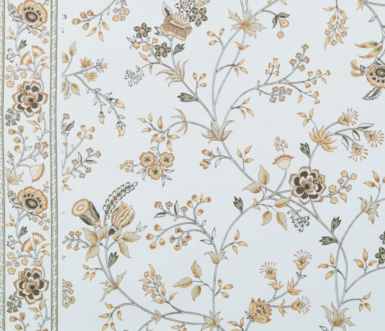
I especially love that some of the designs are printed on a natural-toned (warm) fabric, and some are on pure white (cool). I can’t tell you how helpful this is. Take the pattern, “Patrice,” for example. The Linen/Charcoal colorway is printed on pure white groundcloth:

 Bailey & Griffin, Patrice
Bailey & Griffin, Patrice

And the Flame colorway is on a rich, orangey cream groundcloth:

 Bailey & Griffin, Patrice
Bailey & Griffin, Patrice

Two tones, two colorways, infinite decorating possibilities!

As though the patterns themselves weren’t exciting enough, Bailey & Griffin fabric is hand screened at the VERY SAME press — Griswold Textile Print in Westerly, Rhode Island — where they were printed originally.  Rah, rah, USA! Some fabrics are printed on screens 50 FEET LONG, with two people, one on each side of a screen:

Griswold Textile Print in Westerly, Rhode Island

They print one color at a time, with each color application taking about 30 minutes, and then they repeat with 9-12 colors. FOR EACH BOLT OF FABRIC. Isn’t that amazing?

Bailey & Griffin,  Salur
Bailey & Griffin , Salur

It’s always exciting to have a new resource.

Annie Elliott is an expert in curated interiors, brilliant color palettes, and telling people what to do in the nicest way possible. Her interior design firm, bossy color, has been showing houses in the greater DC area who’s boss for more than 10 years.

Category: Color + paint colorTag: Ann Hahn, Arthur H. Lee & Co., Bailey & Griffin, Duralee, fabric, floral, Griswold Printing, Lee Jofa, textile press, textiles, toile

Sidebar

Subscribe


Bossy Color Blog

Categories

  • Art + accessories »
  • Bedroom »
  • Color + paint color »
  • Dining room »
  • Furniture + upholstery »
  • Kids »
  • Kitchen + bath »
  • Lighting »
  • Living Room + Family Room »
  • Renovation »
  • Rugs »
  • Wallpaper »
  • Window treatments »

View Portfolio

view Bossy Color's portfolio

Instagram

annieelliottdesign

View Instagram post by annieelliottdesign

Mar 25

Open post by annieelliottdesign with ID 18088729466185965
It’s Wallpaper Wednesday! Today we feature Brunschwig & Fils’ Les Touches. @brunschwigfils introduced Les Touches in 1965, and the pattern soon became a Brunschwig classic. (Interestingly, “touches” translates to “keys” or “strokes…” I guess that’s close to “dabs,” which is what I’d assumed.) According to handwritten records, Les Touches is inspired by post-WWII black and white photographs, but the connection between this inspiration and the pattern remains a mystery. Referred to most often as a stylized animal print, Les Touches is a staple of the Le Jardin Chinois collection.Today, Les Touches comes in 18 colorways, but the blue colorway remains iconic. I’ve used Les Touches for window treatments and upholstery, but I can’t wait to try it as wallpaper!

annieelliottdesign

View Instagram post by annieelliottdesign

Mar 23

Open post by annieelliottdesign with ID 18102457048819740
Here’s what ✨ I ✨ would do… Instead of matching everything, you balance it. Pull one color. Shift the scale. Let each piece do something different. Here’s what ✨ I ✨ would do… Instead of matching everything, you balance it. Pull one color. Shift the scale. Let each piece do something different. Bonus: Change the rug! Suddenly you’d make a completely different window choice.Did you guess it?!Watch part 1 for the challenge context and part 2 for what doesn’t work.#interiorsandhome #fabricdesign #romanshades

annieelliottdesign

View Instagram post by annieelliottdesign

Mar 23

Open post by annieelliottdesign with ID 17860517745617635
Let’s talk about what fabric doesn’t work ❌ for the Roman shades in this teenage girl’s bedroom with 2 big windows and a statement ceiling. Even though these fabrics are beautiful on their own… they don’t work here. Biggest mistake: repeating the same motif (moths, butterflies, etc.) across the room. It starts to feel themed instead of designed.Watch part 1 for the full context, and watch part 3 to find out what I would choose.#interiordesign #wallpaper #interiorsandhome

annieelliottdesign

View Instagram post by annieelliottdesign

Mar 23

Open post by annieelliottdesign with ID 18038018090572669
Here’s the challenge: a teenage girl’s bedroom. Not huge. Two big windows. Statement ceiling. White walls.Which fabric would you choose for the Roman shades?There’s a right answer… a safe answer… and a couple very wrong ones. Comment your pick before you see part 2 👇#interiordesigner #wallpaper #romanshades

annieelliottdesign

View Instagram post by annieelliottdesign

Mar 20

Open post by annieelliottdesign with ID 18081942074583086
Behind the scenes at an AED photoshoot! 📸. It is all hands on deck — even Tilly did her part! Shoutout to @stacyzaringoldberg #interiordesign #dcdesigner #interiorsandhome

annieelliottdesign

View Instagram post by annieelliottdesign

Mar 18

Open post by annieelliottdesign with ID 18097450855812440
The star of today’s Wallpaper Wednesday is Schumacher’s Acanthus Stripe. If you’ve studied Green and Roman architecture, the Acanthus motif is an old friend: Acanthus leaves were a common ornament on Corinthian capitals as early as 500 BC. Celerie Kemble’s interpretation of the motif in her Acanthus Stripe wallpaper is streamlined and clever, with the leaves serving both as capitals and as the columns themselves. @schumacher1889 has created three types of Acanthus Stripe wallcovering: paper, vinyl, and sisal, with the latter my favorite by far. The sisal roughs up the pattern a little bit, making the paint a tad uneven and the edges of the design blurry in parts. It’s a little more real, a little more appropriate for a spiky leaf rendered in stone exposed to the sun and wind for thousands of years.Acanthus Stripe Sisal in Fog and Chalk is classic (ask Mabel from the show, *Only Murders in the Building*; she didn’t want to go too crazy redecorating her aunt’s apartment, I guess), but my favorite colorways are Turmeric and Mocha. In these colors, on this material, the design couldn’t be more elegant.#wallpaperins #interiordesign #onlymurdersinthebuilding

annieelliottdesign

View Instagram post by annieelliottdesign

Mar 17

Open post by annieelliottdesign with ID 18332961886216904
Does your kitchen backsplash inspire you? It should! Try using patterned or textured tiles, mix bold colors, or partner with an artist to create a special design. If you have a great view or no wall at all, you won’t need a full backsplash, of course ;) Just wrap the countertop material up 4-6” to protect the wall.#dcdesigner #backsplash #kitcheninspiration

annieelliottdesign

View Instagram post by annieelliottdesign

Mar 12

Open post by annieelliottdesign with ID 17998975517873970
The Dorothy-Draper-designed Greenbrier Resort in West Virginia is a pilgrimage for interior designers. The edgy color combos, repetition of patterns, and Draper’s fascination with scale make it a must-visit for anyone interested in interior design. I’m not a fan of everything, though ;)Check out my blog post about the Greenbrier to see what’s ❤️ and what’s 💔.

annieelliottdesign

View Instagram post by annieelliottdesign

Mar 9

Open post by annieelliottdesign with ID 18200417014327302
Thanks for watching 💚 #aresenicgreen #interiorinspiration #farrowandball
Follow

Looking for something?

Don’t miss a single post


Where classic and modern hang out and drink gin.

  • Instagram
  • TikTok
  • Pinterest
  • Facebook

© 2026 · Annie Elliott Design · privacy policy