• Skip to main content
  • Skip to header left navigation
  • Skip to header right navigation
  • Skip to site footer
  • about
    • services
    • team
  • portfolio
  • press
Annie Elliott Design, Washington DC

Annie Elliott Design

Greater Washington DC

  • book
  • blog
  • contact

Dining room makeover! (Or: wallpaper is magic!)

Annie Elliott | April 30, 2023

My dining room was just fine, Gentle Readers. It really was.

Dining room with natural grasscloth and navy blue trim

But I was sick of our table. That’s how it started.

We bought our dining table 19 years ago, when we moved into this house. It wasn’t expensive. It was newly made from reclaimed walnut, and the legs were painted in a blue/black milk paint. The look didn’t bother me, although I was tired of it.

The real problem was functionality.

First, the table was too tall at about 31″. (30″H is standard for most dining tables; could be 29″ if the table is vintage or antique.) I felt like I needed a booster seat. And the apron was so large…
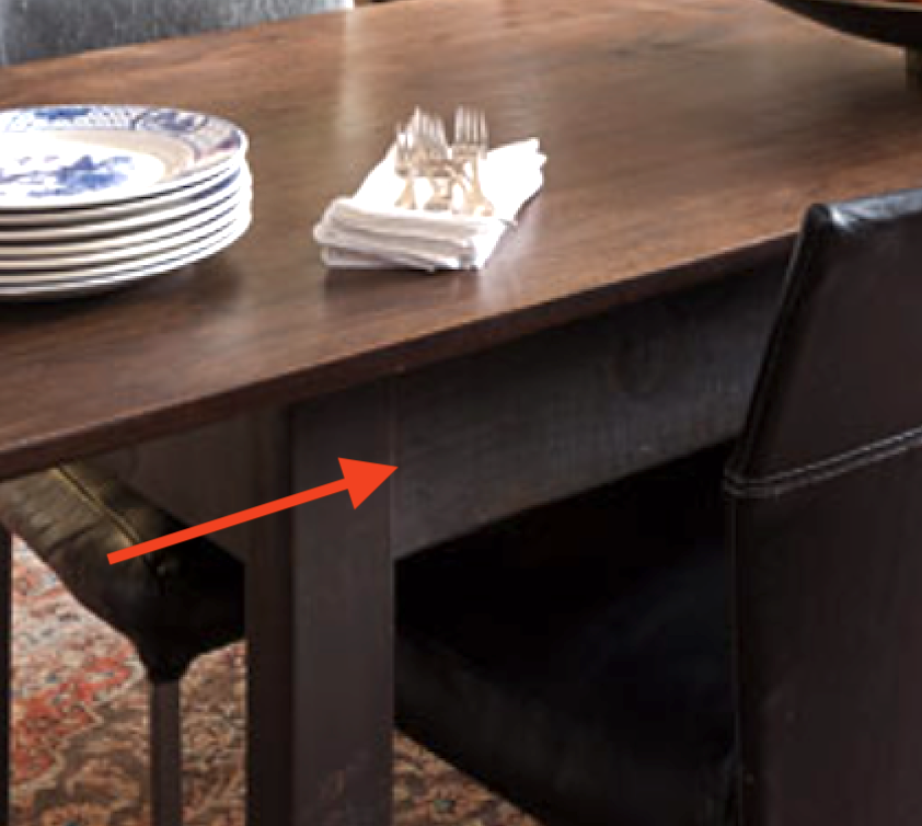
The apron of a dining table

we couldn’t have gotten taller chairs even if we’d wanted to. (And we didn’t want to.)

Second, at only 33″W, the table was a tad too narrow. Skinny tables have many advantages, but I wanted the table to be about 6″ wider.

Third, look at where the legs of the table are positioned.

Close-up of table corner with

The table was 104″L, but you could only fit 3 chairs comfortably on each side because of those darn legs. I wanted a parsons-style table, with legs at the corners, so we could fit 4 chairs per side.

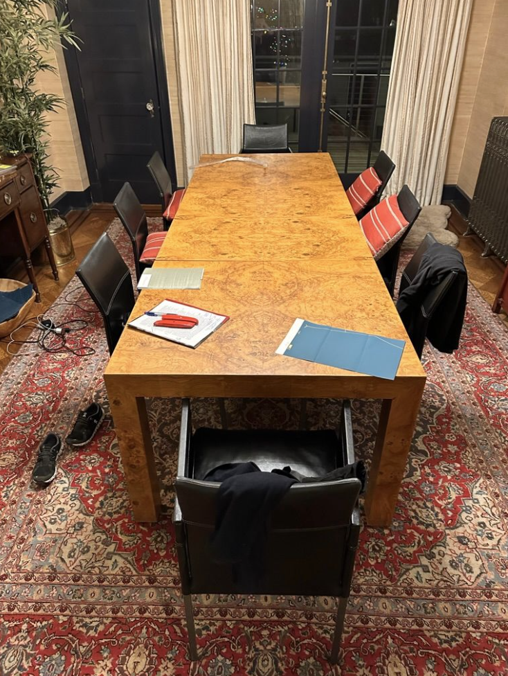
I found THE TABLE, a Milo Baughman 1970s Burlwood table, on Chairish, from a vintage store in Michigan called Le Shoppe Modern. The people there couldn’t have been lovelier to deal with. I knew the table would be a bit orangey, but I liked the richness of the color.

Milo Baughman burlwood dining table
A similar table

I did wonder, though, whether it would work with our grasscloth. Only one way to find out.
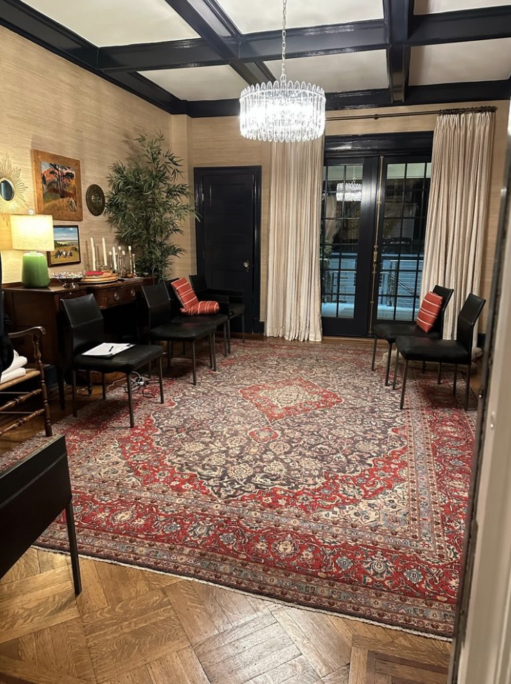
Dining room with Oriental rug, grasscloth, and coffered ceiling
Burlwood dining table

Nope. It didn’t.

SO. Obviously we had to re-wallpaper. (Feeling guilty, I asked John whether we should just paint the walls. He said — and this is how I know I married the right person: “Really? I mean, I think we need wallpaper, don’t you?”)

Like every room in our house, the dining room has gone through many iterations. In reverse chrono order from the grasscloth, the room was bright yellow (for about 2 months – disaster from the start), Farrow & Ball’s Light Blue,
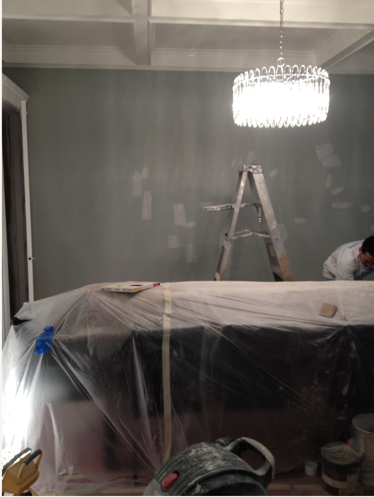
Gray room being painted
I thought it would be MUCH bluer

Revere Pewter (who was I?!),

Man and woman painting a wall with roller
My brother James is pretty good at painting. As am I ;)

and, for move-in, Concord Ivory, which wasn’t as gross as it sounds.

The dining room was a tough code to crack, and the grasscloth definitely cracked it in 2017.
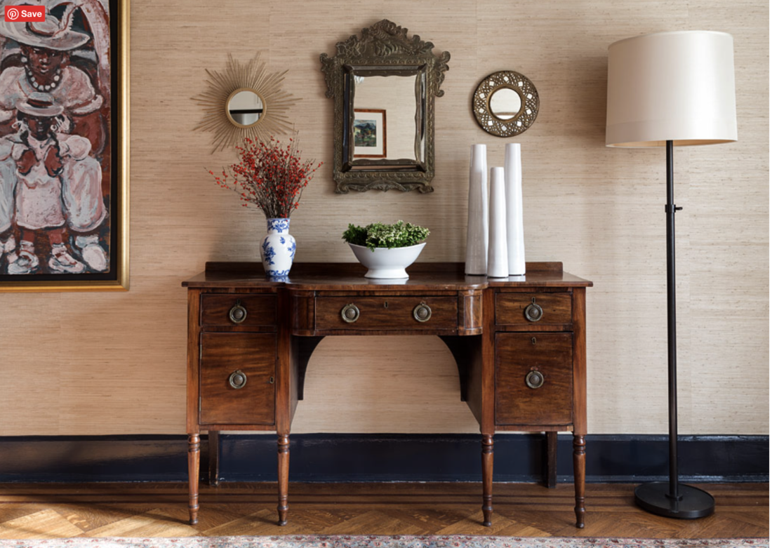
Dining room sideboard against natural grasscloth
Pretty, right?

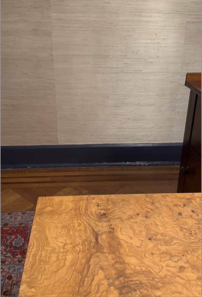
But. The table with it?

Burlwood table with natural grasscloth
Hard no

So. Neisha Crosland’s Queen Fruit to the rescue, via Schumacher.

Wallpaper sample hanging on wall
Go big or go home, right?

Won’t it be dark? I could hear Georgie asking. Well, yes, Georgie, kind of. BUT the wallpaper has some metallic paint, which reflects the light in a most pleasing way; we’ll bring back the floor lamp that was here before the bamboo; and we’ll add a tiny accent lamp on the red cabinet.
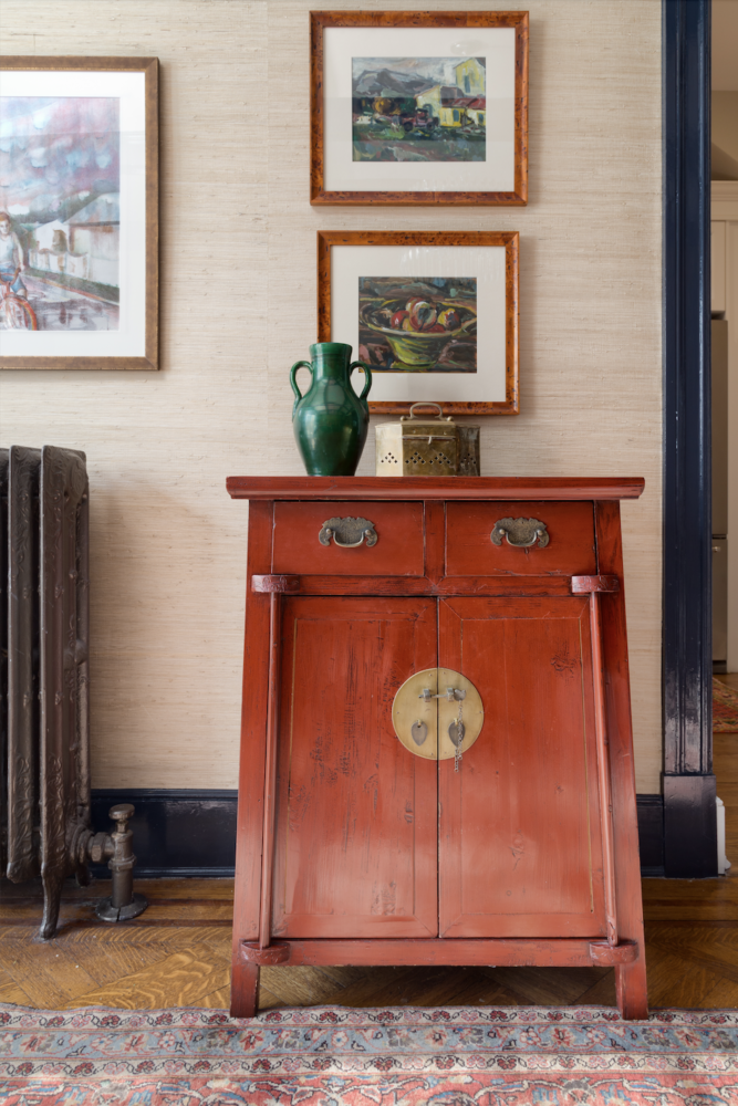
Small red Chinese cabinet
This picture makes me a little nostalgic

Ready?

Dining room wallpapered in Schumacher's Queen Fruit Lapis
Unstyled but relatively tidy
Dining room with Oriental rug and Queen Fruit blue floral wallpaper
I LOVE the Polo Blue trim with this paper. That sealed the deal, tbh
Dining room with burlwood table
See how the walllpaper reflects the light?

It’s kind of awesome. The rug looks much better in real life, as does the red cabinet. The room isn’t finished: I’m not sure about the art I’ve re-hung (oops), and now I wonder about the drapes.

But I think I’ll just figure out what to put on the table and call it a day. For now.

THANK YOU to all of you who voted in the Webby Awards!!! We ended up coming in 2nd to Etsy in the People’s Voice contest, but, not to be cliché, we were very, very honored to be nominated. I am extremely grateful for your support.

This blog post is dedicated to Georgie: fair warning before you come home for the summer, Bub. She recently said, “I hate how I have to find out what you’ve done to the house from TikTok!” Fair enough.

Annie Elliott Design is based in Washington, D.C. We’re experts in creating gorgeous, color- and pattern-filled homes and telling people what to do in the nicest way possible.

Category: WallpaperTag: Benjamin Moore, burlwood, dining room, dining table, Farrow & Ball, Milo Baughman, Queen Fruit, Schumacher, wallpaper

Sidebar

Subscribe


Bossy Color Blog

Categories

  • Art + accessories »
  • Bedroom »
  • Color + paint color »
  • Dining room »
  • Furniture + upholstery »
  • Kids »
  • Kitchen + bath »
  • Lighting »
  • Living Room + Family Room »
  • Renovation »
  • Rugs »
  • Wallpaper »
  • Window treatments »

View Portfolio

view Bossy Color's portfolio

Instagram

annieelliottdesign

View Instagram post by annieelliottdesign

Sep 10

Open post by annieelliottdesign with ID 17906571285498443
Pink, green, and a splash of dark orange come together to create this sunny, summery bedroom 🪷

annieelliottdesign

View Instagram post by annieelliottdesign

Sep 9

Open post by annieelliottdesign with ID 18104009318233584
It’s Wallpaper Wednesday! This week, feast your eyes on @timorous_beasties Fruit Looters. TB claims that William Morris’s Strawberry Thief pattern inspired Fruit Looters, but only the name indicates the connection: Strawberry Thief, Fruit Looters…get it? Whereas Morris’s iconic pattern is medium-scale, rhythmic, 2-D, cartoon-like, and muted, Fruit Looters is the opposite in every way but subject matter. The scale is huge, with the foliage “stripes” providing a geometric order, and it oozes TB’s trademark edginess. The crisp pattern is finely drawn; pull it apart, and each element — a flower, a bird — could be in an English botanical print. Fruit Looters comes in vivid, saturated colorways, some with a metallic sheen, and dramatic black is present in all.Recently, a client (who originally introduced me to Timorous Beasties!) and I used Fruit Looters wallpaper in her stairwell, in the Alabaster colorway. The drama. Oh, the drama!

annieelliottdesign

View Instagram post by annieelliottdesign

Aug 27

Open post by annieelliottdesign with ID 18339370936281789
SO much fun to create this entertainment space! This client already had a living room and kitchen…this space is for friends and family to relax, talk, and just BE. What’s your favorite feature?

annieelliottdesign

View Instagram post by annieelliottdesign

Aug 26

Open post by annieelliottdesign with ID 18618812233051872
Happy Wallpaper Wednesday! There’s no better paper to feature in August than Schumacher’s Citrus Garden 🍋 🍊.The Swedish designer, artist, and architect Josef Frank created the Citrus Garden pattern as a fabric in 1947. The hand-drawn, whimsical, quintessentially mid-century, irresistibly cheerful design exemplifies Frank’s philosophy: “The freer the pattern, the better.” I’ve used Citrus Garden fabric a few times, but shockingly, the pattern wasn’t on wallpaper until 2017!! 🤯 Deprived for so long!! As soon as the opportunity arises, I’m running, not walking, to get my hands on this wallpaper.@schumacher_midatlantic 📸 @angieseckinger

annieelliottdesign

View Instagram post by annieelliottdesign

Aug 19

Open post by annieelliottdesign with ID 17979208500097924
All of a sudden, novelty accent lamps are EVERYWHERE! Some are cute, some are…inadvisable ;) If you just can’t resist a lamp in the shape of a snail, my latest blog post has recommendations for proceeding responsibly💡

annieelliottdesign

View Instagram post by annieelliottdesign

Aug 12

Open post by annieelliottdesign with ID 18109874522009739
Happy Wallpaper Wednesday! Let’s talk about Cole & Son’s Acquario, shall we?Iconic Italian artist Piero Fornasetti designed Acquario for Cole & Son in the early 2010s. He was going through an ocean phase, captivated by its mysterious depths 🐠, so he developed this fish design and put it first on plates and fabrics, and then, luckily for us, on wallpaper. We just installed Acquario in the Print Room Blue colorway in a client’s tiny practice room (he plays classical guitar), and we LOVE it! That big old blowfish, just gliding along…he kills me.Featuring: @cole_and_son_wallpapers @fornasetti

annieelliottdesign

View Instagram post by annieelliottdesign

Aug 9

Open post by annieelliottdesign with ID 18436273279134156
Green, light blue, and a touch of navy come together to create a room that's bright, welcoming, and incredibly summery 🥰 🥰 🥰 #interiordesign #summercolors

annieelliottdesign

View Instagram post by annieelliottdesign

Aug 7

Open post by annieelliottdesign with ID 18065703698744445
Given that my brain is still on an academic calendar 🤷‍♀️ , I thought I'd do a little review and see which blog posts resonated with you the most in 2025-26. Who knew that a post from 2011 (!!!) is still in the top 5! Click over to the post to to see the year’s greatest hits. #interiordesign #designinspo

annieelliottdesign

View Instagram post by annieelliottdesign

Jul 24

Open post by annieelliottdesign with ID 18007861235943398
Get ready for a dramatic before and after! We transformed a playroom into a dining room, and the result is pretty amazing. (But still fun!) #wallpaper #interiordesign #diningroominspo
Follow

Looking for something?

Don’t miss a single post


Where classic and modern hang out and drink gin.

  • Instagram
  • TikTok
  • Pinterest
  • Facebook
American Society of Interior Designers Firm Partner

© 2026 · Annie Elliott Design · privacy policy