• Skip to main content
  • Skip to header left navigation
  • Skip to header right navigation
  • Skip to site footer
  • about
    • services
    • team
  • portfolio
  • press
Annie Elliott Design, Washington DC

Annie Elliott Design

Greater Washington DC

  • book
  • blog
  • contact

Creating the perfect art wall, part 4: That je ne sais quoi

Annie Elliott | November 30, 2010

This is the final installment in the “How to create the perfect art wall” series.

I believe my living room art wall will be my last obsessive personal project in 2010. Even though (spoiler alert) it might not even be finished by December 31.

Art wall in yellow living room

But to review. Recently, we talked about what to hang on an art wall. Framing. And different ways to hang the art – in a grid, randomly, etc.

Even armed with all of that information, though, there’s that je ne sais quoi that tells you whether an art wall is successful or not. And if it isn’t, you have to make adjustments.

I thought I’d cracked the code when my LR walls were white.

Living room art wall

But then we painted. So I re-hung the art, and all was right with the world. For a while.

THEN my lovely Mona Sofette (in Moss velvet) arrived from Mitchell Gold a few weeks ago. I love it!
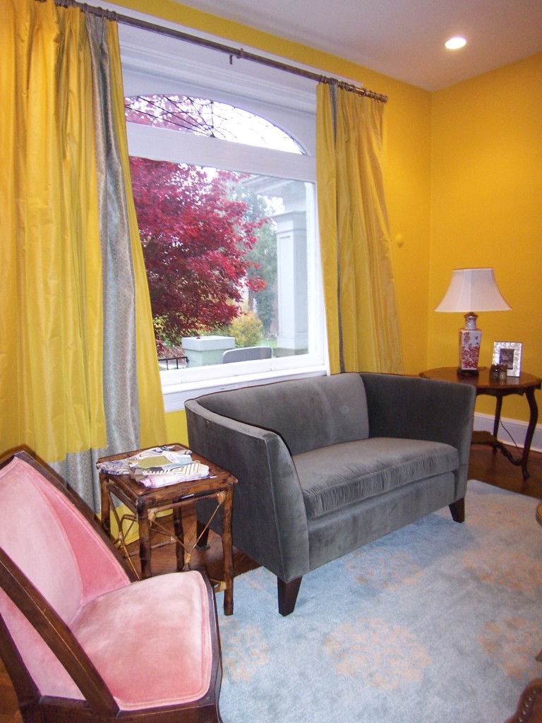
Mitchell Gold's Mona sofette

But egads! The successful art wall was no longer successful! The heavy black frames on the largest pictures were too graphic. And dark. They didn’t look right with the soft gray-green of the sofette.
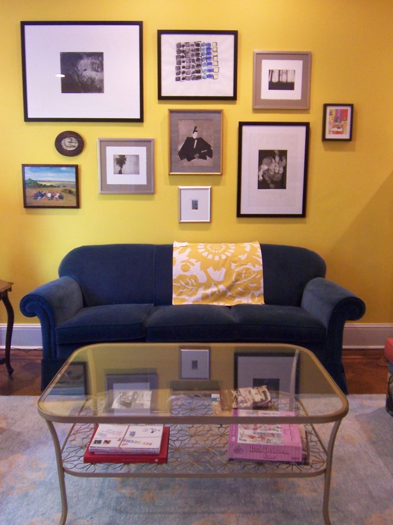
Art wall with blue sofa

Plus I was feeling that after living with this art wall for a few weeks, we needed more space between pictures on those zingy yellow walls.

I took the 3 biggest black-framed pieces down (I left the tiny one) and just for fun, I put up two other paintings on those hooks to see what was what.
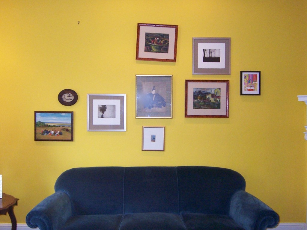
Art wall in progress

Potential?

I didn’t have the different scales to play with anymore, which was too bad; these pictures are mostly the same size. But they’re what I had to work with if I didn’t want black frames.
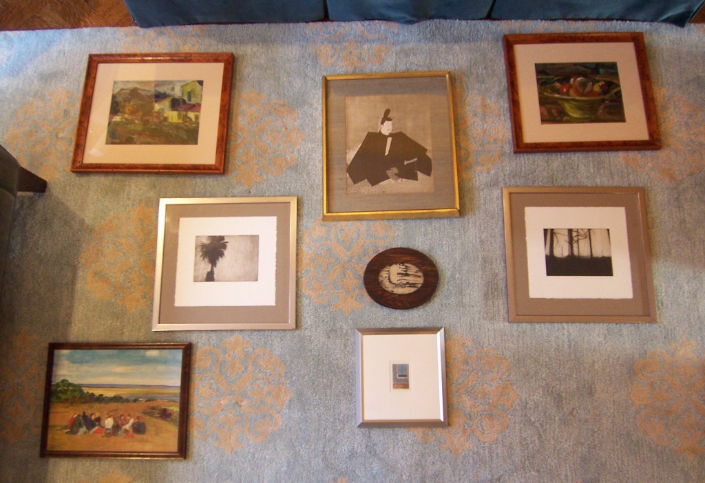
Art on floor

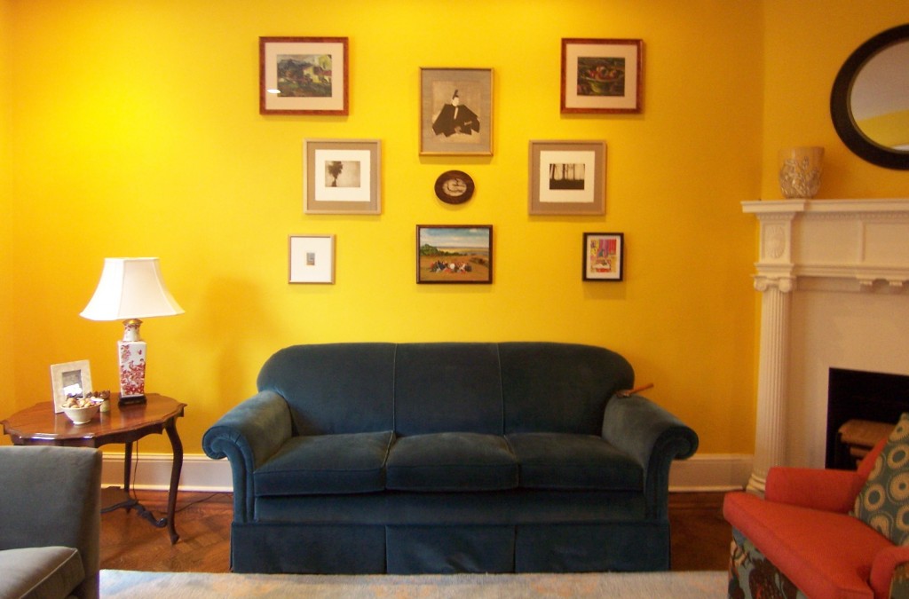
Because there are now 2 pairs of similar pictures in this group (same artist, same frames), the pictures just wanted to be more symmetrical than I’d envisioned. I felt like I had no say in the matter.
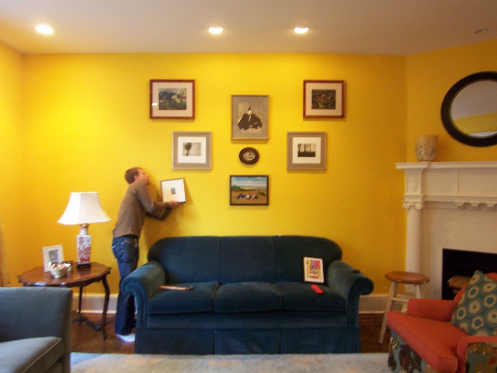
Uncle Jimmy hanging art

Art wall in yellow living room

So, symmetry.

Dr. Albert BarnesColor-wise, I like how this looks – can you see the glimpse of the new sofa on the left? But art wall grouping-wise, it feels a little hokey. (Sorry, family. They were here for Thanksgiving, and they loved it. But on second thought, maybe they were just saying that. Now why would that be? Hmmmm…)

Have you been to the Barnes Foundation in Merion, Pennsylvania, outside Philadelphia? Dr. Barnes was this kooky but brilliant collector who bought zillions of pieces from guys who weren’t so fashionable at the time. Relatively unknown artists such as Renoir, Matisse, Cezanne, Picasso…real losers.

Anyway, Dr. Barnes was SO kooky (and arrogant) that he hung the pictures in a very particular way, quasi-symmetrically, with various Pennsylvania Dutch hinges and things hung in between them.
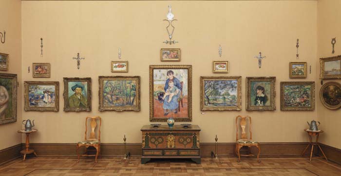
Barnes Foundation gallery

And then he MANDATED through a variety of legal documents that have kept lawyers busy for decades that the art NEVER be moved or re-hung. EVER.

Therefore, packed with masterpieces though they are, the galleries are pretty strange. And tragically, my living room reminds me of them.

Without the Picassos, of course.

Big fat sigh.

Maybe Santa Claus will bring me one largeish, colorful, wood or silver-framed piece of art and I’ll be able to re-hang the whole darn wall in a looser fashion.

In the meantime, Gentle Readers, I hope this art wall series has armed you for battle against those yawning, blank walls in your house. If you follow those suggestions – and then trust your gut – it will look terrific.

Category: Art + accessories, Living Room + Family RoomTag: art, art grouping, art wall, hanging art

Sidebar

Subscribe


Bossy Color Blog

Categories

  • Art + accessories »
  • Bedroom »
  • Color + paint color »
  • Dining room »
  • Furniture + upholstery »
  • Kids »
  • Kitchen + bath »
  • Lighting »
  • Living Room + Family Room »
  • Renovation »
  • Rugs »
  • Wallpaper »
  • Window treatments »

View Portfolio

view Bossy Color's portfolio

Instagram

annieelliottdesign

View Instagram post by annieelliottdesign

Aug 27

Open post by annieelliottdesign with ID 18339370936281789
SO much fun to create this entertainment space! This client already had a living room and kitchen…this space is for friends and family to relax, talk, and just BE. What’s your favorite feature?

annieelliottdesign

View Instagram post by annieelliottdesign

Aug 26

Open post by annieelliottdesign with ID 18618812233051872
Happy Wallpaper Wednesday! There’s no better paper to feature in August than Schumacher’s Citrus Garden 🍋 🍊.The Swedish designer, artist, and architect Josef Frank created the Citrus Garden pattern as a fabric in 1947. The hand-drawn, whimsical, quintessentially mid-century, irresistibly cheerful design exemplifies Frank’s philosophy: “The freer the pattern, the better.” I’ve used Citrus Garden fabric a few times, but shockingly, the pattern wasn’t on wallpaper until 2017!! 🤯 Deprived for so long!! As soon as the opportunity arises, I’m running, not walking, to get my hands on this wallpaper.@schumacher_midatlantic 📸 @angieseckinger

annieelliottdesign

View Instagram post by annieelliottdesign

Aug 19

Open post by annieelliottdesign with ID 17979208500097924
All of a sudden, novelty accent lamps are EVERYWHERE! Some are cute, some are…inadvisable ;) If you just can’t resist a lamp in the shape of a snail, my latest blog post has recommendations for proceeding responsibly💡

annieelliottdesign

View Instagram post by annieelliottdesign

Aug 12

Open post by annieelliottdesign with ID 18109874522009739
Happy Wallpaper Wednesday! Let’s talk about Cole & Son’s Acquario, shall we?Iconic Italian artist Piero Fornasetti designed Acquario for Cole & Son in the early 2010s. He was going through an ocean phase, captivated by its mysterious depths 🐠, so he developed this fish design and put it first on plates and fabrics, and then, luckily for us, on wallpaper. We just installed Acquario in the Print Room Blue colorway in a client’s tiny practice room (he plays classical guitar), and we LOVE it! That big old blowfish, just gliding along…he kills me.Featuring: @cole_and_son_wallpapers @fornasetti

annieelliottdesign

View Instagram post by annieelliottdesign

Aug 9

Open post by annieelliottdesign with ID 18436273279134156
Green, light blue, and a touch of navy come together to create a room that's bright, welcoming, and incredibly summery 🥰 🥰 🥰 #interiordesign #summercolors

annieelliottdesign

View Instagram post by annieelliottdesign

Aug 7

Open post by annieelliottdesign with ID 18065703698744445
Given that my brain is still on an academic calendar 🤷‍♀️ , I thought I'd do a little review and see which blog posts resonated with you the most in 2025-26. Who knew that a post from 2011 (!!!) is still in the top 5! Click over to the post to to see the year’s greatest hits. #interiordesign #designinspo

annieelliottdesign

View Instagram post by annieelliottdesign

Jul 24

Open post by annieelliottdesign with ID 18007861235943398
Get ready for a dramatic before and after! We transformed a playroom into a dining room, and the result is pretty amazing. (But still fun!) #wallpaper #interiordesign #diningroominspo

annieelliottdesign

View Instagram post by annieelliottdesign

Jul 22

Open post by annieelliottdesign with ID 18113978008731617
For today’s Wallpaper Wednesday, we discuss the chinoiserie wallpaper in the Great Hall at  @citytavern_dc  in Washington, DC. Ooooohh - field trip!I was delighted to visit City Tavern recently. It’s a historic 1796 Federal building in the heart of Georgetown, and all the cool kids hung out there. You know, George Washington, Thomas Jefferson…those guys. At one point, the building boasted the largest room in Washington.I, of course, was captivated by the Great Hall, which is covered in @graciestudio hand-painted wallpaper — which was selected by none other than Jackie Kennedy! EVEN THOUGH at that time the building was a club that didn’t admit women. Harumph.The chinoiserie walls are gorgeous from far away, but they’re amazing up close, also: you can see faint brushstrokes left by the painters. Doesn’t that give you a shiver? I love it.

annieelliottdesign

View Instagram post by annieelliottdesign

Jul 21

Open post by annieelliottdesign with ID 17880979779674102
For a recent article in @vogueliving, I was asked how to mix wallpapers — either in the same room or adjacent rooms. I have a few pieces of advice to offer 😊See my latest blog post for more…#interiordesign #designblog #wallpaperinspo
Follow

Looking for something?

Don’t miss a single post


Where classic and modern hang out and drink gin.

  • Instagram
  • TikTok
  • Pinterest
  • Facebook
American Society of Interior Designers Firm Partner

© 2026 · Annie Elliott Design · privacy policy