• Skip to main content
  • Skip to header left navigation
  • Skip to header right navigation
  • Skip to site footer
  • about
    • services
    • team
  • portfolio
  • press
Annie Elliott Design, Washington DC

Annie Elliott Design

Greater Washington DC

  • book
  • blog
  • contact

Before and after: Home makeover in Virginia!

Annie Elliott | April 10, 2022

Hello, Gentle Readers! In the previous post, I included a photo of a bedroom we designed in Virginia. I thought you might like to see some “befores” and “afters” from that project, so here’s a makeover special!

The client didn’t want to replace EVERYthing. Just most things. You’ll see what we kept and what we didn’t.

Bedroom with four-posted bed
Before – primary bedroom
Grand bedroom with blue canopy bed
After

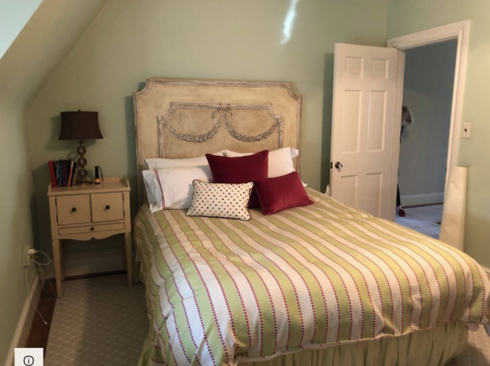
The bed, bedside tables, and lamps all made the cut.

Window seat with no pillows
Before – window seat in primary bedroom
Bright window seat in tones of blue and cream
After

The next one is really fun. (Sorry for the blurry picture – it is the ONLY “before” we have of this space!) This is the anteroom to the primary bedroom suite. The space without a purpose.

Small room with windows and heavy drapes
Before – anteroom

Let’s be honest: no one may ever ACTUALLY sit in here. But why don’t we make it look inviting and purposeful and see?

Bright room with blue velvet settee and light linen window treatments
After. So much light!!!

Here is one of the bedrooms. It had a great run; it just needed updating.

Light green bedroom with whitewashed wooden headboard
Before – bedroom
Bright gray bedroom with green and white pattern on upholstered headboard
After

The kitchen was fun. There was no need for a full-on renovation, since the cabinets, backsplash tile, and countertops were in great shape, and the layout was logical. No, the magic here was in paint. From gray stained cabinets and (it’s hard to see) a dark wood island…

Kitchen with gray cabinets
Before – the kitchen, connected to the family room

…to white painted cabinets and a charcoal gray island. Magic, right?

Bright white kitchen and breakfast area
After. Dramatic, right? Paint!!!!

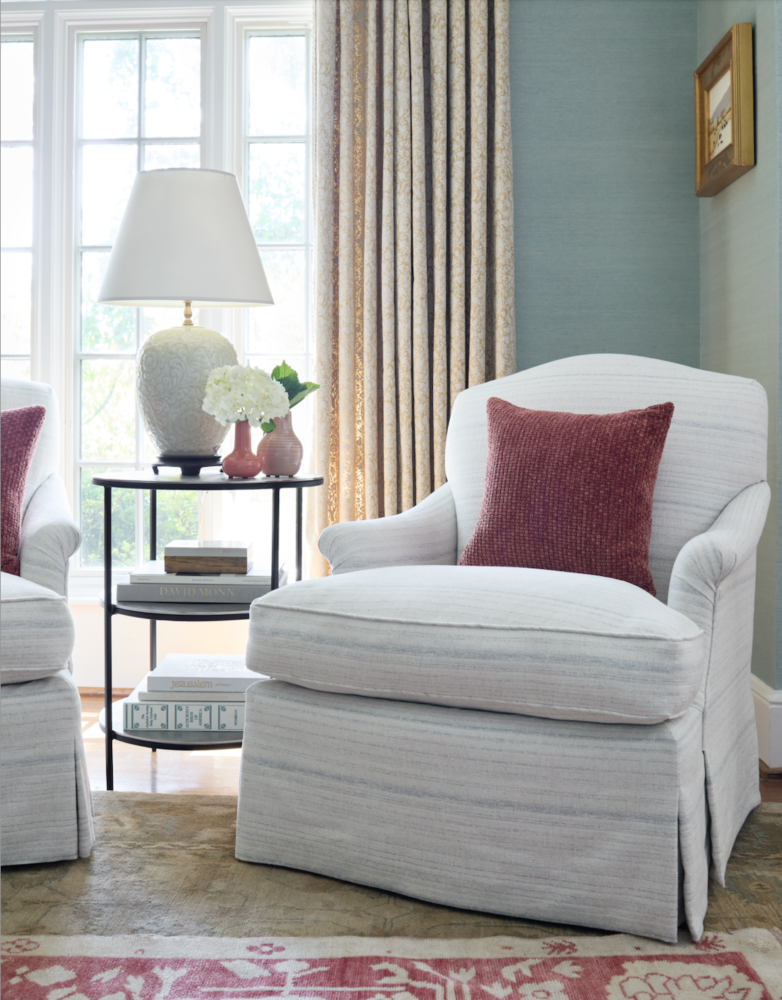
The living room was tricky, because the homeowners wanted to keep the beautiful rug, window treatments, and lounge chairs. And coffee table if possible. They wanted a lighter and brighter room, but white walls would have made the rug and drapes, with their pretty the gold tones, look dirty and tired. White wouldn’t have pulled things together.

Living room with traditional tone on tone rug
Before – living room
Living room with gold sofa and painting of boat
Another Before. You can see that the room gets beautiful natural light

Instead, we pulled out the blue/green tones in the rug and did a grasscloth on the walls in a similar color. We convinced our clients that the classic sofa — while pretty! — was simply too small for the room. The chest and tier table flanking the sofa went into the dining room, where they’re attractive AND useful. Here’s the living room After:

Living room with light blue walls and layered rugs
After

The rug-on-rug is unexpected, but their current rug is gigantic and gorgeous quality…we didn’t want to lose it completely. We reupholstered the lounge chairs, brought in a more substantial sofa, and got new side tables and lamps. And new pillows, of course ;) There is an ottoman visible in the lower L corner of the “after” picture above; it usually sits between the chairs in front of the fireplace.

Lounge chair in front of a window
Across from the sofa

I love a makeover, don’t you?

Annie Elliott Design is based in Washington, DC, with offices in St. Michaels, Maryland and Middlebury, Vermont. Our style? Where classic and modern hang out and drink gin.

Category: Color + paint color

Sidebar

Subscribe


Bossy Color Blog

Categories

  • Art + accessories »
  • Bedroom »
  • Color + paint color »
  • Dining room »
  • Furniture + upholstery »
  • Kids »
  • Kitchen + bath »
  • Lighting »
  • Living Room + Family Room »
  • Renovation »
  • Rugs »
  • Wallpaper »
  • Window treatments »

View Portfolio

view Bossy Color's portfolio

Instagram

annieelliottdesign

View Instagram post by annieelliottdesign

Apr 13

Open post by annieelliottdesign with ID 18085288493580590
Let’s talk about what fabric doesn’t work ❌ for the sectional upholstery in this beach house TV Room. Even though these fabrics are beautiful on their own… they don’t work here. The dark stripes were not lighthearted enough and the smaller scale blue and white pattern was too predictable. Watch to listen to me plead my case for lavender and green! 🏖️#interiordetails #colorfulinteriors #beachhousedesign

annieelliottdesign

View Instagram post by annieelliottdesign

Apr 13

Open post by annieelliottdesign with ID 18321246121271986
Here’s the challenge: Imagine you are designing a lighthearted, summer beach house. In the TV Room, there are bookcases, a neutral rug, and a large sectional.What upholstery would you put on the sectional?Comment your pick before you see part 2 👇#designchallenge #interiorsandhome #interiorinspiration

annieelliottdesign

View Instagram post by annieelliottdesign

Apr 8

Open post by annieelliottdesign with ID 18338258239300458
When you come home after a long day, do you want your foyer to rev you up or calm you down? Decide which approach you need and run with it. Add large-scale wallpaper and layered rugs for excitement, or paint the walls off-white and be selective with your artwork and mirrors for calm. #foyer #homedesign #foyerinspiration

annieelliottdesign

View Instagram post by annieelliottdesign

Apr 3

Open post by annieelliottdesign with ID 17848603689678580
Q: What is one thing you can do to elevate a room❓💬 The first thing you see when you walk into a room needs to look great. In your office, get a nice, big vintage desk. In a living room, paint all the walls a dark color. Avoid satin brass hardware, pills on sofa fabric, and fake wood!#interiordesign #dcdesigner #decorinspo

annieelliottdesign

View Instagram post by annieelliottdesign

Apr 1

Open post by annieelliottdesign with ID 17918392215338642
This will come as no surprise, but I think about window treatments a LOT. Especially during the transition from winter to spring, with the change in temperature and light…I’m reminded what a critical design element window treatments are. And then I get to thinking about window treatments through the ages. Who invented drapes? Did the Romans *really* invent Roman shades?I decided to do some digging. Check out my blog to see what I discovered!📸 @stacyzaringoldberg📸 @jennverrierphoto#windowtreatments #drapes #interiordesign

annieelliottdesign

View Instagram post by annieelliottdesign

Mar 25

Open post by annieelliottdesign with ID 18088729466185965
It’s Wallpaper Wednesday! Today we feature Brunschwig & Fils’ Les Touches. @brunschwigfils introduced Les Touches in 1965, and the pattern soon became a Brunschwig classic. (Interestingly, “touches” translates to “keys” or “strokes…” I guess that’s close to “dabs,” which is what I’d assumed.) According to handwritten records, Les Touches is inspired by post-WWII black and white photographs, but the connection between this inspiration and the pattern remains a mystery. Referred to most often as a stylized animal print, Les Touches is a staple of the Le Jardin Chinois collection.Today, Les Touches comes in 18 colorways, but the blue colorway remains iconic. I’ve used Les Touches for window treatments and upholstery, but I can’t wait to try it as wallpaper!

annieelliottdesign

View Instagram post by annieelliottdesign

Mar 23

Open post by annieelliottdesign with ID 18102457048819740
Here’s what ✨ I ✨ would do… Instead of matching everything, you balance it. Pull one color. Shift the scale. Let each piece do something different. Here’s what ✨ I ✨ would do… Instead of matching everything, you balance it. Pull one color. Shift the scale. Let each piece do something different. Bonus: Change the rug! Suddenly you’d make a completely different window choice.Did you guess it?!Watch part 1 for the challenge context and part 2 for what doesn’t work.#interiorsandhome #fabricdesign #romanshades

annieelliottdesign

View Instagram post by annieelliottdesign

Mar 23

Open post by annieelliottdesign with ID 17860517745617635
Let’s talk about what fabric doesn’t work ❌ for the Roman shades in this teenage girl’s bedroom with 2 big windows and a statement ceiling. Even though these fabrics are beautiful on their own… they don’t work here. Biggest mistake: repeating the same motif (moths, butterflies, etc.) across the room. It starts to feel themed instead of designed.Watch part 1 for the full context, and watch part 3 to find out what I would choose.#interiordesign #wallpaper #interiorsandhome

annieelliottdesign

View Instagram post by annieelliottdesign

Mar 23

Open post by annieelliottdesign with ID 18038018090572669
Here’s the challenge: a teenage girl’s bedroom. Not huge. Two big windows. Statement ceiling. White walls.Which fabric would you choose for the Roman shades?There’s a right answer… a safe answer… and a couple very wrong ones. Comment your pick before you see part 2 👇#interiordesigner #wallpaper #romanshades
Follow

Looking for something?

Don’t miss a single post


Where classic and modern hang out and drink gin.

  • Instagram
  • TikTok
  • Pinterest
  • Facebook

© 2026 · Annie Elliott Design · privacy policy