• Skip to main content
  • Skip to header left navigation
  • Skip to header right navigation
  • Skip to site footer
  • about
    • services
    • team
  • portfolio
  • press
Annie Elliott Design, Washington DC

Annie Elliott Design

Greater Washington DC

  • book
  • blog
  • contact

Goodbye, yellow living room. A love letter of sorts

Annie Elliott | February 20, 2017

Dear Living Room,

I love you.

But I haven’t always.

You’re not easy, you know. When we bought this house at the end of 2004, I didn’t know what to do with you. You’re north-facing. You’re almost square. You have a corner fireplace – and you know how tricky those can be.

1980s picture of boys smoking
Glens Falls, New York, circa 1980. My brother James (aka Jimmy Riot, look him up on YouTube ;) ) is second from right

You have a single, gigantic window, Living Room. And you have two double-width doorways. You have no obvious furniture arrangement, no obvious wall color.
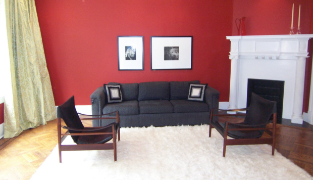
Red living room with black mid-century chairs
My living room, third paint color

I struggled mightily as I tried to figure out what paint color would work best for you. I tried 5 colors in 3 years, isn’t that right? I’ve written about that epic journey before.

White living room with black furniture
My living room, fourth or fifth color in 2007. I’m convinced I’ve lost a color somewhere…

But from the moment in 2011 when I put Benjamin Moore’s 343 Sunrays on your hundred-year-old walls, I knew we’d found the answer. It shouldn’t have taken so long, to be honest. Yellow is my favorite color. Yellow warms up a north-facing room. STRONG yellow maintains its integrity when the weak, gray-tinged light finally makes an appearance.

Yellow living room with blue sofa
Me in my much-adored bright yellow living room, 2011 or so

In so many houses, the living room is underused.

Not so with you, Living Room! Our daughters flop down here when they get home from school, phones in hand for their permissible screen time before homework. I work here sometimes, feet on the coffee table, laptop in, well, my lap. John reads the paper in here. You’re where we have drinks with friends before dinner. Christmas happens here.

Your cheerful yellow walls made us want to spend time with you, Living Room. Yellow cracked the code. Yellow was the answer.
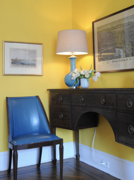
Yellow room
Detail of the yellow living room, with English engraving, English chair and sideboard, and true-blue American map of Glens Falls, NY

So if I love your brilliant yellow walls so much, why oh why am I changing them?

It’s as simple as this: I needed a change.

I will defend saturated wall colors until the end of time. But for me, right now, I want something softer. Something less aggressive. I wanted to see if you could be happy, inviting, and warm with a lighter, more subtle color on your walls.

Blue sofa with art wall
The yellow living room with a good gallery wall — finally! — and a new rug. See, the new rug with the saturated yellow walls…too intense

And guess what, my dear Living Room? You can! Look good in a softer, strategically selected color. Such as blush. A pinky, peachy blush. Possibly darker than the blush so popular right now, because I did learn my lesson: super light colors wash out in your northern light.

Oriental rug
Blush (oh all right: pink) paint samples with the new rug and ideas for new upholstery

You’ll look pretty great in blush, Living Room. Don’t you think? Grannie’s sideboard and round table will look even prettier. I have a new (to me) vintage painting with shades of mustard…that will look terrific against your walls (I’ve always loved dark yellow and light pink together.) And then maybe new furniture, so the blush walls will be the only pink in the room. No more pink furniture – too feminine.

So farewell, yellow, and welcome, blush.

You’ll see, Living Room. I’ll do you proud.

Love,
Annie

Annie Elliott’s work has appeared in publications from Washingtonian Magazine to The Wall Street Journal. Bossy color is a full-service design firm based in Washington, D.C.

Category: Color + paint color, Living Room + Family RoomTag: blue sofa, blush, Danish Modern chairs, Glens Falls, living room makeover, makeover, midcentury chairs, Oriental rug, painting, perfect living room color, pink, re-painting, red walls, Swedish safari chairs, white walls, yellow

Sidebar

Subscribe


Bossy Color Blog

Categories

  • Art + accessories »
  • Bedroom »
  • Color + paint color »
  • Dining room »
  • Furniture + upholstery »
  • Kids »
  • Kitchen + bath »
  • Lighting »
  • Living Room + Family Room »
  • Renovation »
  • Rugs »
  • Wallpaper »
  • Window treatments »

View Portfolio

view Bossy Color's portfolio

Instagram

annieelliottdesign

View Instagram post by annieelliottdesign

Nov 12

Open post by annieelliottdesign with ID 18116363537141007
Grays and blues don’t automatically = un-cozy! Textures support the cool, low-contrast palette to create an inviting, serene space.

annieelliottdesign

View Instagram post by annieelliottdesign

Nov 6

Open post by annieelliottdesign with ID 17977466751149764
Let’s call it like it is: this library-slash-tv room was…boring. BEFORE: dull, a pass-through space, not inviting. AFTER: So fun! with its shiny purple walls and dramatic window treatments!! Makes you want to stay a while, doesn’t it?

annieelliottdesign

View Instagram post by annieelliottdesign

Nov 4

Open post by annieelliottdesign with ID 18117490325589401
This Wallpaper Wednesday we feature Nanjing by @schumacher1889!This  pattern is a modern take on classic chinoiserie motifs: trees, pagodas and fretwork fences. It is named after Nanjing, Jiangsu, East China, one of the four great ancient capitals of China. You may recognize the pattern on your Blue Willow dishes, too :) I used this wallpaper in a client’s Powder Room, and it bring so much energy and brightness to the space. I love the green colorway, too 😊📸 @angieseckinger @schumacher_midatlantic

annieelliottdesign

View Instagram post by annieelliottdesign

Nov 2

Open post by annieelliottdesign with ID 18092508983228146
Where do those gorgeous but multitudinous pillows go at night? See some ideas in my latest blog post… 😌#interiordesign #pillowinspo

annieelliottdesign

View Instagram post by annieelliottdesign

Oct 28

Open post by annieelliottdesign with ID 18167021635426020
My home is my lab :) As evidenced by my constant tinkering. Today: replacing my own DR chandelier.

annieelliottdesign

View Instagram post by annieelliottdesign

Oct 23

Open post by annieelliottdesign with ID 18138180424725389
One could argue that each element in this New York living room is dramatic, from the mirrored (wallpaper) ceilings to the purple sofa. If we had put an antique rug in this room — which, let’s be honest, is often my first thought — the effect could have been dowdy. It would have been cozy, it would have been consistent with the moody vibe, and it still would have been kind of interesting given the other things in the room.But the contemporary rug, Danika by @starkcarpet, makes the room SING. The huge geometric scale is a beautiful contrast to the smaller patterns on the chair and the Roman shade. The light background brightens the room while making the darker colors more intense. And the black…well, black always adds drama.It’s hard to explain, but you see it, right?@schumacher_midatlantic @timorous_beasties @starkcarpet_dc#schustagram

annieelliottdesign

View Instagram post by annieelliottdesign

Oct 21

Open post by annieelliottdesign with ID 17995465526842775
Happy Wallpaper Wednesday! This week, we dive into Martinique by CW Stockwell.This small, family-run print facility in Los Angeles was founded in 1905. Clifton Stockwell’s daughter and son-in-law traveled to the Bahamas in 1942 and were so enchanted by the foliage that they collaborated with illustrator and textile designer Albert Stockdale to create a wallpaper pattern. The result was Martinique — also known as “The Original Banana Leaf Print.” (Martinique is not to be confused with Brazilliance by Dorothy Draper 😉 .)Martinique famously adorns the Beverly Hills Hotel’s halls, stairwells, and Fountain Coffee Room.CW Stockwell now sells the Martinique pattern in seven colorways as wallpaper, grasscloth, and linen fabric.@cwstockwell @scalamandre#interiordesign #wallpaperinspo

annieelliottdesign

View Instagram post by annieelliottdesign

Oct 19

Open post by annieelliottdesign with ID 17884583844691170
I love this cocoon of a bedroom :) And what makes it REALLY interesting? The red lamps. There’s no other red in the room. Oranges, yes, so the red has something to relate to, but the exact shade appears nowhere else.It’s these unexpected elements that can take a room from beautiful to fabulous.Hats off to: @visualcomfort @cowtanandtout @cowtanwashingtondc#dcdesigner #interiordesign

annieelliottdesign

View Instagram post by annieelliottdesign

Oct 16

Open post by annieelliottdesign with ID 17947598421345387
I stand by my decision to drywall the window 🤭. See how we created a dark and cozy boudoir in a spacious sunny condo in DC…#interiordesign #dcdesigner
Follow

Looking for something?

Don’t miss a single post


Where classic and modern hang out and drink gin.

  • Instagram
  • TikTok
  • Pinterest
  • Facebook
American Society of Interior Designers Firm Partner

© 2026 · Annie Elliott Design · privacy policy